I’ve always seen website popups as one of the simplest ways to turn passive traffic into meaningful conversions. In fact, according to Invesp’s research, visitors who are retargeted through display ads are about 70% more likely to convert, which highlights how timely, well-placed messaging can influence user behavior.
They give us a way to deliver the right message to the right person at the right moment.
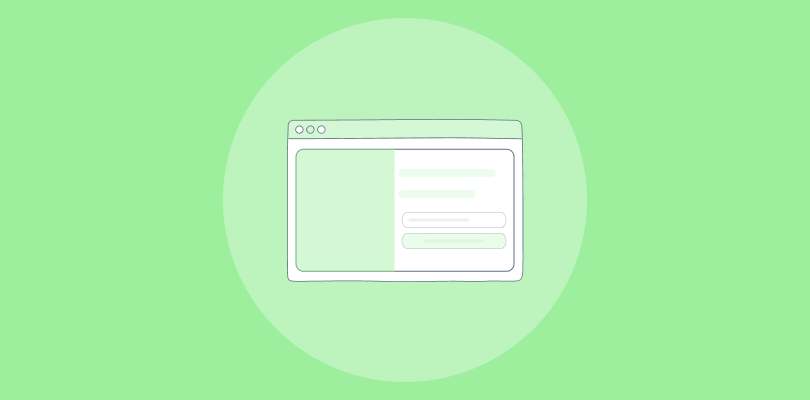
Today’s popups are far from random boxes floating over content. They’re behavior-aware, segment-driven UX elements designed to guide visitors toward something valuable, whether that’s a discount, a lead magnet, or a gentle nudge back to checkout.
They work because they bring together intent, timing, and value. When these three align, you can see a consistent lift in conversions without redesigning your entire website.
In this guide, I break down the popup formats, triggers, examples, and setup steps that actually drive measurable results.
What Are Website Popups and Why Do They Still Convert So Well?
Popups convert because they meet visitors at the exact moment of intent. When someone pauses, scrolls, hesitates, or signals exit, that’s your only real chance to shift the outcome. A well-timed popup doesn’t interrupt the experience; it rescues it. That is why campaigns see conversion rates from 3.77% up to 17% with exit intent.
The real driver isn’t design. It’s timing and relevance. Popups work when they offer a clear value exchange: a discount incentive, resource, or early access in return for an email. When you shift from interruption to assistance, users feel helped rather than spammed.
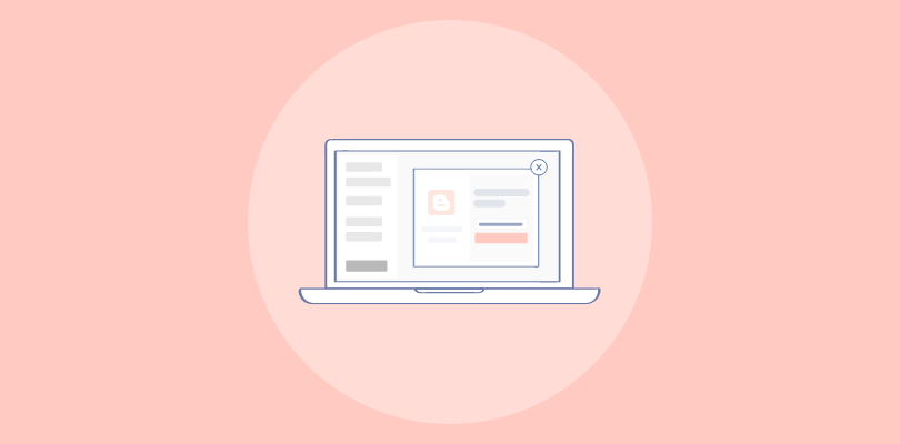
What Are the Best Website Popup Examples You Can Use?
When I look at website popup examples, I am not looking for pretty designs. I am looking for intent, timing, and clarity. Every high-performing popup for website does one thing well: it meets the visitor at the moment they are most likely to act. The 14 examples below are strong because they blend value with behavioral context.
I have grouped all the website popup examples into categories to make scanning easier and to help you match examples to your goals.
Email Capture Examples
These email popups work because they keep the message clear and the incentive strong. Great for growing lists, nurturing audiences, and building long-term revenue.
1. Ultraviolet
Ultraviolet is a skincare and beauty brand targeting first-time online buyers who are price-sensitive and need a nudge to complete checkout. Their audience typically browses for a few minutes, compares prices, then leaves.
To stop that drop-off, Ultraviolet deploys a discount modal early in the session, before a visitor even considers leaving. The goal is simple: capture the email and lock in the first purchase with a small incentive.
What the popup does: A clean overlay appears with a bold percentage-off offer and a single email field. The design is minimal, so nothing pulls attention away from the deal.
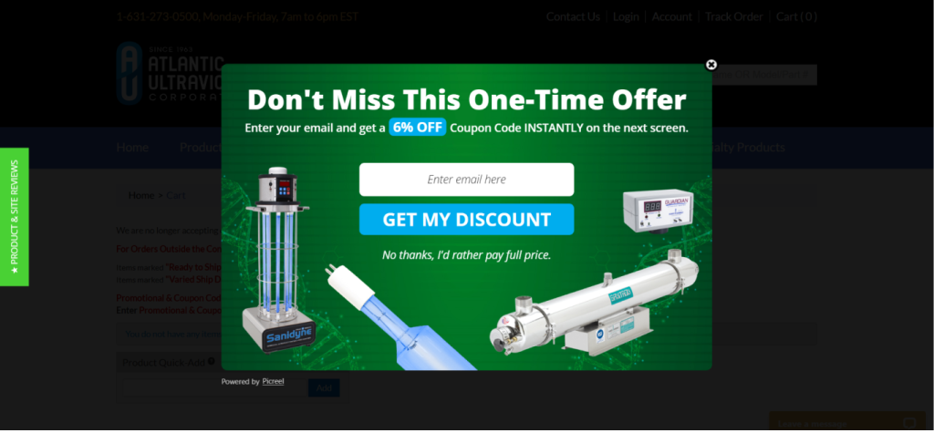
Why this works:
- The bold headline creates instant clarity. Visitors know the offer in under two seconds.
- A 6% discount feels achievable without cutting deeply into margins.
- The “Get My Discount” CTA is first-person and action-driven, which reduces hesitation.
- The decline copy “No thanks, I’d rather pay full price” uses psychological contrast to make opting in feel like the smarter choice.
- There is nothing competing for attention. No navigation. No secondary links. Just the offer.
CTAs you can use:
- “Claim My 6% Off”
- “Unlock My Discount”
- “Get My Deal Before It Expires”
- “Yes, Save Me Money”
Best for: First-time buyers, price-comparison shoppers, beauty and personal care brands running margin-safe promotions.
2. RDPUSA
RDPUSA is a professional coaching and consulting firm that works with decision-makers in business. Their buyers are not impulse purchasers. They research thoroughly, read credentials, and want proof of value before committing to a call or service package.
To attract high-quality leads, RDPUSA uses a lead magnet popup offering a free chapter of their coaching book. This positions them as an authority from the first touchpoint and filters in leads who are genuinely interested in growth.
What the popup does: The popup surfaces mid-session with a compelling content offer. Visitors enter their email to receive the free chapter, joining a nurture sequence designed to move them toward a consultation.
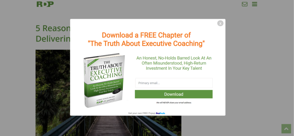
Why this works:
- The headline is value-focused, not brand-focused. It leads with what the visitor gets.
- The subheadline speaks directly to decision-makers, using language that signals industry relevance.
- Offering a book chapter builds credibility faster than a discount could.
- The clean, mobile-optimized layout converts well across devices, which matters for executives reading on phones.
- Email capture here is not just list-building. It is qualification. Anyone who wants the chapter is already interested in the topic.
CTAs you can use:
- “Send Me the Free Chapter”
- “Get My Copy”
- “Yes, I Want to Learn More”
- “Download the First Chapter Free”
Best for: Consultants, coaches, B2B service providers, and businesses selling high-consideration products where trust must be built before a sale.
3. Flaus
Flaus is a modern oral care brand selling an electric flossing device. Their product is innovative but unfamiliar, which means most visitors need a small nudge to move from curiosity to purchase. Flaus uses a minimalist discount popup designed to capture emails and trigger immediate action. The brand keeps the design clean because their audience values simplicity and good design aesthetics.
What the popup does: The popup triggers after a visitor has spent a few seconds on the site. It offers a percentage discount on the first order and uses a single email field to keep entry fast and frictionless.
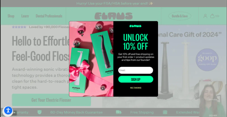
Why this works:
- “Unlock 10% Off” frames the discount as a reward the visitor earns, not a price cut the brand is pushing.
- Mentioning free shipping in the subtext removes a second common objection at checkout.
- A single email field makes the form fast to complete. Every extra field reduces conversions.
- The “No thanks” link gives visitors an exit without frustration, which paradoxically keeps more people on the page.
- The minimalist design mirrors the brand’s product aesthetic, making the popup feel native rather than intrusive.
CTAs you can use:
- “Unlock My Discount”
- “Save 10% on My First Order”
- “Get the Deal + Free Shipping”
- “Claim My Offer”
Best for: DTC brands launching innovative products, founders driving first-purchase conversions, any store where free shipping is a strong conversion lever.
4. Brooklinen
Brooklinen is a premium bedding and home goods brand known for high AOV (average order value) and a loyal customer base. Their buyers are deliberate. They browse, compare thread counts, read reviews, and often revisit the site before purchasing.
Brooklinen uses a two-step popup sequence to first hook visitors with a bold discount, then capture their email in step two. This structure filters out passive clickers and produces a higher-quality list.
What the popup does: Step one presents a bold, attention-catching offer. Once the visitor clicks to engage, step two reveals the email capture form. This two-tap flow significantly improves list quality because people who complete it are genuinely interested.
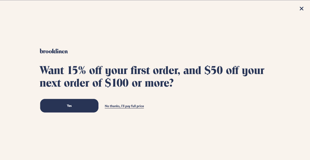
Why this works:
- The two-step structure is known as the Zeigarnik effect in CRO. Once someone starts a process, they are more likely to finish it.
- The bold discount in step one does the heavy lifting to earn engagement.
- Moving the email capture to step two reduces early friction. Visitors agree to the value before being asked for anything.
- Playful decline copy softens the ask and keeps the brand tone consistent.
- Clean, uncluttered design prevents cognitive overload and keeps the conversion path clear.
CTAs you can use:
- Step 1: “Show Me the Offer”
- Step 1: “Yes, I Want to Save”
- Step 2: “Send My Discount”
- Step 2: “Claim My Code”
Best for: Premium brands with high AOV, retailers using Klaviyo or email automation to segment buyers, ecommerce stores with longer purchase consideration cycles.
Discount and Urgency Examples
Urgency-driven popups convert because they give visitors a reason to act now instead of later. These brands use timers, scarcity, or seasonal hooks to push momentum.
5. Nuoo
Nuoo is a French natural beauty and wellness brand. Their target audience is eco-conscious, health-aware consumers who care about ingredients as much as price. Nuoo uses urgency-based popups around promotional windows to create FOMO without undermining the integrity of their brand.
Their popups are visually bold by design because they need to compete in a content-rich site where visitors tend to browse deeply before buying.
What the popup does: The popup appears during sale windows and presents a 25% discount with product imagery and a limited-time message. The visual is rich and colorful, designed to stop mid-scroll behavior.
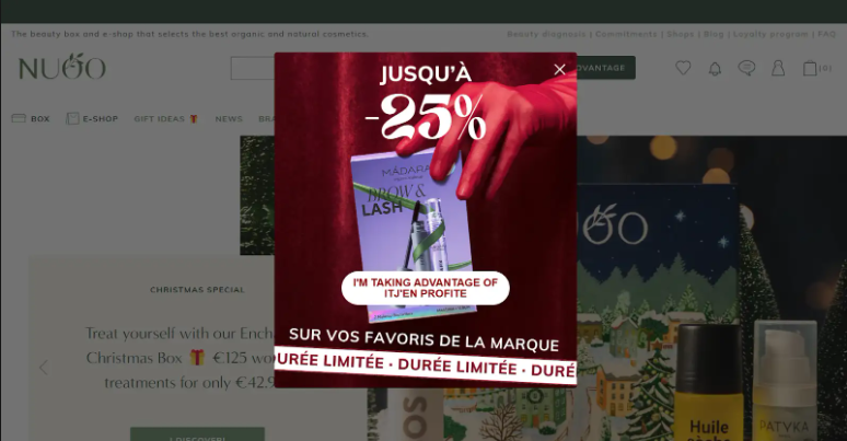
Why this works:
- A 25% discount is large enough to shift buying intent immediately.
- Using vibrant product imagery alongside the offer connects the deal to something tangible, not just a number.
- “Limited Time Only” removes the comfort of waiting. Procrastination is the enemy of conversions and this copy fights it directly.
- A single, focused CTA simplifies the decision. There is no secondary option to distract.
- The visual contrast between the popup and the site background makes it impossible to ignore without closing.
CTAs you can use:
- “Shop the Sale Now”
- “Grab 25% Off Today”
- “Claim Before It Ends”
- “Save Now, Shop Later”
Best for: Natural beauty brands, wellness retailers, DTC stores running time-limited promotions around seasonal moments.
6. Net-A-Porter
Net-A-Porter is a luxury fashion retailer operating at the high end of the market. Their audience is affluent, brand-loyal, and responsive to exclusivity signals. When Net-A-Porter runs a sale, it is a significant event.
Their popups are designed to communicate scale and urgency simultaneously. The tone is premium but the message is direct: up to 60% off is a number even luxury shoppers cannot ignore.
What the popup does: A sale popup appears for site visitors during promotional periods. It leads with the discount percentage at full visual prominence, then routes the visitor directly to the sale section with a clean, prominent CTA.
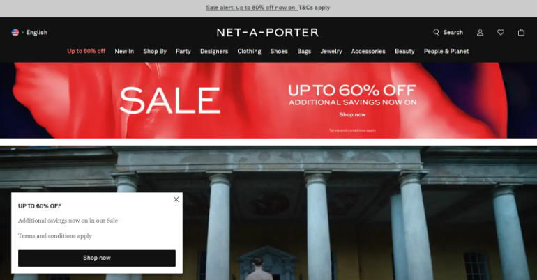
Why this works:
- “Up to 60% off” is a headline that earns attention at any price tier. For a luxury brand, this signals a rare opportunity rather than a clearance event.
- A large, unmissable CTA directs visitors straight to the sale, cutting the navigation path and reducing drop-off.
- Mentioning additional savings layers on perceived value and builds trust that they are getting the best possible deal.
- The clean, uncluttered layout mirrors the brand’s editorial identity. Even a promotional popup feels on-brand.
CTAs you can use:
- “Shop the Sale”
- “See All Offers”
- “Explore Up to 60% Off”
- “Shop Now Before It Sells Out”
Best for: Luxury and premium retailers, high-traffic flash sale events, brands with a loyal audience that responds strongly to exclusive access signals.
Exit-Intent and Recovery Examples
Exit-intent popups are still the most profitable tool in the CRO stack. They show up when you have nothing to lose and everything to gain.
One agency even achieved a 900% weekly increase in newsletter subscribers by adding behavior-based popups, proving how much lift the right timing and value exchange can create.
7. ITM Trading
ITM Trading is a precious metals dealer serving investors who are cautious, research-heavy, and skeptical of hard-sell tactics. Their audience is not buying on impulse. They are often on the site for education before they ever consider a purchase. When these visitors start to leave, a generic discount popup would backfire.
ITM Trading takes a different approach: they use an exit-intent popup that leads with a question directly tied to their buyer’s core concern, and offers a free consultation rather than a coupon.
What the popup does: When a visitor moves to exit, the popup triggers with a question-based headline that speaks to a real investment concern. The primary CTA offers a free consultation, removing cost as a barrier to engagement.
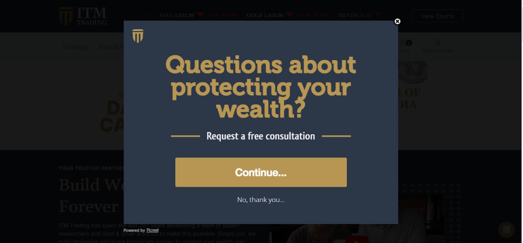
Why this works:
- A question headline creates instant relevance. It mirrors the internal monologue of the visitor and makes them feel seen.
- Offering a free consultation removes financial risk. For a high-consideration purchase like precious metals, this is the right offer at the right moment.
- “Continue” as the CTA is softer and less aggressive than “Book Now,” which matters for an audience that resists hard selling.
- A decline option reduces pressure, which makes the overall experience feel trustworthy rather than pushy.
- This popup does not try to convert immediately. It extends the conversation, which is exactly right for a long sales cycle.
CTAs you can use:
- “Yes, I Want to Learn More”
- “Book My Free Consultation”
- “Talk to an Expert”
- “Get My Questions Answered”
Best for: Financial services, investment companies, B2B service providers, any business where the sale requires education and trust before commitment.
8. Only Natural Pet
Only Natural Pet is a natural pet food and wellness retailer. Their buyers are emotionally invested in the health of their animals. They are not bargain hunters. They care about ingredients, sourcing, and quality.
When they leave without buying, it is usually because of price or because they want to think it over. Only Natural Pet uses an exit-intent popup that combines a meaningful discount with personalization. By asking for the visitor’s pet type before presenting the full offer, they simultaneously segment the list and create a tailored experience.
What the popup does: As a visitor moves to exit, a popup appears with a 35% discount offer and asks which type of pet the visitor has. The pet-type selection feeds into segmentation that personalizes all future email communication.
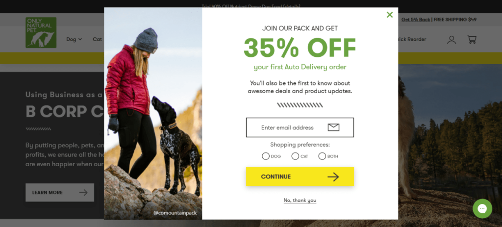
Why this works:
- A 35% discount is aggressive enough to recover exit intent, even for a price-conscious natural product buyer.
- Asking about pet type feels like personalization, not a data grab. Visitors are happy to answer because it seems to benefit them.
- Emotional imagery of pets triggers affection and keeps visitors engaged with the popup rather than dismissing it.
- The simple, clean layout reassures first-time visitors who might be hesitant about handing over an email.
- The segmented data collected here fuels better email performance down the line, making this popup valuable beyond the immediate recovery.
CTAs you can use:
- “Get My 35% Off”
- “Yes, Save Me 35%”
- “Claim My Discount for My Pet”
- “Unlock My Offer”
Best for: Pet brands, natural and wellness retailers, ecommerce stores that want to grow a segmented email list and recover abandoning visitors simultaneously.
Gamified Popup Examples
Gamification works because it mixes curiosity with the promise of reward. It breaks the usual exchange pattern and makes participation fun.
9. Press
Press is a UK-based cold press juice and wellness brand. Their audience skews younger, health-conscious, and digital-native. These are visitors who have seen every popup format and are largely desensitized to static discount offers.
Press introduced a spin-to-win gamified popup to cut through this fatigue. The interactive format changes the dynamic from passive visitor to active participant, which dramatically increases engagement time and email opt-ins.
What the popup does: A wheel animation appears offering multiple prize options. Visitors enter their email to spin. The result is random, which creates genuine excitement and drives participation.
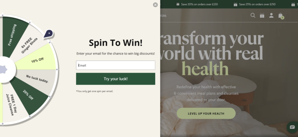
Why this works:
- The wheel animation captures attention the moment it appears. Movement is a psychological trigger that is very hard to ignore.
- Multiple prize tiers increase perceived value. Even smaller prizes feel earned.
- Because the email capture is built into the game mechanic, it feels natural rather than like a demand.
- Seasonal customization keeps the popup feeling fresh across campaigns rather than stale and repetitive.
- Visitors who spin feel a sense of commitment. Even if they win a smaller prize, they are more likely to redeem it because they participated.
CTAs you can use:
- “Spin to Win”
- “Try Your Luck”
- “Spin for Your Discount”
- “Spin the Wheel and Save”
Best for: DTC wellness and lifestyle brands, brands targeting younger audiences, high-traffic seasonal campaigns where engagement rate matters as much as conversion rate.
10. Blue Apron
Blue Apron is a meal kit subscription service targeting busy home cooks who want convenience and variety. Their buyer is value-aware and needs to feel that the subscription is worth the ongoing cost.
Blue Apron uses a gamified discount wheel to make the subscription offer feel exciting rather than obligatory. The variable discount structure is deliberate: not everyone wins the same amount, which makes winning feel more meaningful.
What the popup does: A visual wheel with multiple discount tiers appears to new visitors. The spin mechanic delivers a personalized discount, which the visitor can then apply at checkout.
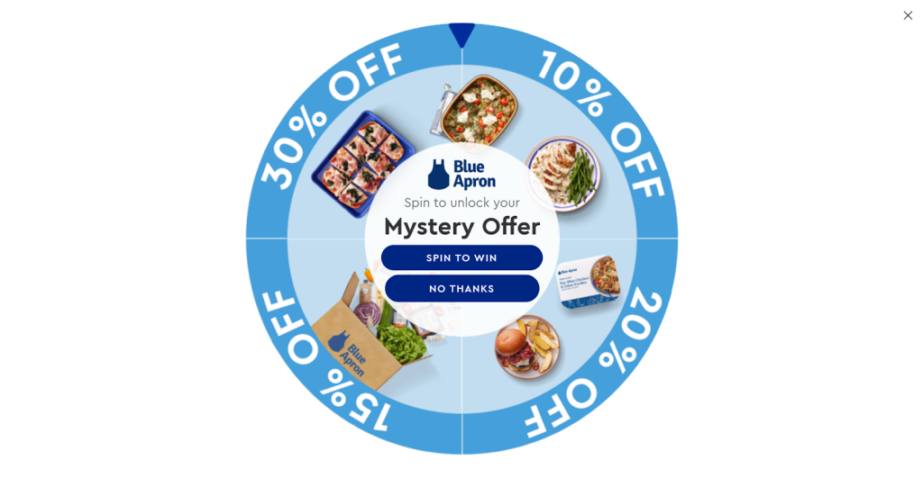
Why this works:
- Visual motion draws the eye and earns a few extra seconds of attention that a static popup would not.
- Variable discount tiers create excitement because visitors do not know what they will get. This uncertainty increases engagement.
- The personalized outcome makes the discount feel earned, which increases redemption rates compared to generic sitewide offers.
- Strong CTAs remove friction between winning and converting.
- A “No thanks” option prevents the popup from creating negative sentiment with visitors who are firmly not interested.
CTAs you can use:
- “Spin to See My Deal”
- “Try My Luck”
- “Reveal My Discount”
- “Claim My Winning Offer”
Best for: Subscription services, food and lifestyle brands, DTC businesses targeting audiences acquired through social media who need a fun entry point to convert.
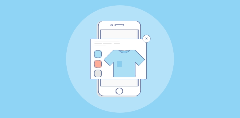
Slide-In banner and Hello Bar Examples
These formats work when you want to increase visibility without blocking content. They are also ideal for mobile, where full popups can hurt UX.
11. Magic Spoon (Hello Bar Example)
Magic Spoon is a high-protein, low-sugar cereal brand disrupting a category traditionally owned by legacy brands. Their audience is fitness-focused, nutritionally literate, and skeptical of processed food. When Magic Spoon uses a hello bar, the goal is not to push a discount.
It is to surface a key product benefit to visitors who may be in early research mode. The top bar is always visible without ever blocking the content experience, which aligns well with an audience that reacts poorly to aggressive marketing tactics.
What the popup does: A slim hello bar sits at the top of the page and highlights a specific product benefit or promotional message. It is visible at all times without covering any content or requiring any action to dismiss.
Why this works:
- Persistent visibility means the message stays in view throughout the browsing session, creating repeated impression without repetition fatigue.
- A short headline communicates the product’s differentiator in one glance, reinforcing brand positioning passively.
- Top-of-page placement works across all devices and does not disrupt mobile scroll behavior.
- The design stays on brand, making the bar feel like part of the site rather than an interruption.
- An “Add to Cart” or “Shop Now” CTA at this placement captures passive intent from visitors who are already convinced.
CTAs you can use:
- “Shop Now”
- “Try Risk-Free”
- “Grab a Box”
- “See Why Thousands Are Switching”
Best for: Content-heavy brand pages, DTC food and health brands, product-led growth companies where the benefit message needs consistent reinforcement.
12. Nora
Nora is a modern lifestyle and home brand with a design-forward audience. Their buyers are aesthetically driven and tend to have a low tolerance for intrusive or visually cluttered popups. Nora uses a sleek bottom banner that captures email addresses without interrupting the browsing experience.
The dark, minimal design communicates brand confidence and positions the subscription as a curated experience rather than a mass email list.
What the popup does: A slim black banner appears at the bottom of the page after a short scroll delay. It contains an email field and a clear CTA. It does not block content and can be dismissed with a single tap.
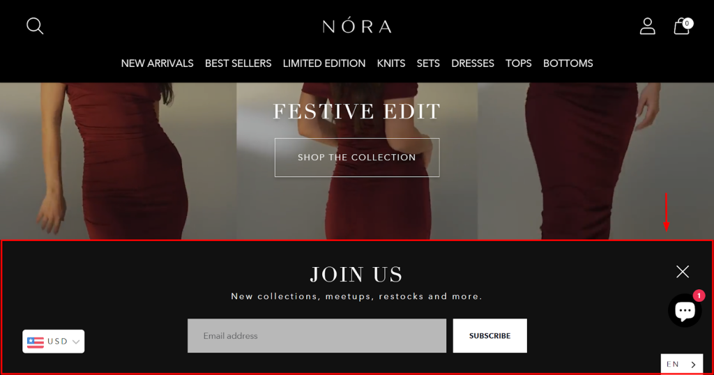
Why this works:
- Bottom placement is the least disruptive format available. Visitors can scroll past it naturally without feeling forced to engage.
- The minimalist black design matches the brand’s premium aesthetic, making the popup feel native rather than bolt-on.
- A single email field keeps the form completion time under ten seconds.
- A high-contrast CTA button stands out clearly against the dark background without feeling aggressive.
- An easy-to-find close button prevents frustration on mobile, which protects the brand experience for non-converters.
CTAs you can use:
- “Subscribe”
- “Stay in the Loop”
- “Join the List”
- “Get First Access”
Best for: Design-conscious brands, content-heavy blogs and editorial sites, any business with a long mobile scroll experience where a full overlay would create friction.
Compliance and Cookie Examples
Cookie popups are legally required for many businesses, but they can still elevate the experience.
13. Proweb
Proweb is a web design and digital agency. Like most agencies, their site doubles as a portfolio and a lead generation tool. Compliance popups are obligatory but Proweb chose to use theirs as a micro-brand moment.
Instead of a dry legal notice, they created a cookie consent popup that reflects their personality and signals the kind of creative thinking clients can expect from working with them.
What the popup does: A bright, eye-catching cookie consent popup appears on first visit. It uses humor in the accept and decline copy to make compliance feel conversational rather than bureaucratic.
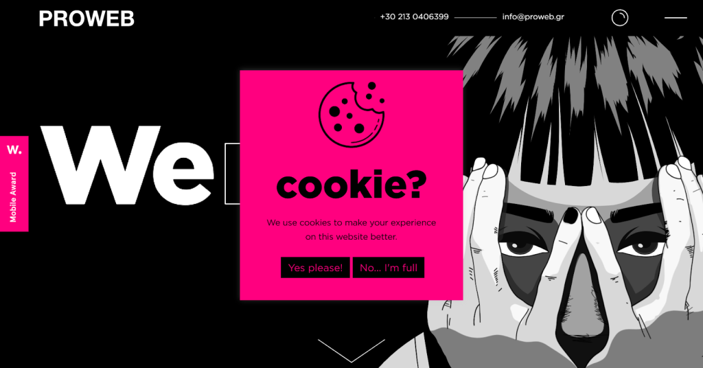
Why this works:
- Bright color immediately draws the eye to the popup without feeling alarming.
- Humorous copy “Yes, please! No, I’m full.” reduces friction and creates a small moment of delight in an otherwise forgettable interaction.
- Clear accept and decline choices satisfy legal requirements while giving users genuine control, which builds trust.
- The simple layout prevents distraction and gets visitors through the consent step quickly so they can continue browsing.
- For an agency, this popup acts as a portfolio piece. It demonstrates creative capability to potential clients before they have even read a case study.
CTAs you can use:
- “Yes, I Accept”
- “Sure, Why Not”
- “Accept All Cookies”
- Decline: “No thanks” or “I’m good, thanks”
Best for: Creative agencies and studios, modern brands with a strong voice, any business that wants to use every touchpoint to signal personality and build brand affinity.
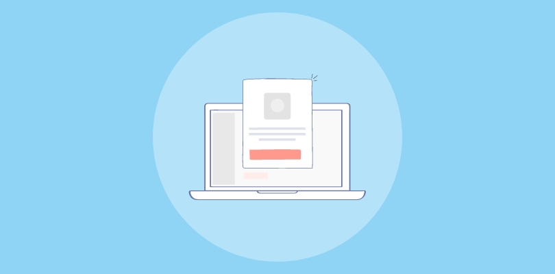
Lead Magnet Examples
Lead magnet or lead capture popups convert well because they offer tangible value immediately. Whether it is a free chapter of a book or a digital cookbook, these popups appeal to curiosity and self-improvement.
14. Sienna Sauce
Sienna Sauce is an independent hot sauce brand founded by a young entrepreneur with a strong personal story and a loyal community. Their audience loves the brand for its authenticity as much as its product. Rather than offering a discount, Sienna Sauce uses a free digital cookbook as their popup offer.
This delivers real value, builds emotional connection with the brand, and captures emails from customers who will engage well in nurture sequences because they opted in for content, not just a coupon code.
What the popup does: A clean popup appears offering a free downloadable cookbook. Visitors enter their email to receive it. The offer is high perceived value at zero cost, making opt-in easy to justify.
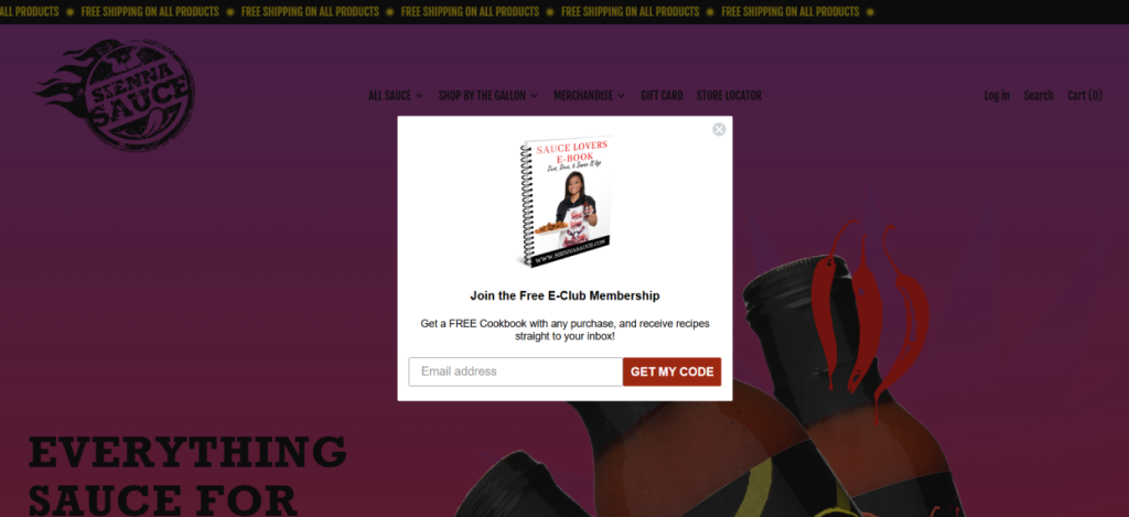
Why this works:
- A free cookbook tied to the brand’s product world has strong perceived value, especially for food-passionate audiences.
- Offering content rather than a discount attracts a different type of subscriber: one who is interested in the brand lifestyle, not just a one-time deal.
- Email capture here feeds into a nurture sequence that can convert subscribers into loyal buyers over time.
- “Get My Code” CTA is direct, specific, and implies something of personal value is waiting on the other side.
- A clean, distraction-free visual layout focuses the visitor’s attention entirely on the offer.
CTAs you can use:
- “Send Me the Cookbook”
- “Get My Free Recipes”
- “Yes, I Want the Cookbook”
- “Claim My Free Copy”
Best for: Food, lifestyle, and passion-driven brands, coaches and consultants building authority funnels, entrepreneurs whose personal story is a competitive advantage worth nurturing.
How to Create Website Popups Step by Step?
Building the best websiter popup isn’t the hard part. The hard part is knowing why it should exist. Once the goal and intent are clear, the setup takes minutes.
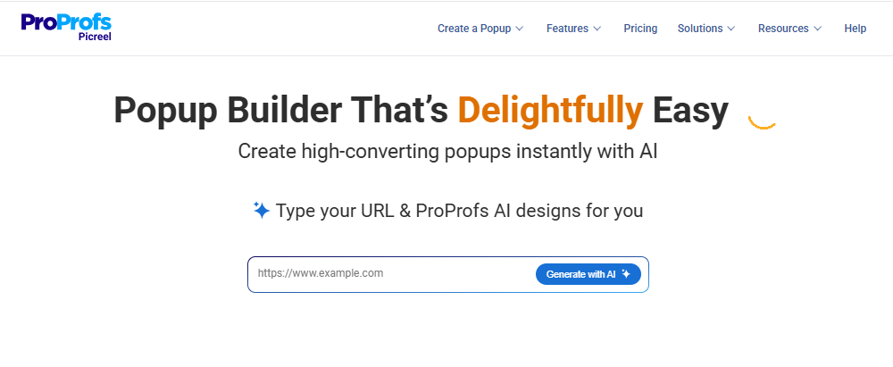
The only tool I’ve been relying on lately for this is a smart popup builder, “Picreel”. Whether I’m helping a brand manage seven domains, sync leads to Klaviyo, or segment traffic by UTM rules, this is the process I follow every time.
Step 1: Define the Job of the Popup
Before choosing tools or templates, get clear on what your popup should achieve. A focused goal makes it easier to design, write, and measure results.
Ask yourself: What is the one action I want this visitor to take right now? Is it to capture an email, complete a purchase, or move them to a specific page?
Most effective popups fall into three use cases: capturing leads, driving purchases, or guiding traffic. One popup should drive one clear outcome.
Step 2: Choose How You Want to Create It (AI or Templates)
You now choose your creation method:
Option A: Build with AI
Best for speed and iteration. Picreel AI generates layouts, copy, and call to action CTAs aligned to your goal based on a few prompts.
Use when you:
- Want fast variations
- Are testing angles
- Need messaging direction without starting from zero
Option B: Use Ready-Made Templates
Best for consistency and control. Use ready made popup templates when:
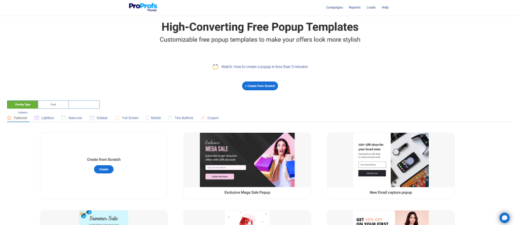
- You already know what you want
- You need proven structures (lightboxes, slide-in banners, hello bars, mobile popups)
- You want minimal design work and faster deployment
Step 3: Set Up the Core Popup Structure
Your popup has one job: communicate value instantly.
Keep the structure simple:
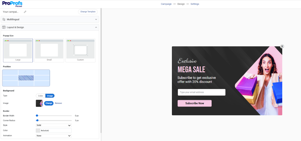
- Headline: direct, benefit-first
- Supporting line: one sentence of context
- Visuals: only if they clarify value
- CTA: one action, clearly labeled
- Dismiss option: easy to find, builds trust
If someone has to “read” your popup, it’s over.
Step 4: Choose When the Popup Appears (Popup Triggers)
Popup Triggers matter more than design. The right moment changes everything.
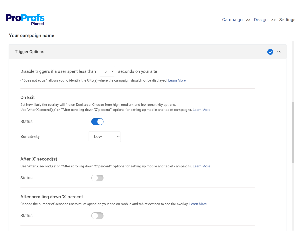
Use:
- Exit intent for cart abandonment and save attempts
- Scroll-depth (~50%) for engaged readers
- Time delays (5–10 seconds) for general sales messaging
- Click triggers for fully opt-in interactions
Avoid:
- Instant on-load popup triggers
- Site-wide triggers that ignore context
Timing should feel natural, not aggressive.
Step 5: Choose Who Sees It (Targeting Rules)
Not every visitor should see every popup. Targeting is where real lift happens.
Use:
- Page-level targeting to match the message to the journey
- URL + UTM rules for campaign-specific traffic
- Location-based rules for regional offers or notices
- New vs returning segmentation for relevance
- Frequency capping to prevent fatigue
Step 6: Track Performance and Optimize
Popup analytics dashboard is where your popup earns its keep.
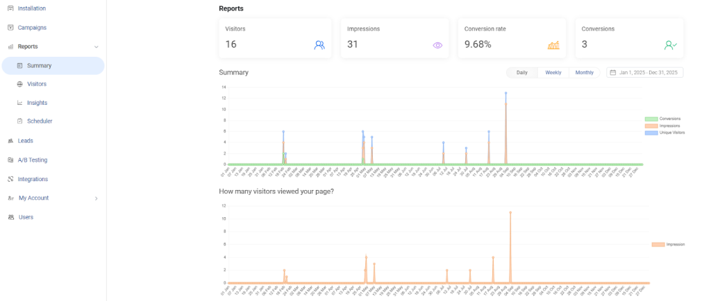
Watch:
- Conversion rate
- Assisted conversions
- Bounce impact
- Engagement metrics (views, clicks, completions)
- Headlines
- Offers
- CTA language
- Trigger timing
Small changes consistently outperform redesigns.
What Are the Common Website Popup Mistakes You Must Avoid?
Most popup failures have nothing to do with the offer or the design. They fail because the experience feels intrusive or technically clunky. If visitors cannot browse, cannot close the popup, or feel tricked, trust drops instantly. Once trust drops, no incentive can save the conversion.
Below are the most common mistakes I see when teams implement popups without a clear strategy. Avoid these, and your conversions rise almost immediately.
1. Instant Trigger
This is the fastest way to lose a visitor. When a popup shows up the moment someone lands, it feels intrusive instead of helpful. A better approach is to wait, observe behavior, and then step in with something relevant.
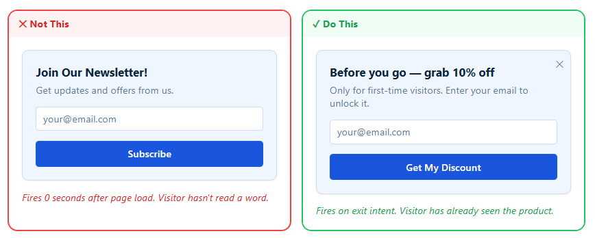
Why it matters: A visitor who just landed has no context for your offer. They’re infinitely more likely to engage after a few seconds or once they’ve explored a bit.
2. No Close Button
Nothing frustrates users faster than feeling trapped. If someone can’t easily dismiss your popup, they’re more likely to leave your site altogether. Good UX always gives control back to the visitor.
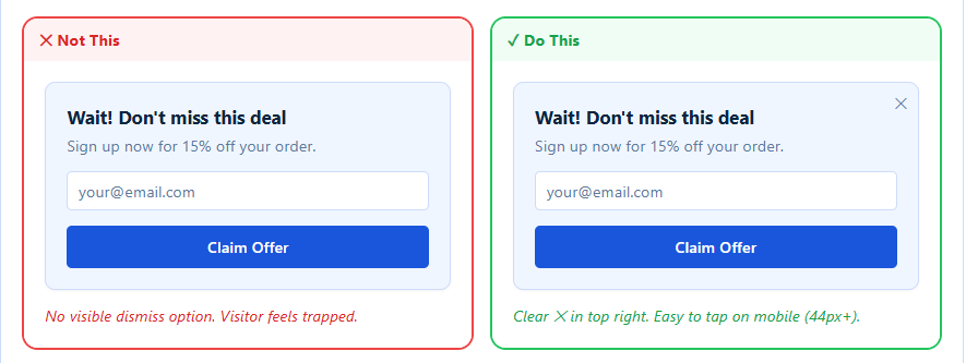
Why it matters: A visible close button reduces friction. Visitors who feel they can exit easily are paradoxically more likely to stay and engage.
3. Generic Discount Copy
“Get 10% off today” sounds familiar, but it also feels forgettable. If your popup could belong to any website, it won’t stand out. Specificity and context make your offer feel real and worth acting on.
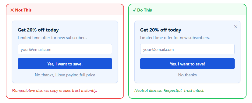
Why it matters: Generic copy doesn’t make visitors feel special. Personalized or context-driven messaging cuts through the noise and drives better results.
4. Too Many Form Fields
The more you ask, the less you get. Long forms inside popups create friction and reduce the chances of completion. Keep it simple and only ask for what you truly need.
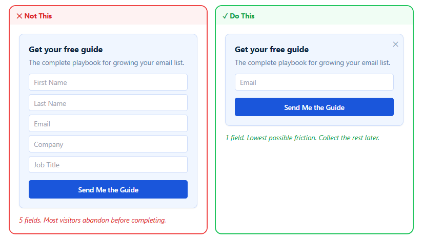
Why it matters: Every additional field lowers conversion rates. Reducing form fields can significantly increase signups and engagement.
5. Checkout Interruption
Interrupting someone mid-checkout with a popup can break momentum. At this stage, the visitor is already close to converting. Instead of disrupting, support their intent with helpful, relevant information.
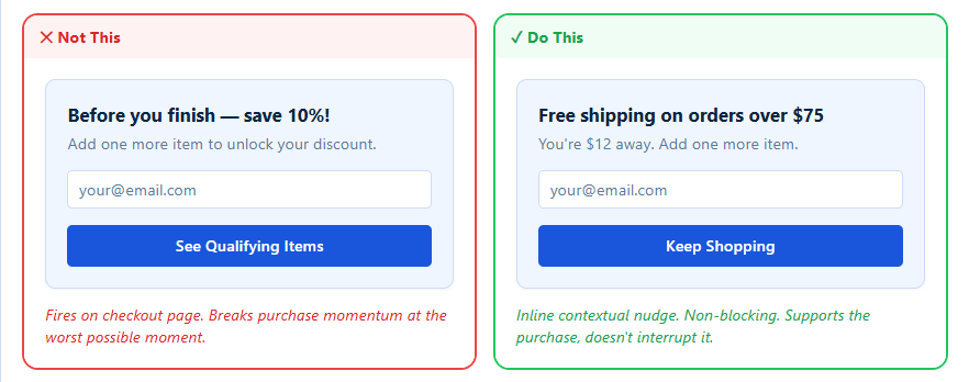
Why it matters: Checkout is the highest-intent moment in your funnel. A popup here should reduce friction, not create it; otherwise, you risk losing the conversion.
FREE. All Features. FOREVER!
Try our Forever FREE account with all premium features!
What Separates High-Converting Popups From Ones People Ignore?
A high-converting popup is defined by clarity, timing, and relevance. When a popup feels like a shortcut to value instead of an interruption, conversions follow. Most brands obsess over visuals. The top performers obsess over intent and user psychology.
Below is the core checklist I use to judge whether a popup will actually work.
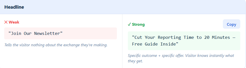
1. Headline
Your headline is the first thing people read, so it needs to be clear and specific. If it feels vague or generic, most visitors won’t bother reading further. Focus on communicating the exact value upfront so visitors instantly know what they’re getting.
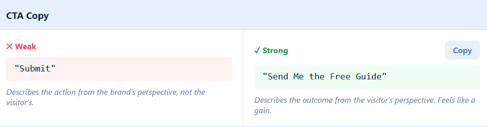
2. CTA Copy
Your CTA isn’t just a button, it’s the final push toward action. If it sounds bland or brand-focused, it won’t motivate clicks. Shift the language to highlight what the visitor gains, not what you want them to do.
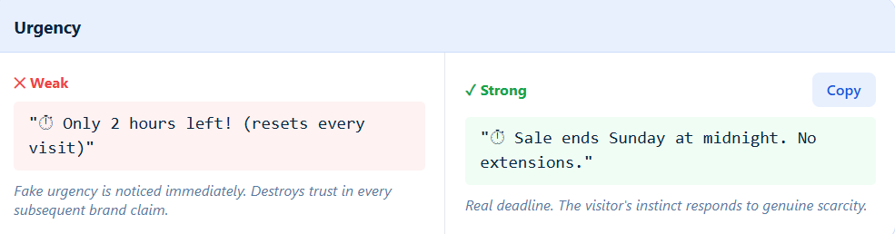
3. Urgency
Urgency works only when it feels real. If visitors sense fake countdowns or recycled scarcity tactics, it can hurt trust. Use urgency sparingly and only when there’s a genuine reason to act quickly.
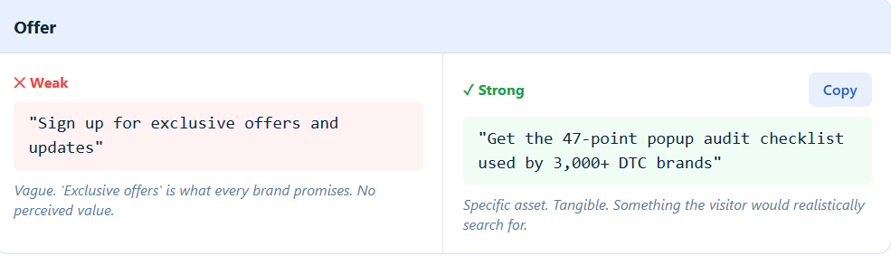
4. Offer
A weak offer blends in with everything else online. If it feels like something every brand says, it won’t stand out or convert. Make your offer specific, tangible, and easy to understand so it feels worth the exchange.
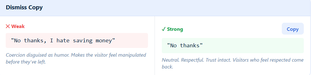
5. Dismiss Copy
Even your “no thanks” matters more than you think. If it sounds guilt-driven or negative, it creates friction instead of trust. Keep it neutral and respectful so visitors feel comfortable engaging again later.
How Do You Choose the Right Popup for Your Business Goal?
Most teams pick popups based on design. I pick based on intent. Your goal should dictate the format, trigger, and targeting. When I’m consulting with brands, this is usually where their strategy finally clicks: popups only work when they match why the visitor is on the page.
Below is a simple decision framework I use with founders, e-commerce teams, SaaS marketers, and multi-site operators.
| Your Goal | Best Popup Type | Best Trigger | Best Targeting Method | Why This Works |
|---|---|---|---|---|
| Grow email list fast | modal overlays or Slide-In | Time delay (30–45 sec) or Scroll 40% | New visitors only | Captures engaged users without interrupting first impressions. |
| Recover abandoning visitors | Exit-Intent Popup | Exit intent | All visitors; cart pages prioritized | Highest conversion trigger for last-second saves. |
| Promote a discount or seasonal campaign | Modal or Fullscreen | Time-based or URL rule | Campaign pages, UTM-specific traffic | Keeps offers aligned with visitor expectations. |
| Increase AOV or drive upsells | Slide-In or Multi-Step | Scroll depth or Inactivity | Returning users, product pages | Feels like a helpful recommendation, not a disruption. |
| Segment visitors before marketing flows | Multi-Step Popup | Behavioral trigger | Interest checkboxes, Klaviyo routing | Improves personalization and email engagement. |
| Drive traffic to another domain or microsite | Hello Bar or Slide-In | Time delay or Referral trigger | Specific sites or page groups | Great for multi-domain brands in your ICP. |
| Build authority or promote a lead magnet | Modal | Time delay | Blog readers, organic visitors | Educational visitors convert well with value-driven offers. |
| Announce product drops, waitlists, restocks | Slide-In or Modal | Scroll or time delay | Returning visitors, category pages | Fits naturally into browsing behavior. |
| Comply with legal or cookie requirements | Banner or Sticky Bar | Immediate load | All visitors, all pages | Low-disruption, legally safe, mobile friendly. |
Does Your Popup Pass This Conversion Checklist?
Most popup problems aren’t obvious. They’re the small things: a form with one field too many, a dismiss button that makes visitors feel guilty, a countdown that resets every visit. Go through this checklist against your live popup and see exactly where you stand.
- Trigger fires after a behavioral signal not on page load
- Close button is visible and at least 44px wide on mobile
- Headline communicates the value before the visitor can dismiss
- Form asks for email only no extra fields
- Dismiss copy is neutral with no guilt-trip language
- Frequency capped to once per session
- Popup is suppressed for known subscribers
- Popup does not appear on checkout pages
- Countdown timer is tied to a real deadline
- Design uses brand colors, fonts, and tone
- Mobile version uses slide-in or hello bar & not fullscreen
- Script loads asynchronously after core page content
Engage & Convert Your Users With the Best Website Popups
Website popups work because they let you meet visitors at the exact moment they’re ready to act. When timing, intent, and value align, even small prompts can lift conversions without redesigning your entire site.
The real differentiator isn’t the format; it’s whether the popup feels helpful, relevant, and easy to engage with. Behavior-based triggers, clean design, strong offers, and clear targeting set high-performing brands apart from everyone else.
If you’re ready to apply these principles at scale, a tool like Picreel makes it practical. You get behavior triggers, segmentation, Klaviyo routing, multi-site support, and templates that already follow UX best practices, so execution becomes the easy part.
Start with one goal, one popup, and one clear offer. The lift comes quickly.
Frequently Asked Questions
How do website popups increase conversions?
Popups work because they appear when intent is highest. If someone scrolls, hesitates, or signals exit, a well-timed offer meets them at the perfect moment. That’s why behavior-based popups consistently outperform static banners and lift conversions without redesigning the entire site.
What is the difference between intrusive popups and high-converting popups?
Intrusive popups fire too early, block content, or feel irrelevant. High-converting popups wait for user intent, offer clear value, and are easy to dismiss. The difference is respect. When a popup feels helpful instead of forced, users respond.
How many popups should a website use at once?
One primary popup per session is usually enough. More than that creates fatigue and reduces trust. Use frequency capping and let intent decide when the next popup appears. A small number of well-targeted popups always outperforms many generic ones.
What is the best type of popup for lead generation?
A simple modal overlays or multi-step popup works best. modal overlays capture attention quickly, while multi-step popups pre-qualify visitors by asking one small question first. Both options reduce friction and feed cleaner leads into your CRM or Klaviyo flows.
When should businesses avoid using popups?
Avoid popups when they block mobile content, interrupt checkout, load instantly on page open, or conflict with core site actions. If the visitor is completing a high-intent task, let them finish. Popups should support momentum, not break it.
Do popups hurt SEO or Google rankings?
Popups only hurt SEO when they block content on mobile or behave like intrusive interstitials. If you use small slide-in banners, hello bars, or delayed triggers, you stay compliant. Google penalizes bad UX, not popups themselves.
What is the best popup timing for maximum conversions?
The sweet spot is intent-driven timing: 5–10 seconds for general offers, 30–45 seconds for content pages, and exit intent for recovery. Let user behavior decide the moment instead of forcing it.
How do exit-intent popups detect user behavior?
Exit-intent popups track rapid mouse movement toward the browser’s close or back button. On mobile, they rely on scroll direction or inactivity. When the system detects “I’m leaving,” it triggers one last, relevant offer. It’s low-risk, high-reward.
How do personalized popups improve user engagement?
Personalization makes the popup feel written for the visitor. Using behavior, location, interests, or UTM source lets you deliver the right message at the right moment. Relevance boosts engagement and dramatically increases conversion rates, especially for segmented email flows.
FREE. All Features. FOREVER!
Try our Forever FREE account with all premium features!
 We'd love your feedback!
What did you like & how can we make it even better?
 Thanks for your feedback!
 Ask Your Question
Have a question? Get expert help to make your decision easier.