You’ve poured your heart and soul into crafting a stunning website, and the traffic is coming in. Despite all that traffic, you’re not seeing the sign-ups and sales you want. It’s a common struggle for many marketers, and it can be really frustrating. However, what if I tell you that there is a simple yet powerful tool that could cover the gap between high traffic and low conversions?
Here comes the two-step popup—a proven strategy that has helped countless businesses transform casual visitors into loyal customers. According to research, multi-step popups improve mobile users’ action rates by 4.55%.
In this guide, I will dig deeper into two-step popups to help boost your conversions. We’ll explore the psychology behind their effectiveness and share practical tips for creating compelling popups and inspiring your campaigns. Read on to find out more!
What Is a Two-Step Popup & Why Do They Work?
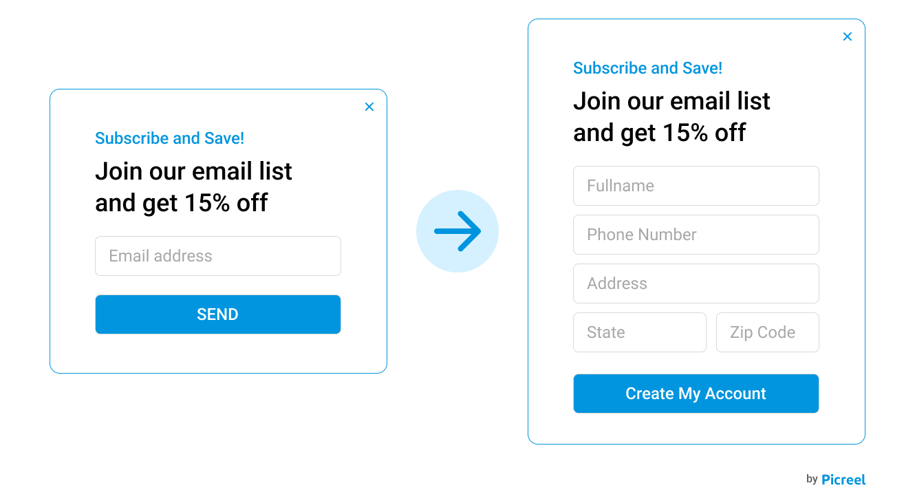
A two-step popup, also known as a multi-step popup or a micro-commitment popup, deviates from the traditional single-step popup approach. Instead of immediately bombarding visitors with a form, it presents an initial question or call-to-action (CTA) that requires a simple yes/no or click-based response. Once the visitor engages with this first step, the actual popup containing the form or desired action is revealed.
But why does this two-step dance work so well? Let’s break it down:
The Zeigarnik Effect: This psychological principle claims that people remember an uncompleted or interrupted task better than completed ones. By initiating a process with the first step, visitors are more likely to follow through and complete the second step (filling out the form) to achieve a sense of closure.
Small Steps, Big Wins: That initial click or “yes” is more than just a gesture—it’s a micro-commitment. Research shows that even small commitments can increase the likelihood of someone taking a bigger action later on, like signing up for your newsletter or making a purchase.
Reduced Friction: The initial question or CTA often presents a low barrier to entry, making visitors more comfortable engaging with the popup. This positive initial interaction paves the way for a more receptive audience when the offer is revealed.
Targeted Messaging: The first step can be used to segment your audience and tailor the subsequent popup content to their specific interests or needs, increasing its relevance and effectiveness.
2-Step Popup Examples to Engage Customers
Here are a few examples of two-step popups that can turn casual visitors into engaged customers:
Air Jordans
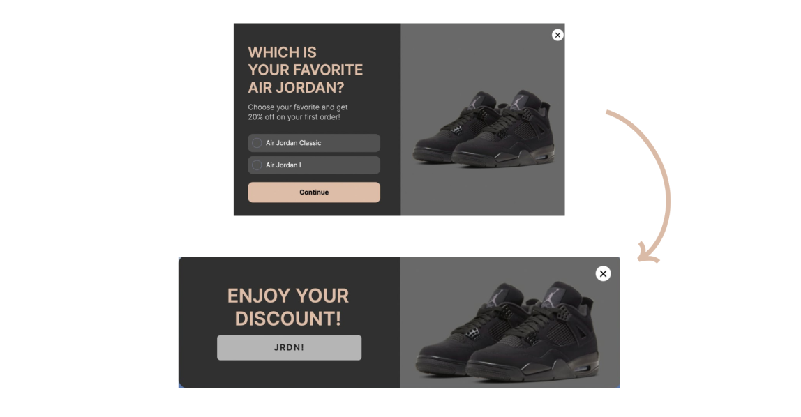
A well-crafted two-step popup like this one can be a game-changer. It begins with an engaging question about your favorite Air Jordan paired with an enticing image and a 20% off incentive. This first step isn’t just about grabbing attention but understanding the customer’s preference.
You’ve just clicked on your dream pair of Jordans in that popup. The next thing you know, you’re whisked away to a page showcasing those exact kicks, maybe even in a few different colorways, and that 20% discount is flashing right there, tempting you to add them to your cart. That’s the magic of a well-executed two-step popup – it’s not just about getting your attention. It’s about making your shopping experience feel tailor-made.
Forget those annoying popups that just want your email. This one listens to what you want and then delivers. It’s like having a personal shopping assistant guiding you towards the perfect purchase. And let’s be honest, who doesn’t love a good discount?
Webstacks
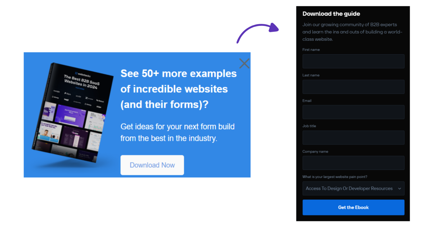
Webstacks’ popup masterfully sparks curiosity with a question that speaks directly to its target audience: “See 50+ more examples of incredible websites (and their forms)?” The image of their ebook, “The Best B2B SaaS Websites in 2024,” catches the eye, making it feel like a treasure chest full of inspiration. The popup clearly shows how valuable this resource is by highlighting actionable tips for creating better forms. It encourages users to take that first step and download the ebook, setting them up for success.
So, this clever first step not only gets people’s attention but also sets the stage for a smooth transition to the next part, where they give us their info in exchange for this super cool ebook. This shows how powerful a well-executed two-step popup can be when it comes to getting leads.
The second step takes the interest created in the first step and runs with it. It makes it easy for people to get the ebook they want while also getting crucial lead information from them. The focus on community and solving problems shows that the brand is committed to helping people with real solutions, which makes people more likely to convert.
BootCuffsSocks
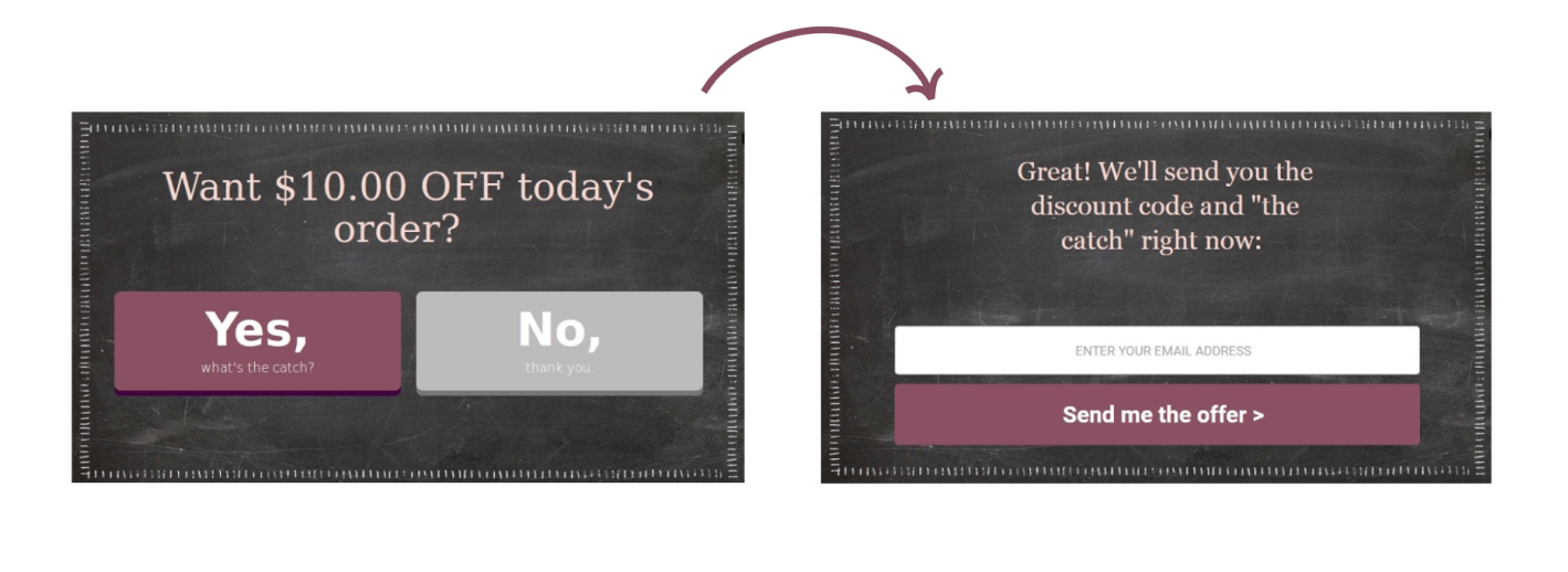
The BootCuffsSocks two-step popup is a prime example of how to engage customers and drive conversions effectively. The initial popup immediately grabs attention with a straightforward offer of “$10.00 OFF today’s order,” presented in a clean and visually appealing design. It then cleverly addresses potential hesitation with a “Yes, what’s the catch?” button, inviting further interaction and fostering trust through transparency.
Step two plays on this curiosity, promising users both the discount code and the “catch” right away. A simple email field and a big, bright “Send me the offer” button makes it easy for people to sign up.
This smooth process, from the initial offer to addressing concerns and finally getting the lead, shows how a well-designed two-step popup can make users happy and help with marketing goals. BootCuffsSocks combines a great offer, transparency, and a clear call to action to turn visitors into loyal customers.
Fabletics
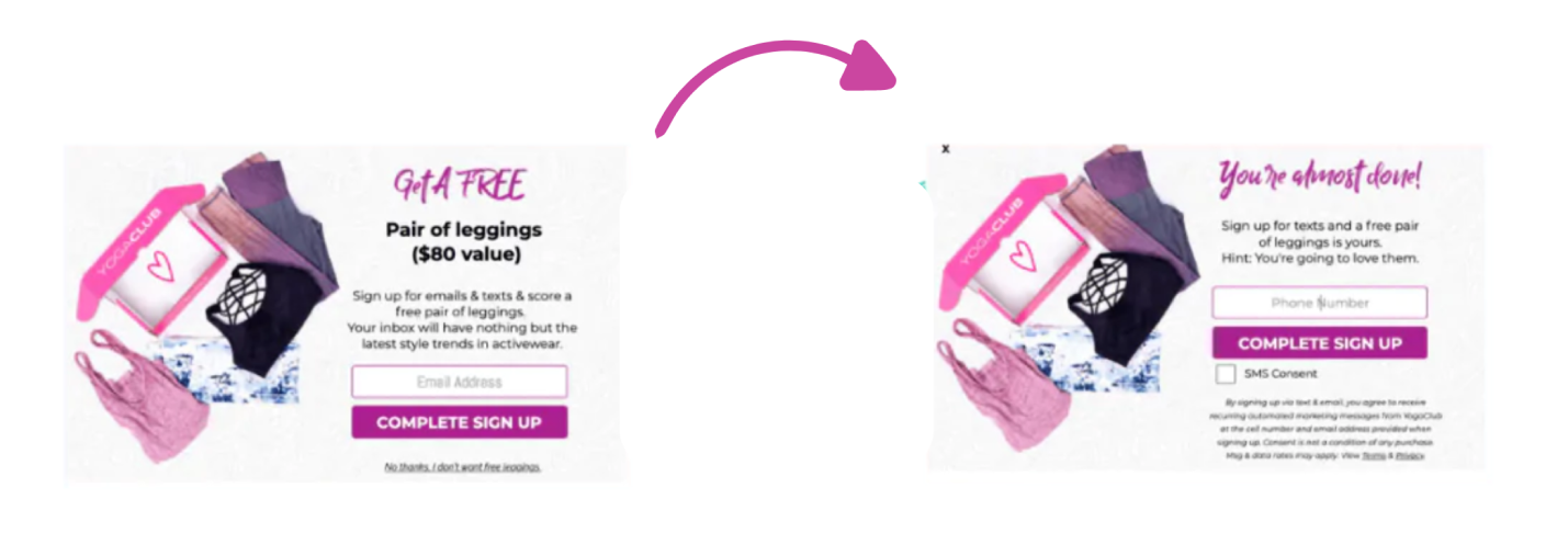
This two-step popup by Fabletics is a masterclass in temptation. The initial screen boldly announces, “Get A FREE Pair of Leggings ($80 value)”, immediately capturing attention with a high-value offer and a visually appealing image. Requiring just an email and text signup creates a low entry barrier, nudging users toward a micro-commitment.
In the next step, we take advantage of the initial excitement by sending a friendly message saying, “Hey, you’re almost there!” This message reminds you about the free leggings offer and makes it even easier to sign up by just asking for your phone number.
This clever approach combines a nice reward with a simple process, making it more likely for people to sign up for emails and text messages. This sets the stage for future marketing campaigns and potential sales.
How to Create a Two-Step Popup That Works
To truly capture and engage your audience, you need more than just a popup builder—you need a superior solution that enables you to create compelling two-step popups.
For example, Picreel can help you craft impactful two-step popups. It allows you to strategically target the right audience with the right message at precisely the right time.
Here are the steps to create two-step popups with Picreel:
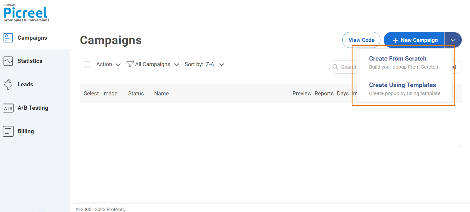
Step 1: From the Picreel dashboard, navigate to the ‘Campaigns’ section. Click on the ‘+New Campaign’ button and select ‘Create Using Templates’ to create a new campaign using one of Picreel’s pre-designed templates.
Step 2: Select and Customize the Template
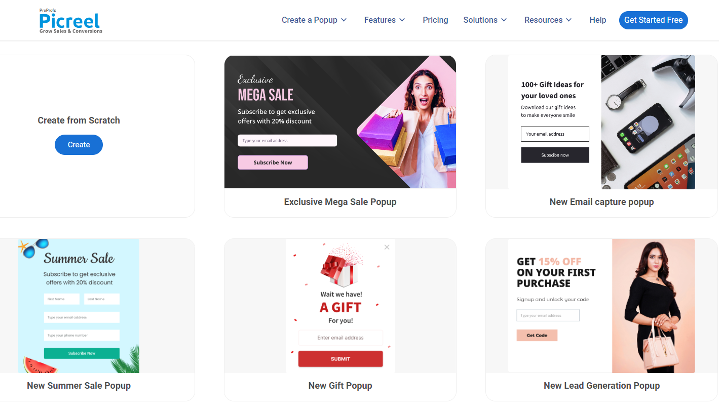
- To find templates for Two-Step/Coupon popups, type “Two step” into the search bar.
- Then, hover your cursor over the desired template and select “Customize.” You can also preview the template before making your choice.
Step 3: Edit the Design
- On the “Edit Design” page, you can select any element from the left panel and modify it to match your desired requirements.
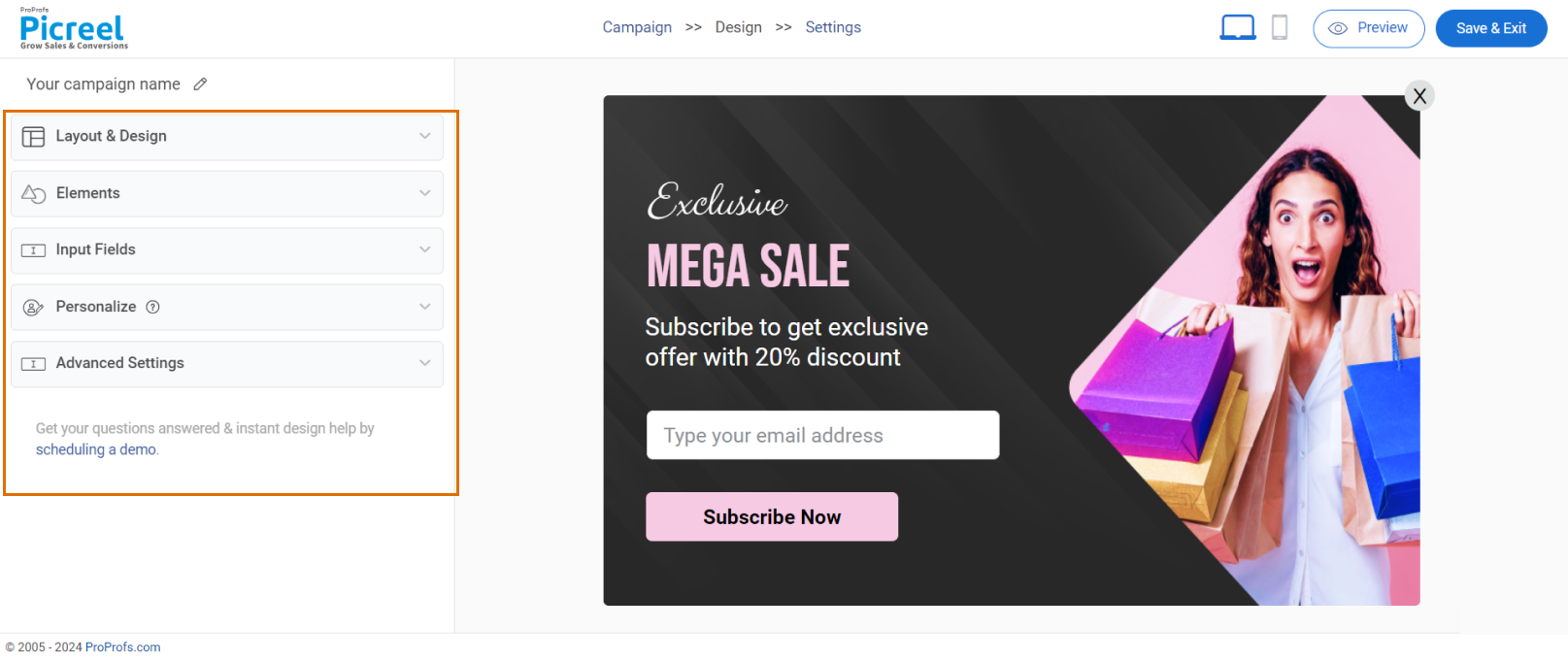
- To preview the template, switch between Step 1 (gathering customer data) and Step 2 (displaying the code).
- Utilize the buttons highlighted in the image given below to switch between the steps.
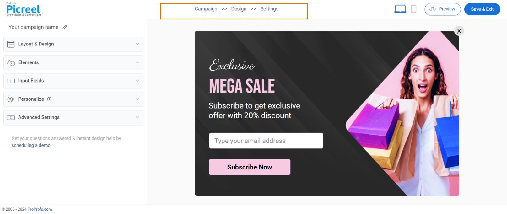
- Click “Save” to go to the settings page.
Step 4: Configure Settings
You can edit the following sections:
- Basic Settings:
- Select the display scope of the popup: entire website or specific pages.
- Popup Trigger:
- Define the conditions for the popup, including when it triggers and how often it displays.
- Additional Options:
- Explore further customization options, such as device type targeting and personalized settings.
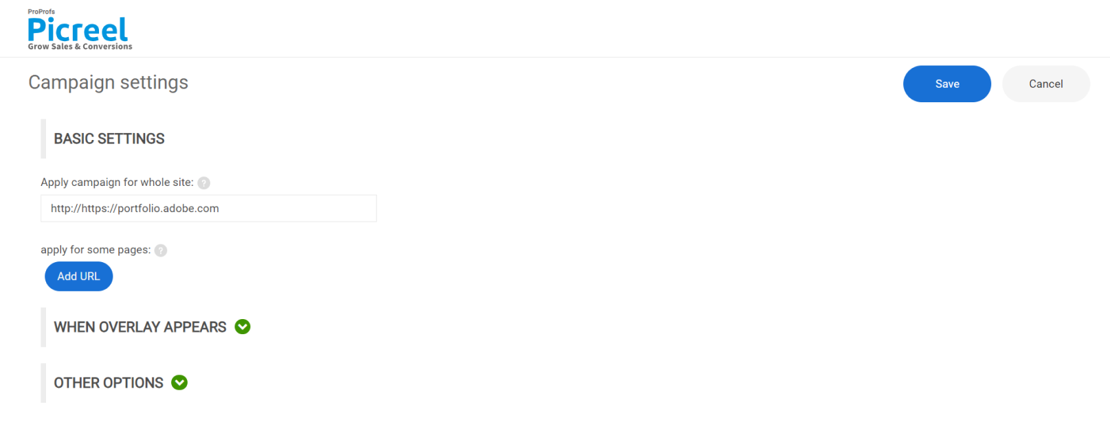
Step 5: Click ‘Save’ to finalize your changes.
Customizing Your Two-Step Popups
There are numerous tools available for creating two-step popups with excellent customization features. For the purpose of this post, let’s take the example of Picreel and see how it can be used to craft visually captivating and highly effective popups tailored to specific needs.
Picreel offers a powerful platform to customize your website overlays and tailor them to your unique brand identity and marketing goals. With a user-friendly interface and an array of design tools, you can effortlessly create visually appealing and highly effective two step optin popups. Here’s how you can make the most of Picreel’s customization options:
Layout & Design:
- Popup Size: Use the slider to choose between large, small, or set custom dimensions.
- Position: Select from nine available positions on the screen to find the best fit for your layout.
- Background: Upload an image or choose a solid color, adjusting the color using RGB, HSL, or hex codes.
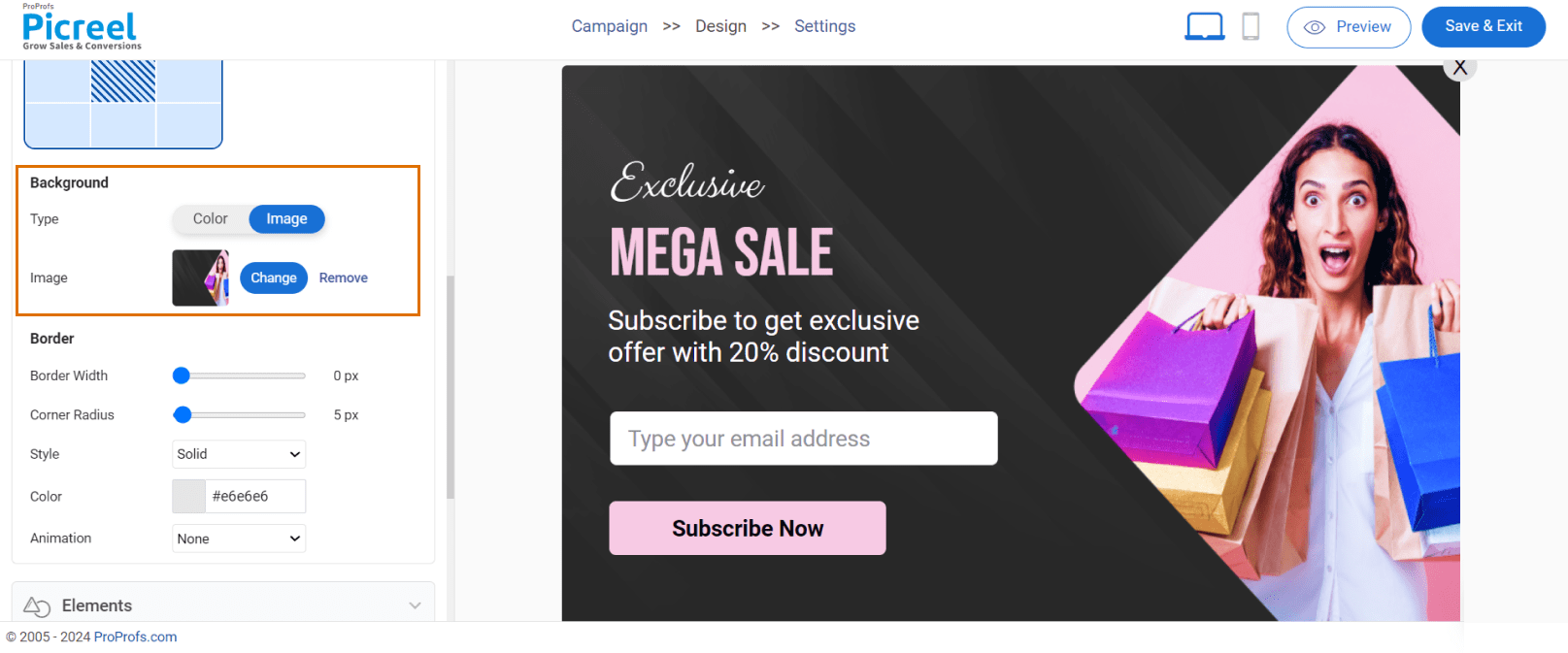
- Border: Customize border width, corner radius, style, and color. Add animation for extra flair.
Elements:
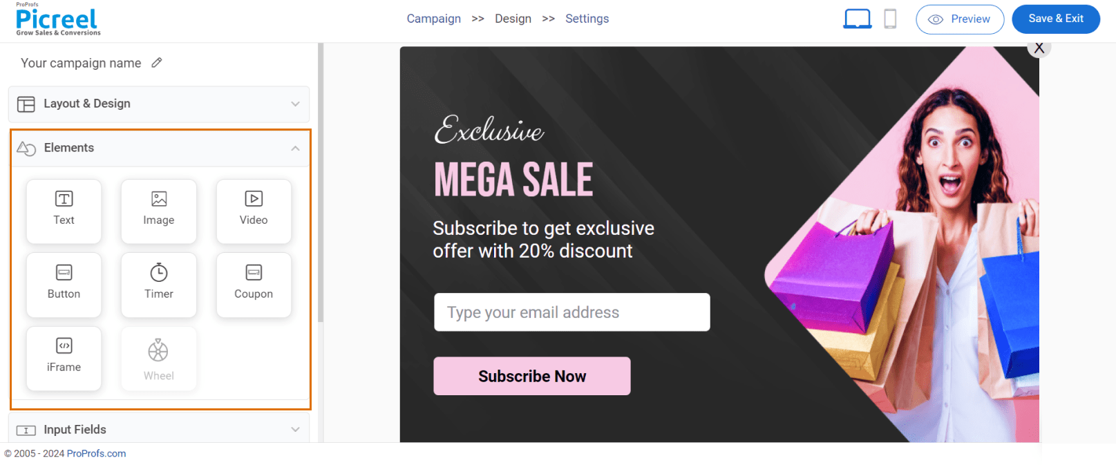
Text: The floating toolbar allows you to easily add and style text, changing the font, size, and format.
Image: You can choose images from the library or upload your own, like your logo. You can also resize and move them around as needed.
Video: You can add videos from your computer or YouTube to improve your message.
Button: Create eye-catching buttons for calls to action, like links to other pages or forms to fill out.
Timer: Add a countdown timer to create a sense of urgency, starting at a specific time or when the popup appears.
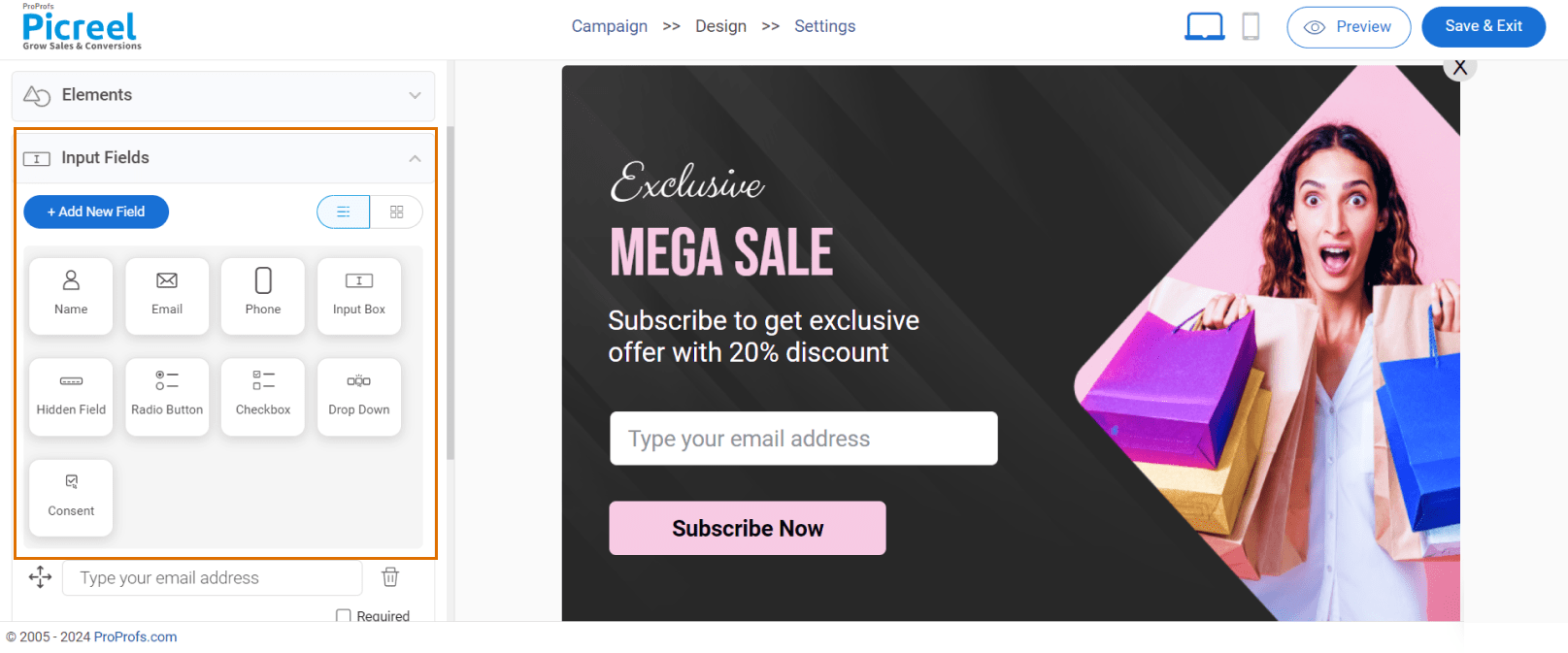
Input Fields:
- Collect Data: Use ready-made fields to gather names, emails, or phone numbers.
- Customization: Add your fields to get extra info from visitors.
- Required Fields: Make some fields mandatory to ensure you get complete data.
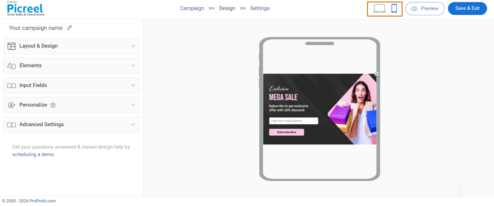
Mobile Preview:
- Optimize for mobile: Toggle to mobile view to see how your popup looks on smaller screens and adjust accordingly.
Save and Configure:
- Save your work: Don’t forget to click “Save” after customizing your popup.
- Campaign settings: Proceed to configure additional campaign settings, such as targeting and triggers.
Boost Your Conversions With Picreel’s Two-Step Popups
Two-step popups provide an intelligent way to engage visitors without being too pushy. They turn what could be an annoying interruption into a friendly interaction. With Picreel’s great customization options, you can create popups that capture leads and improve users’ overall experience.
The solution is to know your audience, offer real value, and help them smoothly move toward signing up or making a purchase. Try different styles, see what works best, and keep tweaking your popups to get the best results.
FREE. All Features. FOREVER!
Try our Forever FREE account with all premium features!
FAQs
What is a two step opt-in popup?
A two-step opt-in method is used in online marketing to capture leads in a less intrusive and more engaging manner. Instead of presenting a complete signup form upfront, it involves two distinct steps:
- An initial call-to-action (CTA) that typically requires a simple click or a yes/no response.
- The actual form or desired action is revealed upon engagement with the first step.
What is a popup form page?
A pop-up form page is a type of webpage element that appears on top of the existing content, usually triggered by specific user actions or time spent on the site. It typically contains a form for collecting information like email addresses, names, or other contact details. Pop-up forms are a common tool for lead generation, promoting special offers, or encouraging specific actions on a website.
Is a two-step opt-in Popup good?
Double opt-in or a two step popup is highly recommended for building a high-quality email list. While it may seem like an extra step, it provides significant benefits. It helps ensure only genuinely interested individuals join your list, reducing spam complaints and improving email deliverability. This translates to a more engaged audience and, ultimately, better outcomes from your email marketing efforts.
FREE. All Features. FOREVER!
Try our Forever FREE account with all premium features!

 We'd love your feedback!
 Thanks for your feedback!


