Grow Conversions With eCommerce Popup & Offers

Increase leads & conversions with ecommerce popups & offers

Some folks visiting your website just need a few questions answered before they’re ready to make the purchase. Others will need a little push to decide when to purchase. But how to do so in an efficient way to boost eCommerce conversion rate? Intrigued? Let’s do it!

What Is an eCommerce Popup?

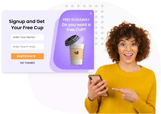
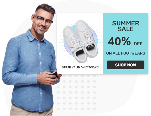
An eCommerce popup is an overlay window that helps businesses in displaying promotional and information on-site messages. These include deals, discounts, product announcements, maintenance notices, surveys, exit offers, and more. These popups are specially designed to attract more visitors for increasing engagement that eventually leads to increase in sales, quality leads, and conversions.
What is an eCommerce Popup?

Instant Integration With Your eCommerce Platform

What Is the Best Way to Grow eCommerce Conversion Rates?

What is an eCommerce Popup?

There are a lot of ways to nudge your visitors down that sales funnel, but perfectly placed popups have worked the best for eCommerce businesses. As more than 70% of abandoning visitors are not likely to return back, an exit popup is your last resort to convince them to stay. An eCommerce popup software lets you create beautiful popups and display these timely to the visitors before they leave.

Why Use Exit Popups for eCommerce

From a conversion perspective, visitors exploring your website for the first time can be hard to target as there is a lot of competition in the eCommerce industry. The best that you can do here is track the visitor’s activity and show them a compelling offer they simply can’t resist. With the right exit popup, you can:

Boost Conversion Rates by 27%

Reduce bounce rate and increase visitor conversions with attractive exit popups.

Reduce Shopping Cart Abandonment

Detect visitor behavior & offer free shipping, discount codes, free gifts, etc. at the right time.

Offer Discounts & Promotions

Get guaranteed customer action via attractive offers, interactive exit popups and bring them closer to the sales funnel.

Cross-Sell, Up-Sell & Re-Target

Invite customers for additional purchases with beatifully designed, customizable pop-ups for larger sales.

Capture More Email Addresses

Use pop-ups to capture email addresses of visitors for increasing sales at later stages for increasing conversions.

Higher Sales & Conversion. Guaranteed.

Get more leads or sales from your existing traffic

When you choose Picreel, we guarantee that you will see more sales or leads from your current traffic.

If not, you can get your money back within the first 30 days.

Try it Free Get a Demo

How to Use eCommerce Popups to Boost Conversion Rates

The tricky part about the best eCommerce pop up is that you need to be precise about the offer, target audience, and timing. The way you implement an exit popup will be the key to getting high conversions. Let’s check out an effective guide to use exit popups on eCommerce platforms.

1

Create your offer

2

Target your offer

3

Create a beautiful design

4

Measure results & make it better

Create your offer

Step 1: Create your offer

To give your visitors a solid reason to stay on the page, you need to create a relevant offer. It could be a lead magnet like a free guide or discount coupon or free shipping on order. You need to be ready with multiple templates for exit popups to show on different pages to different visitors.

Target your offer

Step 2: Target your offer

The timing and placement of the popup needs to be perfect. Display popups based on visitor’s activity on your website like time spent, purchase history, customer name and details, scroll percentage, exit intent, etc. According to the products they are exploring, you can show the most relevant offer to convert them.

Create a beautiful design

Step 3: Create a beautiful (and powerful!) design

Create a minimalistic yet beautiful popup design that clearly conveys the offer on the table. Do not go for anything that is too fancy. Use neutral warm/cool color combinations that fit best with your website and try to incorporate multi-step options to make the popups engaging for visitors.

Measure results & make it better

Step 4: Measure results & make it better

The world of eCommerce is all about testing and improving based on analytics and results. Try A/B testing to run various campaigns and then measure the conversion rate/bounce rate to see what works. Play with your exit popup designs, copies, placement, CTA, and timing. Make it better by efficiently changing and improving.

Types of eCommerce Popups

When we create the offer, there can be different types of eCommerce popups you can come up with. The CTA you go to within that step is crucial for your business. For eCommerce marketing, there can be different CTAs either to compel the visitor to make a purchase right away or to leave their email address. The email leads can be later used to run different campaigns. Some effective eCommerce popups are:

  • tick Picreel

    Up-sell & cross-sell

  • tick Picreel

    Offer discounts & promotions

  • tick Picreel

    Create Urgency With Limited Availability

  • tick Picreel

    Seasonal Promotions

  • tick Picreel

    Provide eBooks, Guides, cheat-sheets

  • tick Picreel

    Promote Giveaway

  • tick Picreel

    Get Newsletter Signups

  • tick Picreel

    Ask a Question

tick Picreel Up-sell & Cross-sell arrow
Up-sell & Cross-sell
tick Picreel Offer Discounts & Promotions arrow
Offer Discounts & Promotions
tick Picreel Create Urgency With Limited Availability arrow
Create Urgency With Limited Availability
tick Picreel Seasonal Promotions arrow
Seasonal Promotions
tick Picreel Provide eBooks, Guides, Cheat-sheets arrow
Provide eBooks, Guides, Cheat-sheets
tick Picreel Promote Giveaway arrow
Promote Giveaway
tick Picreel Get Newsletter Signups arrow
Get Newsletter Signups
tick Picreel Ask a Question arrow
Ask a Question

Up-Sell & Cross-Sell

When the visitor has made up their mind to purchase a product, show them a couple of more relevant products that go perfectly with the added product. Attach a discount tag along with the product you are promoting and attract the visitor’s attention instantly.

Example 1:
The best way to create a cross-sell popup is by using a simple headline “Frequently bought together” or “5000 other shoppers bought this together”. Keep the design of the popup simple with arrow
Desktop Exit intent popup
Example 2:
Use trigger words like “Hang on”, “Stop”, or “Wait!” Compel the user to add extra products to their cart by offering a discounted price if purchased together. arrow
Desktop Exit intent popup
  • Example 1:

    The best way to create a cross-sell popup is by using a simple headline “Frequently bought together” or “5000 other shoppers bought this together”. Keep the design of the popup simple with

  • Example 2:

    Use trigger words like “Hang on”, “Stop”, or “Wait!” Compel the user to add extra products to their cart by offering a discounted price if purchased together.

Offer Discounts & Promotions

The most eye-catching eCommerce popup type can decrease the cart abandonment rates by more than 15%. Who would want to miss out on an opportunity to pay less for their purchase?

  • Example 1:

    A perfect exit pop-up for new visitors. Ask them to sign up for your newsletter in exchange for great offers, deals, and news. Build your email list easily and use the email leads for campaigns later.

  • Example 2:

    When the customer is about to abandon the cart, display an exit-intent popup offering them an additional discount to complete their purchase. Keep the trigger words in bold like “Wait! Here’s a special offer for you.” CTA can be the email address to collect their email as well for future campaigns.

Example 1:
A perfect exit pop-up for new visitors. Ask them to sign up for your newsletter in exchange for great offers, deals, and news. Build your email list easily and use the email leads for campaigns later. arrow
Desktop Exit intent popup
Example 2:
When the customer is about to abandon the cart, display an exit-intent popup offering them an additional discount to complete their purchase. Keep the trigger words in bold like “Wait! Here’s a special offer for you.” CTA can be the email address to collect their email as well for future campaigns. arrow
Desktop Exit intent popup

Create Urgency With Limited Availability

Creating a sense of urgency is a popular marketing technique to influence visitors. Many people have a fear of missing out on the products they are exploring. Make visitors feel as if they'll miss a great opportunity or offer. You can use this to create coupes with a compelling pitch.

Example 1:
The next way is to imply scarcity with limited availability, such as “Only 5 left in stock. Act now!” or “Here’s your last chance to grab this XYZ. Just 2 pieces left in stock!” Use impactful trigger words and an impressive pitch to convey your offer’s value. arrow
Desktop Exit intent popup
Example 2:
Place the timer offering free shipping or discounted prices. Something like “Offer expires in 12 hours.” or “Grab 20% off coupon before it’s gone!” will compel the user to proceed with the purchase. arrow
Desktop Exit intent popup
  • Example 1:

    The next way is to imply scarcity with limited availability, such as “Only 5 left in stock. Act now!” or “Here’s your last chance to grab this XYZ. Just 2 pieces left in stock!” Use impactful trigger words and an impressive pitch to convey your offer’s value.

  • Example 2:

    Place the timer offering free shipping or discounted prices. Something like “Offer expires in 12 hours.” or “Grab 20% off coupon before it’s gone!” will compel the user to proceed with the purchase.

When to Use eCommerce Popups

Timing is everything with eCommerce popup conversion. You need to consider some points for strategizing your popup to target visitors.

Well-timed overlays:

Well-timed overlays:

Too soon and the visitor will be annoyed. Too late and the visitor will feel ignored. To strike a balance, experiment with time delays like tracking the time spent by the visitor on your website and displaying the popup after 10 seconds, 15 seconds, and so on to get it right.

Location-based campaigns:

Location-based campaigns:

Depending on the products or services you are offering, you can try location-based campaigns according to the visitor’s IP address. Target the customers in a location with personalized exit popups.

Don’t forget about mobile users:

Don’t forget about mobile users:

As there is no cursor on mobile screens, exit intent is not clear. Consider some events like the user hitting the back button or home button, switching to another tab, scrolling up the page, or interacting with your website’s widgets, etc. Show mobile-friendly popups that fit on their screen.

Frequency of pop-ups:

Frequency of pop-ups:

Showing the same popup on different pages might annoy your visitors. If a visitor clicks the exit button on your popup, don't display the same popup again for at least a day. Instead, show them some other relevant popup according to their activity on your website.

Seasonal Promotions

Visitors are more active during festive days or special events throughout the year as they constantly search for discounted products and offers. It is a great opportunity for you to create customized popups as per the occasions and target new/existing users by offering them limited-time discounts.

  • Example 1:

    Inform your visitors about the upcoming seasonal sales/discounts. You can also collect email leads by putting up a relevant CTA to remind the visitors again about the promotions later.

  • Example 2:

    Keeping the holiday vibe fulfilled, you can create the popup in a way where the visitor gets to decide. Set the shopping budget as the CTA and the user will eventually click on one leading to your offers/discount page.

Example 1:
Inform your visitors about the upcoming seasonal sales/discounts. You can also collect email leads by putting up a relevant CTA to remind the visitors again about the promotions later. arrow
Desktop Exit intent popup
Example 2:
Keeping the holiday vibe fulfilled, you can create the popup in a way where the visitor gets to decide. Set the shopping budget as the CTA and the user will eventually click on one leading to your offers/discount page. arrow
Desktop Exit intent popup

Provide eBooks, Guides, Cheat-Sheets

Let’s say that the visitor is going through one of your blogs. What next? How to make them stay or convert them? Here, use the resources that you can offer, such as guides, cheat-sheets, eBooks, etc., to your visitors. By providing freebies, you can exponentially grow your email list over time.

Example 1:
People love free stuff, and offering a free guide relevant to something they are browsing on your website will make them quickly enter their email address to receive the guide directly in their inbox. arrow
Desktop Exit intent popup
Example 2:
An impactful cheat-sheet with a beautifully placed CTA. Make sure to write an impressive copy and use a bold font and unique color background for the CTA box as it will grab the visitor’s attention instantly. arrow
Desktop Exit intent popup
  • Example 1:

    People love free stuff, and offering a free guide relevant to something they are browsing on your website will make them quickly enter their email address to receive the guide directly in their inbox.

  • Example 2:

    An impactful cheat-sheet with a beautifully placed CTA. Make sure to write an impressive copy and use a bold font and unique color background for the CTA box as it will grab the visitor’s attention instantly.

Promote Giveaway

Give your visitors a chance to win. This helps in lead generation as visitors will respond to the giveaway by entering their email addresses. More people are likely to enter the giveaway as no one’s going to miss out on a chance to grab gifts.

  • Example 1:

    The copy here is pretty clear, and a lot of visitors will respond to such pop-ups like “Do you want a free XYZ product?”. Collect the email leads, and you can also ask them to share the giveaway on their social handles to earn additional entries.

  • Example 2:

    As it is a giveaway, display the product image in the pop-up and ask the visitors to participate by subscribing to your newsletter. Use a different bold font for highlighting the brand name as it creates a good impression about the brand product you are promoting.

Example 1:
The copy here is pretty clear, and a lot of visitors will respond to such pop-ups like “Do you want a free XYZ product?”. Collect the email leads, and you can also ask them to share the giveaway on their social handles to earn additional entries. arrow
Desktop Exit intent popup
Example 2:
As it is a giveaway, display the product image in the pop-up and ask the visitors to participate by subscribing to your newsletter. Use a different bold font for highlighting the brand name as it creates a good impression about the brand product you are promoting. arrow
Desktop Exit intent popup

Get Newsletter Signups

Getting email leads is one of the best ways to monetize visitors. In exchange for newsletter signups, you need to provide them with something beneficial like discount codes, free guides/downloads, advice, etc. If implemented creatively, your eCommerce business can get upto a 500% increase in signups.

Example 1:
Playing with words using humor is a great way of piquing your visitor’s interest. If it fits your business style, go for it. Surely, an awesome way of getting people to remember your brand! arrow
Desktop Exit intent popup
Example 2:
Make your visitors feel exclusive by offering them access to your newsletter. Use a balanced tone and pitch like “Get exclusive offers delivered right to your inbox.” Such a compound will definitely hold your visitor’s attention. arrow
Desktop Exit intent popup
  • Example 1:

    Playing with words using humor is a great way of piquing your visitor’s interest. If it fits your business style, go for it. Surely, an awesome way of getting people to remember your brand!

  • Example 2:

    Make your visitors feel exclusive by offering them access to your newsletter. Use a balanced tone and pitch like “Get exclusive offers delivered right to your inbox.” Such a compound will definitely hold your visitor’s attention.

Ask a Question

Sometimes, you can’t do much about the visitors leaving your website. The best you can gain for your marketing team is to get feedback by asking questions. Based on the visitor’s activity, you can also put up a question to ask their personal preferences like gender, age, location, etc. to redirect them to a relevant webpage.

  • Example 1:

    Put up simple questions (not more than 3) as a leaving visitor won’t respond to a page full of questions. You can put up an email address box as well to get email leads. Make them feel valuable by using phrases like “We’ll get back to you soon!”

  • Example 2:

    A feedback popup for visitors who explored your eCommerce portal but didn’t find the product they were looking for. This will be valuable for you to know your visitor’s expectations so you can add/update your products.

Example 1:
Put up simple questions (not more than 3) as a leaving visitor won’t respond to a page full of questions. You can put up an email address box as well to get email leads. Make them feel valuable by using phrases like “We’ll get back to you soon!” arrow
Desktop Exit intent popup
Example 2:
A feedback popup for visitors who explored your eCommerce portal but didn’t find the product they were looking for. This will be valuable for you to know your visitor’s expectations so you can add/update your products. arrow
Desktop Exit intent popup

Do you want instant business growth?

Picreel customers get a 15-300% instant increase in inbound leads & conversions.
Try it Free Get a Demo

We Believe Software Should Make You Happy

We are building a 100-year company with awesome human support

We are building a 100-year company with a mission to DELIGHT customers. People think we’re crazy to offer phone, chat, and email support. We still do it. When it comes to awesome support & building delightful software, we go the distance - try it, and you will love it.

Join Our Thriving Community

  • Generate new signups
    Our KPI using Picreel is to generate new signups and it has certainly helped us achieve this. We've also seen that the popup has been beneficial to sales performance as well.
    Matt Stevenson
    Matt Stevenson,

    Marketing Manager at Student Money Saver

  • 28% lift in referrals
    Picreel given us a 28% lift in referrals to LivePlan over same timeframe (since starting with Picreel) previous year. Prior to installing Picreel, referrals from PaloAlto.com to LivePlan we're flat to slightly down.
    John G
    John Procopio,

    Director of E-Commerce at Palo Alto Software

  • Great investment for capturing leads
    Picreel is an excellent tool to use for capturing leads. If you are in the business of collecting opt-ins so you can market to potentially interested leads, Picreel is a tool worth investing in.
    Raymond Fong
    Raymond Fong,

    Co-Founder of Deviate Labs, LLC

Features

Overlays, Links & Surveys

No HTML or CSS required. Just copy and paste the code.

Advanced Targeting

Target users by referral source, site content, new or returning, and even personalize content based on visitor metadata.

Desktop, Tablet, Mobile

Popups look great on desktop, tablet, and mobile views. Designed for performance on smartphones, tablets, and laptops.

Capture & Sell

Capture leads, build lists, increase sales, interview web visitors, promote special offers, and reduce cart abandonment

Customize & Brand

Brand popups with your company logo and customize fonts, colors, and more.

Proven Templates

Use our pre-made designs that offer the highest conversion rates.

Track Campaign Success

Monitor and improve campaign performance with live stats.

Personalize Popups

Personalize pop ups with data you collected before in your database such as name, or interested products.

Do you want instant business growth?

Picreel customers get a 15-300% instant increase in inbound leads & conversions.
Try it Free

tick Created with Sketch. No credit card required.