You’re browsing a website, engrossed in its content, when suddenly — a window appears out of nowhere, urging you to subscribe, claim a discount, or take a survey.
Yes, we’re talking about popups – those love-them-or-hate-them elements that have been both praised for their effectiveness and criticized for being intrusive.
But what if we told you that not all popups are created equal?
In this article, we’ll explore the meaning of popups and discover their impact on user engagement. We will also provide effective tips on how to create popups that don’t leave your visitors running for the hills.
What Is a Popup?
A popup is a graphical user interface (GUI) element that appears on top of a webpage, obscuring the content beneath it.
Their aim is to capture the user’s attention and encourage them to take a specific action, such as a purchase or signing up for a newsletter. These popups can include coupons, discount codes, notifications, countdown timers, surveys, spin-to-win, etc.
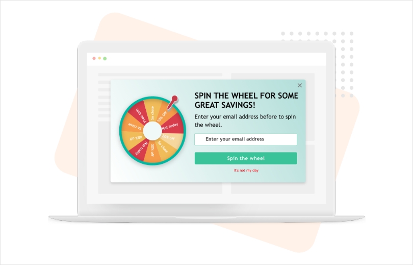
Popups are created using a third-party popup builder such as Picreel and are added by inserting a setup code into the website’s HTML.

Popups can take various forms, including:
- Full-Screen Popups: These popups cover the entire screen and demand the user’s full attention. They are often used for important announcements, newsletter subscriptions, or age verification.
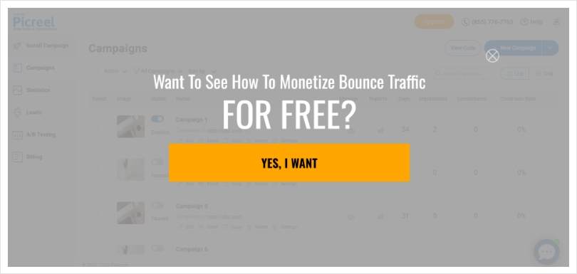
- Sidebar Popups: Sidebar popups appear on the side of the screen and can be less intrusive than full-screen versions. They are commonly used for chat widgets, social media buttons, or contact forms.
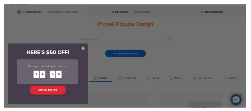
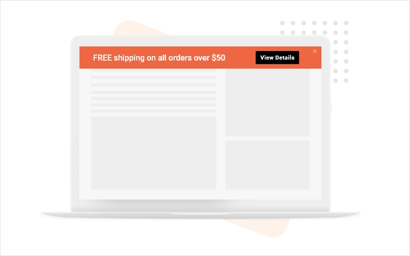
- Banner Popups: Banner popups are typically placed at the top or bottom of the webpage, grabbing attention without being overly obtrusive. They are often used for cookie consent notices or to highlight limited-time offers.
Watch this quick video about what popups are and how to create them.
“Popup” Or “Pop-Up”?
Before we dive further into the world of popups, let’s clear up some confusion. Is it “popup” or “pop-up”? Well, both are technically correct, but “popup” has become more popular in recent years. The term “pop-up” originated from the words “pop” (referring to something sudden or quick) and “up” (indicating a display appearing on top of another). However, with time, “popup” without the hyphen has become the dominant form.
Are Popups Annoying?
Well, it depends. Historically, popups gained a reputation for being intrusive and annoying, often bombarding users with irrelevant information.
Back in the early days of the internet, popups were indeed a nuisance, disrupting the browsing experience and leading to frustration.
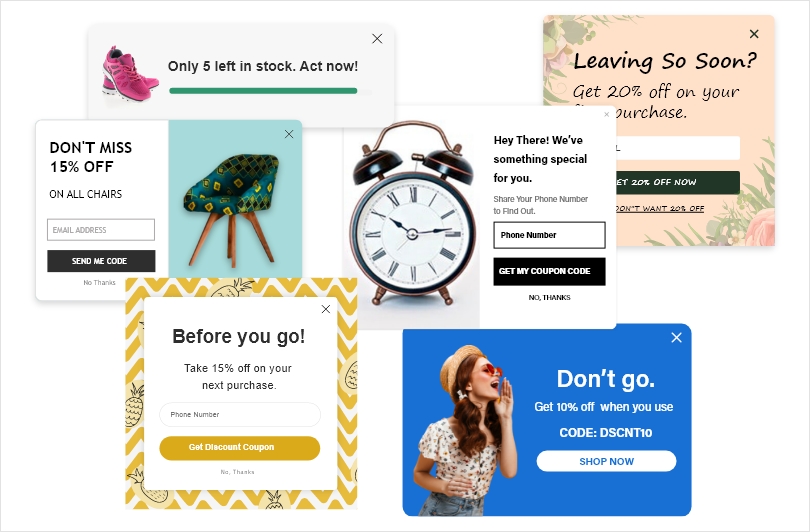
However, over time, their effectiveness and user-friendliness have greatly improved.
Did you know?
The top 10% of highest-performing pop-ups average a conversion rate of 9.28%.
So, love them or hate them, popups can be highly effective if used correctly!
Why Are Popups Important- 4 Benefits You Shouldn’t Miss Out On
Following are the top 4 benefits of popups that make a convincing case for them.
1. Lead Generation
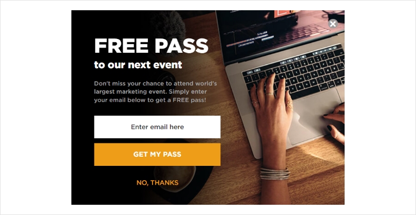
Popups play an important role in lead generation by capturing visitor information through enticing offers and incentives like free ebooks, courses, or guides.
Moreover, popups with lead magnets increase signup rates by over 100%.
Smartly triggered popups, displayed based on interaction with specific elements of the website, like a CTA or an image, ensure a seamless user experience while targeting only interested prospects.
2. Reduced Bounce Rate
One thing about abandoning visitors is that they never tell you the reason why they are leaving, so you’re always left guessing. This is where website popups can help!
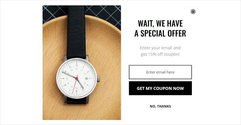
You can not only offer attractive coupons or discounts to your leaving visitors to stop them but also ask your visitors about the reason behind their abandonment. All you have to do is get an exit-intent popup tool, which will automatically display popups to the leaving visitors.
3. Personalization
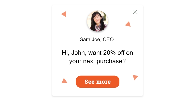
With advanced targeting and segmentation options, popups can be personalized to cater to individual user preferences and behavior. By analyzing user interactions, such as browsing history, location, or previous purchases, you can deliver relevant and personalized offers through popups.
For example, if a user has shown interest in a specific product category, a targeted popup offering a discount on related items can be displayed.
Also Read : Personalized Popups: Custom Pop-Ups for Engagement & Conversions
4. A/B Testing
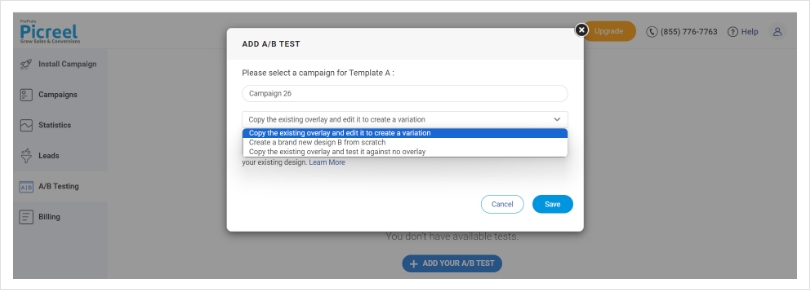
A/B testing is a powerful tool for optimizing popup performance. By creating multiple variations of a popup and testing them simultaneously, you can identify which design, content, or timing resonates best with your audience.
For instance, you can test different colors, copy, or CTA buttons to see which combination drives the highest engagement and conversions.
Read More: How to Conduct A/B Testing for Popups: Examples and Best Practices
What Makes a Good Popup- 8 Essential Traits
Now that we’ve established popup meaning and that they can be extremely effective if done right, let’s explore what makes a good popup that users won’t find annoying.
1. Relevance
The key to a successful popup is relevance. Ensure that the popup’s content aligns with the user’s intent and the page they are on. A relevant popup would be seen as helpful rather than intrusive.
2. Timing
Timing is everything. A popup that appears too soon might be off-putting, while one that appears too late may not catch the user’s attention.
A study by Drip found that popups displayed after a visitor spends 8 seconds on the website are likely to convert better.
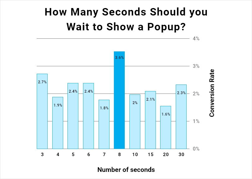
Image Source: Drip
3. Clear Call-to-Action (CTA)
Your popup should have a clear and compelling CTA. Whether it’s subscribing to a newsletter, claiming an offer, or starting a chat, the CTA should be straightforward and enticing.
Also Read : 11 Proven Call to Action Button Best Practices for Popups
4. Simplicity
Keep it simple. Avoid cluttering your popup with too much text or unnecessary elements. A clean and visually appealing design will have a better chance of engaging users.
5. Display & Targeting Rules
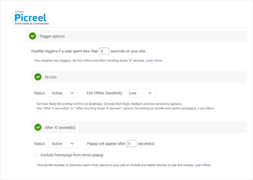
Customize when and where the popups appear based on user behavior. Use display rules, such as exit-intent or scroll-based triggers, to show popups at the right time.
6. Well-Optimized Design
A visually appealing popup with an eye-catching design will grab the user’s attention without being overly obtrusive. Ensure that the design is optimized for various screen sizes and devices. For the best results, popup forms should be responsive and seamlessly integrated into the overall user experience.
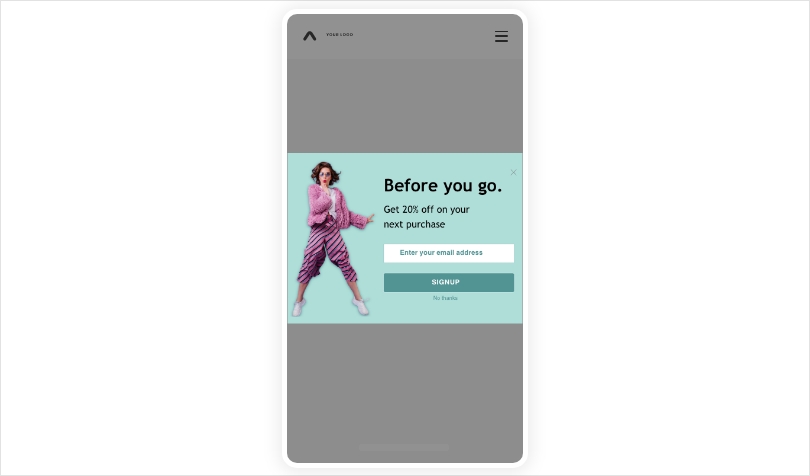
Also Read : Boost Your Conversion Rate with Mobile Popups: Examples and Tips
7. A Clear Close (X) Button
Users appreciate having the option to close a popup easily if they are not interested. Always include a clear and prominent close (X) button that allows users to dismiss the popup.
8. Page Load Speed
Ensure that your popups do not slow down the page load time. Optimize the popup code and use asynchronous loading to minimize any negative impact on user experience.
By incorporating these elements into your popup strategy, you can create engaging and user-friendly popups that enhance your website’s performance and user experience.
Also Read : 11 Popup Best Practices to Drive Conversions
Popups- The Good & The Bad
Like any marketing tactic, popups have their fair share of pros and cons. Let’s take a look at them.
Pros:
- Popups get the point across
Popups are loud and proud, and based on the way they are built, it is very hard to miss them. This is why you can integrate your popups with any type of message and be sure that your audience will get it.
- They help in capturing data
Popups are not just for delivering coupons and discount codes. You can embed surveys in your popups and easily collect data from your audience. You can even gather your users’ contact information by integrating relevant fields into them.
- They can boost conversion rates
Popups have the potential to drive higher conversion rates compared to other marketing methods because they demand immediate attention from website visitors. Popup statistics often show that a well-crafted popup offering a time-sensitive discount can encourage visitors to make a purchase they might have otherwise abandoned.
- They help notify the visitors
You can also use popups to relay information to your visitors about potential bugs or errors and deliver notifications as well. Simply design your popups around the information you want to deliver and time them for whenever users enter your website or trigger them based on certain events.
- They reduce cart abandonment
Popups can reduce cart abandonment by offering timely incentives, such as discounts or free shipping, when users show signs of leaving the checkout page. These attention-grabbing messages can remind customers of their intention to purchase and motivate them to complete the transaction before leaving the website.
Cons:
- Their reputation precedes them
At this point, we’re not aliens to the fact that popups hold a bad reputation. This is why they create a holo perception amongst the visitors where they automatically consider the popup bad as soon as they see it before even considering the value it may add.
- They are not safe from ad blockers
A huge disadvantage of popups is that many ad blockers tend to block the script that deploys popups on the website, and there is no way around it. A ton of people use ad blockers, and there’s not much you can do about that.
- Poorly designed or ill-timed popups can be irritating and drive users away
Intrusive popups may cover important content, interrupt the user’s flow, or appear too frequently, leading to a negative user experience. If visitors feel bombarded with popups that offer little value or are difficult to close, they may become frustrated and leave the website altogether.
The benefits of popups far outweigh the cons. This is why a vast majority of businesses deploy popups on their websites.
Popups in Action- 5 Proven Examples
There are plenty of different popup types, and marketers deploy them based on their use cases and the goal they are trying to achieve. Let’s look at some of the most popular types of popups and how companies are deploying them in the real world.
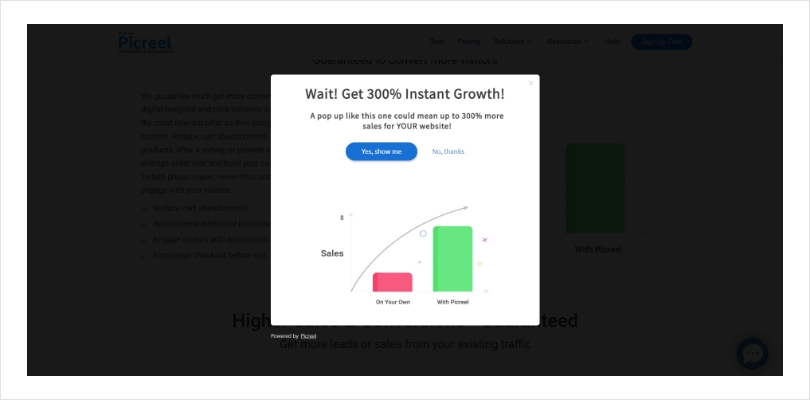
1. Get Started Popups- Picreel
These popups give visitors a basic understanding of the product. Picreel presents one of the best examples in this case as they allow users to get started for free so that users can get familiar with the tool before committing to a purchase.
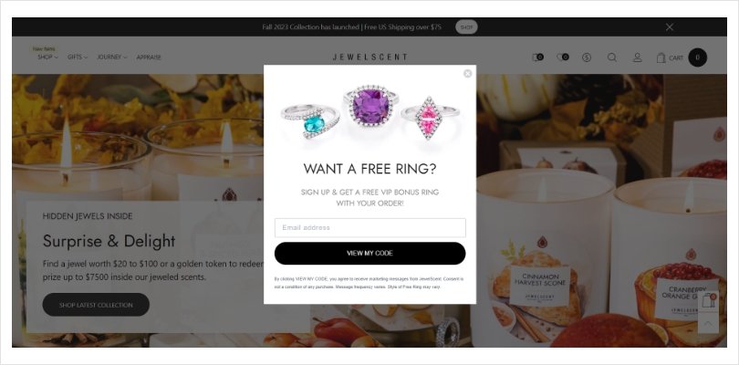
2. Welcome Popups- JewelScent
When you visit JewelScent, a welcome popup appears, offering you a free ring with your first purchase. This encourages purchases while also capturing details for future marketing outreach.
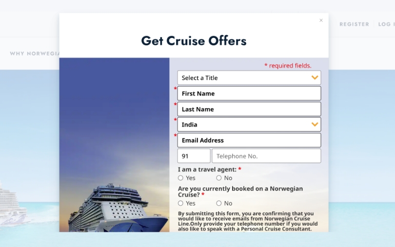
3. Offers Popup- Norwegian Cruise Line
Offering discounts and offers from time to time is a great way of re-engaging visitors and retaining them for a longer time. Norwegian Cruise Line does exactly this.
4. Exit-Intent Popups- Mavenlink
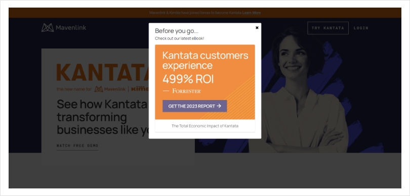
Mavenlink utilizes exit-intent popups that appear when you’re about to leave the website. The popup offers a free eBook to the visitor to keep them engaged.
5. Sign-Up Popop- GQ
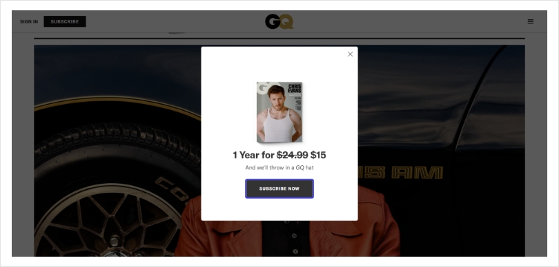
GQ, the renowned men’s lifestyle magazine, offers a compelling signup popup to its website visitors. The popup invites users to subscribe to GQ Daily, promising exclusive tips, trend updates, and engaging content delivered straight to their inboxes.
Creating SEO-Friendly Popups With Picreel
If you are building a popup, you would require a popup builder tool, and building a popup with Picreel is as easy as it gets. Let’s take a look at how to do it.
Step 1- Create a popup campaign.
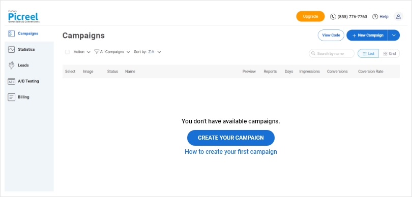
Once you log in to your Picreel account, select “Campaigns” on the left side of the screen from your dashboard and click “Create a campaign” in the middle of the screen.
Step 2- Choose a popup design.
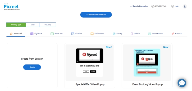
Once you create a new campaign, you will be taken to the next screen, where you will have to select a popup design. There are over 100 different built-in popup templates available for you to choose from, and you can even create a new popup campaign from scratch.
Step 3- Customize the design.
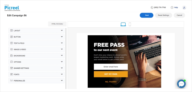
Once you have chosen the type of popup you want to deploy, you can customize it however you want. The things you can customize in your popup include:
- Design
- Animation and placement settings
- Fonts
- Banner settings
- Personalization settings
Step 4- Customize targeting & trigger options.
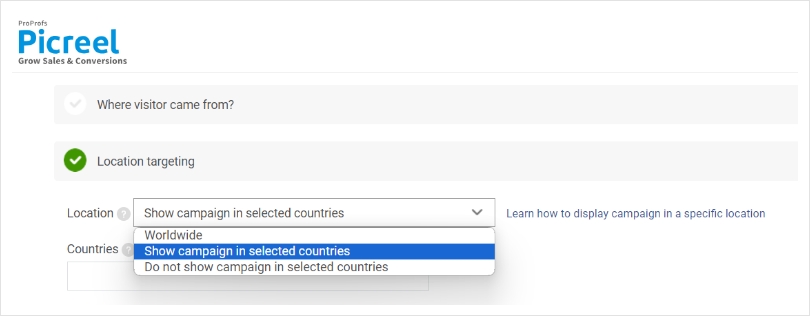
Here, you can select the type of audience you want to display your popups to. You can start by selecting the target website and applying your popup to the whole website or selecting specific pages by entering their respective URLs.
Once you do that, you can move to the scheduling options and select when you want to display your popups by customizing the time frame. Next, you can select your triggers, which can include time spent on a page, scroll distance, and element-based triggers.
Apart from that, there are targeting options as well that include location-based, device-based, cookie-based, and much more.
Step 5- Add code snippet.
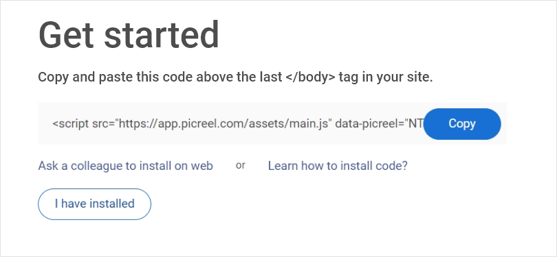
When starting your first campaign, you’ll be redirected to the ‘Get Started’ page to complete the setup. From there, simply copy the snippet code and paste it onto your site as directed. It’s that simple!
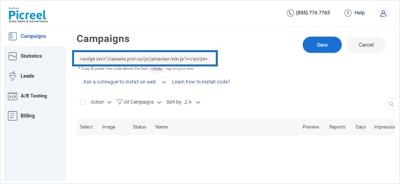
Alternatively, you have the option to copy the code directly from the ‘Campaigns’ page. Just click on ‘View Code’ to easily copy and paste it.
Captivate Your Audience With Artfully Designed Popups!
Popups are a powerful marketing tool that can drive traffic to your website, facilitate customer engagement, get you more subscribers, and improve your sales.
With relevant, well-timed, and visually appealing popups, you can create a positive user experience and maximize the potential of this contentious marketing tactic.
Creating a good popup is an art that combines design, functionality, and user-friendliness.
Tools like Picreel support all these aspects. With its user-friendly interface and a range of templates, it can help you create effective popups that won’t annoy your visitors. Sign up for a forever-free plan today, and witness the impact of well-designed popups on your website’s success.
Happy engaging!
Frequently Asked Questions
How can I make popups less annoying for users?
To make popups less annoying for users, ensure they provide relevant and valuable content. Create non-intrusive popups that appear at appropriate times, such as exit-intent triggers, to avoid disrupting the user experience.
Do popups actually work?
Yes, popups can be effective when used strategically. Create eye-catching popups with clear calls-to-action, enticing users to take desired actions like subscribing to newsletters or accessing special offers.
Are popups suitable for mobile devices?
Yes, Picreel allows you to design mobile-responsive popups that adapt to various screen sizes. Ensure your popups are mobile-friendly, unobtrusive, and offer value to mobile users for a positive experience.
How can I measure the effectiveness of my popups?
Popup builders offer detailed analytics, enabling you to measure popup effectiveness. Track metrics like conversion rates, click-through rates, and engagement data to assess how well your popups are performing and make data-driven improvements.
Are there alternatives to traditional popups?
Yes, alternatives to traditional popups exist. Slide-in boxes, notification bars, and interstitial ads are less intrusive options. Picreel offers a variety of popup styles, allowing you to experiment and choose the most suitable format for your audience and goals.
FREE. All Features. FOREVER!
Try our Forever FREE account with all premium features!


