Ever feel like you’re pouring time and effort into your website, but visitors just scroll by without taking action? 98% of site visitors leave without doing what you want them to do—be it signing up, shopping, or even clicking a link.
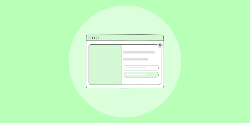
That’s where website popups can help. These small but mighty windows grab attention, spark interest, and encourage action when done right. But how do you create website popups that grab attention without being annoying?
In this blog, I have shared some ideas on how to create website popups and listed 25 proven examples from which you can take inspiration. Continue reading to find out.
What Is a Website Popup?
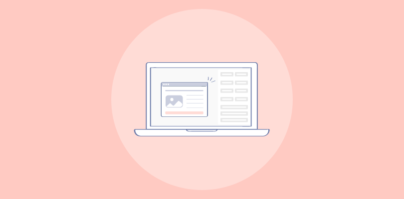
A website popup is a small message window that appears on a website, often grabbing visitors’ attention instantly. They are an effective tool for encouraging sign-ups, promoting offers, or capturing feedback.
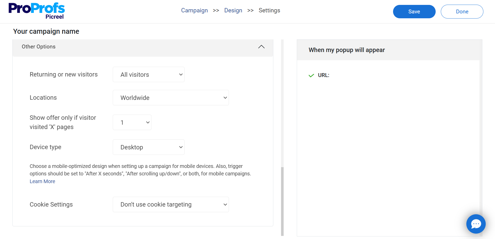
Here’s an example:
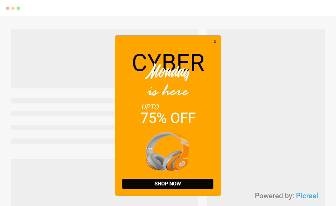
Image Source: Picreel
But hey, website popups might annoy our visitors! Is that what you’re thinking right now?
Well, let’s bust the myth: “Website popups aren’t interruptions — they’re opportunities for businesses to connect, engage, and deliver value in seconds.” That’s why they can increase conversion rates by up to 9.28% when designed well and used strategically.
Here are 8 types of popups you can consider to boost your engagement:
- Welcome popups
- Discount offers
- Newsletter sign-ups
- Exit-intent popups
- Cart abandonment reminders
- Shopping deals
- Gamified popups
- Survey popups
How Top Brands Use Website Popups to Drive Conversion
Looking to create popups that actually convert? Below are 25 real-world examples from top brands to inspire your own strategy.
When you’re done browsing, check out the next section for a quick guide to building your lead-generating popup.
Let’s go!
1. Ultraviolet

Use This Template | Image Source: Picreel
This is one of the best website popups that leverages urgency to drive conversions. It offers a 6% discount instantly for email sign-ups, paired with a bold headline, clear CTA (“Get My Discount”), and a clever alternative (“No thanks, I’d rather pay full price”).
This email popup not only grabs attention but also helps you grow your email lists while boosting immediate sales. You can make the offer more compelling by testing higher discounts or freebies. Adding personalized product recommendations based on user behavior could also drive better engagement!
2. Rdpusa

Use This Template | Image Source: Picreel
This website popup from RDPUSA offers a free chapter of “The Truth About Executive Coaching” to capture leads. The headline (“Download a FREE Chapter…”) grabs attention by emphasizing value while the subheadline clearly highlights the book’s relevance to decision-makers. Popups with email input helps build email lists and establish authority by offering something valuable upfront.
With good authority, you can easily win customer trust. Then, you’ll be on top of their mind whenever they need a product or service you offer, boosting conversions. When adopting a similar lead magnet popup, add a testimonial of your product to build trust and drive more conversions.
3. ITM Trading
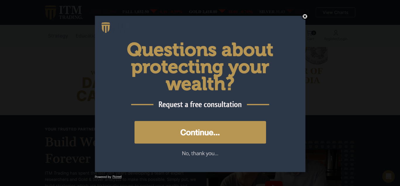
Use This Template | Image Source: Picreel
This popup by ITM Trading is direct and impactful. The headline, “Questions about protecting your wealth?” grabs attention immediately, addressing a common concern. Below it, the call to action, “Request a free consultation,” reassures users of a no-strings-attached opportunity.
The “Continue…” button simplifies engagement, while the “No, thank you…” option ensures a non-intrusive experience. Such popups drive conversions by tapping into customer concerns and offering a quick solution. To make this strategy more relevant and effective, personalize the popup based on user behavior.
4. Flaus

Use This Template | Image Source: Flaus
The Flaus popup is a prime example of driving conversions with simplicity. The bold headline, “UNLOCK 10% OFF,” immediately hooks users and encourages them to make their first purchase. The subtext highlights free shipping and updates to increase visitors’ interest and drive conversions.
The email input field and “SIGN UP” button streamlines user action, while the “NO THANKS” option maintains a non-intrusive tone. The vibrant imagery complements the popup, creating visual appeal. You can enhance this popup by adding urgency, like a countdown timer. It will create FOMO and boost immediate sign-ups. It will create FOMO and boost 76% sales.
5. Blume

Use This Template | Image Source: Blume
This interactive popup by Blume showcases a personalized approach to customer engagement. The first popup asks users to select their primary skin concern (e.g., acne, hydration), creating a tailored experience that fosters connection and builds trust.
Once users select their option, the second popup appears, requesting their email to deliver personalized recommendations. It also offers a compelling 30% discount, a strong incentive for conversions. You can level up this strategy by adding interactive visuals and testimonials. Doing so will ensure that users feel confident in their choices, driving both sales and customer loyalty.
6. Elder Statesman

Use This Template | Image Source: Elder Statesman
The Elder Statesman popup invites visitors to subscribe for exclusive previews, events, and seasonal offers, creating a sense of exclusivity. Additionally, it sweetens the deal with complimentary express shipping on the first order, a direct incentive to drive conversions.
The minimalist design and clear call-to-action button keep the focus on the offer. To further boost sign-ups and engagement, you can feature a preview of the exclusive content subscribers will receive.
7. Nuoo

Use This Template | Image Source: Nuoo
Nuoo’s popup is a visually striking offer. It highlights a 25% discount with bold text and vibrant imagery that grabs attention. The “I’m Taking Advantage Of It” call-to-action creates urgency, while the “Limited Time Only” message drives FOMO (fear of missing out). This approach effectively boosts conversions by motivating users to act quickly.
To improve and tailor the offer, you can personalize the popup based on the user’s browsing or purchase history. Adding a countdown timer would amplify urgency, driving faster decision-making and boosting sales.
8. Brooklinen
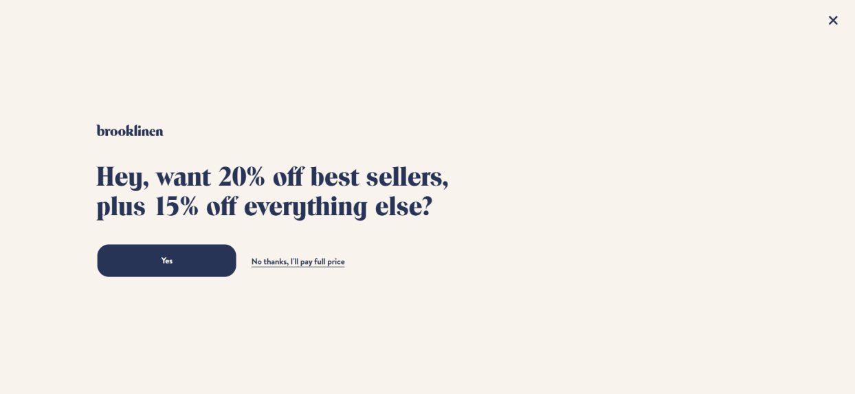
Image Source: Brooklinen
Brooklinen’s popup offers a 15% discount on the first order and $50 off on purchases over $100, making it irresistible for new and repeat customers. The simple layout, bold typography, and contrasting buttons draw attention. The cheeky “No thanks, I’ll pay full price” option adds a playful tone while nudging users toward conversion.
After you select the yes button, another popup appears asking for visitors’ email addresses. This helps Brooklinen build its email list, nurture visitors, and drive future sales. To amplify urgency with this popup, consider including a countdown timer. Doing this will also maximize engagement and long-term sales opportunities.
9. Net-A-Porter
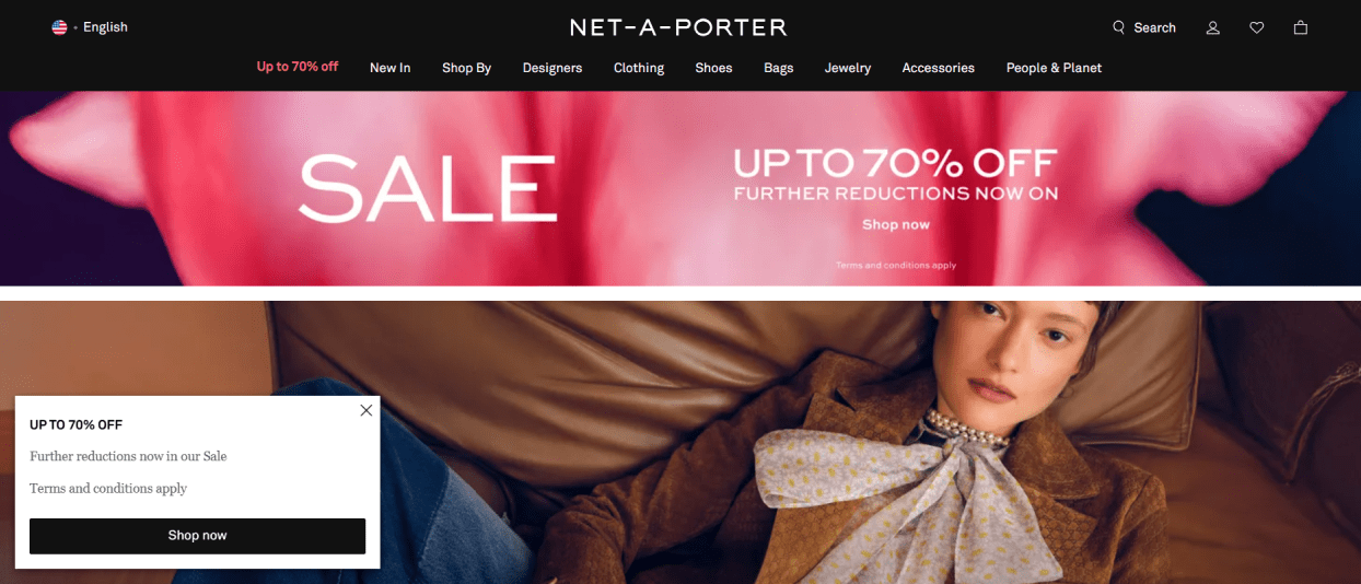
Use This Template | Image Source: Net-A-Porter
Net-A-Porter’s popup promotes an exclusive sale with up to 60% off, using bold text to emphasize the discount. The “Shop Now” CTA immediately directs visitors to the sale, reducing friction and encouraging impulse purchases. Highlighting additional savings and subtly mentioning terms and conditions creates a sense of urgency while maintaining transparency.
To improve this strategy, you can highlight the offer of a free gift for first-time shoppers. This would drive more conversions.
10. Recess

Use This Template | Image Source: Recess
Recess uses a subtle bottom banner popup offering 10% off to grab visitor attention without being intrusive. The clear CTA “Sign Up” and simple fields for first name and email make it easy to take action, lowering barriers to conversion. The minimalist design aligns with their calming brand aesthetic, ensuring the popup complements rather than distracts.
When adopting a similar popup, you can briefly highlight your unique product benefits to strengthen the value proposition and drive conversions.
11. Nora

Use This Template | Image Source: Nora
Nora’s sleek bottom banner popup invites visitors to subscribe for updates on new collections, meetups and restocks. This is a perfect strategy for fostering loyalty and conversions. The email field and bold “Subscribe” button simplify sign-ups, while the minimalist black design keeps the focus sharp. The close button ensures a user-friendly experience, making it unobtrusive.
To elevate this popup, you can promote special offers (e.g., “early access to sales” or “members-only discounts”). This will create urgency, build curiosity, and drive conversions even further.
12. TOMS
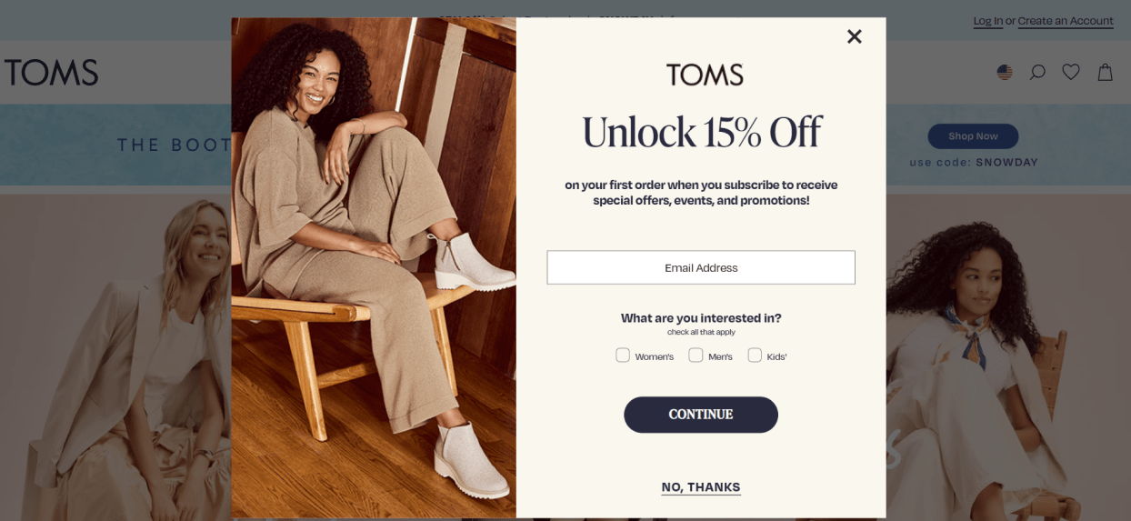
Use This Template | Image Source: Toms
TOMS’ popup offers a 15% discount on first orders, incentivizing users to subscribe. This incentive helps TOMS drive more conversions. The email address field simplifies sign-ups, while the “What are you interested in?” section personalizes the experience and increases engagement. The clean design and bold CTA (“Continue”) makes taking action easy and natural for visitors.
To level up this strategy, consider adding exclusive benefits like free shipping for subscribers. This would make the offer more compelling, driving quicker conversions and enhancing user engagement.
13. Magic Spoon

Image Source: Magic Spoon
Magic Spoon’s popup effectively uses a bold and concise headline (“Snackable. Portable. Delectable. Try Treats!”) to immediately grab attention and showcase its unique selling points. Positioned at the top of the page, this bar seamlessly integrates into the user experience, ensuring visibility without being intrusive.
It subtly nudges visitors to explore their products, driving curiosity and engagement.
To optimize this hello bar popup further, you can add a clickable CTA, such as “Shop Now”. This will drive users toward purchases and enhance conversions.
14. Black Ember

Use This Template | Image Source: Black Ember
The Black Ember popup strategy is designed for maximum conversion. The first element, a sleek “Hurry – 15% Off Everything” bar, creates urgency and nudges users to take action. When visitors click on it, the second popup (a minimalist holiday-themed design) appears, inviting users to join the email list for exclusive deals.
Image Source: Black Ember
This combination of urgency and exclusivity builds anticipation while capturing valuable leads. To make the experience even more compelling, you can personalize offers based on user behavior or past purchases.
15. Art of Play
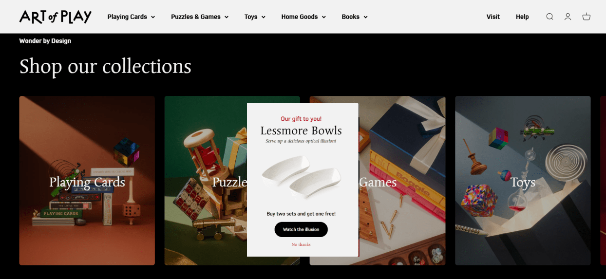
Use This Template | Image Source: Art of Play
The Art of Play popup is both creative and engaging. It offers a gift-like incentive—”Buy two sets and get one free!” — to drive sales. The headline, “Our gift to you!” creates a sense of exclusivity, while the product image visually reinforces the offer. The “Watch the Illusion” button piques curiosity, encouraging interaction.
To create urgency and boost conversions effectively, consider adding a countdown timer. It will make visitors want to grab the offer before it is gone.
16. Press

Use This Template | Image Source: Press
The Press “Spin to Win” popup brilliantly gamifies engagement. The spinning wheel encourages users to enter their email to win discounts like “10% Off” or freebies like “Free 1-Day Juice Cleanse”. This fun, interactive format keeps users engaged and increases email signups, directly boosting conversions.
To adopt this spin the wheel strategy better, you can customize the wheel sections for seasonal offers or add confetti animations when users win.
17. Hard Graft

Use This Template | Image Source: Hard Graft
The Hard Graft popup introduces visitors to the brand’s story, creating a personal connection. The minimalist design, with fields for name and email, keeps things simple and user-friendly. This popup boosts conversions by engaging visitors and encouraging them to subscribe for updates and offers.
To optimize this strategy, you can add a clear benefit for subscribing, like exclusive first access to new collections or limited-time discounts. This would encourage users to engage faster while maintaining the popup’s classy appeal.
18. Only Natural Pet
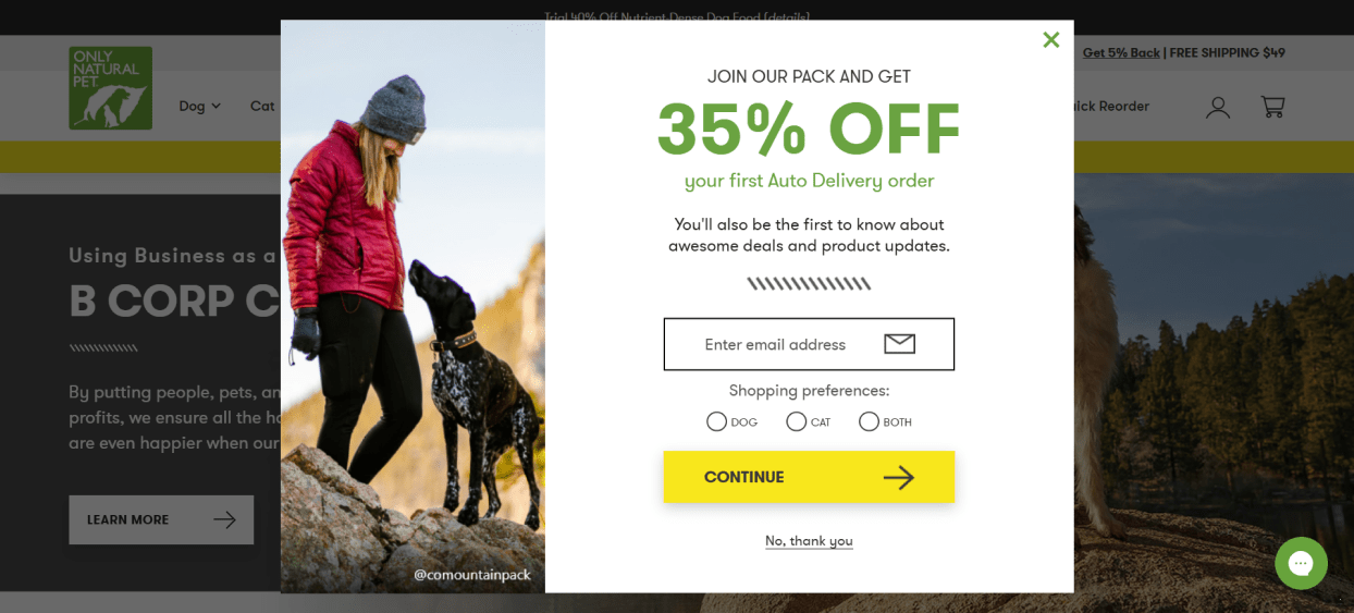
Image Source: Only Natural Pet
The Only Natural Pet popup offers an enticing 35% discount on first auto-delivery orders, clearly displayed in bold to grab attention and encourage action. Including email collection and shopping preferences (dog, cat, or both) personalizes future interactions, fostering customer loyalty and boosting conversions.
Using a pet image adds emotional appeal and makes visitors resonate with their target audience. For added trust and engagement, you can showcase testimonials or customer reviews alongside the offer.
19. Wild Souls

Use This Template | Image Source: Wild Souls
The Wild Souls popup, with its bold “Join the Wild!” headline, instantly grabs attention. To drive conversions, it offers a 10% discount on first orders. The minimalist design, paired with an email collection form and a checkbox for agreeing to terms, ensures simplicity and compliance.
To enhance this popup, you can include a brief tagline emphasizing your products’ unique benefits. Adding a subtle animation or testimonial could further increase engagement and trust.
20. Blue Apron

Use This Template | Image Source: Blue Apron
Blue Apron’s “Spin to Win” popup injects an element of fun and engagement. The interactive wheel with irresistible discounts of 10-30% captivates visitors and motivates them to participate. Clear CTA buttons like “Spin to Win” and “No Thanks” simplify navigation.
To further boost conversions and sales with this popup, you can personalize rewards based on visitor preferences or show limited-time offers.
21. Portrait Coffee

Use This Template | Image Source: Portrait Coffee
Portrait Coffee’s popup offers a 15% discount on the first order, alongside exclusive perks like early access to new coffee releases and brewing tips. These elements capture visitors’ attention and offer a sense of exclusivity. The clean design with fields for first name, last name, and email makes it easy for visitors to sign up, while the bold CTA button, “Save 15% On Your Order,” drives conversions.
To create more urgency and encourage immediate signups through this popup form, you can add a countdown timer for limited-time offers.
22. Omsom
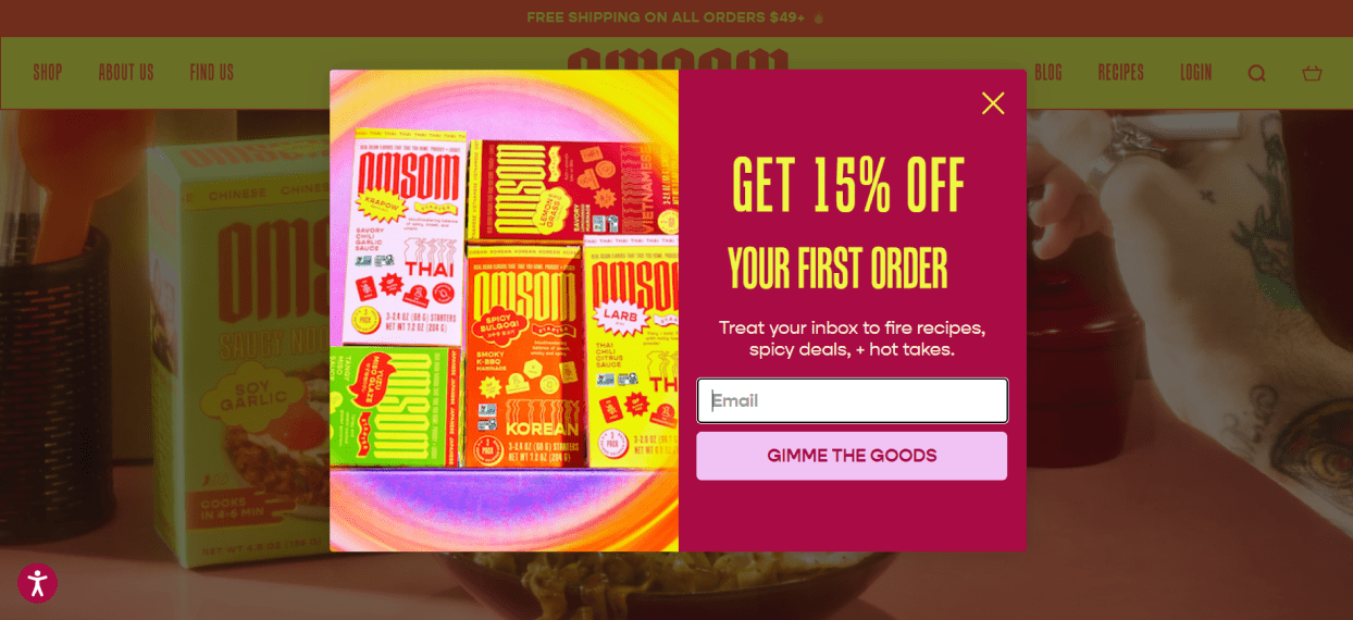
Use This Template | Image Source: Omsom
Omsom’s popup bursts with energy, offering a 15% discount on the first order to grab attention. The bold colors and enticing food imagery create an engaging visual appeal, while the promise of exclusive recipes and deals add value and encourage signups. The playful CTA “Gimme the Goods” makes the interaction fun and engaging.
To make it more relevant and converting, you can integrate a brief quiz to recommend product bundles based on user preferences.
23. Proweb
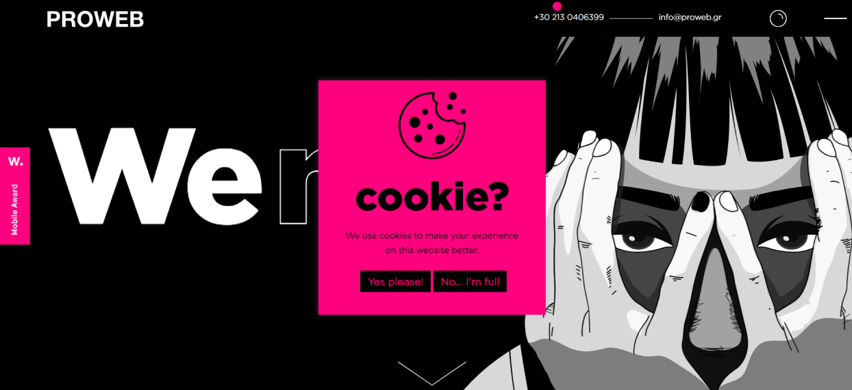
Use This Template | Image Source: Proweb
Proweb’s playful cookie consent popup grabs attention with its bright pink color and humorous text, such as “Yes, please! No. I’m full.” It uses fun visuals and concise messaging to inform users about cookies while keeping the tone light and interactive. This approach creates a memorable impression and enhances the user experience.
When adopting a similar cookie popup, you can briefly explain how cookies benefit users, like improving page loading or personalized experiences. This will build trust.
24. Coschedule
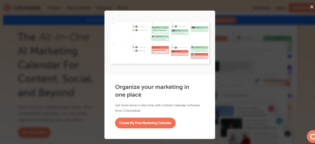
Use This Template | Image Source: Coschedule
CoSchedule’s popup effectively drives conversions by offering a free marketing calendar and showcasing a visual preview of the tool. The headline, “Organize your marketing in one place,” simplifies the benefit for users. Also, the bold call-to-action, “Create My Free Marketing Calendar,” adds urgency and personalization.
You can include a short testimonial or trust badge when adopting a similar popup. This will make your visitors feel more confident in their decision to engage.
25. Sienna Sauce

Use This Template | Image Source: Sienna Sauce
The Sienna Sauce popup gives a simple but great deal: a free cookbook with any purchase. It’s a smart way to grab attention and get more people to buy. The email signup helps Sienna Sauce get more subscribers. The brand then nurtures customers by sending recipes and updates. The big “Get My Code” button makes it easy to take action.
If you’re adopting a similar strategy, try showing happy customer reviews about the cookbook. This will boost loyal subscribers, as 49% of customers trust online reviews.
How to Create the Perfect Website Popup: Step-By-Step
After seeing those highly engaging website popup examples, you want to create one for your website. Right? Well, to create different types of popups quickly, you need an easy and feature-rich popup builder like Picreel.
Its built-in website popup templates and advanced trigger feature simplify creating and implementing website popups.
Check the video below to learn how to create website popups in minutes:
Need proper steps? Here you go-
Step 1: Sign In or Get Started
Sign in to your Picreel account. If you don’t have one yet, create your forever-free Picreel account.
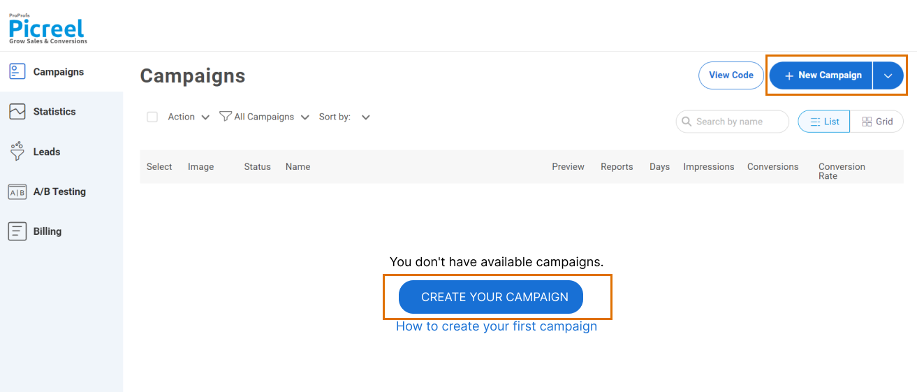
Step 2: Create a New Campaign
Head to the “Campaigns” tab and click the “New Campaign” button at the top right corner.
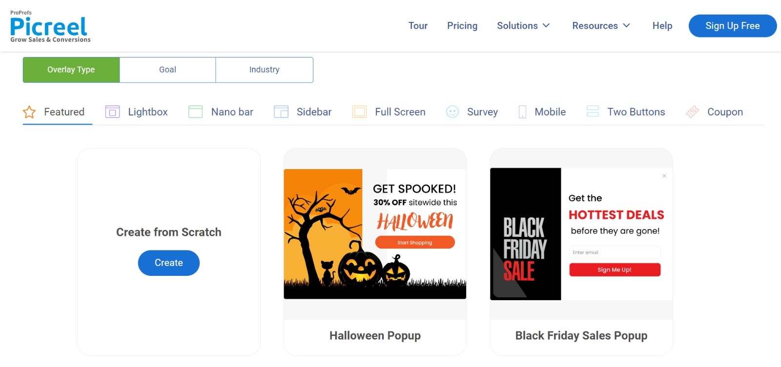
Step 3: Choose a Template or Build From Scratch
Browse through 100+ ready-made popup templates for lead capture, promotions, surveys, and more or start from scratch if you want full creative control.
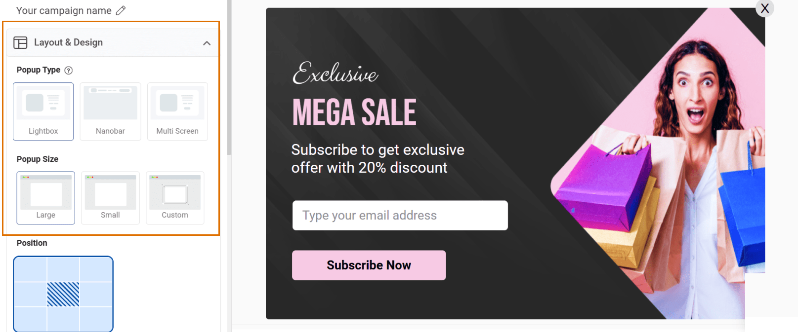
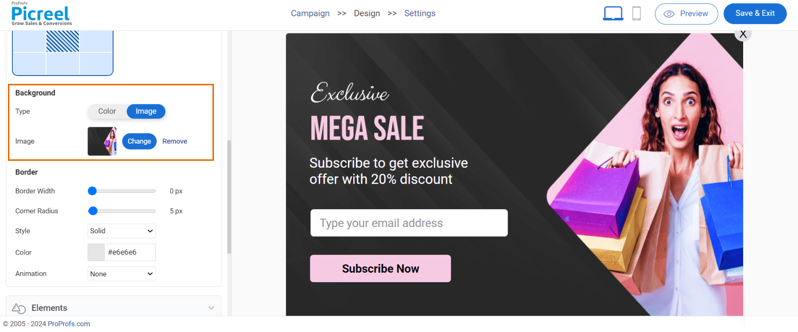
Step 4: Customize the Design
Once you have opened your favorite website popup template, customize its ‘Layout and Design’ according to your needs.
- Set Size & Position: Adjust the popup’s height and placement on the screen and check its appearance on the right side in real time.
- Adjust the Visuals: Pick background color, borders, and animation to match your site’s branding.
- Add Interactive Elements: Include buttons, timers, images, or text to grab attention and influence buying decisions of 70% of online shoppers.


Step 5: Set Targeting & Triggers
Set up targeting and trigger options to decide when and where your website popups will be display.
Here are the popup targeting and triggering options Picreel offers:
- Target by Audience: Show popups to new visitors, returning users, or based on location for better personalization.
- Set Display Timing: Schedule your website popups during key events like sales, holidays, or product launches.
- Show by Behavior: To boost engagement, trigger popups based on user actions such as scrolling, time spent, or exit intent.
- Optimize for Mobile: Set targeting to “all devices” or choose a mobile-friendly design so your popup auto-adjusts.
Step 6: Preview, Save & Publish
Happy with the setup? Hit “Save”, then head to the “Install Campaign” section to grab your JavaScript snippet. Paste it into your website’s HTML, and your popup goes live!

Step 7: Analyze & Optimize With Data
Head to Picreel’s “Reports & Analytics” dashboard to track the performance of your popup, including views, clicks, form completions, and more.

Once you’ve gathered enough data, look for patterns in user behavior to see what’s working.
Also, leverage the inbuilt A/B testing feature to experiment with different CTAs, offers, or designs and improve your results based on real-time insights.
Are Website Popups Effective?
Yes, popups for website are effective. But you don’t have to take my word for it.
Explore the latest website popup data proving just how powerful popups can be in 2025.
- Drive Action: They prompt immediate responses, like signing up for newsletters or grabbing limited-time deals.
- Capture Leads: Help you build your email list effortlessly by offering incentives like discounts or freebies.
- Improve User Experience: Guide your visitors with helpful information or navigation tips at the right time.
- Increase Sales: Let you upsell or cross-sell products with personalized recommendations.
- Reduce Cart Abandonment: Exit-intent popups can bring back potential customers before they leave.
FREE. All Features. FOREVER!
Try our Forever FREE account with all premium features!
Engage & Convert Your Users With Website Popups
Website popups are a powerful tool for companies to drive sales and boost conversions. They grab attention, deliver targeted offers, and encourage action in seconds.
Using the examples in this blog, you can design the best website popups that truly engage your audience. Whether you’re offering discounts, gathering emails, or showcasing special offers, these strategies are your key to success.
To make the most of popups for your website without much effort, consider switching to a simple, feature-loaded popup builder like Picreel. With easy-to-use templates, advanced targeting, analytics, and a forever-free plan, Picreel helps you create the best website popups with zero cost and no hassle.
Don’t wait—start creating popups today and watch your conversions soar!
FREE. All Features. FOREVER!
Try our Forever FREE account with all premium features!
 We'd love your feedback!
What did you like & how can we make it even better?
 Thanks for your feedback!
 Ask Your Question
Have a question? Get expert help to make your decision easier.