If you are in the marketing business, most likely you are constantly looking for techniques for website conversion rate optimization and to slash conversion rate optimization pricing. Marketers have released tricks that have worked for them. In this post, I have outlined some of these tricks. The information comes from many sources and has been placed here for your convenience. Here for you are 20 website conversion rate optimization and conversion rate optimization pricing case studies.
1. To Increase Conversion by 33% Update Your Design
Results Achieved and Overview:
CloudSponge had one of these updated designs:
This is after the redesign:
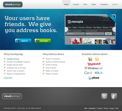
The later design achieved a 33% increase in website conversion rate optimization and conversion rate optimization pricing.
Key Findings:
Anyone can see a big difference in the two designs. One is very boring, it only has one call to action, and it also does not give a real good reason for anyone to choose CloudSponge. While the new one allows visitors to view a demo and gives visitors a reason to try CloudSponge.
If you own a website that is similar to the first one make sure to get an update on it. He update will pay for itself when you see a spike in website conversion rate optimization and conversion rate optimization pricing.
2. To Cause up to 93% More People Make it Copy Action Oriented
Results Achieved and Overview:
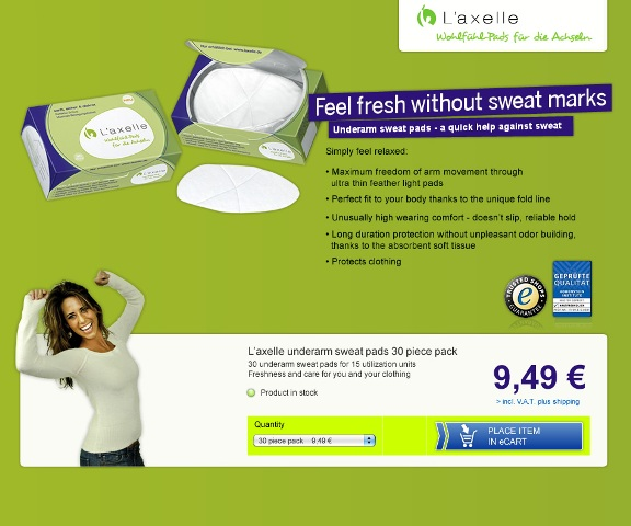
L’Axelle was in need of more viewers to click on the add to cart button on their site. This is what the original site looked like:
This is what the test looked like:
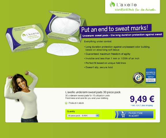
L’Axelle has described the original design as comfort-oriented. Their selling point is that people will feel relaxed and relieved. While the test copy is more action-oriented, therefore being more about solving problems.
The one with action oriented headlines and copy got an increase in website conversion rate optimization and conversion rate optimization pricing of 38.3%, 93% greater than the original.
Key Findings:
“Put an end to sweat marks” is an action-oriented statement and causes the customer to feel relieved. Also the word “end” will make it sound as if they will not get sweat marks again. If the headline would have read “Reduce Sweat Marks” then the copy may have not performed well.
3. Clearing Their Homepage Helped The Weather Channel Increase Website Conversion Rate Optimization and conversion rate optimization pricing by 225%
Results Achieved and Overview:
The Weather Channels’ goal was to turn visitors into premium subscribers. They stated off by removing all of the clutter from their home page and had only one action. This caused an increase of 225% in website conversion rate optimization and conversion rate optimization pricing.
Key Findings:
Make sure to simplify. This requires restraint but it allows visitors to easily navigate the webpage and to make decisions.
4. When Adding a Picture of Some Person it Will Increase Highrise Signups by 102.5%
Results Achieved and Overview:
37signals have changed their design on their Highrise product page. They have done many tests but we will showcase one where they have used a white background and compared the results with a test that used a customer. Here are the results that followed: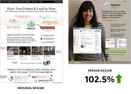
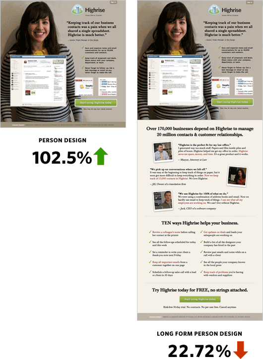
They have also tested a long page against a sort page and the sort page performed much better:
Key Findings:
As you may have noticed the background with the person sticks out a lot more than other pages on the internet. It signals to the customer the importance of the page and makes them want to keep reading about the offers.
5. Improving Value Proposition Will Cause a 128% Increase in Visitor Registration for Games.
Results Achieved and Overview:
The Sims 3 goal was to get more visitors to register. They have tested their value proposition.
The original page:
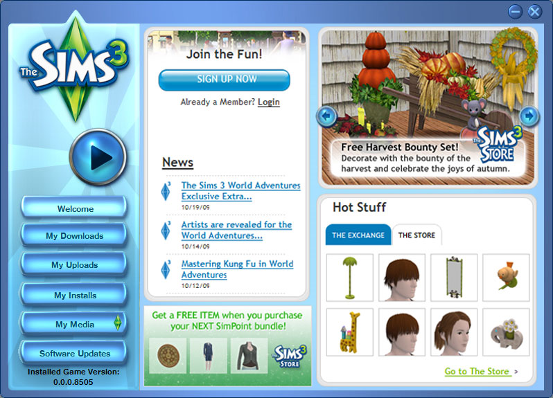
The test: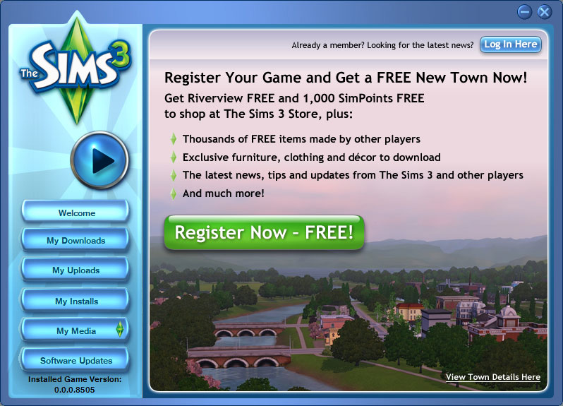
The test resulted in an increase of 128% in-game registration.
Key Findings:
As you are able to see clearly, the text emphasizes the word free. If you are offering a free trial or free offer do not hide it. Let it be known to visitors because most will try something free.
6. Make the Call to Action a Bit More Prominent Will Result in an Increase in Website Conversion Rate Optimization and conversion rate optimization pricing by 592%
Results Achieved and Overview:
Nature Air use to have 17 different landing pages. Nature Air did one A\B test on every landing page. The control didn’t make the CTA stand out:
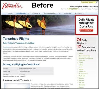
Therefore they moved the CTA to the content area:
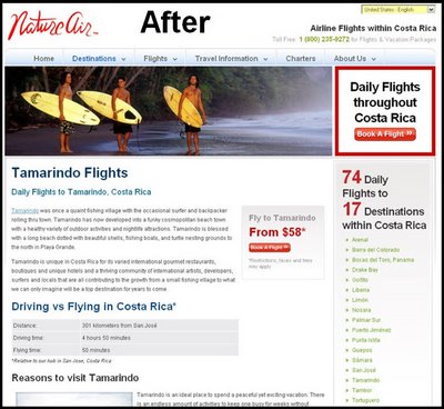
Website conversion rate optimization and conversion rate optimization pricing went from 2.78% to 19%; this means that their website conversion rate optimization and conversion rate optimization pricing improved 591%.
Key Findings:
No matter how attractive your offer is if the offer is not prominent the visitor will never know. Make sure to make your CTA prominent, let it be part of your content area, and make it easy to find. Preferably keep it up above the fold.
7. Add Reviews to Boost Webpage Conversion Rate Optimization and conversion rate optimization pricing by More Than 35%
Results Achieved and Overview:
FigLeaves is a company that sells woman’s apparel on its webpage. FigLeaves added product reviews on their site and this change made customers 35% more likely to make a purchase.
Key Findings:
When you help the costumer make decisions and navigate the page once again helps increase webpage conversion rate optimization and conversion rate optimization pricing and makes the visitor buy.
8. To Bring 25% More Website Conversion Rate Optimization and Conversion Rate Optimization Pricing Redesign the Pricing Page
Results Achieved and Overview:
BaseKit wanted more performance from their pricing page. This is the old desing:
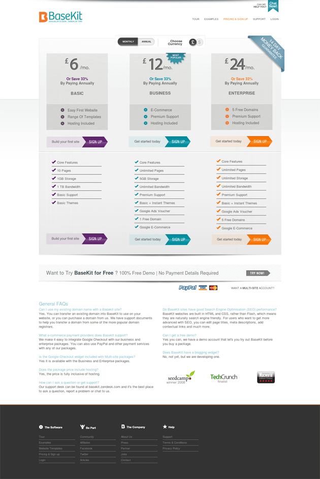
This is the new one: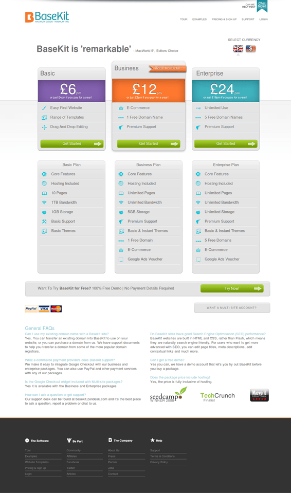
BaseKit has named the new version “Bolder, brighter, clearer pricing, nicer design, testimonial, more obvious currency selection.” The new design got an increase of 25% in website conversion rate optimization and conversion rate optimization pricing.
Key Findings:
The pricing page is as important as the pricing. The information around your pricing and the way that you present the plays a great part in whether a visitor becomes a customer.
9. Changing Your Homepage Will Make Visitors Two to Three Times More Likely to Buy
Results Achieved and Overview:
Hawk Host performed an A/B on their homepage.
This is the control:

This is a test they used with a prominent padlock:

The padlock brought a 2 to 3 times better website conversion rate optimization and conversion rate optimization pricing than the original. The official percentage was not given.
Key Findings:
I am not sure what the globe was used for but it should not surprise anyone that the padlock brought an increase in website conversion rate optimization and conversion rate optimization pricing. The padlock gives a scene of assurance and security to the visitor. Always make sure that the images that you use the link with your main message and unique value proposition.
10. To Increase Webpage Conversion Rate Optimization and Conversion Rate Optimization Pricing by 34% Just Add Testimony
Results Achieved and Overview:
WikiJob had only 3 testimonials on their site. There were a few problems with the testimonials. The testimonials were not connected to specific customers and it was not clear that they actually were testimonials. They just ended up being quotes on the page. WikiJob placed the testimonials at the very bottom of the page. They decided to run an A/B test and to place the testimonials at the very top of the page.
This resulted in a 34% increase in website conversion rate optimization and conversion rate optimization pricing.
Key Findings:
The power of testimonials is that it gives the new user assurance that others have used your services with good reviews.
11. When You Register Website Flow Website Conversion Rate Optimization and Conversion Rate Optimization Pricing Increases by 2.20%
Results Achieved and Overview:
Zen Windows website conversion rate optimization and conversion rate optimization pricing was .75% before they hired a firm to redesign visitors flow.
The old design:
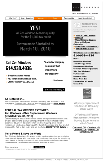
The new design:
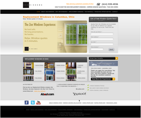
The result was an increase in website conversion rate optimization and conversion rate optimization pricing of 2.95%.
Key Findings:
The redesign made it a lot easier for the visitor to navigate the site. If a visitor struggles to navigate around on your site it will hurt your conversion rate. If you need to find out how visitors feel about your site, check out User Testing.
12. If You Change Your Button Color to Red It Will Increase Conversion Rate by 21%
Results Achieved and Overview:
Performable has performed a test on their homepage with a green button and a red button. The text stayed the same.
The result was that 21% more visitors clicked on the red one.
Key Findings:
Button color is very easy to test. Do an experiment and the results might be surprising.
13. Red Color on Your CTA Will Increase Website Conversion Rate Optimization and Conversion Rate Optimization Pricing by 2.5%
Results Achieved and Overview:
UK airline BMI had a very urgent CTA that stated “Hurry! Only XX seats left.” When a red background was added to the CTA, they saw an increase of 2.5% in conversion rate.
Key Findings:
A color that coordinates with your message may bring an increase in conversions. Make sure to keep the color and message consistent to help instill your message to the visitor.
14. Protect Purchases with Bonds to See an Increase In Conversion Rate by 10.4%
Results Achieved and Overview:
BellaCor gave visitors bonds from Buy Safe only to a few of their visitors. They tested their version against one that was given no options of bonds. The group with bonds had a 10.4% increase in conversion rates.
Key Findings:
Any consumer wants to have protection for their conversion. That is why you need to give them security and assurance.
15. A Security Seal Will Increase Conversions by 7.6%
Results Achieved and Overview:
Oriental Furniture placed a Buy Safe seal on their site. They tested this against a control that did not have a seal. The result was an increase of 7.6% in website conversion rate optimization and conversion rate optimization pricing.
Key Findings:
Assurance is always beneficial for site customers.
16. Add Google Site Search to Increase Conversions by 11%
Results Achieved and Overview:
WaterFilters.net wanted to place a search on their site. They used Google Site search.
The result was that the bounce rate went down by 4% and conversions increased by 11%.
Key Findings:
Aiding your visitors when navigating your site will always increase conversions.
17. By Implementing a Proactive Chat Intuit Increased Conversion Rate by 211%
Results Achieved and Overview:
Intuit placed proactive chat in various parts of their site.
They saw an increase of 43% in order value by placing an interactive chat in the checkout process. Also there was a 20% increase of conversion rates.
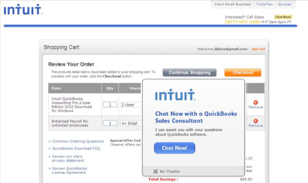
When proactive chat was used on a product site sales increased by 211%:
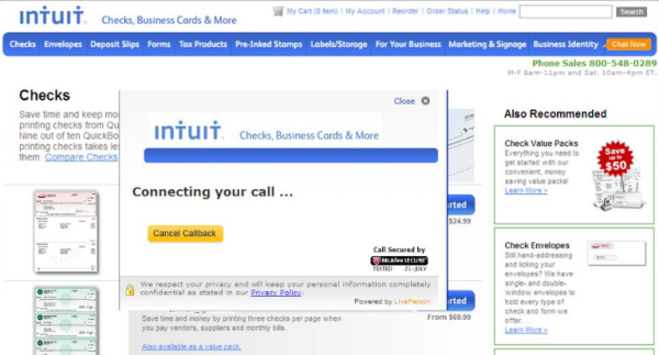
They also included it on their checks and product site:
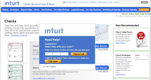

Also on their lead generation site:
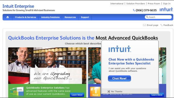
Key Findings:
Adding proactive chat in areas where visitors may have questions can increase conversion rates.
18. Redesign Your Website to See an Improvement of 21% in 30 Days
Results Achieved and Overview:
Crazy Egg decided on a website redesign and experienced an increase in conversions by 21% in 30 days. A few key areas were highlighted.
1.Allow visitors to try before buying.
2.Align the product with the audience
3.Make sure to pay attention to deal
4.Test, then learn, and never be satisfied
19. Get a 400% Conversion Rate Increase Just by Removing One Image
Results Achieved and Overview:
Bradley Spencer uses to have this huge secure image on one site:
Without the image:
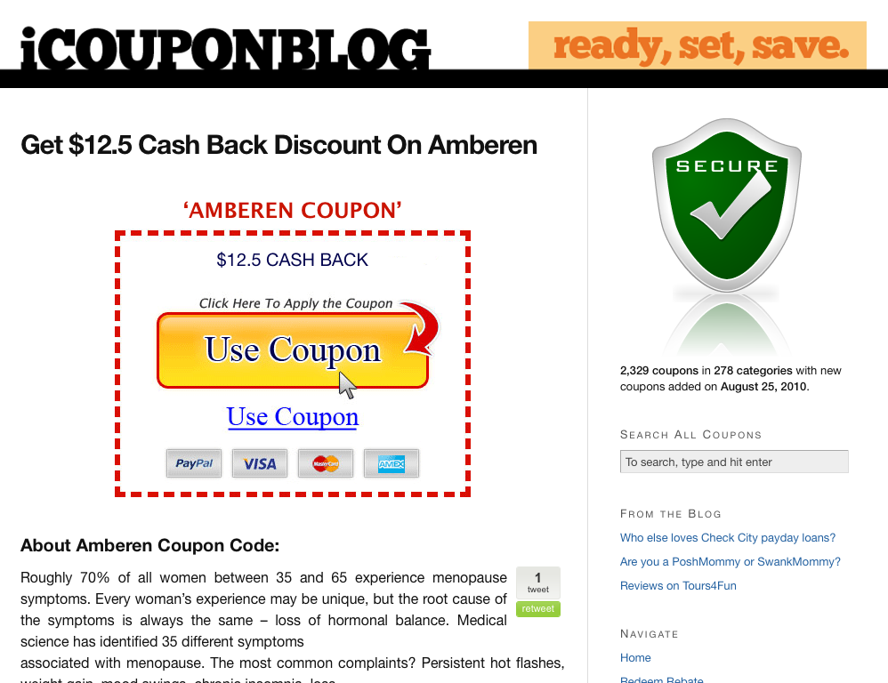
The result was astounding. A 400% increase in conversion rate over their days. 4 times more visitors clicked on the link to the coupon.
Key Findings:
Common sense tells us that adding a security badges to your site will increase conversions and 85% of the time it does just that. This is one of the very rare times that it did not. Always make sure to keep experimenting, because you will never know what works for you until you try.
20. Video Was Outperformed by Image Slider by 30%
Results Achieved and Overview:
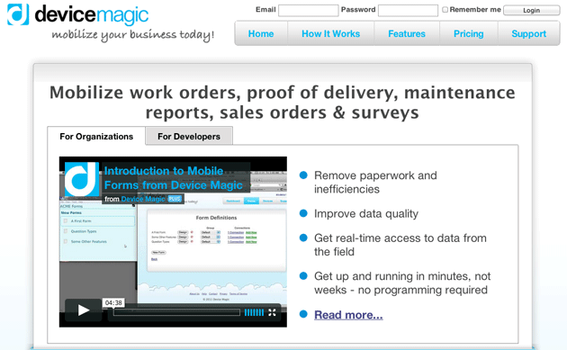
The old site with video:
The new one with image slider:
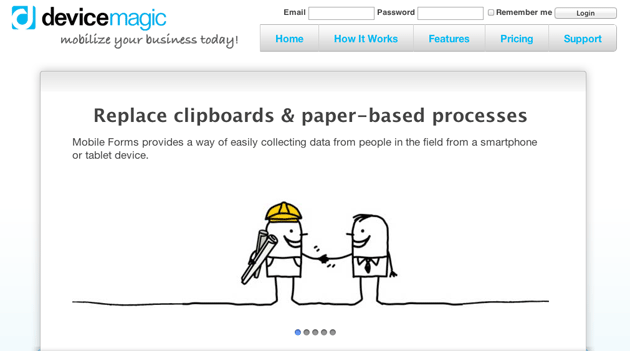
Using the image slider increase conversion rate from homepage to signup site by 35% and following signups by 31%.
Key Findings:
Websites vary a lot; therefore do not be surprised if an image slider outperforms a video. The video was too long in this case (viewers knew that they would have to sit there for at least 4 minutes) and the screen cap did not make the video look interesting enough.
FREE. All Features. FOREVER!
Try our Forever FREE account with all premium features!

