Did you know that over 5 billion people send and receive SMS messages every day?
If you are a marketer, SMS marketing can seem like a goldmine. With exponential growth in mobile usage, marketers across the globe use SMS to easily connect with prospects and existing customers.
But how do you find the contact details of different prospects? Well, an SMS popup is your answer!
SMS popups give you the chance to capture the mobile number of your target audience and connect with them in the cheapest and fastest way. You can promote your ongoing campaigns, share personalized offers or discounts, and increase your sales manifolds. Sounds interesting, right?
In this blog, we will understand what SMS popups are and how you can incorporate them into your marketing strategy. We will also share SMS popup examples that will offer all the inspiration you need to kickstart your campaign. Let’s go!
What Is an SMS Popup?
SMS Popups are an essential marketing tool with the primary function of collecting data. With engaging SMS popups, you can ask for personal details, including the visitor’s name, phone number, and permission to contact via phone. The popup tool works on your website and targets users who are already interested in your product but are still in the contemplating stage.
Once you have acquired the contact details, you can launch your SMS marketing campaigns. You can share proactive notifications, discount offers, urgent updates, upcoming events, and other information with your audience.
Now, let’s move a step further and understand the benefits of SMS popups for your business.
Benefits of Using SMS Popups
Wondering why you need SMS popups? The practice has several advantages, which are listed below:
Grow Your Text Message Marketing List
The primary function of the SMS popup is to grow your phone details list. Today, 91.54% of the world’s population is using phones for communication. Hence, companies are relying on text messages to reach a wider audience.
Increase Sales
The huge number of mobile phone users are untapped potential sales for many companies. Use SMS popups to get contact details and then target the users with special deals to get more conversions.
Higher Open Rate of Marketing Messages
SMS marketing campaigns have a higher open rate among their peers. Compared with email marketing, SMS has an open rate of 98%. Hence, it is an ideal tool to help improve sales.
Convert More of Your Website Visitors
Firstly, use SMS popups to collect users’ phone numbers. Then, use the SMS for advertising your latest products, biggest sales, and other announcements. Encourage the users to visit your website every day with an SMS, and you will turn several of your visitors into paying customers.
15+ SMS Popup Examples
Here are 15+ SMS popup examples for inspiration. Use them to create the perfect popups for your website.
1. Picreel
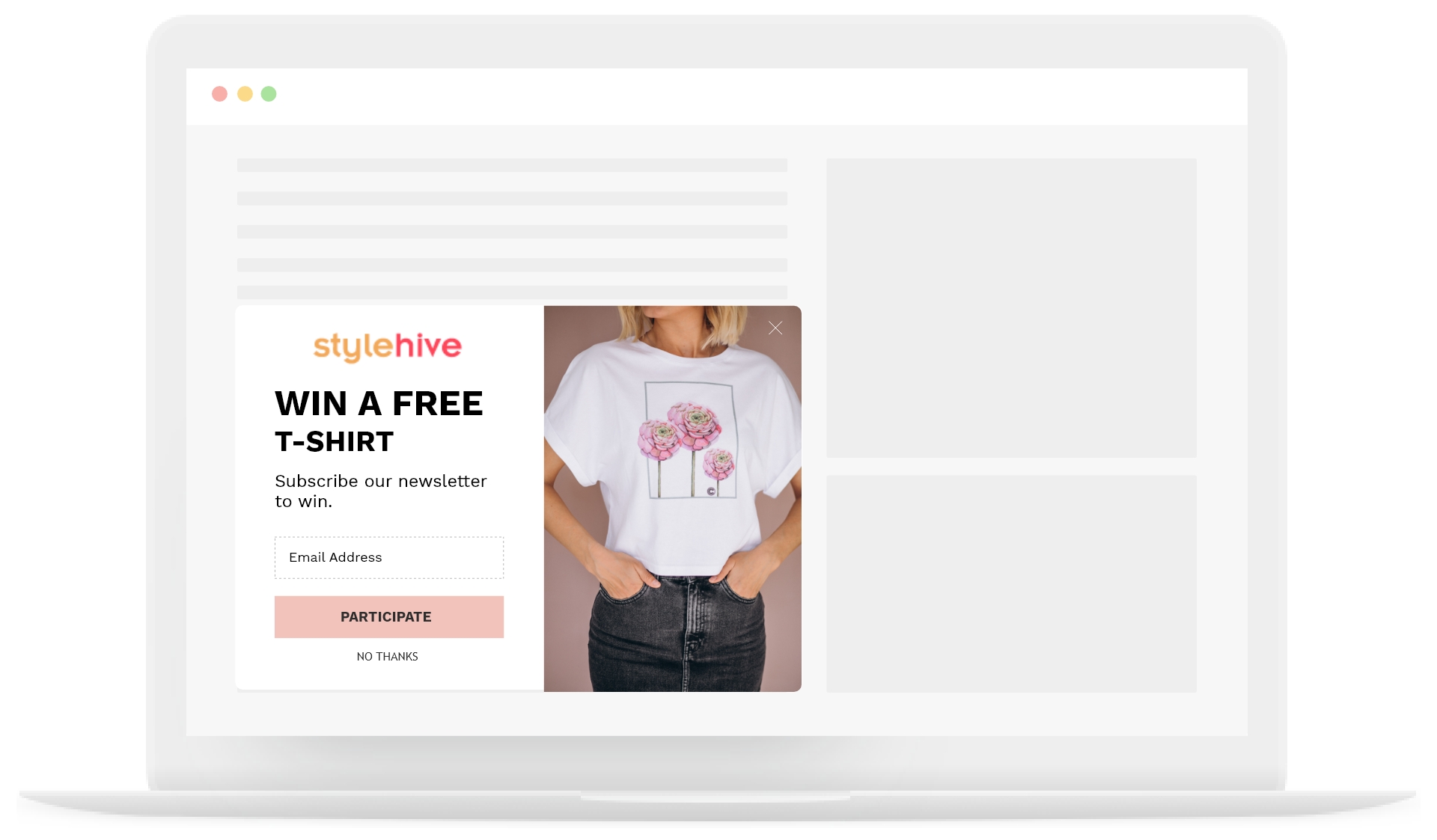
Picreel also has several phone number popups for the users. This SMS popup example shows a giveaway where the users can participate by entering their phone numbers.
The chance of getting something for free in exchange for the information is among the best ways to get users to convert. You can customize the popup with images and copies of your choice.
2. Kératase
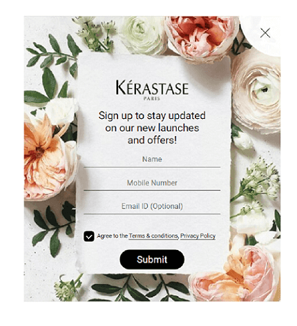
Kérastase sign-up popup is amongst some of the most feminine and beautiful popups you will find on the internet. They are a luxury haircare brand that generally targets women. Hence, they opt for the most floral background.
In this popup, they ask the users to fill in their details to stay up to date with the latest offers and launches from the brand. They have added both phone number and email address sections in the popup to give an illusion of an option. But in this SMS popup example, only the phone number is mandatory, and the email address is optional.
They have also added terms and conditions and a privacy policy link. The popup already asks the user to agree to their policies and then click on submit.
3. Uber
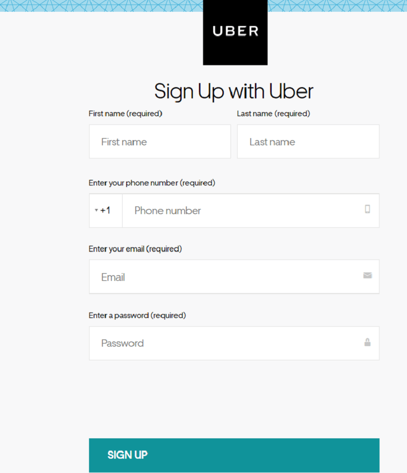
Uber sign-up popup asks for a variety of information from the user. It includes signing up with your email address, email password, mandatory phone number, and first and last name.
Uber is a service that relies heavily on conversation as people need to communicate with the drivers. Hence, they are more willing to provide their phone numbers.
Moreover, Uber is a trusted brand, which gives them leverage while asking for contact details.
As Uber caters to all genders, they have a more simplistic approach to their popup. Anything way too masculine or feminine will alienate a major chunk of their audience.
The ‘Sign Up’ part is bold with a dark blue background to attract more attention from the user.
4. Try Guys
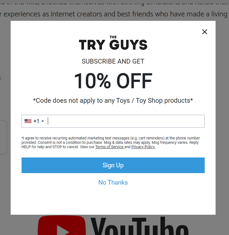
The Try Guys website uses the scroll trigger on their popups. The popup only shows up once you have scrolled through the page. As most of their audience comes from their YouTube channel, they already have a strong bond with them.
Hence, they keep their copy simple and ask you to subscribe by adding your phone number and signing up. The popup offers a 10% discount on the merchandise but mentions that the code is not applicable on Toy/Toy Shop products.
They also have the fine print asking users to comply with their ‘Terms of Service’ and ‘Privacy Policy.’
The text message popup does not have a close button, and they do have the option of clicking on ‘No Thanks’ for users to opt-out of the offer.
5. DoorDash
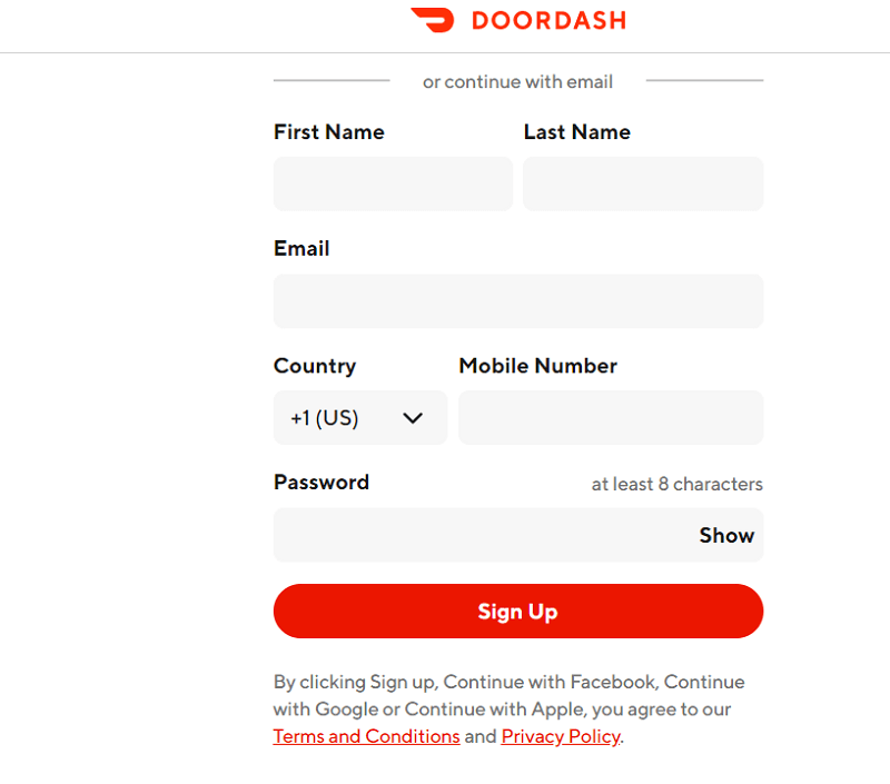
DoorDash also presents one of the website popup message examples that asks for several details. It includes sections for first name, last name, email address, phone number (with country code), and password. It is important to remember that businesses in multiple countries must provide appropriate sections for country codes.
The popup mimics the logo’s colors with white background and a red call to action button background. It also has the terms and conditions section and privacy policy section that users automatically agree to when they sign up.
6. Meshki
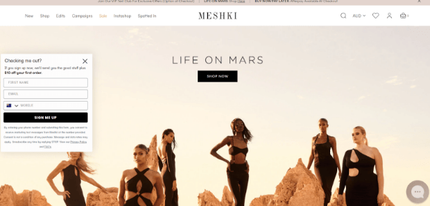
Meshki has a less intrusive popup for its users. They use their banner as the background and get a small popup to scroll in on the left-hand side. As most users follow a left-to-right reading pattern, it makes sense to place the box on the left-hand side. Firstly, the picture will grab the user’s attention, and then the user will directly land on the popup.
The popup has black and white colors. It has a simple white background with sections for first name, email, and phone number, followed by a CTA.
The popup also mentions the consent that the user is offering by signing up.
7. Mumu
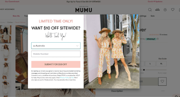
Mumu SMS popup is another prime example of the effectiveness of a short and simple message. You see two women standing on the right wearing the clothes. On the left side, you have a limited-time deal. The use of white and pink in the popup resonates with the female audience.
The popup offers a flat $10 off for people who submit their phone numbers and agree to the terms.
It is a bargain that users will find hard to ignore. Also, the copy promises to text you in a friendly manner.
The lightbox popup appears on the screen, and it has a cross button on the top right hand side. However, The cross button is transparent to avoid the user’s attention.
8. BaGallery
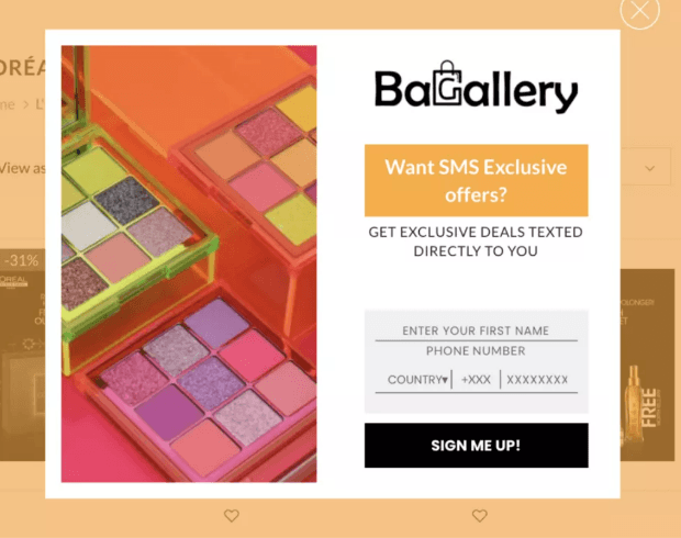
BaGallery is another female-oriented brand that uses bright colors like orange to bring users’ attention to SMS exclusive offers. The website provides users with a viable reason to give their phone number. Then, a short copy tells you what you will receive when you sign up here.
The popup asks for your first name and phone number. Minimum information requirements enable users to complete the task quickly. This popup does the same. Users can add the country code and phone number followed by CTA to register.
It is an exit-intent popup, which means that it only opens when the user is leaving the website. Asking for the phone number at exit-intent gives you a higher chance of success as the user is interested in your products and offers.
9. Fraîcheur
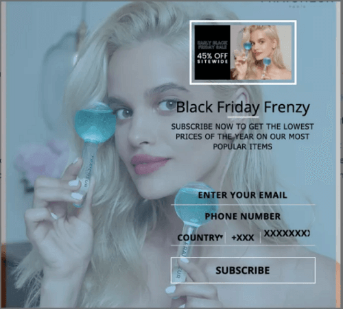
Fraîcheur popup is another amazing example of SMS overlays. In this popup, they only ask for your email address and phone number with the CTA of subscribing. In this popup, they advertise the best offers they will have in the year for the ‘Black Friday Frenzy.’
The promise of 45% off sitewide will lead many potential customers to convert. It is especially true for customers interested in the product but want a better price. The model at the back holds the product for advertisement while the content is black. The muted colors in the back allow the black and bold font to pop while still advertising the product.
10. Altamont Apparels
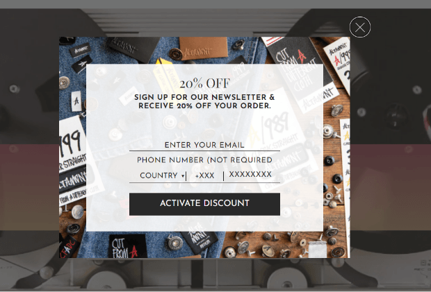
Altamont Apparel is a men’s brand that focuses on clothing. Their welcome popup asks the customers for their email address and phone number (optional) to get a 20% discount on their order. In return, they are aggregating to receive the newsletter from the company.
The background picture is filled with denim, nuts, and other more masculine objects. On top of that, there is a white background with black content for higher visibility of the copy.
Lastly, the CTA is put on a black background with white and bold content for higher visibility. The ‘Activate Discount’ CTA encourages users to provide relevant information. The popup is also aesthetically well-made.
The cross button is on the top right corner but with lower visibility to avoid notice.
11. William Sonoma
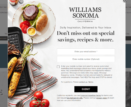
Williams Sonoma is a homeware products store. Their popup shows an image of the home lifestyle they want to portray. The copy offers daily inspirations, special savings, recipes, and more to the clients who enter their email addresses, provide their phone numbers (optional) and accept automated text messages.
The copy also has a special section for the contact us page for any queries. The ‘Submit’ button has a black background with white text to grab maximum attention. They have added a lot of fine print to adhere to the government guidelines and privacy policies for users.
12. Bebe
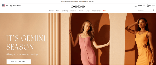
Bebe uses the nano bar to advertise their offers. It is another non-intrusive method of getting phone details from interested customers. In the nano bar, they mention that signing up with email and SMS will earn users 15% off on their purchase.
Once the users click on the nano bar, it will take them to the next page where they can fill in the details to avail the offer.
It is a short and simple popup that does not demand anything from the users. But people who are truly interested in buying things from you will actively look for offers and provide their details.
13. Wayre
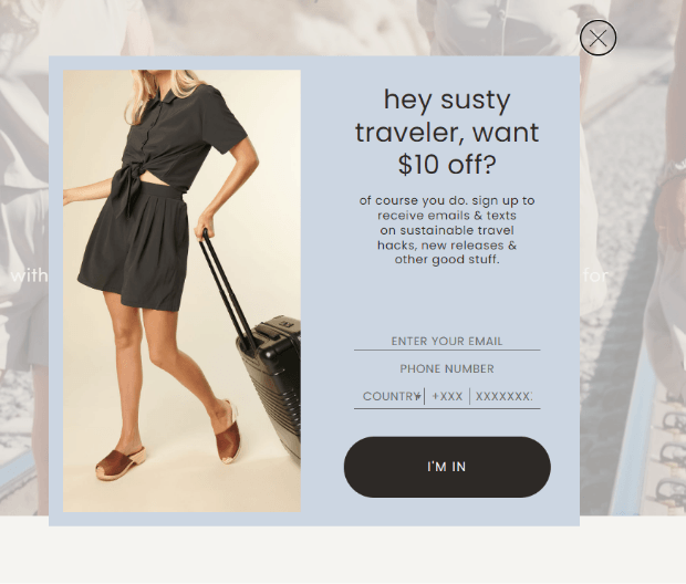
Wayre Popup uses cool tone colors to stay easy on the eyes. As a brand for women, it has an informal copy that poses a question no one wants to say no to. The trade-off is your email address and phone number with a country code for $10 off your purchase. Moreover, the copy offers users sustainable travel hacks, new releases, and other good things in the inbox.
The call to action comes with a black background with white text for more visibility. The image of a woman with a travel bag alludes to a touristy lifestyle.
14. Judy
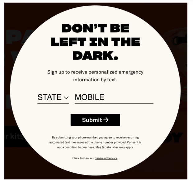
Judy offers safety products in case of disaster. Their popup has a short copy that asks for your personal contact details to provide personalized emergency information by text. The popup uses contrasting colors with black text to highlight all the information.
The CTA button again uses the black box with white text for better visibility. They have a better chance of getting the details and using the information to send them promotional content.
15. Miss A
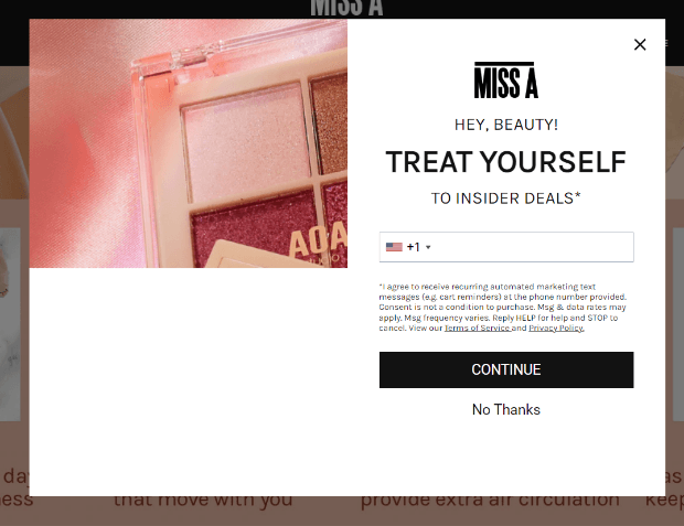
Miss A welcome popup offers insider deals to users who provide their phone details. It also asks the user’s permission to send automated marketing text. The image on the side shows the products on the website. It also has a ‘No Thanks’ button for people who want to opt-out of the offer.
The white and pink theme of the popup is very feminine. As the store mainly caters to women, the color scheme is ideal.
Also, the CTA has a black background to ensure that the user can easily see it.
16. Digital Marketing Institute
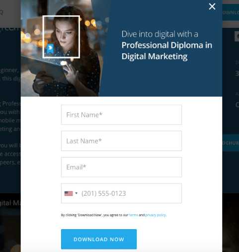
Digital Marketing Institute offers a professional diploma in digital marketing. You need to provide your first name, last name, email address, and phone number to download the content. Once you fill in the information, you can download the course material to read.
The small image shown on the top caters to the users’ expectations from the course. Moreover, they have a short copy on a blue background with white text.
The form has a white background, black text, and links to the privacy and terms page.
How Can Picreel Help You to Create an SMS Popup?
Creating website popups is relatively easy if you have the right tool for them. For people who are new to the world of popups, you can get Picreel. It will help create amazing overlays and utilize smart triggers to get more conversions.
Before we begin learning how to create SMS popups, you first need to connect your website with Picreel.
Here are the steps to create effective SMS popups for people who already have everything set up.
Step 1: Get Started with the New Campaign
Firstly, log in to your Picreel account. After signing up, you will land on the dashboard. It is essentially a statistics page that carries all the information related to your campaigns.
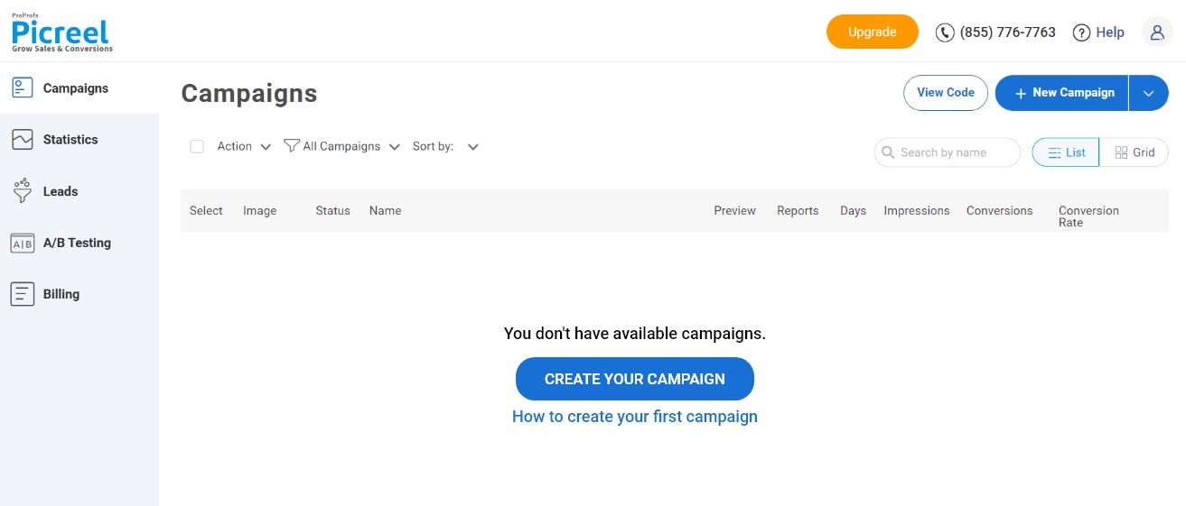
Now, go to the ‘Get Started‘ section for new users. Existing users can go to the campaign section and click on ‘+New Campaign.’
Step 2: Select your overlay
Picreel offers a range of templates for your campaign. So, you can either search for the popup design of your choice or create an overlay from scratch.
If you are creating your first popup, using a template will make things easier. However, you can build your overlay from scratch if you want to pick a more creative route.
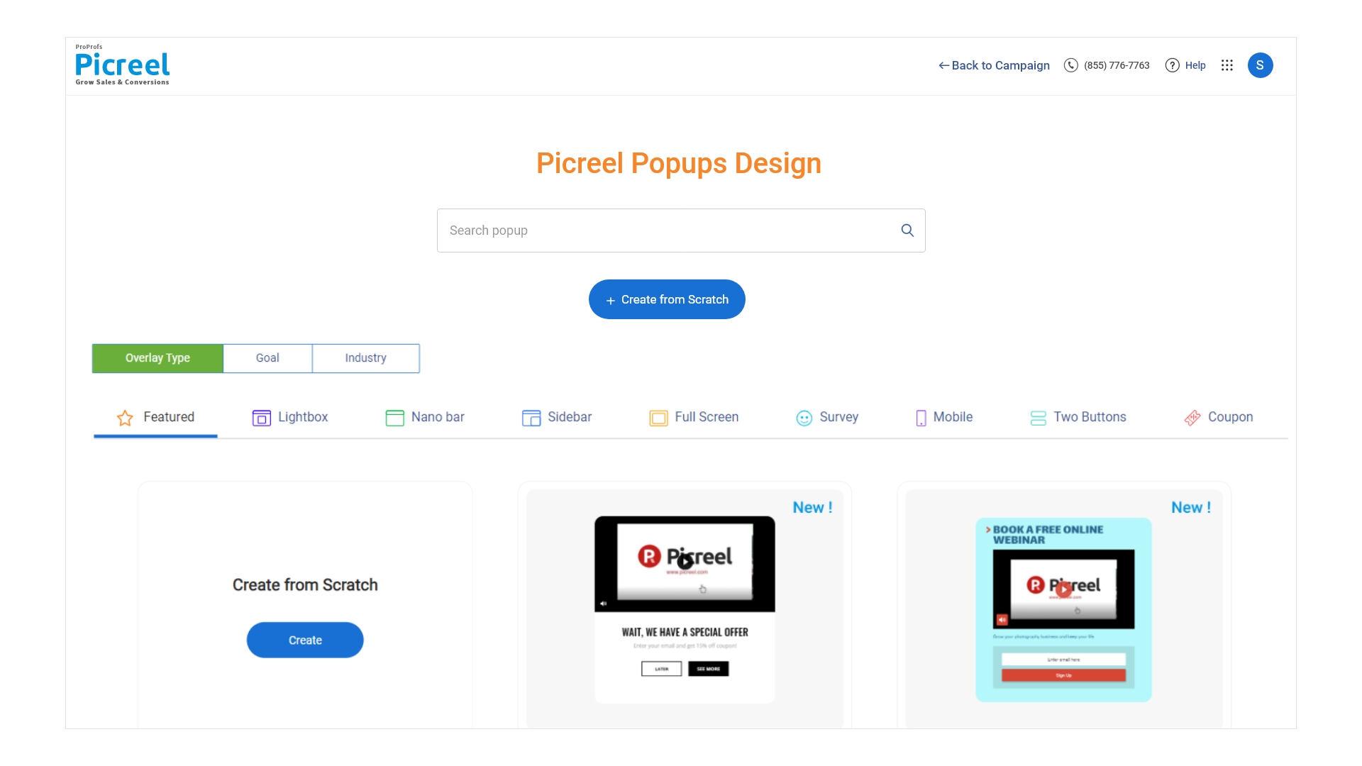
Here, the overlays are divided into three sections, namely overlay type, goal, and industry. Choose ‘Goal‘ and select ‘Collect Phone‘ for the most relevant popups.
Hover over the popup you like, and select the customize option.
Step 3: Let The Editing Begin
After the selection, Picreel will take you to the edit design page. Use the various features of the in-built editor to create a popup that matches your website aesthetics.
Here you have full freedom to let your creativity shine.
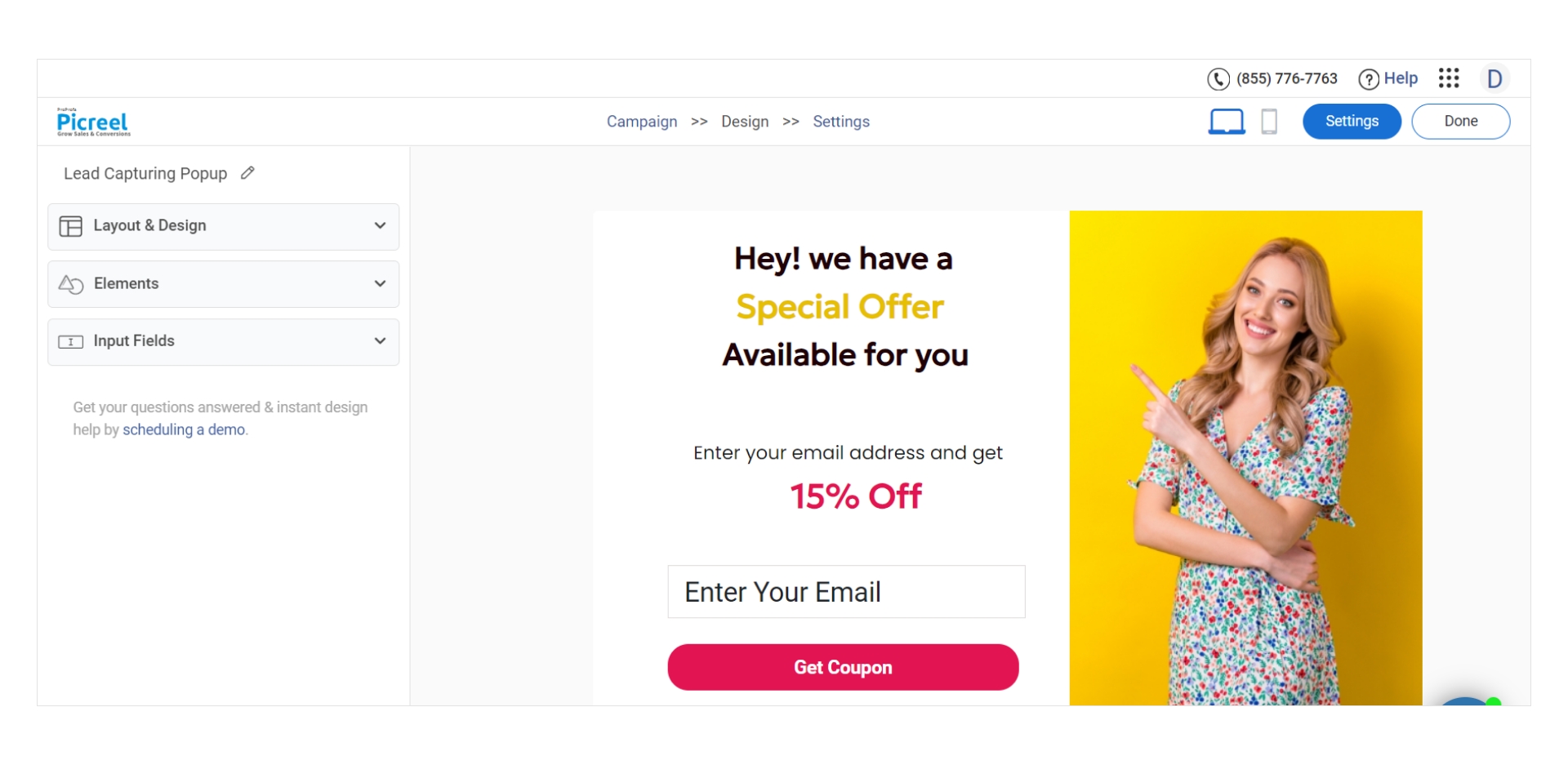
The main elements of your SMS popups are:
- The copy.
- Popup section to fill phone numbers.
- The call-to-action button that users want to press.
Once you have prepared the overlay, click on ‘Save.’
Step 4: Set the Right Triggers
Afterward, Picreel will take you to the page for setting up triggers, adding URLs, and other popup settings. Select the options most appropriate for the campaign, and then select ‘Save.’
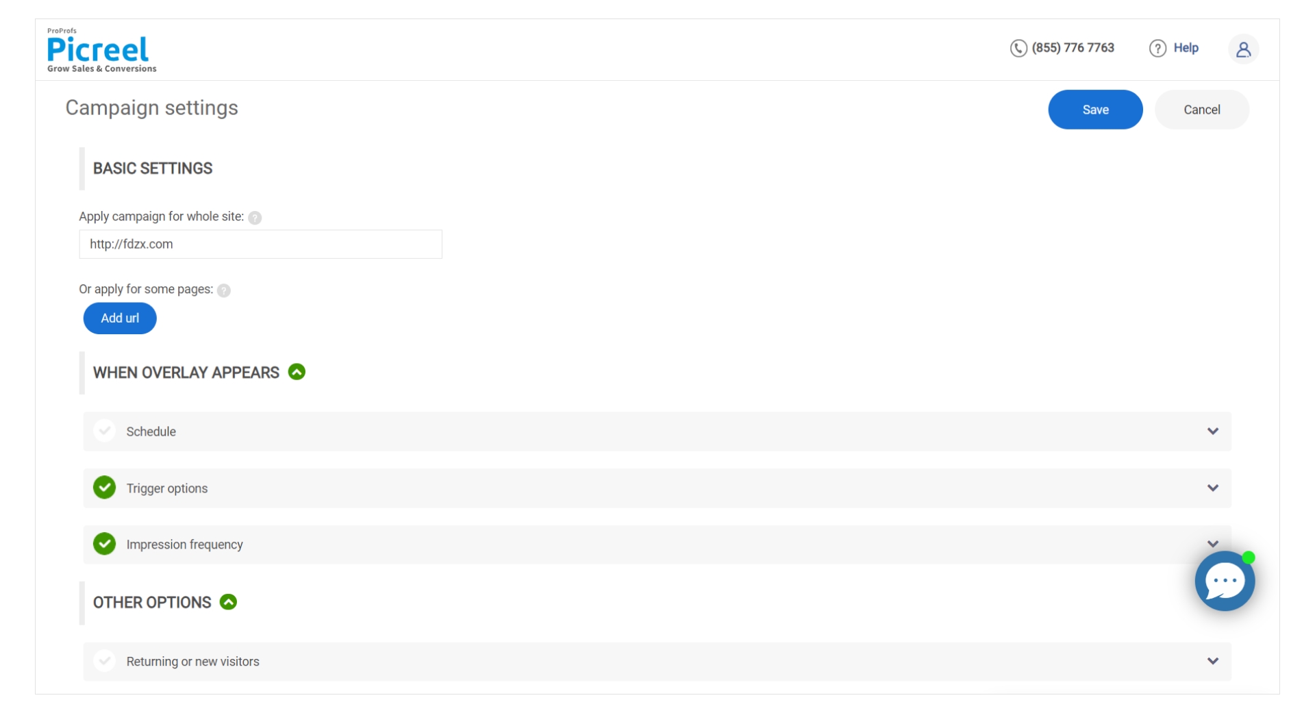
You have set up the campaign after this stage.
Step 5: Add Code Snippet
For the first campaign, you will have to copy the snippet code and paste it onto the website as per instructions.
For existing users, go to the ‘Campaigns‘ page and click ‘View Code‘ to copy and paste the content.

The popup will start showing on your website as per the targeting settings.
Step 6: Integrate the Appropriate tools
While Picreel will help you collect users’ phone numbers data, it cannot send phone messages. You need to integrate the SMS marketing apps that automate SMS campaigns once you have the phone numbers.
Find your tool in the integration list and follow the instructions to automate your SMS campaigns.
FREE. All Features. FOREVER!
Try our Forever FREE account with all premium features!
Bring More Sales With SMS Marketing!
SMS marketing has the potential to engage several more customers for your brand. However, people are more willing to provide their email addresses than their phone numbers. With the right SMS popups, loaded with undeniable deals, you can get the mobile contact details of your users.
Use Picreel to create and test various types of SMS popups. Increase your contact list and get customers to come back with irresistible offers.
 Tips
Tips
We’d love to hear your tips & suggestions on this article!
FREE. All Features. FOREVER!
Try our Forever FREE account with all premium features!

 We'd love your feedback!
 Thanks for your feedback!


