Have you ever walked into a store to buy the perfect gift, only to walk out bewildered and overwhelmed? The scenario is the same, more frequent even, for most online emporiums. With a voluminous catalog full of products and buyers only having themselves to rely on for making a choice, it is quite common to see a lot of confusion and no conversion being made at all. Here’s exactly where product recommendations come in.
As is evident from the name, product recommendations are part of the myriad of personalization strategies most eCommerce stores adopt, wherein the products are dynamically formatted and displayed to a user according to their customer attributes, browsing behavior, or the context of their visit.
Simply put, it’s a product suggestion strategy by which you narrow down the choices for your customers by pushing products they are more likely to buy to the forefront of their vision.
This article will discuss 15 tried and tested product recommendation strategies and examples in depth.
Let’s dive in!
Product Recommendations Benefits
A product recommendation algorithm can help shoppers hone in on products that might interest them, even if those aren’t what they originally intended to buy. By showing relevant items to your users, you widen the scope of enticing mere browsers into paying customers and extend your retail goals beyond the usual.
These recommendations can be as simple as a product tray titled “Similar Products” to more complex, personalized displays based on data gathered by carefully observing each customer’s browsing patterns, demography, situational context, and more.
In fact, in a survey, 22% of the total respondents stated they would shop much more frequently from stores that regularly showed intelligent recommendations.
Put more succinctly, the benefits of product recommendations can be chalked down to —
- Increased conversions
- Higher average order amount
- A loyal customer base
- Boosted revenue growth
How Do Product Recommendations Work?
Basic product recommendations work simply by learning the buyer trends associated with a particular product and pushing the related purchases into subsequent users’ feeds. While the basic implementation of this tactic is easy and, thus, more commonly adopted by brands, the real challenge comes in when you have to personalize the recommendations.
Delayed data processing, poor visibility in decision-making, limitations in analyzing complex data sets, and the inability to push the proposed products to customers at all touch points are the common deterrents that businesses face in the way of posting yieldable recommendations.
The task gets easier with the deployment of advanced machine learning models that can grab real-time behavioral context from all channels and use it to make informed recommendations at the right moment.
Top Product Recommendation Examples & Tactics
The types of product recommendation tactics you adopt will depend on your business, intended customers, compatibility with your brand image, and effectiveness. But irrespective of what you are selling, given below are some of the peak-performing strategies along with their examples that you can follow to sell faster.
Show Similar Products
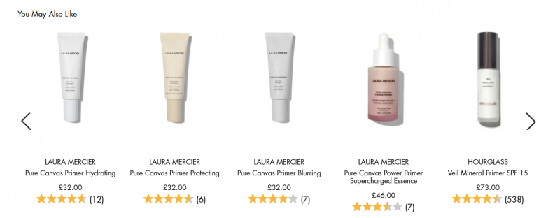
This product recommendation strategy suggests products similar to the product being searched for or the product currently displayed on the page. The similarity is determined by the contents of product details, such as name, composition, description, and tags. You can use an overlay popup to show the recommendations in an even more eye-catching manner.
Example: The product recommendation page from Space NK.
Why Does This Work?
- The displayed products are closely related to the original product with additive effects and thus increase the chances of enticing somebody looking for the complete set.
- This tactic immediately displays relevant items based on the product information alone, without requiring manual tagging or customer behavioral data.
Push Your Bestsellers
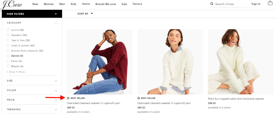
As one of the simplest and most effective product recommendation strategies, this requires no advanced tracking or sophisticated tools to execute — all you need to do is keep track of your most popular products and highlight them in all the prominent locations of related product pages repeatedly. An exit-intent popup with your bestselling products would help you revert leaving visitors splendidly, as they show up just when your visitors navigate to the exit or “close tab” button.
Example: A display of the bestsellers in a particular apparel category on J. CRew’s webpage.
Why does this work?
- The page entices users by showing relevant products carrying the tag “Best Seller” as a testament to their popularity.
- It plays into the susceptibility of customers to social proof by establishing the products most in vogue.
Display Products on Your Homepage
Your homepage is the first page visitors land on when coming to your website, making it one of the most significant places to pitch your products. The items you exhibit here will set the bar for what your customers expect you to sell.
Example: Bailly’s “Featured Collection” panel.
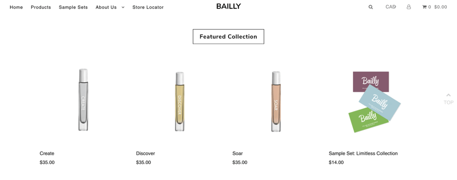
Image Source: Bailly
Why does this work?
- A section dedicated to selected items is added on the homepage that’s bound to catch more eyes.
- The most profitable products are displayed singly as well as in a set to broaden the scope of conversion further.
Exhibit New Arrivals
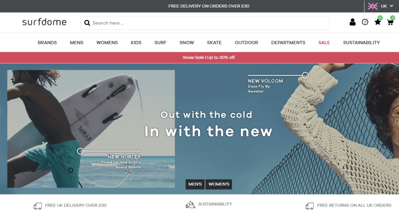
Use this product recommendation tactic to suggest the latest products in your store. These can be generic new launches or personalized suggestions based on the customer’s preferences. Apart from displaying the items on the homepage, they can also be pushed through emails, newsletters, targeted ads, and popups — especially if you use one that drops down just as a visitor enters your website to grab their attention right away.
Example: Surfdome’s announcement of a new arrival on their homepage.
Why does this work?
- It caters to the customers’ built-in expectations of newer being better, always!
- Recommending a new product builds a sense of excitement, and piqued curiosity tends to positively impact conversion.
Recommend “Frequently Searched” & “Previously Purchased ” Products
This product recommendation strategy proffers products in your online store that your customer has browsed through already or bought a closely related item in the past. These personalized recommendations work particularly well because they reinforce previously purchased products or products they have shown an interest in but didn’t cart yet. You can garner this data by analyzing user heatmaps and creating a popup accordingly to suggest products that are more likely to appeal to your visitors.
Example: A snippet from Bear & Bear featuring recommendations based on a customer’s buying history.
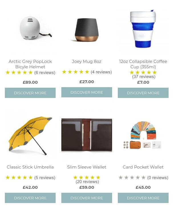
Image Source: Bear & Bear
Why does this work?
- The product recommendations are a continuation of what the user already looked for or bought.
- The “mix and match” approach works great in the research stage of a customer’s journey as it splits the purchase decision into multiple directions, all equally explorable.
Use Tailored Recommendations
Recommendations that are personalized based on customer history are incredibly effective. They consider your customers’ browsing and purchase history to recommend relevant products tailored to their needs and taste. This adds credence to your website as a reliable source where your users can purchase a variety of products, as well as serves the purpose of nudging them into buying things that may go beyond the items they initially intended to add.
Example: Personalized recommendations on the webpage of Sephora.

Image Source: Sephora
Why does this work?
- The section displays a plethora of products in one place, reducing research time for customers by much.
- The recommendations, while seemingly unrelated, are personalized after carefully considering what may interest a particular buyer, thus boosting the chances of conversion considerably.
Promote Daily Deals & Discounts
A study shows that about 64% of online buyers wait to make a purchase until a deal or a discount on the product they seek to buy is announced. With everybody looking to save money on their purchases, it’s a no-brainer that these offers will attract more visitors than usual to your page. Displaying discounted items or limited deals through popups makes the information prominent on your website and saves your users the trouble of having to track these down themselves, thereby increasing direct traffic and customer retention.
Example: Lululemon’s display of discounted items for Black Friday.
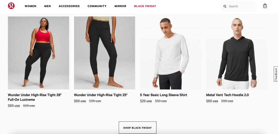
Image Source: Lululemon
Why does this work?
- The section shows a selection of apparel at discounted prices where it’d be clearly visible to the shopper.
- It highlights a complete set for a particular event with all the products being sold at a price that is lower than usual, motivating buyers even further to purchase before the offer is over.
Showcase Your Best Reviewed Products
As social beings, our tendency to rely on people’s opinions of a particular product before investing in it is pretty much hardwired. You can use products evaluated by other customers to persuade new visitors to make a purchase. This is specifically because shoppers trust reviews from other buyers more than they trust product descriptions.
Example: Avon’s display of products with user ratings and number of reviews included.

Image Source: Avon
Why does this work?
- The products all come with user ratings and the total number of reviews to instill confidence in a new buyer.
- The ratings are not suspiciously uniform for all the items and have been curated carefully to make the ratings appear credible.
Create Exclusivity with Selected Picks
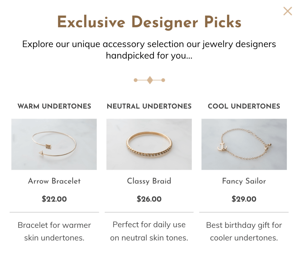
For customers who are further down the sales funnel, displaying handpicked recommendations can make them feel special as insiders, enticing your customers to convert. Exclusive picks can come in many forms — editor’s picks, staff favorites, expert recommendations, and so on. This strategy adds another form of social proof and adds credibility to your brand. One of the most effective ways to accomplish this is displaying the products through various types of popups, as they are more prone to grabbing eyeballs immediately.
Example: A popup displaying a jewelry store’s exclusive products to return visitors.
Why does this work?
- The set uses exclusivity as a persuasion tool to convince visitors and creates a sense of belonging in individual visitors while still keeping the variety intact.
- The products are personalized to an extent as they cater to all skin tones, making the collection inclusive and attractive to everyone.
Generate a Sense of Scarcity
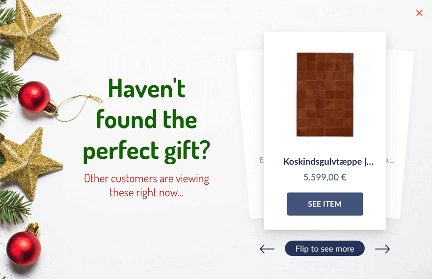
A largely popular item is more likely to be sold out faster, and establishing your product’s limited availability, either in terms of stock or time, assigns an additional value to it. This tactic also inadvertently designates a social proof of the product in question without you having to show reviews or ratings. You can combine this principle of scarcity along with social proof to imply your product is about to sell out soon without sounding too pushy and enhance the urgency further with popups that show the live count of the current viewers.
Example: A popup displaying holiday-themed, popular gift choices.
Why does this work?
- The popup recommends products based on how many people have viewed them recently, which works both as a peer-trusted, popular suggestion as well as an implicit reminder of its popularity and, by extension, a possible scarcity.
- It increases the time-sensitivity of the activity further with a gentle nudge without being too salesy.
Instill Urgency with Limited-Time Offers
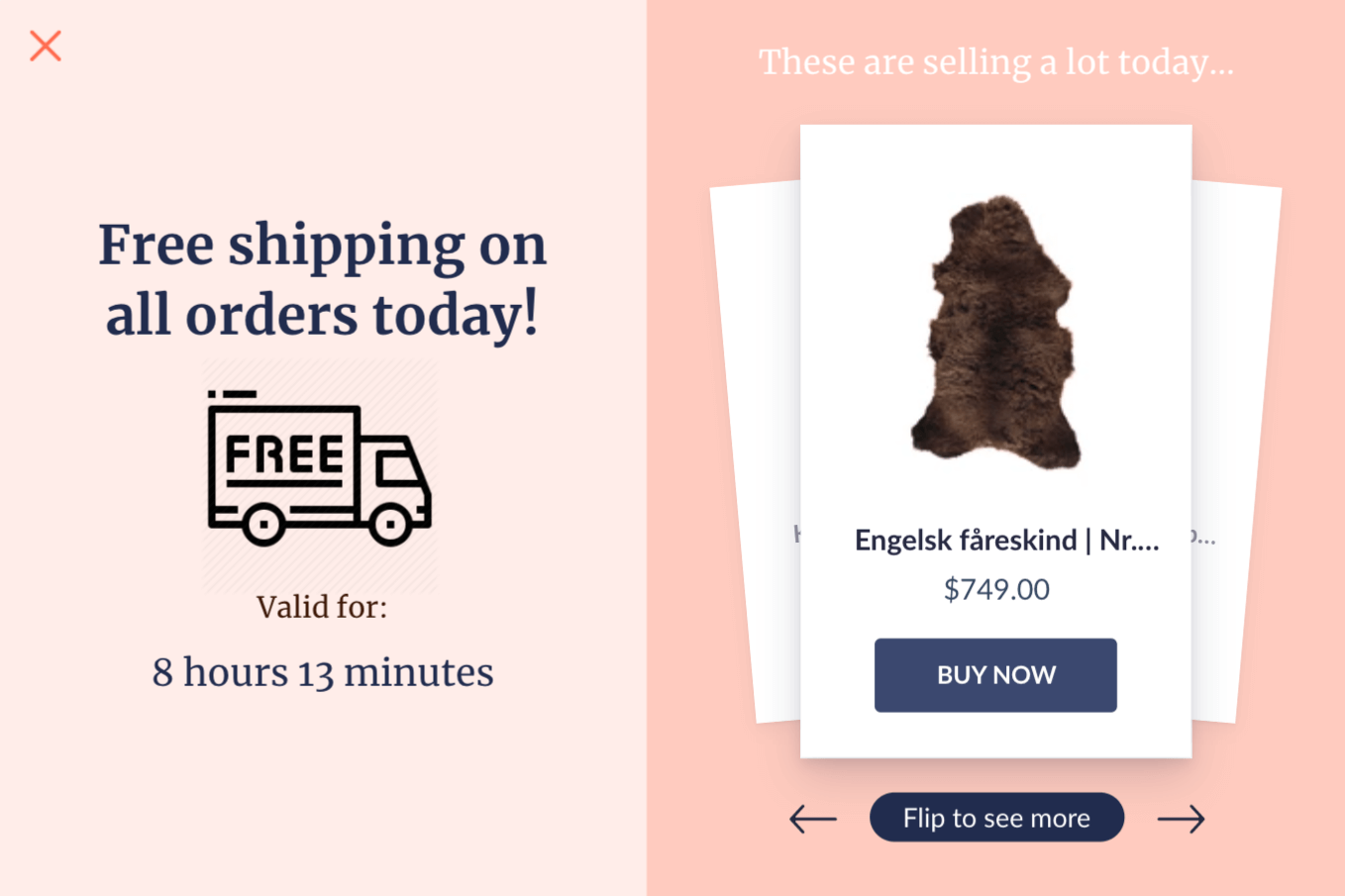
This strategy follows a similar logic to the one we discussed above, with the slight difference of focusing more on time than product popularity. Sometimes, an offer isn’t enough to get your visitors to convert, you need to create an additional push by displaying its fleeting availability, and one of the most compelling ways of doing that is by creating timed popups that show when the offer ends. As a further perk, this also keeps your recommendations fresh and relevant.
Example: A popup that shows a timed offer and popular products simultaneously.
Why does this work?
- The ad shows the best-selling products of the day and adds an incentive to them with the offer.
- It drives a sense of urgency using a straightforward approach without overwhelming the visitors with too many options.
Cross-Sell During Checkout
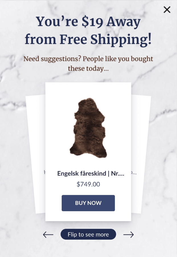
Acquiring new customers and pushing them all the way down the funnel is tough; a wiser idea would be to make the most out of customers that are already at the conversion stage, i.e., about to check out a product. This is the perfect opportunity to cross-sell higher-value orders with incentives like discounts, free shipping, and more. Use an overlay popup that displays what your customers gain by adding more items to their cart to see immediate results from the strategy.
Example: A popup showing the required basket value to get the products shipped for free.
Why does this work?
- It offers one of the most attractive incentives — free shipping — to the buyers in lieu of a seemingly minimal increment of the cart value.
- The ad tactfully inserts product suggestions based on popularity to nudge the users further into buying items the seller desires.
Recommend Better Products to Leaving Customers
Cart abandonment may occur due to a plethora of reasons, one of them simply being your visitors not finding what they were looking for. While strategies like email marketing and website popups may work fine for on-the-fence users, things get a little different when it comes to users belonging to the former category. In such cases, a simple exit-intent sensing popup displaying relevant and possibly better recommendations can get your customers to turn back and reconsider.
Example: A popup from Forever21 displaying products based on the user’s chosen category.
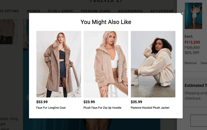
Image Source: Forever21
Why does this work?
- The popup recommends highly relevant products in different price categories, removing the barrier of pricing considerably.
- The layout offers an immediate variety that increases the chance a customer will be attracted to any of these and convert.
Add Low-Value Accessories & Related Products
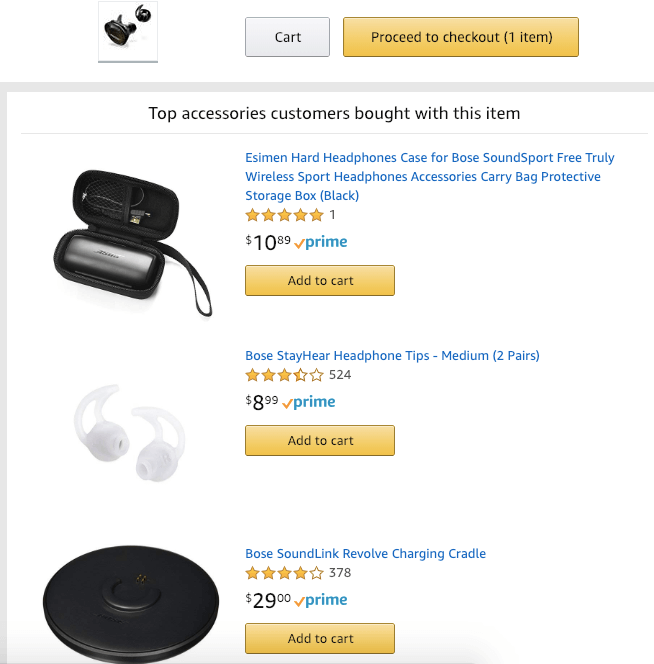
Recommending similar products on the cart page when the customers have already decided what to buy is counterintuitive. However, it’s worth promoting low-value products that are relevant as accessories and add-ons. For most people who have already invested in a high-value purchase, it is unlikely that they will invest again in a similar-value product, but a lower-priced accessory is often lucrative enough if presented as a part of the whole package.
Example: Amazon displaying the top accessories related to the product.
Why does this work?
- The recommended products are less expensive than the original purchase and appeal as worthy additions.
- The added products are relevant in a way that makes the purchased item incomplete without them.
Utilize Dead End Pages
Turn a 404 page into a viable product recommendation strategy by using the space to display relevant items. This effectively minimizes the frustration arising from the virtual equivalent of hitting a blank wall and turns the experience into one of discovery instead. You can utilize these pages through popups that drop as soon as a broken or expired link is reached and immediately reverts your customers back to sections where making a conversion seems the most possible.
Example: FastLane’s use of a dead link to promote their bestselling products.
Why does it work?
- The popup uses product links to redirect viewers to functional pages.
- It pushes various products that the viewers can choose from through a space that would otherwise be a waste and possibly induce annoyance.
Picreel – The Perfect Product Recommendation Tool to Grow Your Sales
As an eCommerce store owner, if you aren’t placing your best recommendations to your visitors, you are leaving a lot of cash on the table. While there are innumerable ways to accomplish this task, a product recommendation tool minimizes the effort and makes the process way simpler than it would be if it were to be done manually.
As most recommendation strategies rely on displaying your products in a lucrative manner to your audience, popup tools like Picreel is your best bet.
Listed below are all the reasons you should consider Picreel as the perfect partner to recommend the right products to the right visitors.
- With a huge library of 100+ templates that you can customize according to your will, Picreel makes for a versatile option to gather valuable data such as gender, location, purchase intent, and preferred product categories to help you select the best range of products for your users
- The tool may be used in multiple popup formats to display what you have in store at various points of the customer journey
- It has a stellar exit-intent technology that senses when a user is about to leave and can help revert them back with attractive items, discounts, offers, and more
- Picreel popup builder helps you target the right set of visitors owing to its audience segmentation feature and lets you decide the best strategies with an advanced A/B testing module — all without requiring any complicated coding inputs
FREE. All Features. FOREVER!
Try our Forever FREE account with all premium features!
Ready to Get Started with the Best Product Recommendation Strategies?
The process of product recommendation is fairly simple, to begin with. With the right tools and strategies in place, you can completely transform how your customers interact with your website, boost conversions, attract long-term subscribers, and increase your order value for each purchase. Having discussed the most profitable strategies for product suggestions in this blog, we are certain that you are now equipped with a solid understanding of how to go on about it. If you need further assistance, we are always ready to help!
 Tips
Tips
We’d love to hear your tips & suggestions on this article!
FREE. All Features. FOREVER!
Try our Forever FREE account with all premium features!

 We'd love your feedback!
 Thanks for your feedback!


