Have you ever been browsing a website, minding your own business, when suddenly a notification pops up on your screen, demanding your attention?
It might have been annoying at first, but then you read it and realized it was actually something you were interested in. That, my friend, is the magic of popup notifications.
Popup notifications have become a popular marketing tool for businesses looking to capture their audience’s attention and drive conversions. Whether you’re promoting anew product, offering a discount, or simply reminding visitors to subscribe to your newsletter, a well-crafted popup notification can be a game-changer for your marketing campaign.
But with so many websites using popup notifications, how do you make yours stand out?
Well, that’s where we come in.
In this blog, we’ll be sharing some inspiring popup notification examples to help you take your next campaign to the next level. From coupon codes to video popups, these examples will show you how to use popup notifications to engage your audience and achieve your marketing goals.
So, if you’re ready to take your popup game to the next level, let’s dive in!
What Is Popup Notification?
Popup notifications are those small, attention-grabbing messages that suddenly appear on your screen while you’re browsing a website or using an app.
You know, those little boxes that might say things like “Subscribe to our newsletter!” or “Get 10% off your first purchase!”
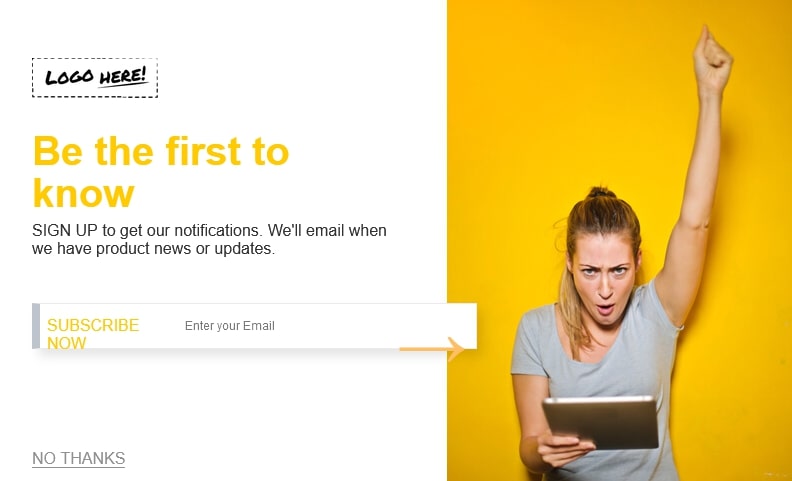
At first, they might seem like an annoying interruption to what you’re doing, but they’re actually a pretty effective marketing tool. Popup notifications are designed to capture your attention and encourage you to take a specific action, like signing up for a service or making a purchase.
What’s great about popup notifications is that they’re hard to ignore.
Unlike an email that might get lost in your inbox, a popup notification demands your attention right then and there. And if the message is crafted well, it can be a powerful way to drive conversions and achieve your marketing goals.
Of course, there’s a fine line between an effective popup notification and a frustrating one. Nobody wants to be bombarded with irrelevant or intrusive messages while they’re trying to browse a website. That’s why it’s important to create popup notifications that are creative, engaging, and offer real value to the user.
8 Best Popup Notification Examples to Increase Conversion
There are tons of popup message examples out there that you can use. Here are 8 of the best ones:
1. Coupon Code Popup
Ah, the coupon code popup – a classic and effective pop up alert to drive conversions and boost sales. If you’re looking for a way to get visitors to make a purchase on your website, a well-crafted coupon code popup can be a game-changer.
So, what makes a great coupon code pop up alert?
First, it has to be eye-catching and attention-grabbing. You want to make sure it stands out from the rest of your website and immediately catches the visitor’s eye. Second, it has to offer real value. Nobody is going to bother entering a coupon code if it’s not worth their time.
One great example of a coupon code popup is from the clothing brand, Everlane. When you first visit their website, you’re greeted with a popup that says “Get 10% off.” The message is simple and to the point, and the “Unlock 10% off” button stands out nicely against the white background.
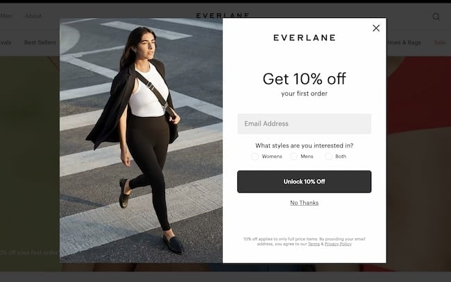
But what really makes this popup effective is the timing. Everlane waits until you’ve been on their site for a few seconds before displaying the popup, so you have a chance to browse their products and get interested before being presented with an offer.
2. Product Recommendation Popup
When it comes to increasing conversions on your website, one of the most effective strategies is to personalize the user experience.
That’s where product recommendation popup announcements come in.
By offering visitors personalized suggestions based on their browsing history or preferences, you can increase the likelihood that they’ll make a purchase.
One great example of a product recommendations popup announcement is from the online retailer Amazon. When you visit their site and start browsing for products, you’ll notice that they start making suggestions for you based on your search history and purchase history.
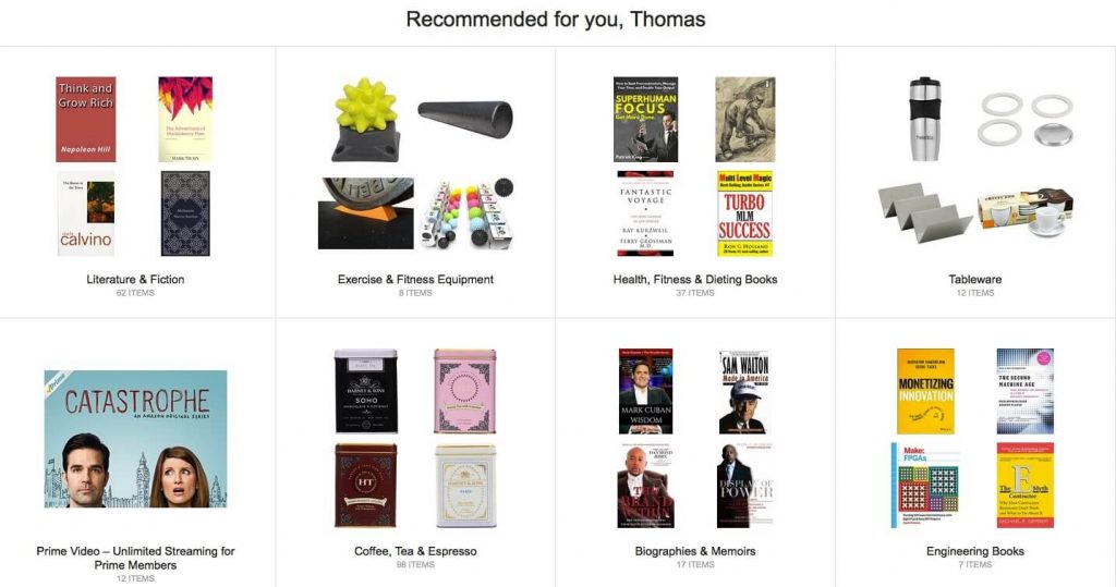
They use a combination of popups and other on-page messaging to promote these suggestions, making it easy for you to discover new products you might be interested in.
What makes these product recommendation popups so effective is that they’re personalized, relevant, and timely.
By showing visitors products that they’re likely to be interested in, you’re increasing the likelihood that they’ll make a purchase. And by using popups to display these recommendations, you’re making it easy for visitors to take action right away.
3. Exit Intent Popup
Have you ever been browsing a website, ready to leave, when suddenly a popup appears, offering you a special deal or discount if you stay?
That’s an exit intent popup, and it’s one of the most effective ways to increase conversions and keep visitors on your site.
The idea behind an exit intent popup is simple – when a visitor shows signs that they’re about to leave your site, such as moving their mouse towards the “back” button or closing the tab, a popup appears with a message that encourages them to stay.
This message could be a discount, a special offer, or just a friendly reminder of why your site is worth sticking around for.
One great example of an exit intent popup is from the online retailer J.Crew. When you’re about to leave their site, a popup appears with a message that says, “Sign up for J.Crew Passport and get an extra 15% off.”
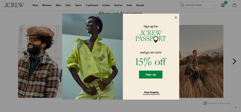
The message is timed just right, appearing right when you’re about to leave, and the clear call-to-action encourages visitors to stay and make a purchase.
What makes exit intent popups so effective is that they’re timely and personalized. By showing visitors a message just as they’re about to leave, you’re catching their attention at a crucial moment.
4. Special Offer Popup
If you’re looking to increase conversions on your website, one of the best ways to do it is by using a special offer popup.
These popups offer visitors a special deal or discount, encouraging them to make a purchase or take some other action.
One great pop up message example of a special offer popup is from the online retailer Zappos. When you first arrive on their site, a popup appears that offers you $25 off your first purchase of $50 or more. The message is clear, the offer is compelling, and the bright orange color makes it hard to miss.
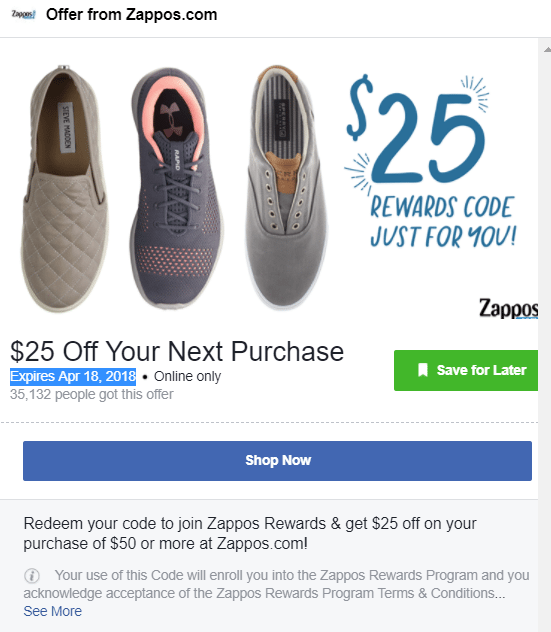
What makes special offer popups so effective is that they give visitors a reason to take action right away.
By offering a discount or special deal, you’re creating a sense of urgency that can be hard to resist. And by using popups to display these offers, you’re making it easy for visitors to take advantage of them.
5. Nanobar Popups
Have you ever heard of a nano bar popup?
If not, you’re missing out on a powerful tool for increasing conversions on your website.
A nano bar popup is a small, unobtrusive bar that appears at the top or bottom of a web page. It’s typically used to display a message or offer without interrupting the user’s experience. For example, you might use a nano bar popup to offer a discount or promote a new product without getting in the way of the user’s browsing.
One great example of a nano bar popup is from the online furniture retailer Wayfair. As you browse their site, a small bar appears at the top of the page, offering a 70% discount and free shipping on orders over a certain amount.
![]()
The message is timed just right, appearing when you’re already interested in their products, and the small size of the bar keeps it from being too intrusive.
What makes nano bar popups so effective is that they’re subtle and unobtrusive. By displaying a small bar at the top or bottom of the page, you’re giving visitors a clear message or offer without interrupting their browsing experience.
6. Full-Screen Popup
If you’re looking to make a big impact with your popup alerts, a full-screen popup might be just what you need. These popups cover the entire screen, making it impossible for visitors to ignore your message or offer.
One great example of a full-screen popup is from the online clothing retailer ModCloth. When you first arrive on their site, a full-screen popup appears that offers you 15% off your first purchase if you sign up for their email list.
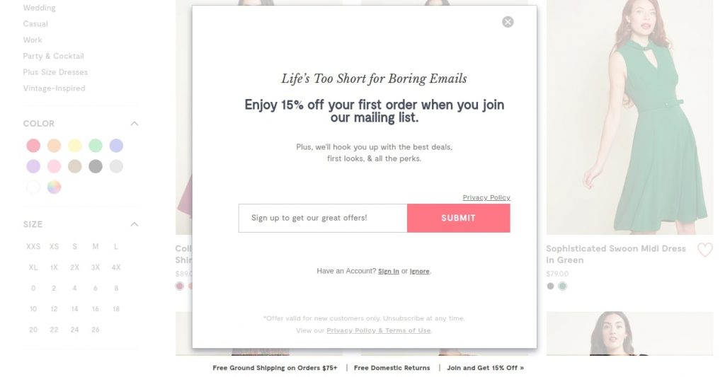
The message is hard to miss, and the offer is compelling enough to make many visitors want to take action.
What makes full-screen popups so effective is that they grab visitors’ attention and create a sense of urgency. By taking over the entire screen, you’re making it impossible for visitors to ignore your message or offer.
7. Countdown Timer Popup
If you’re looking for a way to create urgency and drive conversions on your website, a countdown timer popup might be just what you need.
These popups feature a timer that counts down to a specific event or deadline, such as the end of a sale or the release of a new product.
One great example of a countdown timer popup is from the online clothing retailer ASOS. When you add items to your cart on their site, a popup appears that features a countdown timer that counts down to the end of the discount offer.
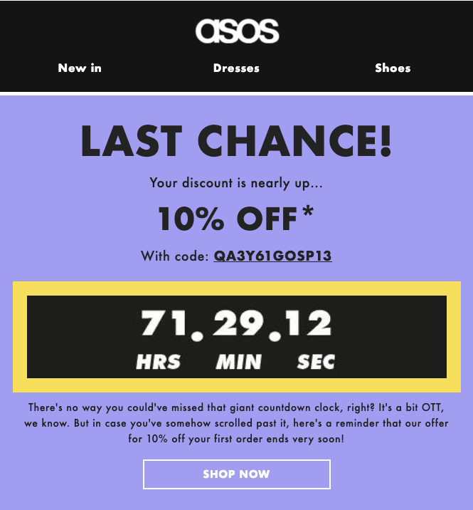
The timer is a great way to create urgency and encourage visitors to complete their purchase before the offer ends. For those using Shopify countdown timer popups can be an effective tool to highlight limited-time offers.
Of course, it’s important to use countdown timer popups strategically. You don’t want to use them for every offer or promotion or use them for events that aren’t truly time-sensitive.
But when used thoughtfully, a countdown timer popup can be a powerful way to increase conversions and drive more sales on your website.
8. Video Popups
Video popups are a great way to engage visitors and create a memorable experience on your website.
These popups feature a video that plays automatically when a visitor lands on your page or takes a specific action, such as clicking a button or filling out a form.
One example of a company that uses video popups on its website is HubSpot, a software company that provides marketing, sales, and customer service solutions.

When you first arrive on their site, a popup appears that features a video introducing their products and services.
The video provides a brief overview of what HubSpot does and how its software can help businesses grow. It’s high-quality and engaging, and it does a great job of capturing the visitor’s attention and getting them interested in learning more about the company.
By featuring a video that showcases your products or tells a story, you’re creating a more memorable experience for the visitor and increasing the chances that they will convert.
Read More - 10 Website Popup Examples + How To Create One
How to Customize Your Popups for More Conversions
Customizing your popups is a great way to increase conversions and create a more engaging experience for your visitors. Here are some tips on how to customize your popups for maximum impact:
- Create a clear and concise headline: Your headline should grab the visitor’s attention and clearly communicate what you are offering.
- Use eye-catching visuals: Adding high-quality images or graphics to your popups can help them stand out and make a strong visual impact.
- Personalize your popup message: Use the information you already know about the visitor, such as their name or location, to make your messaging more personal and relevant.
- Offer a special deal: Providing a special offer, such as a discount code or free shipping, can entice visitors to take action and increase conversions.
- Use a clear call-to-action: Your call-to-action should be clear and easy to understand, with a strong visual element that draws the visitor’s attention.
- Choose the right timing: Think carefully about when your popups appear and consider using exit intent or scroll-triggered popups to avoid interrupting the visitor’s experience.
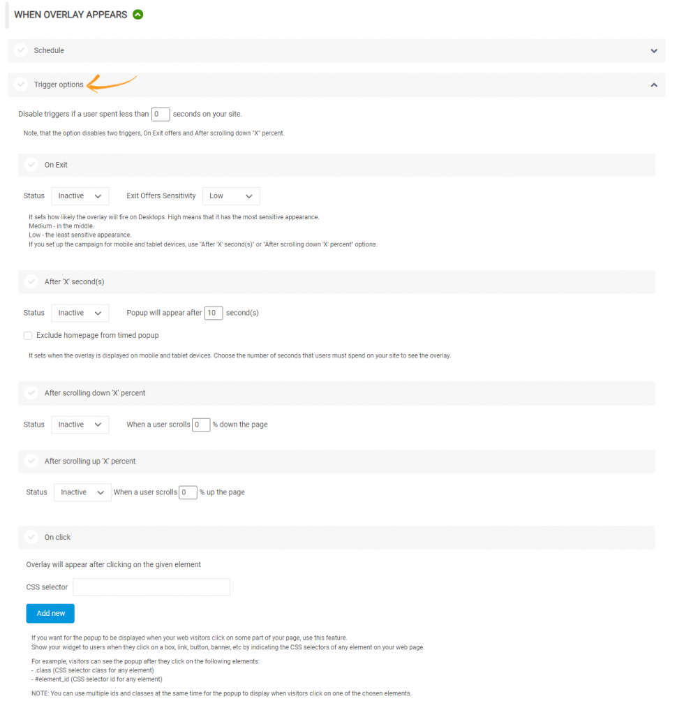
- Test and optimize: Experiment with different designs, messaging, and timing to see what works best for your audience, and use data to make informed decisions about how to customize your popups.
By customizing your popups, you can create a more personalized and engaging experience for your visitors and increase the chances of converting them into customers.
What Is the Best Popup You Should Use for Your Website?
Deciding on the best popup for your website can be a bit of a challenge since there are so many different types of popups out there. However, there are a few factors you can consider to help you choose the best one for your site:
- Your website’s design: The type of popup you choose should complement the design and layout of your website rather than look out of place or disrupt the user experience.
- Your business goals: Consider what you are trying to achieve with your popups – are you looking to increase conversions, capture email addresses, or promote a specific product or offer?
- Your audience: Think about who your target audience is and what type of popup is most likely to engage and convert them.
Some popular types of popups including:
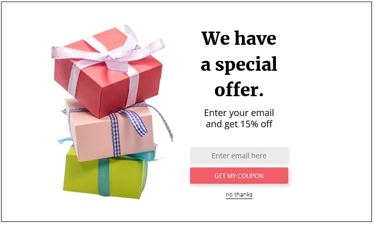
- Coupon code popups: Offer a special discount code to visitors in exchange for their email address or another action.
- Product recommendation popups: Suggest related products or services that the visitor might be interested in based on their browsing history.
- Exit intent popups: Display a popup announcement when the visitor is about to leave the site, encouraging them to stay or take a specific action.
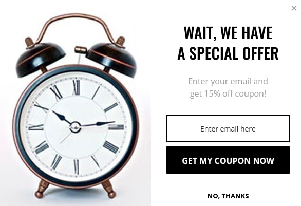
Ultimately, the best type of popup announcement for your website will depend on your specific business goals, audience, and content. So take some time to think about what you want to achieve with your popups, and experiment with different types to see what works best for your site.
However, if you’re looking for a top-notch popup message builder tool, then Picreel should be on top of your list.
Picreel is incredibly easy to use. You don’t need to be a coding or design expert to create professional-looking popups. Their drag-and-drop editor makes it a breeze to customize your popups to match your website’s design and branding.
They offer a ton of options, so you can easily find a template that fits your brand and messaging. But the real magic of Picreel is in its advanced targeting options. You can target your popups based on a ton of different factors, like the visitor’s behavior, location, or referral source. This lets you create more personalized and relevant popups that are more likely to convert.
Read More - Popups for Feedback: Get To Know Your Customers
Deploy the Best Popup Notification and Boost Conversion Rates
Popup notifications can be a powerful tool for boosting conversions on your website, and we’ve covered several effective pop up message examples in this blog post.
However, it’s important to remember that not all popups are created equal, and the success of your campaign will largely depend on the quality and relevance of your message, as well as the overall user experience.
That being said, if you’re looking for a top-of-the-line popup builder tool to help you create high-quality and effective popups, Picreel is an excellent choice. With their wide selection of customizable templates, advanced targeting options, and robust analytics and reporting features, it can help you optimize your campaigns and achieve your conversion goals.
FREE. All Features. FOREVER!
Try our Forever FREE account with all premium features!
