Are you looking to explore creative popup ideas to enhance your website’s online presence?
You might be surprised to learn that popups can take your website’s engagement levels from good to extraordinary. Although popups have had a bad reputation in the past, today’s popups are sophisticated and persuasive.
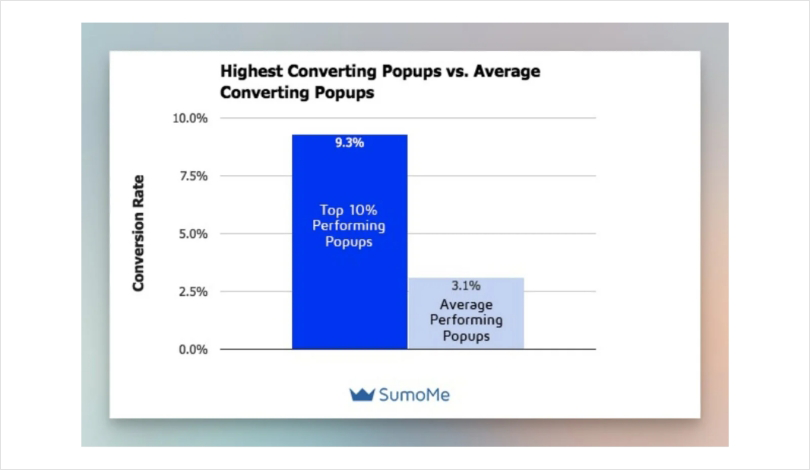
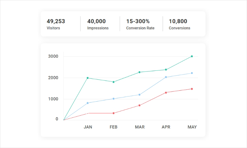
According to Sumo, top-performing popups can have conversion rates as high as 9.3%. This means that for every 100 visitors to a website, nearly nine visitors take a desired action triggered by the popup.
Image Source: Popupsmart
But what exactly makes popups such potent tools for marketing and conversion rate optimization?
Well, picture this: you’ve poured your heart and soul into crafting a remarkable website, but it feels like a hidden gem waiting to be discovered. Enter the hero of our tale—website popup!
In this blog, we’re going to explore some of the most popular popup ideas, their dos and don’ts, the art of timing, and the science of personalization.
Let’s dive right in!
7 Innovative Popup Ideas for Enhancing Website Engagement and Conversions
Now let’s look at some of the most effective website popup ideas for boosting your marketing efforts and improving your conversion optimization.
1. Increase First-Time Purchases With a Webpage Popup Offer
Picture this: a potential customer lands on your website for the very first time, curious about what you have to offer. They browse and explore, but something is missing—an extra nudge to transform their curiosity into an irresistible desire to make a purchase.
That’s when they see a webpage popup offer!
A webpage popup offer is a strategic tool that greets your visitors with a captivating offer right from the get-go. It’s like extending a warm welcome and saying, “Hey there, shopper! We’ve got something special just for you!”
By presenting a compelling offer upfront, you create a sense of exclusivity and urgency, enticing your visitors to take immediate action and make their first purchase.
But why are upfront offer popups so effective? Well, let’s delve into the benefits:
- The Power of Personalization: Upfront offers allow you to tailor your message and offer based on your visitor’s interests, demographics, or browsing behavior. This personal touch creates a sense of relevance, making your visitors feel valued and more likely to convert. According to recent popup statistics, well-designed popups can significantly increase your subscriber count by offering valuable content or incentives.
- Building Trust and Confidence: By presenting an enticing offer right away, you establish trust with your visitors. They see that you’re not just another faceless website but a business that genuinely wants to provide value and build a long-lasting relationship.
- Triggering the Fear of Missing Out (FOMO): Upfront offers often come with a time-sensitive element, such as a limited-time discount or a special bonus. This taps into the psychology of FOMO, driving your visitors to seize the opportunity and make a purchase before it’s too late.
You now probably have some idea about website popup offers, but to give you a holistic view, let’s take a look at some of the examples:
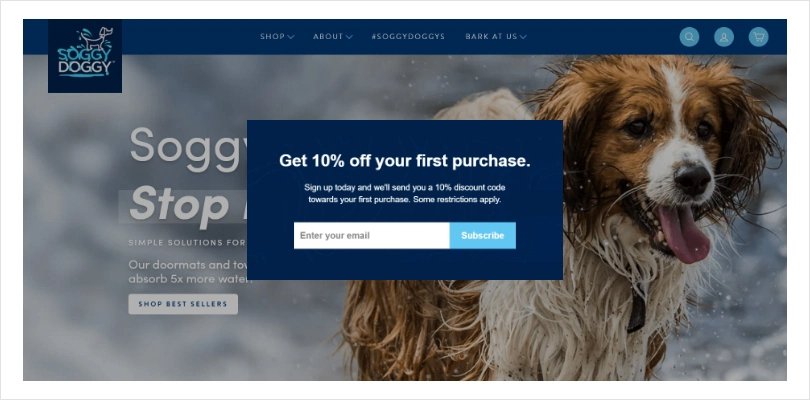
- The “Exclusive Discount Club” Popup: Capture your visitors’ attention by inviting them to join an exclusive club that offers members-only discounts and early access to new products.This creates a sense of exclusivity and provides an incentive for immediate purchases.
Image Source: Soggy Doggy Doormat
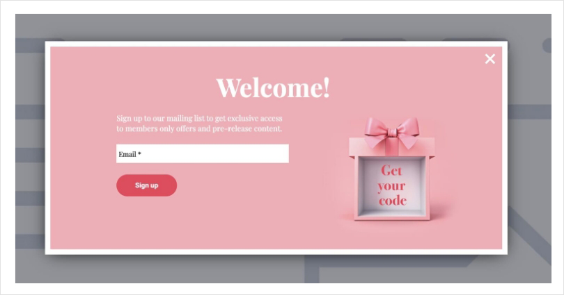
- The “Welcome Gift” Popup: Offer a special welcome gift, such as a free ebook, a downloadable resource, or a discount code, to new visitors who sign up for your newsletter or create an account. This not only encourages their first purchase but also helps you build a valuable email subscriber list.
- The “Limited-Time Flash Sale” Popup: Create a sense of urgency by showcasing a limited Time flash sale with significant discounts on select products. Highlight the limited availability and emphasize that it’s a one-time opportunity to secure a great deal.
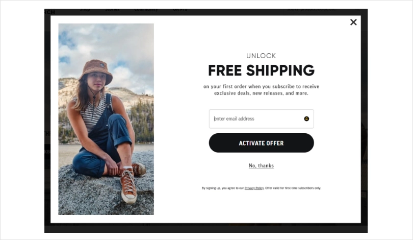
- The “Free Shipping on First Order” Popup: Eliminate one of the biggest barriers to purchase by offering free shipping exclusively to first-time customers. This incentivizes visitors to make their first purchase while enjoying the added benefit of free shipping.
Image Source: Tadpull
Remember, the key to effective upfront offer webpage popups lies in crafting compelling copy, visually appealing designs, and irresistible offers. Strike the right balance between creating urgency, providing value, and maintaining a seamless user experience. Here, tools like Picreel stand out as an exceptional website popup maker tool, offering a range of features and benefits.
With its user-friendly interface and intuitive design, Picreel makes it effortless to create engaging and visually appealing website popups.
Now that we’ve explored some interesting examples of upfront web page popups let’s take a moment to uncover the secret ingredients that make these popups truly irresistible.
- Clear and Compelling Copy: Craft concise and persuasive copy that clearly communicates the value of your offer and creates a sense of urgency.
- Eye-catching Design: Use visually appealing designs that align with your brand, grab attention, and make your popup stand out on the webpage.
- Strategic Timing: Implement smart triggering options such as exit-intent or timed delays to display the popup at the right moment when visitors are engaged or about to leave.
- Mobile Optimization: Ensure your popups are mobile-friendly and responsive, providing a seamless experience across all devices.
- Easy Exit: Include a clear close button to provide visitors with a hassle-free exit option if they choose not to engage with the popup.
2. Boost Cross-Sell Purchases With a Related Product Recommendation Popup
Let’s say a customer is browsing your website, exploring a specific product that catches their interest. Suddenly, a popup appears, showcasing a complementary or related product that perfectly complements their initial choice.
That, right there, is the magic of product recommendation popups!
Product recommendation popups leverage the power of cross-selling by suggesting additional items that enhance the customer’s shopping experience.
By analyzing their browsing or purchase history, you can offer tailored suggestions that align with their preferences, needs, or the product they are currently interested in.
This strategic approach not only increases the average order value but also enhances customer satisfaction and encourages repeat purchases.
The benefits of related product recommendation popups are never-ending:
- Enhanced Customer Experience: By offering relevant suggestions, you provide customers with a seamless and personalized shopping experience, making them feel understood and valued.
- Increased Average Order Value: Cross-selling through related product recommendations encourages customers to add more items to their cart, increasing their overall purchase value.
- Repeat Purchases and Customer Loyalty: By introducing customers to complementary products they may not have considered, you can foster repeat purchases and long-term loyalty.
Let’s take a look at some examples of effective Related Product Recommendation Popups for Website Optimization:
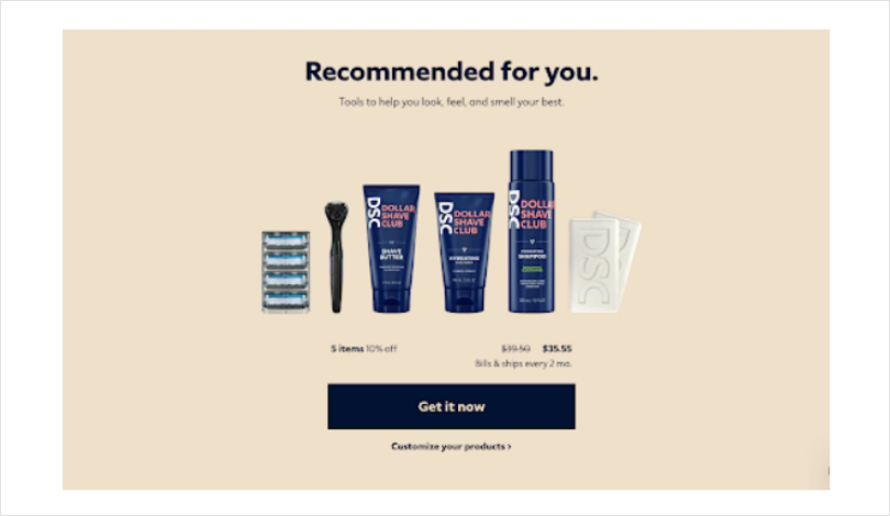
- Dollar Shave Club: Known for its exceptional grooming products, Dollar Shave Club stands out by providing an exceptional and captivating product recommendation quiz popup.This interactive quiz evaluates your individual attributes, grooming practices, and personal hygiene routine, requiring just a minute of your time, and then recommends relevant products.
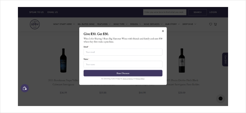
- Big Hammer Wines: Famed for their exceptional wine creations, Big Hammer Wines presents a convenient approach to streamline options for customers using a concise and user-friendly quiz available on their website.This quiz efficiently collects essential information regarding the customer’s wine preferences, allowing them to be directed towards a precise selection of choices.
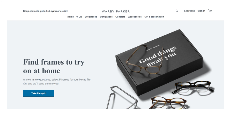
- Warby Parker: Warby Parker, an e-commerce eyewear brand, provides a user-friendly product quiz that enables customers to try eyewear at home before making a final decision.This seamless process allows customers to select and purchase their preferred pair on the spot, with the option to pay upfront or opt for a convenient payment plan.
Now, let’s take a look at some best practices for designing and implementing related product recommendation popups on websites:
- Analyze Data: Utilize customer browsing history, purchase patterns, and collaborative filtering algorithms to provide accurate and relevant product recommendations.
- Engaging Design: Create visually appealing popups that seamlessly blend with your website’s aesthetics, showcasing enticing product images and clear calls to action.
- Strategic Timing: Display the related product recommendation popup at the right moment, such as when a customer is about to complete a purchase or during the checkout process.
3. Get Visitors’ Email Addresses Before They Leave With Email Capture Popups
In the vast world of digital marketing, capturing email addresses is akin to unlocking a ton of potential. Email remains a powerful and direct channel for reaching your audience, and that’s where email popup ideas come into play.
By strategically utilizing email capture popups to collect visitors’ email addresses, you can enjoy plenty of benefits for your email marketing efforts:
- Building a Valuable Subscriber List: Email capture popups enable you to grow your subscriber base, providing you with a pool of engaged individuals who are interested in your brand and are more likely to convert.
- Enhancing Customer Engagement: With email addresses in hand, you can foster deeper connections with your audience through personalized and targeted email campaigns. By delivering relevant content and offers, you can keep your subscribers engaged and nurture them along the customer journey.
- Boosting Conversion Rates: Email marketing is a proven driver of conversions. By capturing email addresses through popups, you have the opportunity to send timely and persuasive emails. This encourages subscribers to make purchases, sign up for services, or take other desired actions.
Here are some effective email popup ideas for email marketing:
- The “Exclusive Content Access” Popup: Offer visitors access to exclusive content, such as ebooks, guides, or industry reports, in exchange for their email addresses. This creates a win-win situation, as visitors receive valuable content while you gain new subscribers.
Image Source: Tim
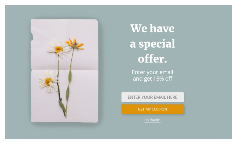
- The “Limited-Time Discount” Popup: Entice your visitors with a limited-time discount or coupon code for their first purchase when they sign up for your newsletter. This incentivizes immediate action and encourages conversions.
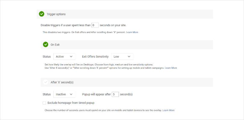
- The “Exit-Intent” Popup: Display a popup just as visitors are about to leave your website. This gives them a compelling reason to stay connected by subscribing to your newsletter or receiving updates about future offers.
Now, let’s look at the best practices for designing and implementing email popup ideas on websites:
- Keep it Simple: Design clean and visually appealing popups that are easy to understand and engage with. Avoid overwhelming visitors with excessive form fields or unnecessary distractions.
- Offer Value: Clearly communicate the benefits of subscribing, whether it’s exclusive content, discounts, or insider information. Give visitors a compelling reason to share their email addresses.
- Mobile Optimization: Ensure your email capture popups are mobile-friendly and seamlessly adapt to various devices, providing a smooth experience for mobile users.
Also Read: 13 Ecommerce Popup Design Examples to Boost Customer Base
4. Upsell Additional Products or a High-Value Version Popup
When it comes to maximizing revenue and enhancing the customer experience, upselling is a strategy you don’t want to overlook. Upselling involves enticing customers to upgrade their purchase or add complementary products or services, and popups provide an excellent opportunity to showcase these options.
Here’s why upselling through popups is a game-changer for website optimization:
- Increased Average Order Value: By presenting customers with attractive upsell offers at the right moment, you can encourage them to spend more on their initial purchases. This boosts your average order value and ultimately leads to higher revenue.
- Enhanced Customer Satisfaction: Upselling allows you to offer additional products or a higher-value version that aligns with customers’ needs and preferences. This personalized approach enhances their overall experience and satisfaction, leaving them feeling valued and well taken care of.
- Cross-Promotion and Exposure: Through upsell popups, you can cross-promote relevant products or services, introducing customers to a wider range of offerings they may not have discovered otherwise. This not only expands their choices but also increases the exposure of your product catalog.
Let’s look at some examples of effective upsell popups for websites:
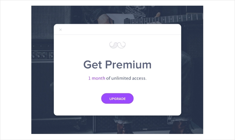
- The “Upgrade to Premium” Popup: Offer customers the opportunity to upgrade to a premium or deluxe version of a product or service. Highlight the enhanced features, benefits, or exclusive perks they’ll receive by opting for the higher-value option.
Image Source: Uplabs
- The “Complete the Look” Popup: Suggest additional items or accessories that complement the customer’s current purchase. For example, if they’re buying a dress, recommend matching shoes or jewelry to create a complete ensemble.
- The “Frequently Bought Together” Popup: Showcase products that are commonly purchased together with the item the customer is currently viewing. This social proof and convenience can persuade customers to add the suggested items to their order.
Image Source: Amazon
Here are some of the best Practices for designing and implementing upsell popups on websites:
- Strategic Placement: Display upsell popups at the appropriate point in the customer journey, such as after they’ve added an item to their cart or during the checkout process. This ensures relevance and captures their attention when they’re already engaged.
- Message Clarity: Clearly communicate the value and benefits of the upsell offer in a concise and persuasive manner. Use persuasive copy and visual elements to highlight the advantages of upgrading or adding additional products.
- A/B Testing: Continuously test different upsell offers, designs, and messaging to optimize their effectiveness. Experiment with different combinations and analyze data to identify what resonates best with your audience.
5. Reduce Abandoned Carts With a Well-Timed Incentive Popup
When it comes to reducing cart abandonment and maximizing conversions, implementing cart abandonment popups is a powerful strategy that can significantly impact your bottom line. These popup ideas serve as a proactive approach to address the common issues of customers leaving their carts without completing their purchases.
By strategically displaying targeted popups, you have the opportunity to re-engage these potential customers, remind them of their pending purchases, and offer incentives to entice them back.
Here’s why cart abandonment popups are a valuable tool for website optimization:
- Recovery of Lost Sales: By capturing the attention of users who have abandoned their carts, you have the chance to remind them of their pending purchases and offer an incentive to to complete the transaction. This helps recover lost sales and improves your conversion rates.
- Personalized Incentives: Cart abandonment popups allow you to offer tailored incentives, such as discounts, free shipping, or limited-time offers, to entice customers to return and complete their purchases. This personalization adds value and addresses the specific reasons that may have led to cart abandonment in the first place.
- Increased Customer Engagement: Popup forms, including cart abandonment popups provide an opportunity to re-engage customers, opening a dialogue and offering assistance. By addressing their concerns or providing support, you can build trust, increase customer satisfaction, and improve overall engagement.
Here are some examples of effective cart abandonment popups for websites:
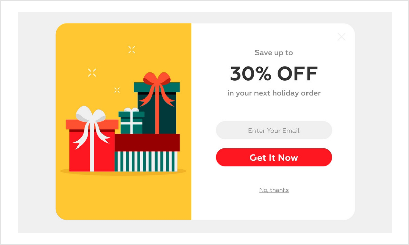
- The “Exclusive Discount” Popup: Offer visitors a limited-time discount or coupon code as an incentive to return and complete their purchase. Highlight the savings they can enjoy and encourage them to take action.
Image Source: Vector Stock
- The “Free Shipping” Popup: Remind customers of the added benefit of free shipping if they return and complete their order. This removes a common barrier and can motivate them to finalize their purchase.
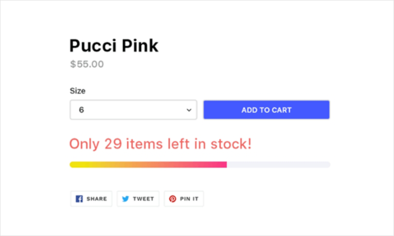
- The “Limited Stock” Popup: Create a sense of urgency by notifying customers that the items in their cart are running out of stock. This can prompt them to complete the purchase before missing out on the desired products.
Image Source: Pucci
Let’s take at some of the best practices for designing and implementing cart abandonment popups on websites:
- Timely Display: Trigger the cart abandonment popup at the right moment, such as when a user is about to leave the website or after a certain period of inactivity. This ensures that the popup is displayed when it’s most likely to capture the customer’s attention.
- Clear and Compelling Messaging: Craft persuasive copy that clearly communicates the incentive or value proposition of returning to complete the purchase. Keep the message concise, engaging, and benefit-focused.
- Simple Opt-In Process: Make it easy for customers to accept the incentive and return to their cart. Streamline the process by pre-filling information, offering one-click options, or providing a direct link back to the cart.
Also Read - 36 Winning Exit Intent Popup Examples to Boost Website Conversions
6. Encourage Sales With a Time-Limited Offer Popup
Limited Time offer popups allow you to build a compelling strategy to create a sense of urgency and drive immediate action from your website visitors. These popups present customers with exclusive deals, discounts, or promotions that are only available for a limited time.
By leveraging the principle of scarcity, limited time offer popups can significantly impact website optimization and enhance your overall popup marketing ideas and strategy.
Including an opt-in popup alongside a limited time offer can further engage visitors by encouraging them to subscribe to your newsletter or receive updates on future deals.
The benefits of using popup marketing ideas are numerous. Firstly, they create a sense of urgency and fear of missing out (FOMO) in customers. When faced with a time constraint, visitors are more likely to make a purchase decision promptly rather than delaying or abandoning it altogether.
The limited availability of the offer instills a sense of exclusivity and encourages immediate action.
Secondly, limited-time offer popups can help increase conversion rates. By presenting visitors with a compelling incentive that is only valid for a short period, you motivate them to take action immediately. This can lead to a higher number of conversions and boost your overall sales revenue.
On top of that, limited-time offer popups provide an opportunity to showcase your products or services in a unique way. By featuring special deals or limited-time promotions, you create excitement and capture the attention of your audience. This can generate buzz, encourage social sharing, and attract new customers to your website.
Let’s take a look at some examples of effective limited time offer popups for websites to get a better idea:
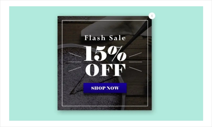
- “Limited-Time Flash Sale”: Display a popup promoting a flash sale that lasts only a few hours. Offer a significant discount on select products or services, and clearly communicate the limited duration of the sale. This creates a sense of urgency and encourages immediate purchases.
Image Source: Pucci
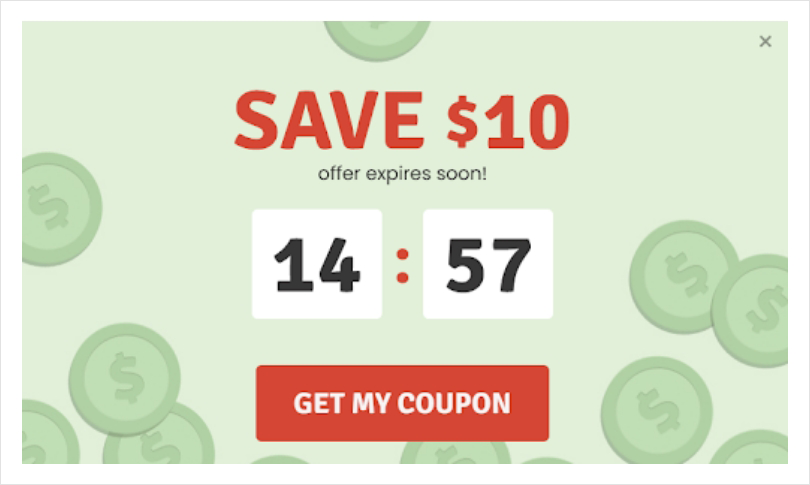
- “Exclusive Time-Limited Coupon”: Present visitors with a popup offering an exclusive coupon code that is valid for a limited time. Highlight the discount value and specify the expiration date of the coupon to motivate customers to redeem it before it expires.
- “Countdown Timer Promotion”: Utilize a popup with a countdown timer showcasing a limited-time offer. For example, offer free shipping or a bonus gift for orders placed within a specific time frame. The ticking timer visually reinforces the urgency and prompts visitors to take advantage of the offer.
Best practices for designing and implementing limited Time offer popups on websites:
- Clear and Eye-Catching Design: Design your limited-time offer popups with attention-grabbing visuals, vibrant colors, and concise messaging. Use clear call-to-action buttons that stand out to prompt visitors to take immediate action.
- Mobile Responsiveness: Ensure that your limited-time offer popups are fully optimized for mobile devices. The majority of online traffic comes from mobile users, so it’s crucial to provide a seamless experience across different screen sizes.
- Testing and Tracking: A/B test different variations of your limited-time offer popups to determine the most effective design, messaging, and timing. Monitor and analyze the data to make data-driven optimization and continuously improve your results.
7. Capture Newsletter Subscribers With a Fun, Value-Packed Popup
When it comes to building customer relationships and implementing a successful email marketing strategy, capturing newsletter subscribers through a fun and value-packed popup is a game-changer.
Newsletter subscriptions offer a direct and personalized communication channel between your brand and your audience, opening up a world of benefits for both parties involved.
Let’s take a look at some of the benefits of encouraging newsletter subscriptions on your website:
- Direct Communication Channel: Newsletters provide a direct and personalized communication channel between your brand and your customers.
- By obtaining their email addresses through subscriptions, you gain permission to engage with them directly, delivering valuable content, promotions, updates, and exclusive offers.
- Relationship Building: Newsletters allow you to nurture and strengthen your relationship with subscribers over time.
- By consistently delivering relevant and valuable content, you can establish trust, credibility, and brand loyalty. Regular communication through newsletters helps to keep your brand top-of-mind and encourages repeat purchases.
- Targeted Marketing Opportunities: With newsletter subscriptions, you have a targeted audience that has already expressed interest in your brand. This enables you to segment your subscribers based on their preferences, demographics, or past interactions.
By tailoring your email campaigns to specific segments, you can deliver highly relevant and personalized content that resonates with your subscribers, increasing engagement and conversions.
Here are some examples of effective newsletter subscription popups for email marketing:
- “Exclusive Content Access”: Offer subscribers exclusive access to premium content, such as ebooks, guides, or whitepapers, by subscribing to your newsletter. Highlight the value they will receive and the knowledge or insights they can gain by being a part of your subscriber community.
Image Source: Getresponse
- “Discounts and Promotions”: Provide subscribers with special discounts or promotions as an incentive to join your newsletter. Offer a discount code or a limited-time offer exclusive to subscribers, enticing them to subscribe and make a purchase.
- “Freebies or Samples”: Promise subscribers freebies or samples of your products or services upon subscription. This can include samples, trial versions, or downloadable resources that align with your brand and provide value to your target audience.
Take a look at some of the best practices for designing and implementing newsletter subscription popups on websites:
- Clear and Compelling Call-to-Action: Use a clear and concise call-to-action that clearly communicates the value proposition of subscribing to your newsletter. Use action-oriented language and highlight the benefits subscribers will receive.
- Minimize Form Fields: Keep the subscription form fields simple and concise. Ask for only the essential information, such as name and email address, to minimize friction and encourage more sign-ups.
- Privacy Assurance: Address privacy concerns by including a brief statement or link to your privacy policy, assuring subscribers that their information will be kept secure and will not be shared with third parties.
Unlock the Power of Popups With the Best Strategies
Website popup ideas and strategies play a crucial role in effective marketing and conversion optimization.
By implementing well-designed popups strategically throughout the customer journey, you can significantly improve your conversion rates, capture valuable leads, and nurture strong customer relationships.
To make the most of popups, it’s essential to follow best practices in design and implementation.
To create effective popups, you need to make them visually appealing, strategically place them, and make sure they work on mobile.
Also, Picreel is an excellent example of a user-friendly tool for deploying your website popup ideas. It boasts a straightforward interface that is easy to grasp and experiment with.
With the added benefit of a forever-free plan, you can experience Picreel firsthand, at no cost, before making a commitment to purchase.
 Tips
Tips
We’d love to hear your tips & suggestions on this article!
FREE. All Features. FOREVER!
Try our Forever FREE account with all premium features!



 We'd love your feedback!
 Thanks for your feedback!


