Let’s admit it – pop-ups are annoying, especially if they show up at the wrong place and at the wrong time.
While we are busy browsing a website or immersed in an article, suddenly, out of nowhere, a pop-up shows up asking to subscribe to a newsletter or give contact details. And in this very moment, when frustration is at its peak, the company loses its potential customer.
A 100 such instances mean a possibility to lose 100 customers – this is what an obtrusive popup is capable of.
On the contrary, good pop-ups can work miraculously for a business. They are thoughtfully implemented and accurately timed, showing exactly when needed.
According to Conversion Sciences, 10 to 15 percent of lost visitors can be saved with exit-intent popups as experienced by these companies. For instance, Danish Skin Care increased its conversion rate significantly using exit-intent popups to engage departing visitors, leading to higher sales growth.
So, the million-dollar question is – how to create pop-ups that enrich customer experience and drive conversions?
This blog presents 11 popup best practices to create high-performing popups. It also explains the importance of good popups and gives sure-shot ways to increase popup conversion rates.
Let’s get started.
Top Benefits You Can Glean From Good Popups
A good pop-up is least disturbing. It keeps into account multiple factors such as the browsing pattern, time spent on a page, and a lot more, before showing up. It doesn’t appear frequently. Instead, it pops up at the right time and makes an attractive, relevant offer that visitors cannot resist.
Before we learn about the best practices of website popups, let’s look at the top benefits that can be derived by adding this magical tool to your website:
Attract & Convert New Visitors
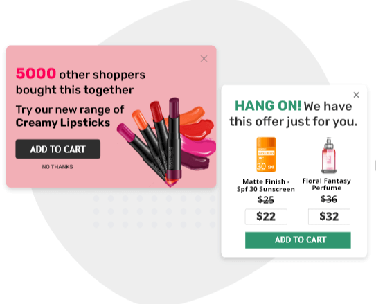
It’s a task to drive traffic to your website, but it’s a bigger challenge to convert this traffic. That’s where popups help. They help you make attractive offers in the form of discounts, free shipping, contests, free gifts, and a lot more. It’s not just these offers that woo visitors, it’s also the time and relevance with which they are displayed that eventually results in conversions.
For example, using exit popups, you can pull back leaving visitors by giving them reasons to stay. These reasons can be discounts, promotions, contests, or anything that keeps visitors interested.
Read More: Effective Conversion Rate Optimization Methods
Build Your Email List
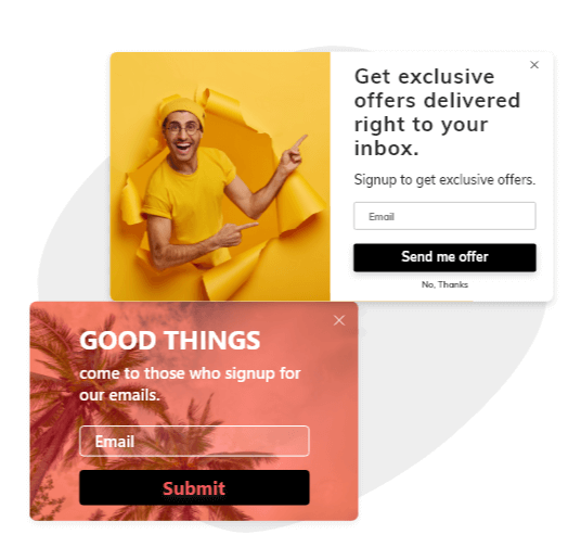
Sales is a long and tricky process. Mostly, customers take their own time to buy from a brand, especially if they are first-time visitors. In the beginning, there is an apprehension about the brand, and a lot of thought and competitor analysis goes into making a purchase decision.
To continue the conversation with potential customers after they leave your website, it’s essential to have their email addresses. With pop-ups, you can display lead gen forms and capture email addresses, phone numbers, and other details of visitors. This data can then be used to contact visitors and make sales.
Capture Customer Feedback
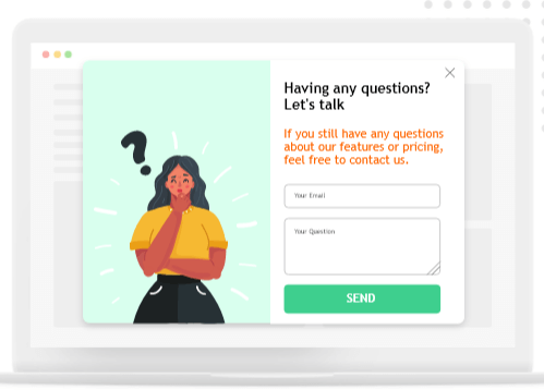
There can be multiple reasons visitors show exit intent – poor website experience, irrelevant products, dissatisfying pricing, and a lot more. As a business, you need to find the exact reasons that lead visitors to the X button of the website.
A good pop-up is quite versatile as it also allows you to share surveys as soon as a customer shows signs of leaving. The survey can be in the form of a single question or multiple-choice questions asking about the customer’s experience.
If timed and placed correctly, such pop-ups can give you valuable insights into what your customers were looking for and whether you matched up to their expectations.
Reduce Cart Abandonment
A lot of people add products to their cart, but only a few end up buying them. The ones who ditch you at the last minute, just before checking out, are either unsure of their decision or disappointed with something or the other.
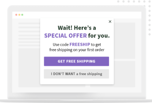
The right pop-up helps you win back lost sales. It pulls shoppers back by showing exclusive offers, free shipping, or anything that drove them to abandon the cart in the first place. Pop-ups make instant and relevant offers, just what customers need to complete their purchase, creating a win-win situation.
Read More: 11 Best Abandoned Cart Email Subject Lines (That Work)
Power Your Popups With These 11 Best Practices
There was a time when customers loved to hate pop-ups, thanks to their obtrusive, irrelevant nature. Fast forward to today, popup ads have evolved to become important tools to attract leads and increase sales.
So how is it that you can make your popups more appealing and less interfering, more helpful, and less frustrating for customers?
The popup best practices mentioned below have the right answer to this question.
1. Time Them Right
Popups can be annoying if not timed correctly. Showing up popups just when visitors have landed on your website and expecting them to get swept by your offers is not a good practice. For your popup strategy to work well and bring the intended results, timing is an important factor to consider.
The idea is simple, make a compelling offer just when the time is right. For example, when visitors show exit intent, an exit popup can appear displaying some attractive discounts and promotions, luring customers to continue browsing the website.
Many customers leave the cart just before check-out. In such instances, a popup can quickly appear showing offers tailored to what customers want, for example – free shipping or an attractive discount.
An ideal popup is relevant to the visitors’ needs and well-timed – to keep them from leaving your site.
2. Make the Most of Visuals
Popups have a tough task of leaving no stone unturned to woo visitors and pull them back into your website. And the importance of visuals cannot be stressed enough here.
A plain, simple and relevant popup is good, but a visually appealing popup with images that go well with the offer is certainly better. Visuals are known to add a spark to popups and catch customers’ attention.
This doesn’t mean forcefully adding images to the popup. Visuals can be an appealing background pattern or using soothing colors in the overlay. Images of people can be used to direct customers’ attention to the key message. For example, while featuring the images of people in your popup, ensure that they look at the message that you want visitors to see.
The eye-tracking study by Business Insider reveals that simply adding a pretty face to a popup doesn’t suffice. Ensure that the person is looking at the key message of the popup.
3. Make Your CTAs Clearly Visible
The ultimate aim of a pop-up is to get visitors to take action. There is no scope here to beat around the bush. Since there is little space and a lot to be said and done, it’s crucial to get to the point quickly.
A prominent call to action is key to instantly push visitors to take action. It should be the highlight of the pop-up that quickly catches the eye as soon as the overlay appears.
A distinct call to action keeps the confusion at bay, giving customers clarity over what exactly they need to click to get discounts, promotions, or free gifts. In case a CTA is somewhere lost in the popup, shoppers are most likely to exit in confusion.
While creating CTAs, ensure that they are short, eye-catching, and easy to read. For example, Buy Now, Sign Up Now, Get Started, etc.
4. Customize Popups to Match Your Brand
Many times popups can get on customers’ nerves, thus moving them away instead of pulling them in. This usually happens when they are poorly timed, irrelevant, or do not offer a pleasant experience.
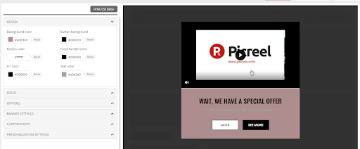
Since popups form a crucial part of your website, branding them with your company logo, color scheme, and fonts is a good way to make them look good and feel familiar. When a popup shows up, it shouldn’t feel out of place. It should feel like an integral part of the website so that customers can quickly relate to it.
That’s where customization comes in. Tailoring the popups so that they align with your brand, look and feel good to customers is super easy with Picreel. The software helps you customize the popup to the core, right from its fonts and colors to buttons and a lot more.
Follow this popup design best practice to create popups that resonate with your brand and do not look unfamiliar to visitors.
5. Optimize for Mobile Phones
Shopping on mobile phones is on a massive rise.
This is mostly because of the tech-savvy Millennials and Gen Zers who prefer shopping on their smartphones. To tap this particular audience who prefers mobile shopping, you’ve no choice but to level up your popup design.
Mobile-friendly popups allow visitors to check your offers and do shopping right on their smartphones – anytime and from anywhere they are. But remember that a one-size-fits-all approach would not work here. The pop-ups for desktop and mobile phones cannot be the same. Since phones have smaller screens, a popup created for desktop screens can come across as confusing and intrusive.
Popups for mobile phones should be thoughtfully designed considering the screen space and other elements of the mobile user experience. The idea is to ensure that the popups are equally impactful on mobile devices as they are on larger screens.
6. Make Pop-Up Exit Easy & Fuss-Free
Poorly timed and irrelevant pop-ups are frustrating, but you know what’s even worse? A pop-up that is hard to close. That’s the most irritating thing you can do to visitors.
Hiding or not adding the X button doesn’t guarantee that shoppers will willingly subscribe to your newsletter or give their contact information. It’s a shady technique that drives customers away and leaves a poor impression. For first-time visitors, this is the best way to crush the expectations they had when they landed on your site.
The X button should be clearly visible and easy to click. You can also provide a “No, Thank You’ button to make the exit easier. Embrace the fact that shoppers will take your offer only if they are completely convinced. When in doubt, they will want some time to think and will not be ready to shell out money right away.
Another popup best practice to make visitors second guess their decision to exit is by using psychological tricks.
For example, suppose you are into online fitness training, you can offer two options – ‘Sign Me Up’ and ‘No, I am completely fit’. Usually, people with fitness issues will be coming to your website. The second option here may attack their insecurities, increasing the possibility of signups.
7. Keep Your Popups Short & Sweet
The #1 rule to a compelling popup is to keep it short and sweet. No beating around the bush or overwhelming visitors with a lot of content in that small space. Giving too much information and asking for too many details can hamper the effectiveness of the popup. It can leave visitors confused as to what exactly they are supposed to do and how.
A better way here isto provide a clear path to achieve a specific goal. Get rid of unnecessary information. Start by capturing visitors’ attention and then clearly convey the benefits of the offer. Next – prompt them to act.
When designing popup forms, keep the fields to a minimum. For example, if you just need the first name and an email address, let it be that way. Do not add unnecessary fields, as that might prevent them from filling the form.
8. A/B Test the Offer
Ultimately what really matters in pop-ups is the offer itself. What differentiates high-performing pop-ups from poor-performing ones is largely related to the offer you are making.
If the website popups fail to arouse visitors’ interest, they will not result in a conversion, no matter how accurately timed and well-designed they are.
A website popup best practice to prevent this is A/B testing. It allows you to test the content and design of the pop-up so that you know what works well and what doesn’t. Analyze the data received and choose offers that are in line with the visitors’ intent.
For example, suppose you run an e-commerce store and are confused about which discount offers to display. With A/B testing, you can test different discount types, such as 20% off vs. $20 off or discount vs. free gifts.
After analyzing the results, choose the offer that has the best chances of clocking conversions.
Sometimes, small changes bring remarkable results!
9. Consistently Analyze & Improve Popup Performance
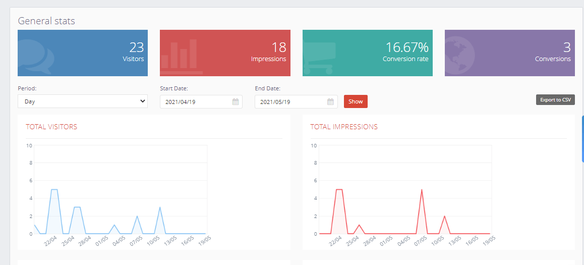
Just creating pop-ups and expecting them to work magic on visitors is not a good idea. Popups have to be constantly checked for their performance – are they really converting visitors? How many impressions are generated? How many visitors engaged with the po pup?
Having the right answers to these questions is critical to understanding whether or not popups are generating the desired results. A sneak peek at the popup’s monthly, quarterly or yearly performance exposes the areas that are working well and the ones that are proving problematic.
For example, Picreel, a leading popup builder, offers actionable insights into conversion rates, total conversions, impressions, and the number of visitors in graphical form. You can track these metrics to boost the performance of your website popups.
10. Integrate With Email & CRM Platforms
The extra mile is the least crowded place. You won’t find many people going there. That’s why going the extra mile with your marketing efforts can bring results you would not have thought of.
A website popup is a great tool to capture and convert leads.
But is it enough?
What if you use popups in combination with email marketing and CRM platforms. It will create a super-powerful system that allows you to capture leads, build email lists, manage and convert them faster.
For instance, if you integrate the popup software you use with a CRM tool like HubSpot or Salesforce, the leads generated will directly go to your CRM account, where they can be easily managed. Similarly, on using a popup tool with an email marketing platform, all the email leads captured go directly to your email marketing account. You can then easily contact and convert them.
Modern popup tools offer seamless external integrations to help you make the most of your website popups. For example, Picreel comes with 700+ integrations with popular CRM, email marketing, e-commerce, social, and many other tools.
So, whenever you use popups, ensure that you pair them with such platforms for stellar results.
11. Use Exit Intent & Stop Customers from Leaving
Tracking the exit intent of visitors and giving them an attractive offer is your last shot at making them stay. And this last shot should be your best one if you don’t want to lose out on potential customers.
Modern website popup tools are equipped with technology that monitors the visitors’ digital footprints, click behavior and exit intent. When they show signs of leaving, popups with attractive offers instantly appear, increasing the possibility of a conversion.
Exit overlays can be used to:
- capture email leads that can be converted later
- increase sales by making compelling offers and discounts
- Reduce cart abandonment
- Collect customer feedback on your products, services, pricing, and more.
Exit-intent overlays are quite versatile as they can be used in various ways to fulfill different requirements. You can massively boost conversions by displaying the right popup as soon as visitors show signs of leaving.
Read More: Top 7 Best Exit Popup Software
That was all about popup best practices. It’s time to look at some quick tips that can add to the best practices mentioned above and make the ultimate customer experience even better.
Create Pop-Ups That Convert Random Visitors Into Paying Customers
Popups are a great source of leads. When placed smartly and timed correctly, they have the power to steal visitors’ attention. While playing with popups, you have to be extra cautious, as one mistake, and you risk losing a potential customer.
What happens when you do it right? The possibilities are endless – you get leads, instant sales, higher engagement, and best of all – delighted customers who want to come back for more!
For that, a website popup strategy should keep into account simple things like popup timings, visuals, CTAs, and customization to achieve your top goal – conversions. Besides, other things are equally important such as tracking the exit intent of visitors, A/B testing of popups, and monitoring performance metrics for improvement.
Follow these popup best practices and leave no opportunity to delight and convert visitors!
FREE. All Features. FOREVER!
Try our Forever FREE account with all premium features!


