Having a wide range of options to choose from is an amazing thing, isn”t it? For customers, it is! For marketers, that can result in lost revenue and loyal customers.
In this digital world, online businesses are constantly striving and coming up with outstanding marketing strategies to make themselves a better option for customers. However, the way your business performs depends on how you strategize.
Getting more traffic is not the primary goal for many marketers. Instead, converting visitors into customers or getting their contact details is more important.
A crucial and in-trend strategy is a website overlay. Every online visitor comes across multiple popups or overlays while browsing different websites, and that’s because overlays are simply effective in driving sales.
Your content writers, website designers, and sales/marketing experts spend endless hours in designing the perfect pages, writing up-to-the-point content, and grabbing the visitors’ attention. But the conversions are still stuck below par? Perhaps, your visitors are not landing on the right content or are not seeing your offers or maybe call-to-action is missing.
Whatever it is, website overlays/exit-intent popups can do an amazing job to address all of these concerns with simplicity. Want to know how online businesses can boost conversions using website overlays? Here we are with some of the proven tips, tricks, and strategies!
What is Website Overlay?
You are browsing some watches online or looking for a cloud-based software solution, and suddenly something pops up on your screen “Free shipping for you!” or “Get flat 10% off on your first-year subscription.” That’s a website overlay.
Generally, website overlays are displayed to visitors when they have spent some time on the website and are about to leave/abandon their cart. As creative thinking doesn’t have any limits, marketers use overlays to offer help, promote discounts, guide visitors, and do much more to deliver an exceptional customer experience.
The range of exit popups is vast as customization has made it easier for marketers to design unique overlays with different fonts, backgrounds, colors, etc. To help you understand better, let’s check out how popups are important and see some of the best website overlay examples.
Why Do You Need to Use Website Overlays?
A lot of online visitors bash on overlays and think of these as annoying. But, on the other hand, if used with perfection, website overlays can prove to be the real game-changer in terms of conversions and sales. Here’s why you should use website overlays!
Convert More Traffic:
More than 70% of website visitors abandon their shopping carts and that surely is a lot of lost revenue. With perfectly timed overlays, you can give your visitors reasons to stay. That helps in increasing conversions and reducing bounce rates.
Build Email/Phone List:
The email signup form at the corner of your website or at the bottom of the page is just catching virtual rust. Using well-designed beautiful overlays and strong CTA, you can actually collect the email address/phone number of your visitors. This will build your list of potential customers a lot faster.
Boost Sales:
With the help of exit pop-ups and overlays, you can drive sales effectively. Promoting your special offers, best-selling products/pages, and discount coupons is super easy with overlays. It opens the door for more sales opportunities and helps in re-engaging with your customers.
Simplify Visitors’ Choices:
Everyone feels overwhelmed when there are so many choices. So, with the help of a website overlay tool, you can easily track visitors’ activities and browsing patterns to display limited choices to them. Using overlays, you can guide your visitors to specific products/pages, making their decision-making process a lot easier.
Collect Valuable Feedback:
No one is picture-perfect and there’s always room for improvement. Using exit overlay forms, you can ask your visitors about the products/services to make improvements in the future. Also, it provides an opportunity for your sales & support team to offer assistance and win customers.
To make this further clearer to you, we have gathered a few overlay website examples. Let’s get right into it.
High Converting Website Overlays Examples
We’ve put together some of the best and proven website overlays. These examples should give you a brief idea of what marketers out there are successfully using to boost their conversion rates and sales.
Living Online
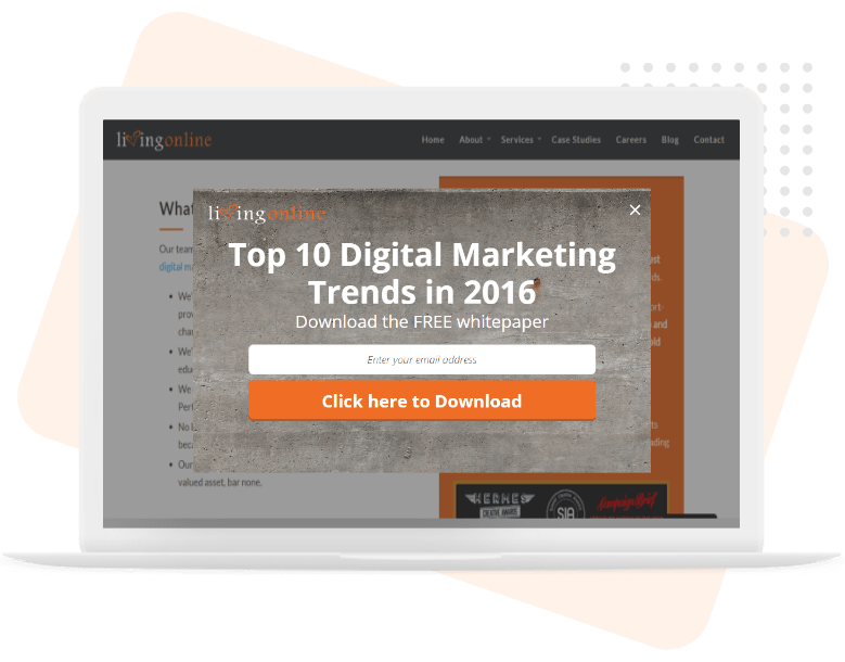
Living Online witnessed a weekly increase of 900% in email subscribers! They easily boosted their conversions and generated quality leads from their visitors by offering premium guides for free in return for the visitors’ email addresses.
Vertical Nerve
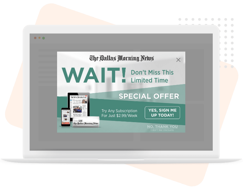
Vertical Nerve’s topmost client “The Dallas Morning News” saw a boost in conversion rate to 17%, with retention of over 3000 lost visitors. Here, they use a beautifully designed copy to offer limited-time discounts on their subscription.
Kitchen Cabinet Kings
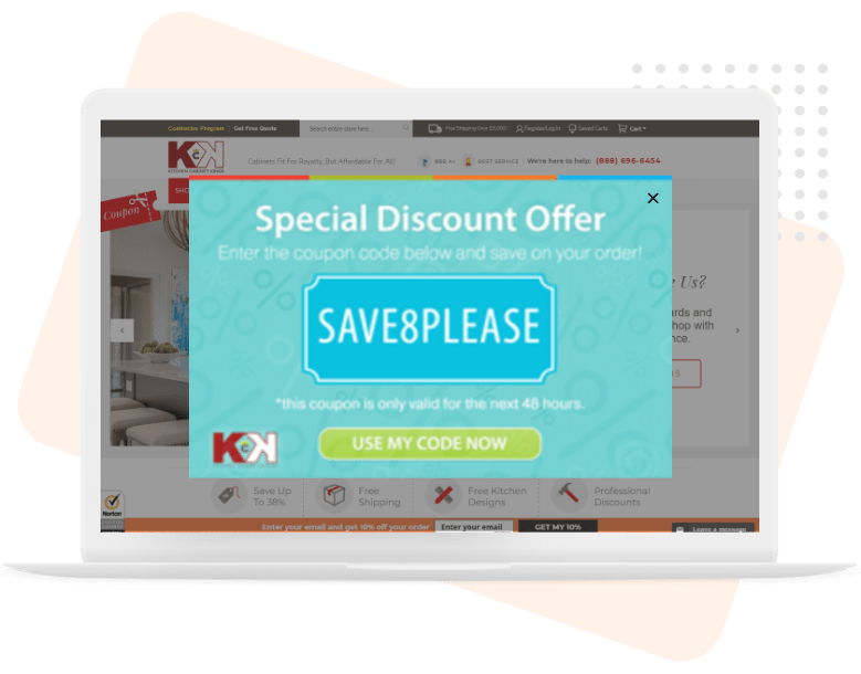
Kitchen Cabinet Kings achieved a cart recovery rate of 27%, which helped in increasing sales and building brand value. They use a simple discount coupon overlay with a perfect CTA that redirects visitors back to the shopping cart.
Foundr
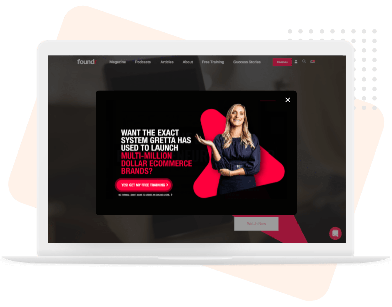
Foundr successfully captured over 20,000+ leads by running this website overlay campaign. They offered free training and webinars to the visitors and generated high-quality leads to boost their sales and increase the customer base.
Grivy
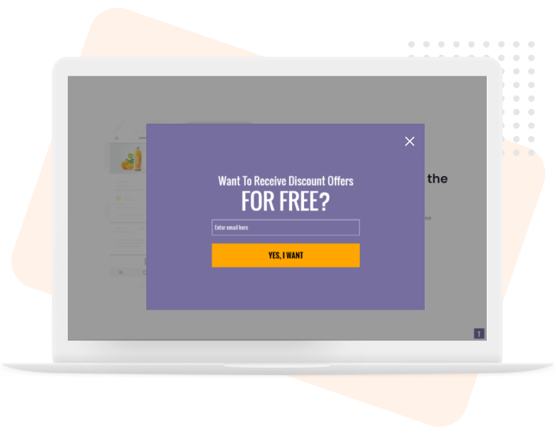
Grivy used this simple and minimalistic design and witnessed an increase in their leads by over 57% and a conversion rate of 22%. They collect the visitors’ email addresses by offering discount coupons for various products and services.
12 Tips & Tricks to Boost Conversions Using Website Overlays
Now that we have gone through some of the high-converting overlay examples, how can you implement website overlays successfully? It’s time to get into smart tips & tricks that will surely help you in boosting your conversion and sales.
1- Discount for First-Time Visitors
Promoting discounts and offers for new visitors or first-time users is one of the best and effective ways to convert visitors into customers. As per the visitors’ browsing pattern or the products in their cart, you can display relevant offers they just can’t refuse.
What’s more? You can design an overlay asking visitors to sign-up or enter their email address to receive discounts directly in their inbox. Along with a welcome email, your sales team can nurture quality leads by offering deals to new visitors. As most of the customers are in the buying mood, there are high chances of conversion.
2 – Offer a Free Shipping
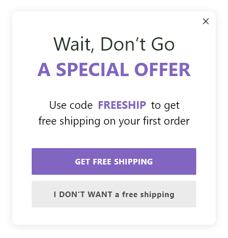
As per research by Marketing Land, 90% of online consumers are likely to shop if offered the option of free shipping. Moreover, 28% of shoppers abandon their cart if they find unexpected shipping charges. For such visitors, when they decide to leave after seeing the final price, you can reduce cart abandonment with free shipping popups.
You can also go with an alternative overlay design copy to capture visitor’s email addresses by sending them the free shipping coupon over the mail. You can place this overlay on pricing/sign-up pages, shopping cart pages, or product pages for maximum conversion.
3 – Create Urgency with Limited-Time Discounts
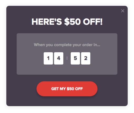
Adding an element of urgency creates the fear of missing out. Time-based popups, especially with a countdown to promote a coupon/discount price invokes a sense of urgency, pushing your visitors to complete the purchase. These popups are perfect around the holiday season or when the shoppers are most active i.e. during clearance sales, flash sales, etc.
Such types of promotional overlays may be effective for various audiences, but you should test different designs on first-time visitors. These are perfect to be displayed on landing pages. Also, you need to make sure that your visitors don’t see the overlay again and again as it questions the credibility of your offer.
4 – Present Personalized Offers
Personalization can do wonders as it helps you connect emotionally with your visitors. Use your customer analytics to create powerful and effective overlays that make the customer feel valued. Human emotions definitely play a crucial role in increasing conversions.
You can welcome the existing customers with a personalized message or can have a last go at them when they’re about to leave. As for the new visitors, you can get creative with your overlays to customize their browsing experience and gather some information for further marketing/sales campaigns.
5 – Host Giveaways & Offer Gifts to Build Email Lists Rapidly
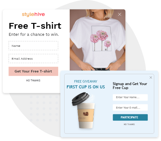
One of the quickest ways to gain new email subscribers is through giveaways & gift contests. Simply offer one of your best-selling products/services using a beautiful overlay with a compelling CTA and witness your email list grow.You can use high-value merchandise to attract more visitors and can also use giveaways as a promotional tool to market your new products. Create a copy with an option to increase the entry by sharing the content over social media. This will increase your reach and will result in more email sign-ups & new customers.
6 – Recommend Similar Products/Services
One of the most common reasons for visitors leaving the website is not finding what they were looking for. With the help of a triggered overlay, you can recommend similar products based on the browsing pattern they might like.
You can at least keep the visitor engaged for a little more time and that increases the chances of converting them later. This is also helpful in re-targeting your previous customers with personalized recommendations based on their past purchases, downloads, and clicks.
7 – Offer Customer Support
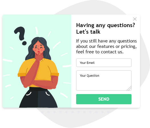
Sometimes, visitors need a little nudge from your side to complete the purchase. They appreciate talking to a human before they make up their mind. So, if your visitors are exploring multiple products on your website, they’re probably looking for reasons to buy and might have some doubt about the product quality, reviews, return policies, etc.
To address this, you can present the right customer support/help overlay at the right time. You can either redirect the visitors to the knowledge base/FAQs section or can connect them with a customer support agent for increasing the conversion chances. This type of popup is perfect for first-time visitors and paid traffic, and can be placed on pricing pages/landing pages.
8 – Offer Free Content Like Ebook, Course, Guide
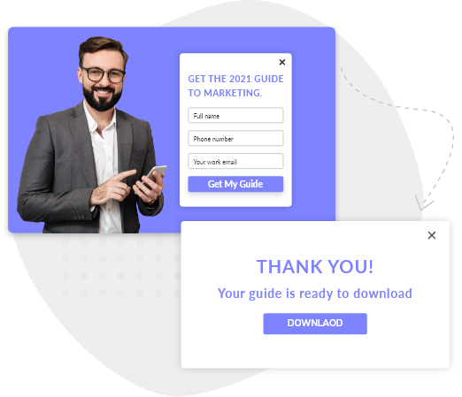
A lot of people love to read stuff, especially the one that provides value to the audience. That’s why ebooks and courses/guides generally have a higher conversion rate than newsletters. Think about such type of content and align it with your business to communicate with customers.
Using a delightful and informative website overlay, you can easily offer cheat sheets, ebooks, marketing & how-to guides, paid courses, etc. to get visitors’ email addresses in return. You can also offer this content in parts to keep the visitors engaged. Such type of website overlays work well on blog pages and about pages.
9 – Recover Abandoned Cart with Exit-Intent Overlays
Shoppers abandon their carts for all kinds of reasons from high product prices to a complex checkout process and lack of trust. That’s where the exit-intent technology is helpful to display the right overlay to visitors.
Customers always love to grab a bargain and you can give them a discount to complete the purchase. Alongside, you can place the customer rating of the product, and make the checkout process easier with one-click checkout using a bold CTA. If you want to chase the lead later, you can ask for their email address/phone number when they abandon the cart.
10 – Get Newsletter Signups with Creative Overlay Copy
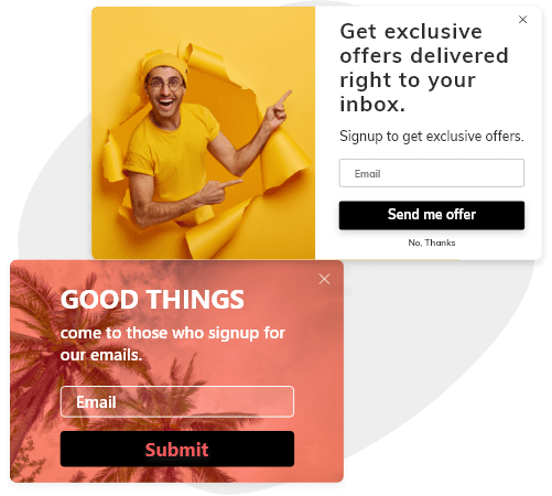
Email marketing never goes out of trend and is one of the most effective ways to communicate with your target audience. But for that, you first need to get the email addresses of your prospects/potential customers.
For visitors who are currently not interested in buying your products/services, can be targeted and encouraged to subscribe to your newsletter. While writing and designing your newsletter overlay, make visitors feel the value of this subscription. Let them know the benefits like special deals, free content, new product launch notifications, loyalty programs, and so on.
11 – Up-sell & Cross-sell to Boost Sales
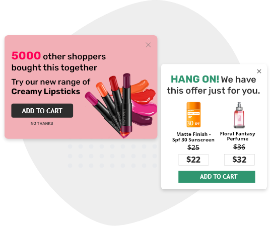
When the visitor has made their mind to checkout, show them a couple of other relevant products that go well with the items in the cart. You can also attach a discount tag or coupon while you attempt to up-sell or cross-sell as discounted prices surely grab visitors’ attention.
Make sure to display the overlay at the perfect time and don’t forget to add the images of the products you are trying to sell. Also, a tagline such as “10000+ other shoppers bought this together” or “You get 15% extra off when you purchase this!” increases the conversion chances.
12 – Encourage Visitors to Share to Increase Social Traffic
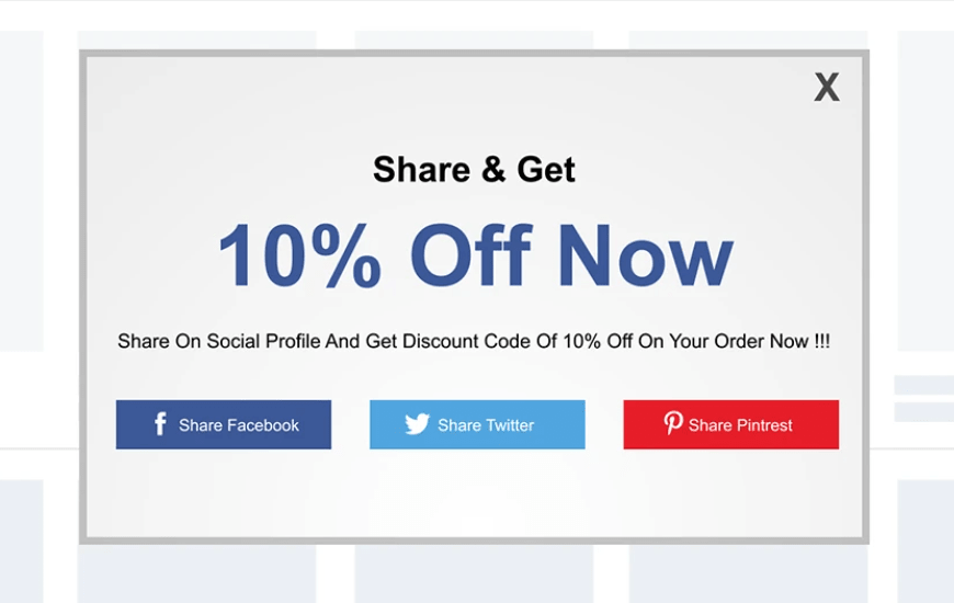
Image Source: Shopify
Social media almost tripled its user base in the last decade and the number keeps on increasing. So, when most of the online users are spending their time on social media, it is the perfect opportunity for you to run a referral campaign using website overlays.
Encourage your visitors and customers to share your products/services and their purchases over social media profiles with peers in return for discount coupons, premium guides/gifts, etc. It not only increases your conversion rate but also helps in building brand awareness. Include buttons of popular social apps like Facebook, Twitter, Instagram, Pinterest, Tumblr, etc., and make sure to highlight your offer & CTA.
Give Smart Overlays a Try in Your Own Online Store
Website overlays are the digital equivalent of alcoholic wine. When used in moderation, they can turn out to be pretty good for your conversions. When overused, or used at the wrong time, they just create unwanted problems.
It is crystal clear that overlays and popups can be beneficial for your online business, both in terms of sales and in offering a delightful browsing experience to your customers. The tips & tricks we talked about are all important and should be put together in your sales/marketing strategies to deliver excellent results. Got any questions about website overlay software? Feel free to ask our experts!
FREE. All Features. FOREVER!
Try our Forever FREE account with all premium features!

