Creating a well-crafted opt-in popup is more than just a means of capturing email addresses—it’s a strategic way of fostering meaningful connections with your audience.
These unobtrusive windows, strategically timed during a user’s journey on your website, present an invaluable opportunity to invite visitors into a more personalized and interactive experience.
By encouraging users to share their contact information willingly, you not only build a foundation for direct communication but also gain permission to deliver tailored content, promotions, and updates.
This targeted approach not only bolsters your marketing efforts but also enhances the overall user experience by providing relevant and timely information.
In this blog, we’ll explore real-world examples and delve into best practices. By striking the right balance between user-friendly design and persuasive messaging, you can elevate your website’s performance, driving conversions and establishing a robust foundation for long-term customer relationships.
6 Examples of Opt-in Popups You Can Use
Let’s take a look at some of the best opt-in popup examples used by companies in real life:
1. Alo Yoga
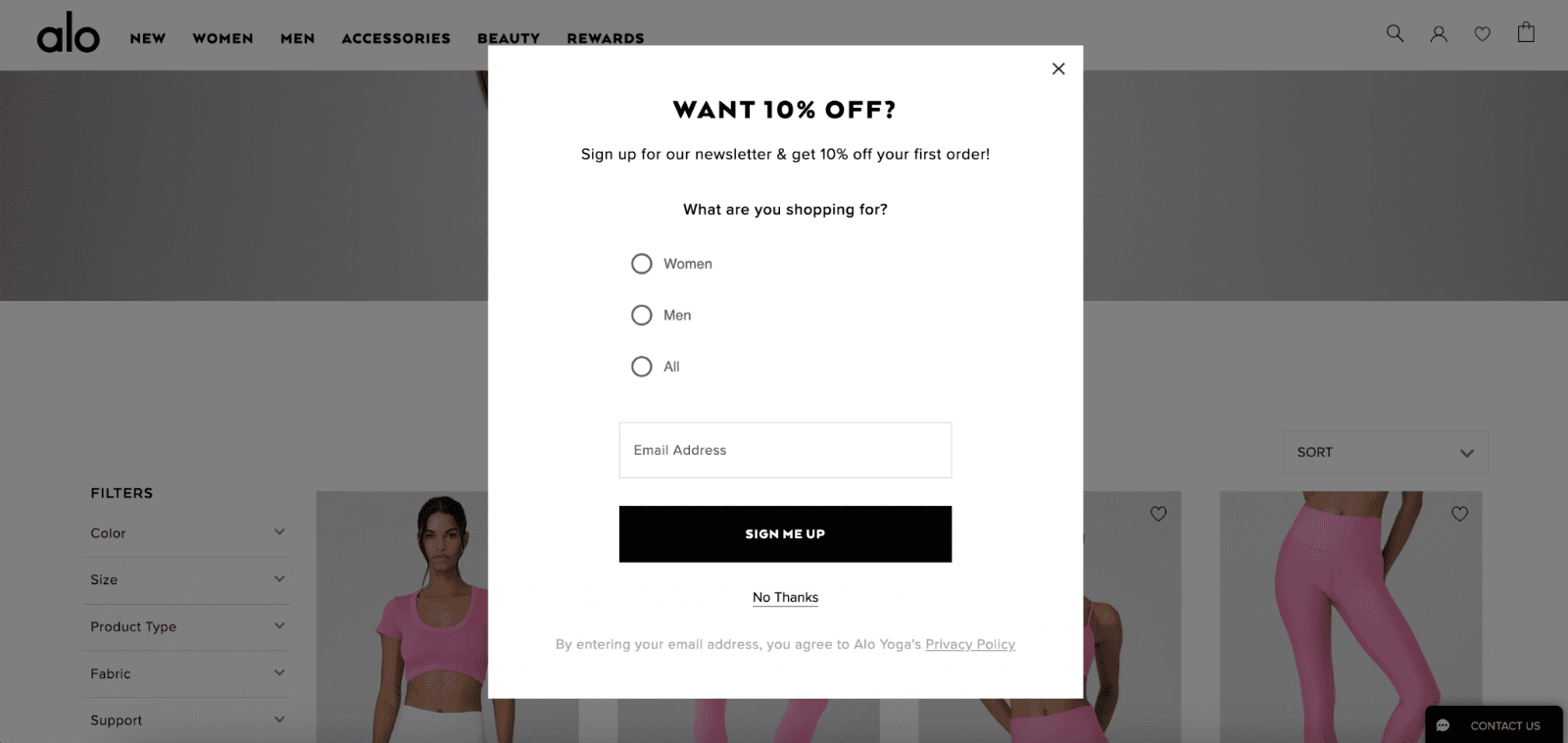
Alo Yoga employs a straightforward yet effective popup strategy on its website, strategically positioned to capture the attention of visitors upon entry.
By prompting users to share their email addresses through a simple opt-in form, Alo Yoga not only adds to its subscriber base but also opens avenues for future engagement and communication.
This unobtrusive approach ensures a seamless user experience, where each completed opt-in form represents a potential lead, laying the groundwork for sustained brand interaction.
2. Beis Travel
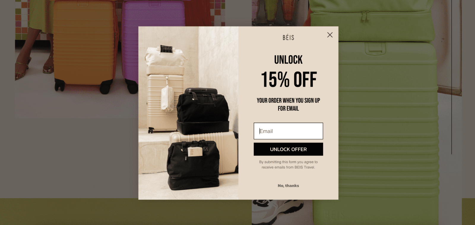
Generating leads through a website popup requires a delicate balance of showcasing your lead magnet while highlighting your brand and products.
Beis Travel expertly achieves this balance in their popup example, seamlessly blending concise yet compelling copy with visually appealing product photography.
The popup not only serves as a gateway to potential subscribers but also reinforces the brand’s identity and offerings, creating a holistic and engaging user experience.
3. Bubble Skincare
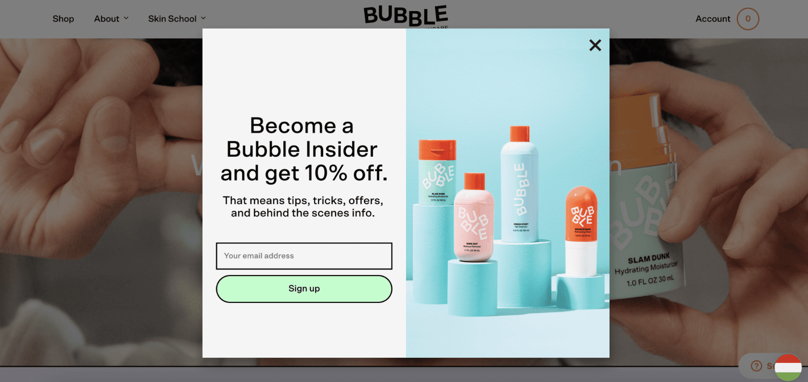
Bubble Skincare’s innovative popup campaign goes beyond the conventional by inviting website visitors to become part of the exclusive “Bubble Insider” community.
This unique approach refrains from relying solely on discounts, instead positioning its email list as an exclusive club, appealing to the human desire for exclusivity.
By leveraging this sense of privilege, Bubble Skincare not only attracts potential email subscribers but also cultivates a community mindset, fostering a deeper connection between the brand and its audience.
4. Caraway
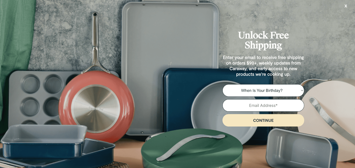
Caraway adopts a bold and immersive approach with a fullscreen popup dedicated to promoting their enticing free shipping offer.
Opting for a larger format over a smaller lightbox popup, Caraway ensures that all users are captivated by their offer without distraction.
This strategic move capitalizes on the persuasive appeal of free shipping, one of the most compelling incentives in online shopping, presenting it prominently to maximize user engagement and conversions.
5. CoSchedule
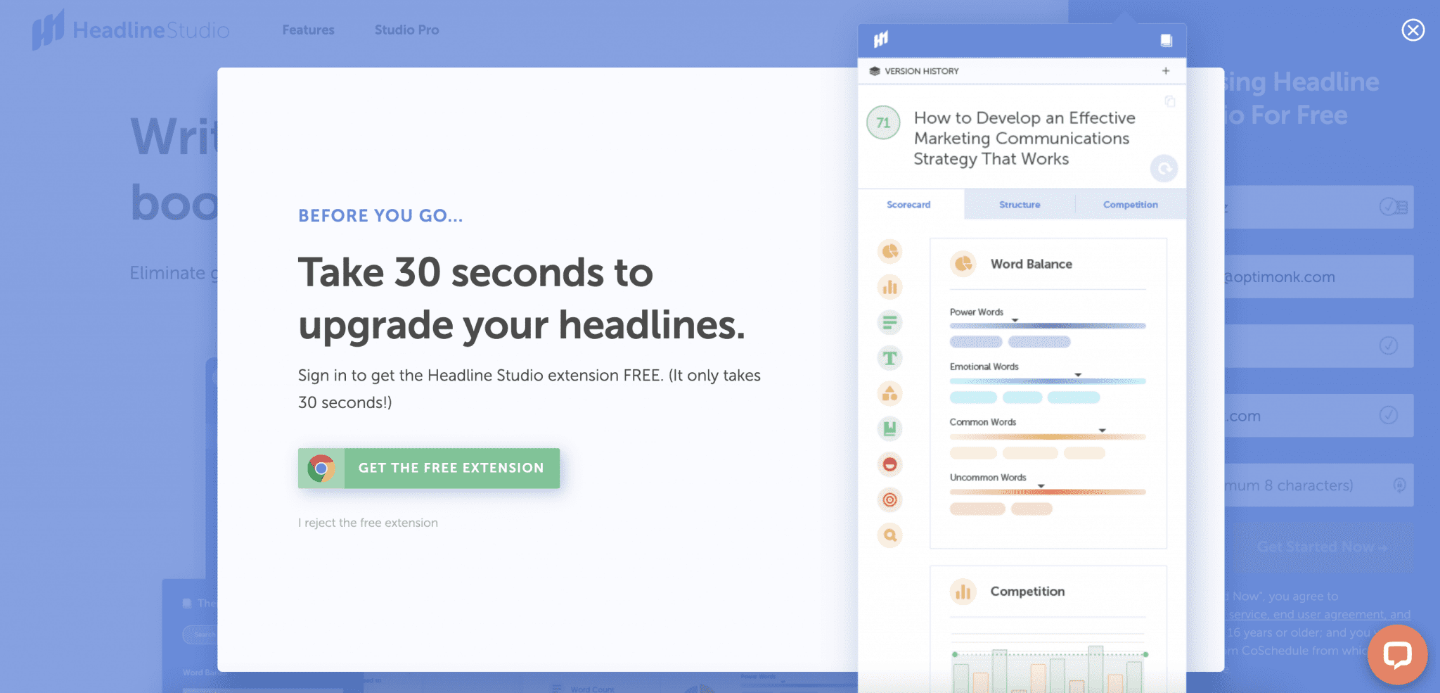
CoSchedule strategically employs a lightbox popup on its website, akin to the approach taken by ClickUp, to emphasize the time-saving capabilities inherent in its software.
The purpose of their exit-intent popup is clear: enticing users to explore their software through a free demo, conveniently presented as a Chrome extension. What sets this example apart is the inclusion of a sizable screenshot showcasing the application in action, providing potential users with a visual preview of the benefits they can expect upon downloading the app.
This visual representation enhances user understanding and engagement, making the proposition more tangible and compelling.
Opt-in Popup Best Practices
Now, let’s go over some of the best practices that you need to deploy to create the most effective opt-in popups:
Create a Clear Message in Your Popup
Construct a crystal-clear message within your popup, avoiding any potential confusion. Articulate the benefits of taking the desired action concisely and persuasively.
Ensure that the language used aligns seamlessly with your brand identity, maintaining a consistent tone across all communication channels. This clarity not only fosters immediate understanding but also sets the stage for a positive user experience.
Personalize Your Popup for Better Engagement
Elevate user engagement by implementing robust personalization strategies. Utilize available user data to address individuals by their names, reference their past interactions, and suggest content based on their preferences.
This tailored approach goes beyond surface-level personalization, creating an experience that feels intimately connected to the user’s journey and preferences, thereby significantly increasing the likelihood of a positive response.
Offer a Tempting Incentive for Sign-Ups
Transform your popup into an irresistible proposition by offering a carefully curated incentive. Whether it’s a time-sensitive discount, exclusive access to premium content, or a sneak peek at upcoming releases, the incentive should be not only attractive but also urgent.
Craft a value proposition that not only entices immediate action but also conveys a sense of exclusivity, creating a compelling reason for users to share their information willingly.
Design a Catchy Popup to Grab Attention
Capture the user’s attention with a visually striking and cohesive design that mirrors your brand identity. Utilize vibrant colors, captivating imagery, and fonts that are not only aesthetically pleasing but also align with your overall brand theme.
The design should seamlessly integrate with the user interface, creating a visually appealing and engaging popup that not only enhances brand recognition but also entices users to interact.
Tailor Popups for Desktop and Mobile Users
Optimize the user experience across diverse devices by tailoring your popups for both desktop and mobile users.
Implement responsive design principles to ensure a seamless adaptation to various screen sizes. Prioritize legibility, visual appeal, and navigational ease on all devices, ensuring that the user journey remains consistent and delightful.
A user-friendly design is pivotal in facilitating positive interactions and nurturing higher conversion rates across the entire spectrum of user devices.
Capture Exiting Visitors with Exit-Intent Popup
Strategically deploy exit-intent popups as a dynamic tool to re-engage users who are on the verge of leaving your site.
Craft persuasive messaging or offers that directly address potential concerns, providing users with a compelling reason to reconsider their decision to exit.
Whether it’s a limited-time offer, additional information, or an enticing discount, the exit-intent popup serves as a last-minute opportunity to recapture attention and retain interest.
This proactive approach aims to salvage potentially lost conversions by presenting users with a compelling reason to stay and explore further, transforming an exit into a renewed opportunity for engagement.
How to Create an Opt-in Popup
Creating an opt-in popup is easy, provided that you have the right popup builder tool for it. We’ll take Picreel as our tool of choice since it is one of the most capable popup builders out there, and it’s also free.
Watch this video tutorial on how you can create a popup using Picreel:
Here are step-by-step instructions on creating Opt-in popup using Picreel:
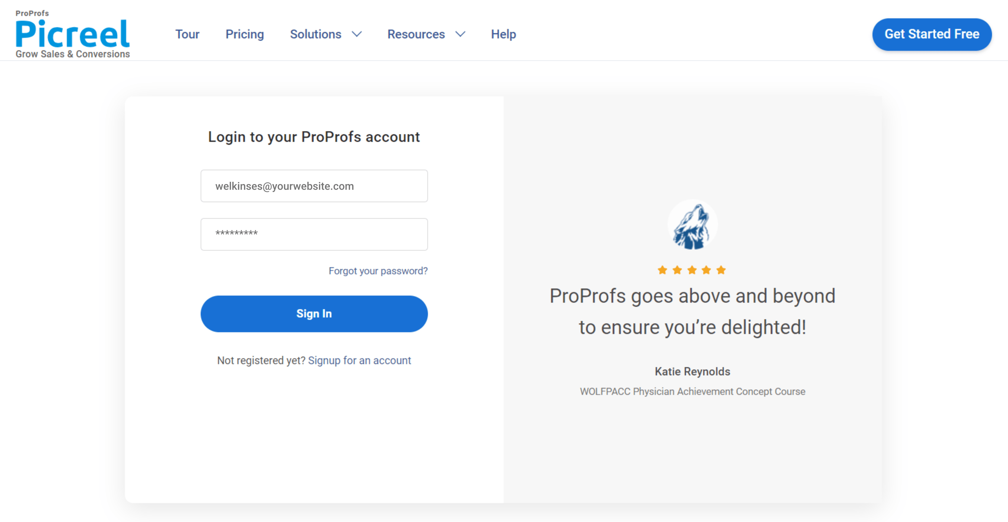
1. To begin using Picreel, you must first sign up for an account and then log in.
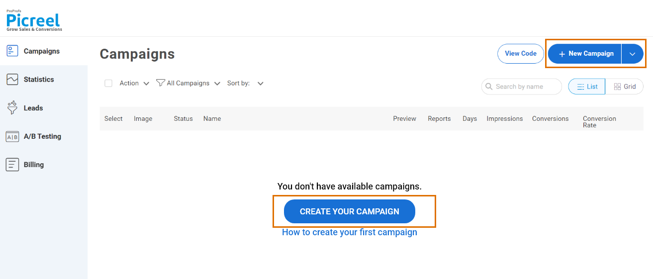
2. Navigate to the “Campaigns” tab, then click on “New Campaign” in the top right corner. Alternatively, you can start with a template by choosing the “Create Using Templates” option from the drop-down.
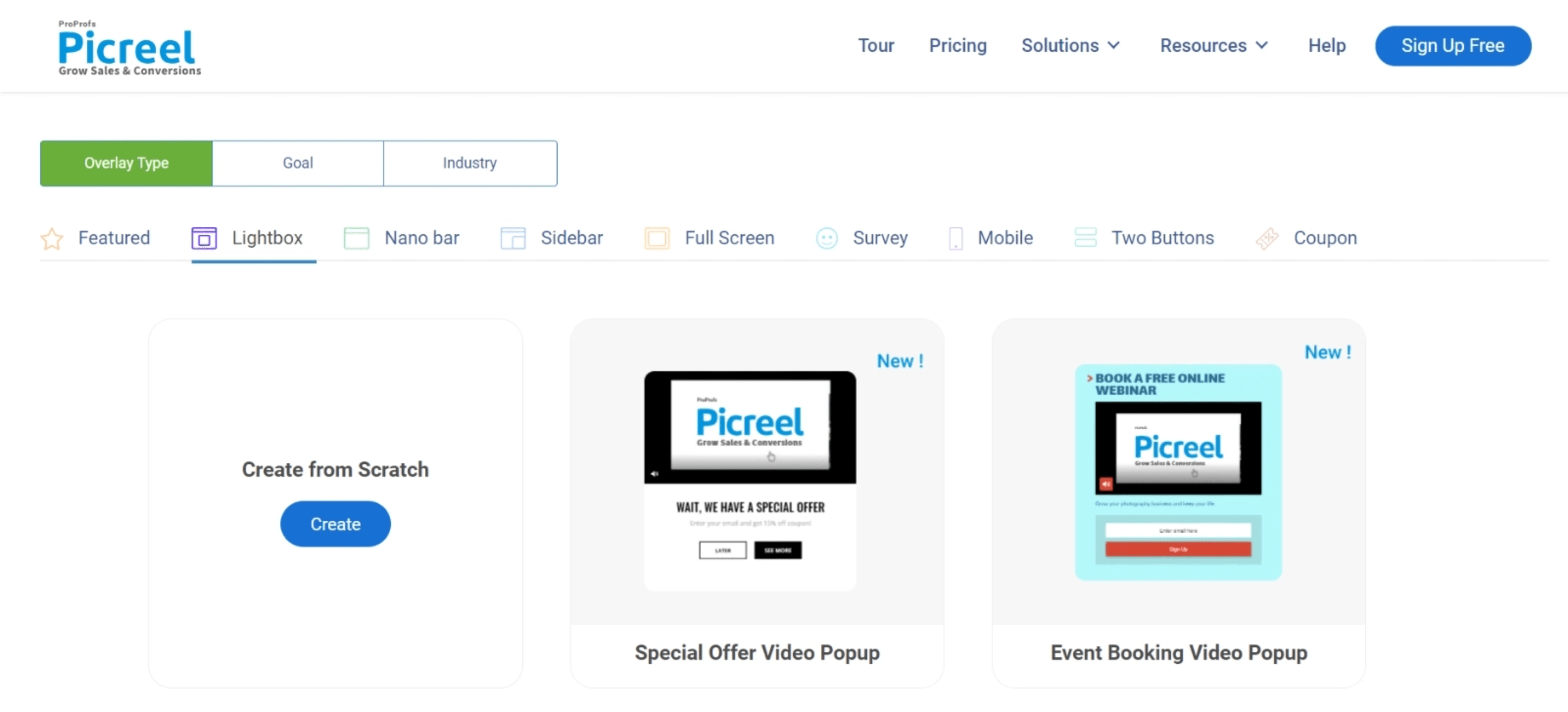
3. Choose the template of your choice.
4. After selecting a design, personalize it based on your preferences.
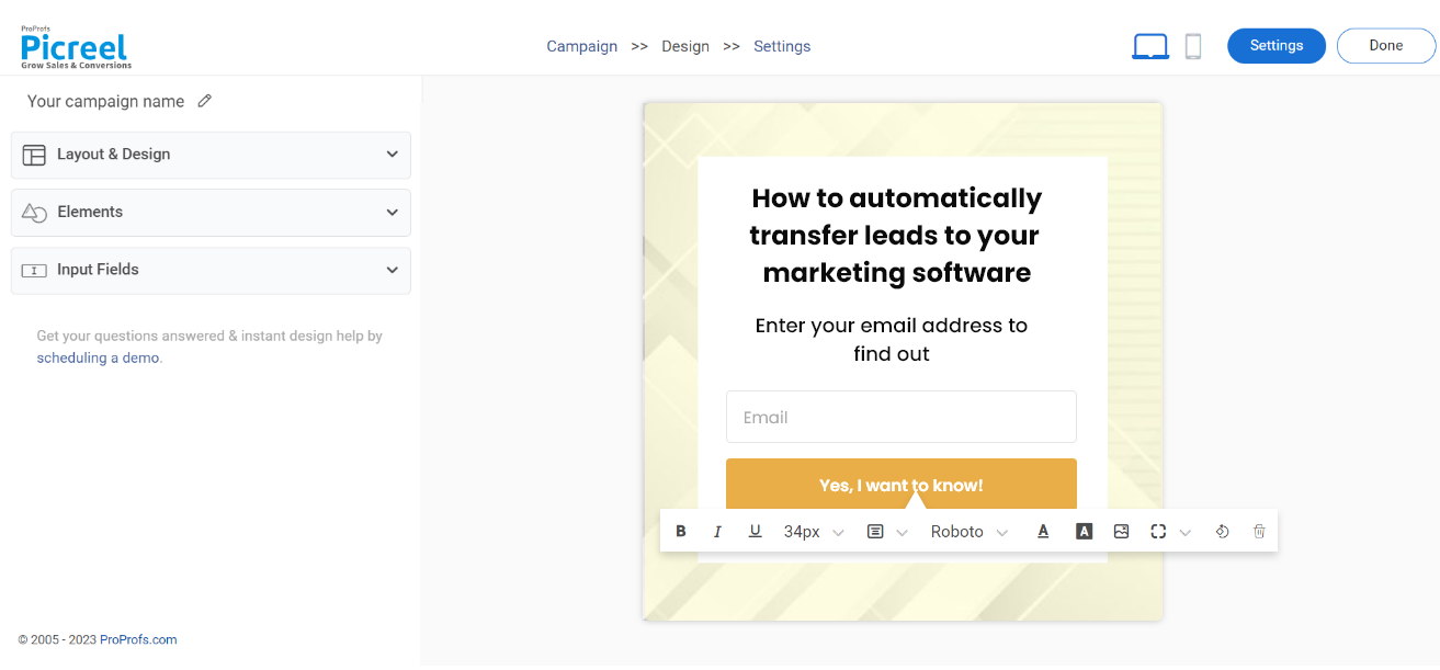
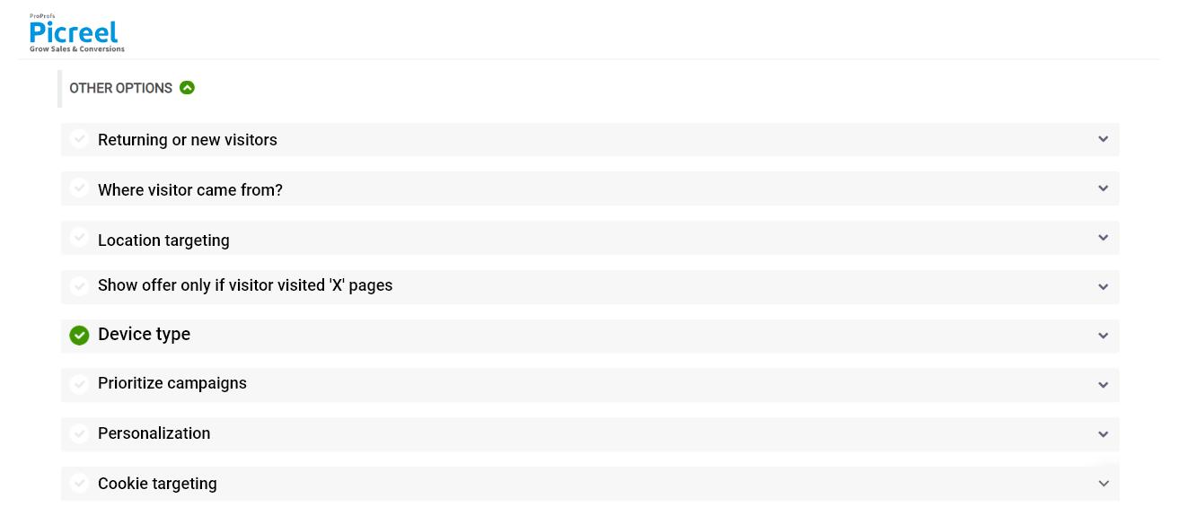
5. Configure the targeting and trigger options to specify the specific conditions and locations for displaying your cookie popup.
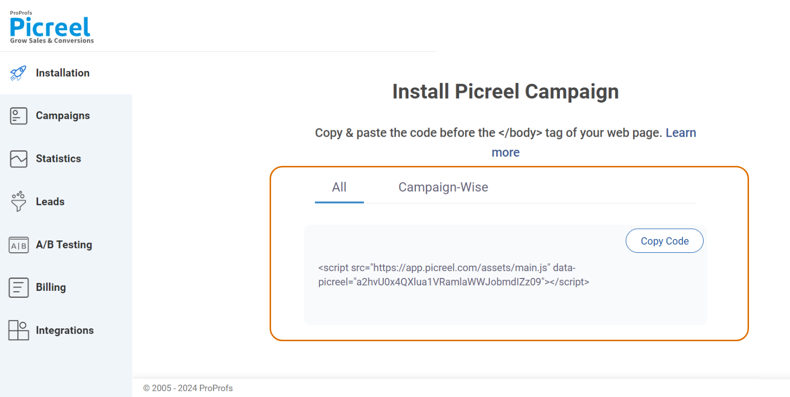
6. Click the “Save” button. Next, integrate the popup with your website.
Revolutionize Your Website With Opt-in Popups
Mastering the use of opt-in popups goes beyond just getting email addresses—it’s about building real connections. By using clear messages, personalized engagement, tempting incentives, eye-catching designs, and adapting to different devices, businesses can create a path to meaningful user engagement and increased conversions.
The smart use of exit-intent popups also shows dedication to keeping users interested. These best practices combine creativity with functionality, making popups not just attention-grabbing but also tools for fostering lasting relationships with an ever-changing online audience.
Apply these techniques to your website and see how they can positively transform your conversion strategy.
 Tips
Tips
We’d love to hear your tips & suggestions on this article!
FREE. All Features. FOREVER!
Try our Forever FREE account with all premium features!

 We'd love your feedback!
 Thanks for your feedback!


