“The key is not to just collect leads, but to cultivate relationships with them.” – Tim Ferriss
If you want to stand out, you need to engage your audience. Your website may be bustling with visitors, but the majority are simply window-shopping. They’re curious but not quite ready to commit. How do you transform those casual browsers into valuable leads?
My opinion? It’s time to rethink your lead generation strategy. Multi-step popups present a sophisticated solution to this challenge. In this post, I’ll dissect the essentials, share the best practices I’ve learned, and demonstrate how you can build popups that convert like crazy.
Continue reading to find out.
What Is a Multi-Step Popup?
A multistep popup is an interactive feature on websites that presents visitors with a series of windows, or “steps,” each containing different content—like sign-up fields for email or phone numbers, surveys, and more. These popups are crafted to capture meaningful user data, making them a valuable tool for marketing.
What makes multistep popups particularly effective is their ability to create a more engaging and gradual interaction with visitors. By guiding users through a thoughtful process, they enhance engagement and help gather important information such as contact details, product interests, and feedback.
Common Types of Multi-Step Popups
- Email & SMS Subscription With Progressive Profiling: These are classic two-step popups. The first step requests the visitor’s email address, and upon submission, the second step asks for additional information like phone number or preferences. This approach respects the user’s time and builds trust by not initially overwhelming them with a long format.
- Lead Generation With Qualification Questions: This multi-step popup focuses on gathering and qualifying leads simultaneously. The initial step might offer a lead magnet or an incentive in exchange for an email address. Subsequent steps ask qualifying questions to segment leads based on their needs and interests. This allows for targeted follow-up and personalized communication.
- Gamified Popups with Mystery Offers: This interactive popup engages visitors with a game-like experience, often using a spin-the-wheel or scratch-off format. The initial step entices the visitor to play, and subsequent steps reveal the mystery offer or discount, typically requiring an email address to claim the reward. This approach adds an element of fun and surprise, increasing participation.
- Content Upgrades & Resource Downloads: This popup promotes valuable content like ebooks, white papers, or templates. The first step highlights the offer, and subsequent steps collect the visitor’s email address and potentially other relevant information before granting access to the download. This helps build an email list and positions the blog as a valuable resource.
- Exit-Intent Popups With Special Offers: These popups appear when a visitor is about to leave the site, offering a last-minute discount or incentive to stay. The initial step might present a compelling offer, followed by steps to collect the visitor’s email or prompt them to complete a purchase. This can help recover potentially lost leads and boost conversions.
- Survey or Feedback Popups: These popups gather valuable insights from visitors through a series of questions. The first step introduces the survey topic, and the subsequent steps present the questions individually. This approach encourages completion by not overwhelming visitors with a lengthy survey.
- Product Recommendation Quizzes: These interactive popups guide visitors through a series of questions to understand their needs and preferences. The first step introduces the quiz and its purpose, while subsequent steps present the questions. Ultimately, the popup recommends relevant products or services, often prompting the visitor to provide their email for further information or personalized offers.
- Cart Abandonment Popups: These popups target users who add items to their cart but exit without buying the product. The first step might remind the visitor of their cart contents, while subsequent steps offer incentives, free shipping, or other discounts to encourage them to complete the transaction.
- Personalized Welcome Mats: These popups greet first-time visitors with a customized message based on their location, referral source, or other data. Subsequent steps might offer a discount code, invite them to join the email list, or direct them to specific content relevant to their interests.
- Social Proof Popups: These popups leverage testimonials, reviews, and follower counts to build trust and credibility. The first step might display a compelling statistic or quote, followed by steps encouraging visitors to subscribe to the email list or follow the blog on social media.
Advantages of Multi-Step Popups
Multi-step popups offer numerous benefits:
- Comprehensive Data Collection: These popups enable you to gather detailed information about your audience, including product preferences, gender, and contact details—all in one go.
- Flexible Marketing Objectives: You can achieve multiple goals with a single popup, combining website feedback collection with email or phone number gathering.
- Improved Conversion Rates: Because they are less intrusive, multi-step popups can encourage more visitors to take action, such as signing up or purchasing.
- Higher Quality Leads: These popups generate more likely-to-convert leads by prompting users to provide specific information, such as their preferences or answers to questions.
- Boosted Visitor Engagement: Keeping users engaged with a series of prompts encourages them to stay on the site longer and increases conversion chances.
8 Best Multi-Step Popup Examples for Different Use Cases
Here, we will discuss some multi-step popup examples primarily used for generating leads, and explain their perks in detail.
1. Increasing User Engagement
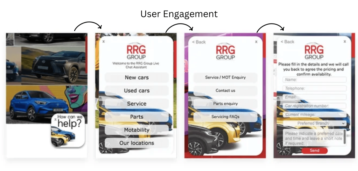
The RRG Group’s multi-step popup is among the stellar multi-step form examples. It has a user-friendly design that helps visitors engage. It starts with a warm welcome and a simple “How can we help?” message, creating a friendly atmosphere right away. The first popup offers clear options, making it easy for users to identify what they need quickly.
Instead of overwhelming users with a complicated form, it uses an intelligent approach called progressive disclosure. As users make choices, the popup smoothly transitions to the next step, asking for specific details related to their selections. This keeps the experience relevant and straightforward.
The design is clean and minimalist, emphasizing ease of use. A handy “Back” button lets users change their minds or review their choices. Finally, a clear “Send” button on the last step tells users exactly what to do to finish the process.
Overall, this popup does an excellent job of understanding user needs, personalizing the interaction, and boosting lead generation through a smooth and user-friendly experience.
2. Growing Your Email List
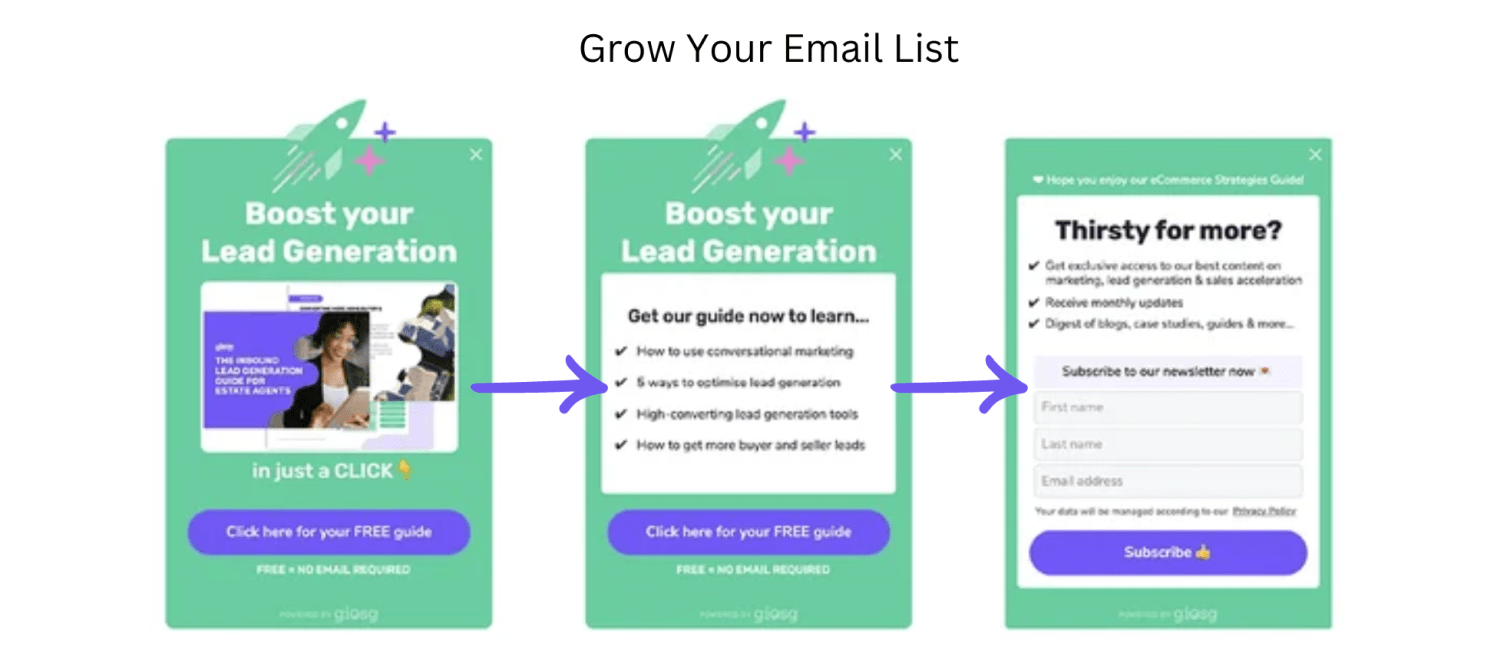
This pop-up is sneaky and clever, and it’ll help you grow your email list like a boss. Just one click, and this pop-up will take your lead generation game to the next level. The visuals are eye-catching, and the offer of a free guide is like a magnet, pulling people in and making them want to sign up.
When users click, the second step elaborates on the offer, giving a sneak peek into the guide’s valuable content—like tips on conversational marketing, optimizing lead generation, and tools for boosting conversions. This highlights the benefits and encourages users to keep engaging.
In the final step, users see the main goal: signing up for email updates. Tapping into their earlier interest offers exclusive access to premium content and monthly updates. The form is simple, with minimal fields, making it easy for users to subscribe, and a clear “Subscribe” button prompts quick action.
This multi-step approach works well because it doesn’t overwhelm users with an immediate subscription request. Instead, it builds interest by showcasing the benefits, creating a sense of reciprocity, and ultimately making users more likely to convert.
3. Reducing Cart Abandonment
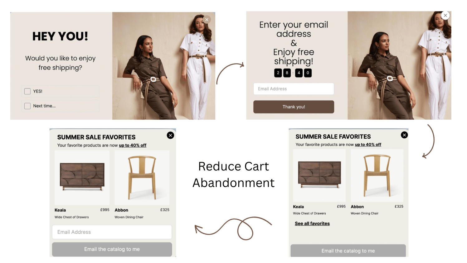
This multi-step popup employs a classic incentive-driven strategy to combat cart abandonment, leveraging the allure of free shipping. The initial popup strategically targets visitors about to leave without completing their purchase, posing a direct question: “Would you like to enjoy free shipping?”. This timely and enticing offer is a compelling reason to reconsider abandoning their cart.
The second step capitalizes on the positive response by presenting a simple email capture form. It reinforces the initial offer with the message “Enter your email address & enjoy free shipping!” creating a sense of immediate gratification. The streamlined form minimizes friction, encouraging users to provide their information to secure the benefit quickly.
Upon submission, the final step expresses gratitude and reiterates the value proposition: “Thank you! Enjoy free shipping!”. This positive reinforcement solidifies the user’s decision to stay and complete their purchase. “Next time…” subtly suggests ongoing communication and future incentives, potentially fostering customer loyalty and encouraging repeat visits.
This popup’s effectiveness lies in its well-timed intervention and enticing offer. Presenting a valuable incentive at a crucial moment disrupts the cart abandonment process and motivates users to reconsider their decision.
4. Surveying & Taking Feedback
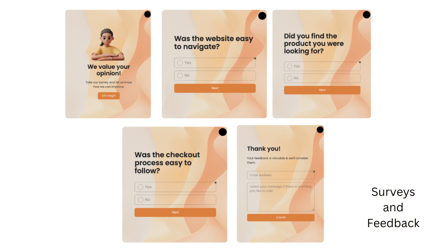
This is among the simplest multi-step form examples. First, the popup takes a focused approach that zeroes in on critical parts of the user experience. This ensures that the feedback collected is relevant and can be used to improve things like website navigation, product searches, and the checkout process.
Also, placing just one question at a time makes it quick and easy for users to respond, increasing the chances of getting valuable feedback.
Second, the popup creates a positive experience with its friendly visuals and appreciative tone. Highlighting the importance of user opinions and thanking participants for their time encourages people to engage and feel valued.
Finally, the multi-step design helps prevent users from feeling overwhelmed by a long survey all at once. This can result in increased completion rates and more detailed feedback for businesses. While there’s always room for improvement—like adding open-ended questions or offering incentives—this popup sequence is a strong starting point for gathering targeted and actionable user insights.
5. Generating Leads
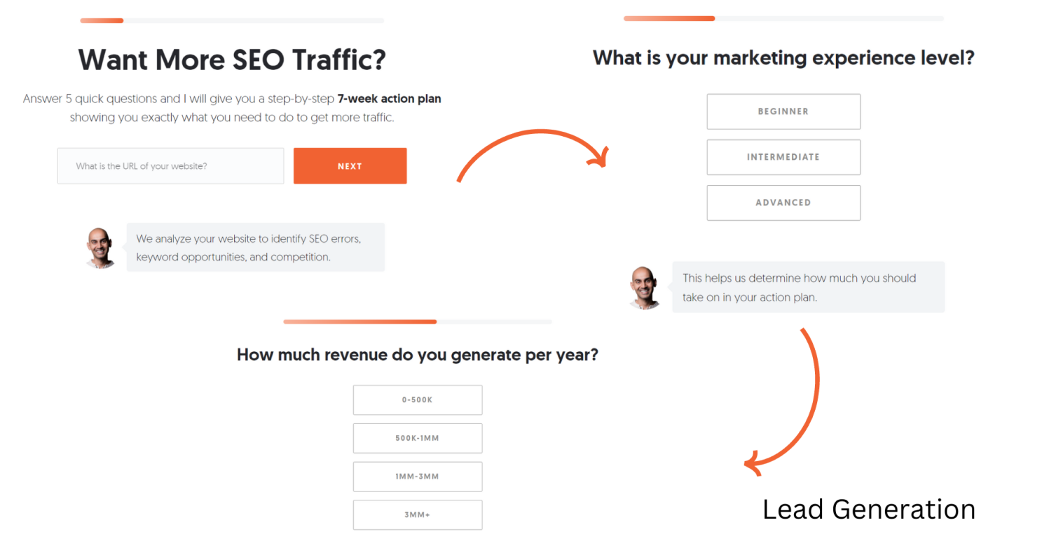
Neil Patel’s multi-step popup is a classic example of effective lead generation. It starts by addressing a common issue for its audience: wanting more SEO traffic. Right away, it offers a solution—a personalized 7-week action plan—which makes it very appealing for users to engage.
What really sets this popup apart is its progressive profiling approach. It begins with simple questions, lik e asking for the website URL and the user’s marketing experience. This builds trust and makes it easier for users to share more sensitive information later on, like revenue and budget. Easing users into the process increases the likelihood that they’ll complete the whole sequence.
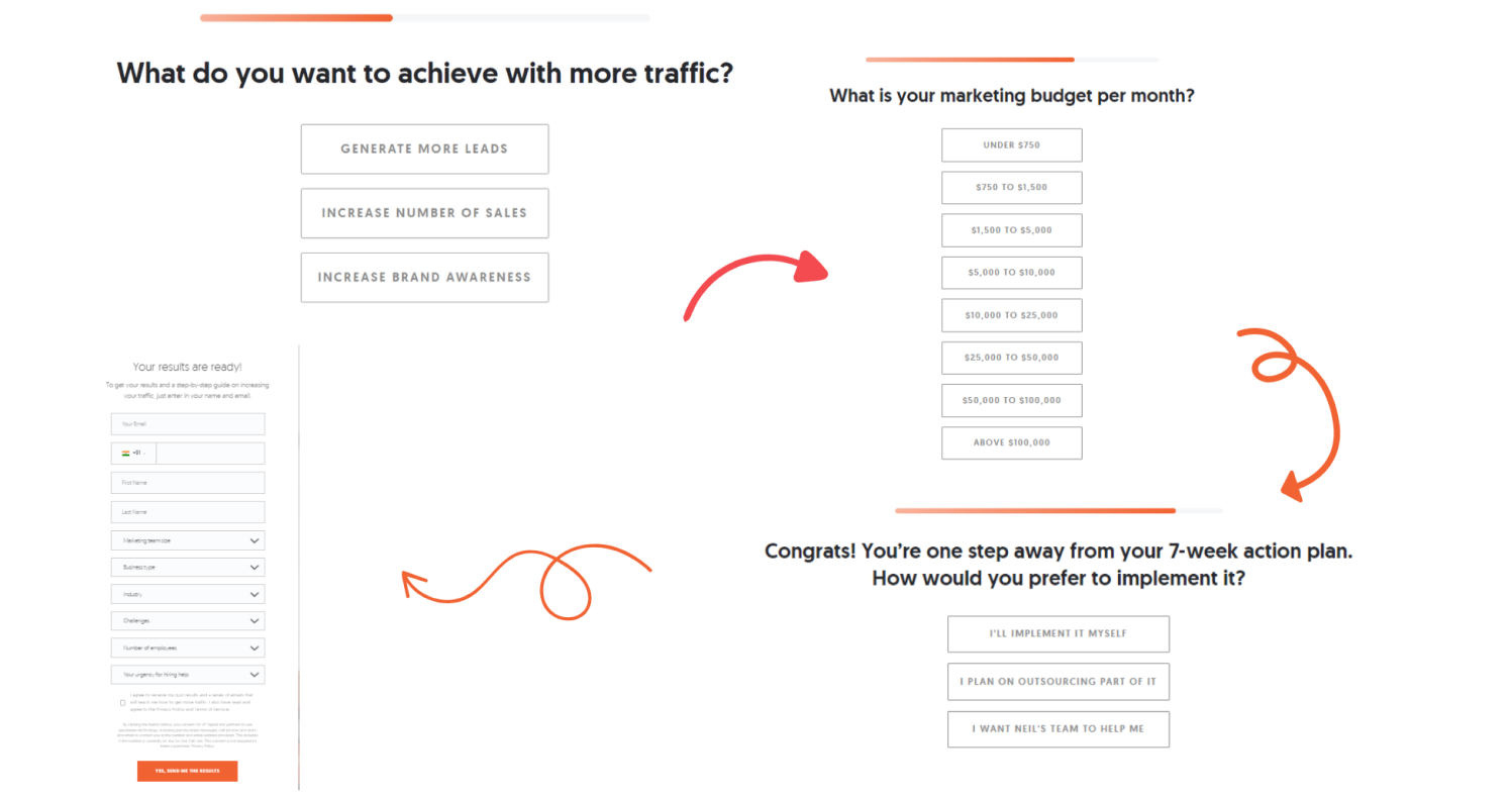
The questions serve two purposes: they gather valuable information and qualify leads. Neil Patel can categorize leads and tailor his follow-up efforts by learning about a user’s experience, revenue, and budget. This focus on high-potential leads boosts the chances of conversion.
The design also plays a pivotal role in the popup’s success. With a clean layout, clear calls to action, and Neil Patel’s image adding credibility, the overall experience is smooth and engaging. It guides users seamlessly through each step, keeping them focused on the ultimate goal—lead generation.
6. Promoting Products & Offers
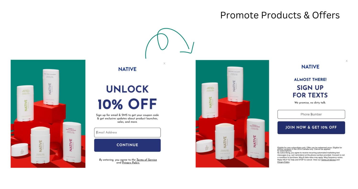
This multi-step popup from Native does a great job of attracting attention and capturing product leads by combining eye-catching visuals, clear messaging, and appealing incentives.
It kicks off with a bold “Unlock 10% Off” headline, immediately highlighting the benefit of engaging further. The vibrant colors and visuals of Native products strengthen the brand’s identity and add excitement. The “Continue” button is straightforward, guiding users to the next step smoothly.
The second popup’s design remains consistent and focuses on gathering the user’s phone number. It includes a lighthearted reassurance—“We promise no dirty talk”—to ease any worries about spam. The “Join Now & Get 10% Off” button reinforces the incentive and creates a sense of urgency.
Overall, this multi-step popup leads users through a smooth experience, from the initial interest to capturing their contact information. It effectively combines clear value propositions, concise messages, and appealing design to encourage users to sign up for a discount on Native products.
7. Gamification
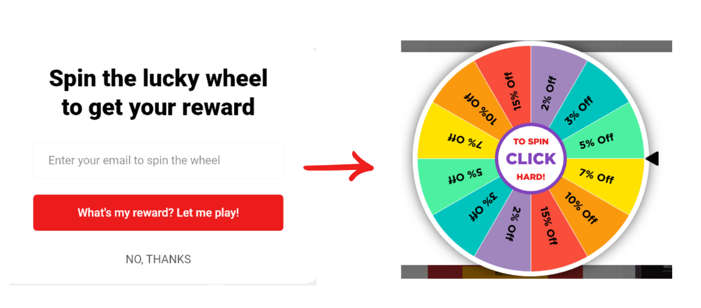
This gamified popup made using Picreel uses a fun two-step approach to attract users and collect their email addresses.
In the first step, the popup invites users to spin a lucky wheel for an opportunity to win a reward. The clear call-to-action—“What’s my reward? Let me play!”—along with a simple email entry field makes it easy for users to engage. This focuses their attention on the exciting possibility of winning, encouraging them to share their email to continue.
Once they submit their email, users are greeted by the second popup, which features the spinning wheel. The visual display of potential rewards, ranging from small to big discounts, creates excitement. The playful instruction, “CLICK HARD!” adds a fun interactive element, enhancing the gamified experience.
This two-step design is clever. By collecting the email upfront, the popup ensures that even if users don’t end up spinning the wheel or don’t win a big prize, their contact information is still captured. The game reveal acts as a reward for sharing their email, making the interaction more engaging. The chance of winning a discount incentivizes participation, leading to higher conversions and a growing email list for future marketing.
8. Quizzes & Assessments
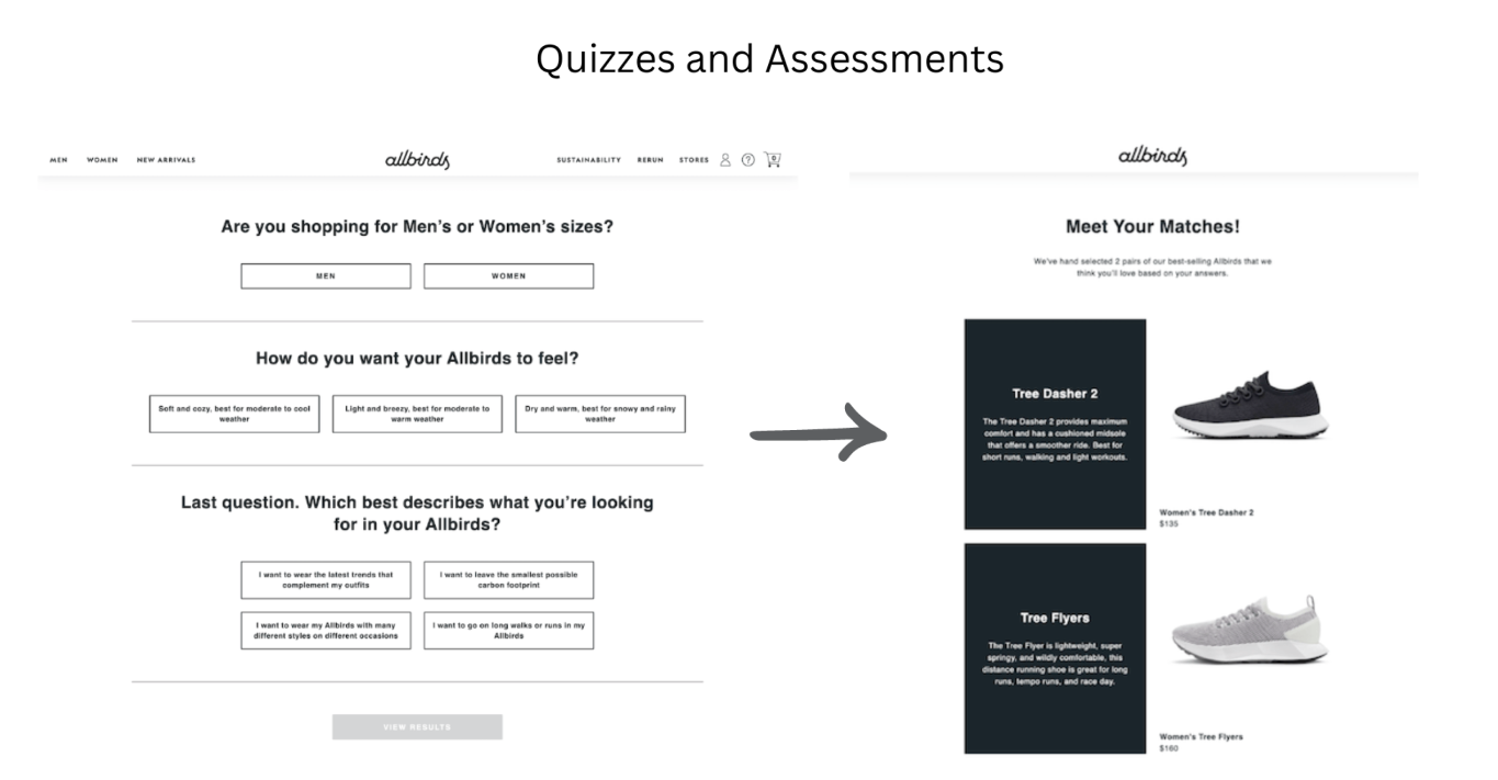
This multi-step popup quiz is a fantastic tool for helping shoppers find their perfect shoes from Allbirds.
Visually, it’s clean and simple, matching Allbirds’ minimalist style. The high-quality product images in the final “Meet Your Matches” section are eye-catching, and a clear arrow helps guide users through each step. The straightforward, jargon-free language makes it easy to understand.
By breaking the selection process into small steps, the quiz keeps things manageable and prevents users from feeling overwhelmed. The focus on personalization makes each shopper feel special, which creates a positive impression of the brand. Plus, by providing tailored recommendations, the quiz saves users time and effort, smoothing their shopping experience.
Overall, this popup combines thoughtful design, clear communication, and user-friendly features to create an engaging way for customers to discover products. It does more than just ask questions; it offers an interactive experience that leads shoppers to their ideal Allbirds shoes, reinforcing the brand’s commitment to customer satisfaction and personalized service.
FREE. All Features. FOREVER!
Try our Forever FREE account with all premium features!
How to Create Multi-Step Popups: A Step-by-Step Guide
When it comes to capturing the attention of website visitors and guiding them toward becoming loyal subscribers and customers, a standard popup builder may not suffice. You need a tool that goes beyond the basics and allows you to create captivating and personalized popups that genuinely resonate with your audience.
Let’s walk through the process of creating multi-step popups by using Picreel as an example tool:
Step 1: Start a New Campaign
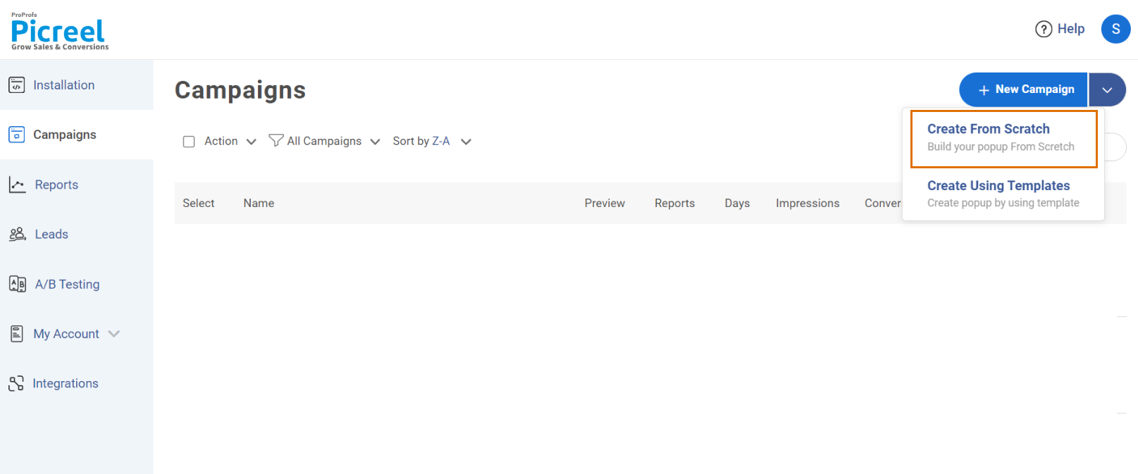
In your Picreel Campaigns dashboard, locate the “+New Campaign” button and click the dropdown arrow next to it. Select “Create from Scratch.”
Step 2: Choose Multi-Screen Layout
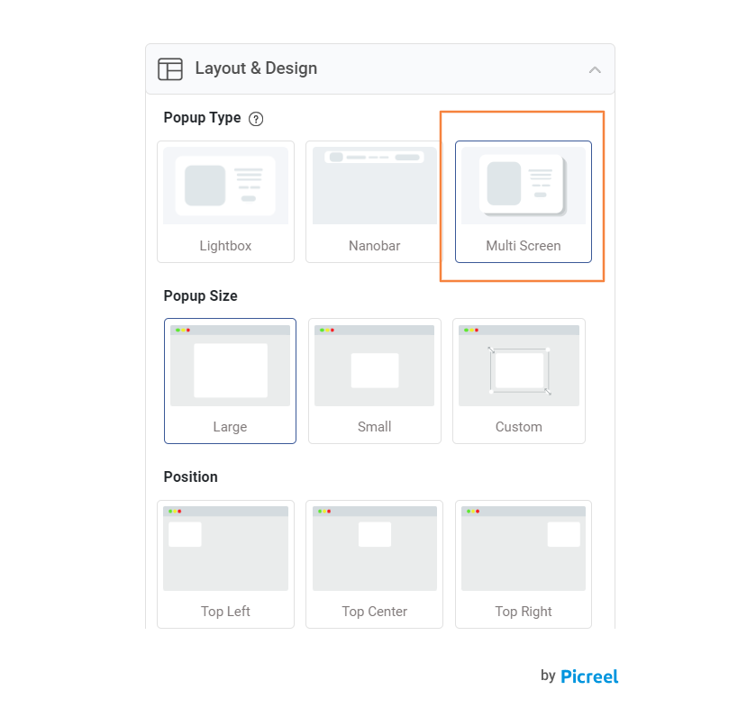
In the “Layout & Design” section, under “Popup type,” choose “Multi-Screen.”
Step 3: Design the First Screen
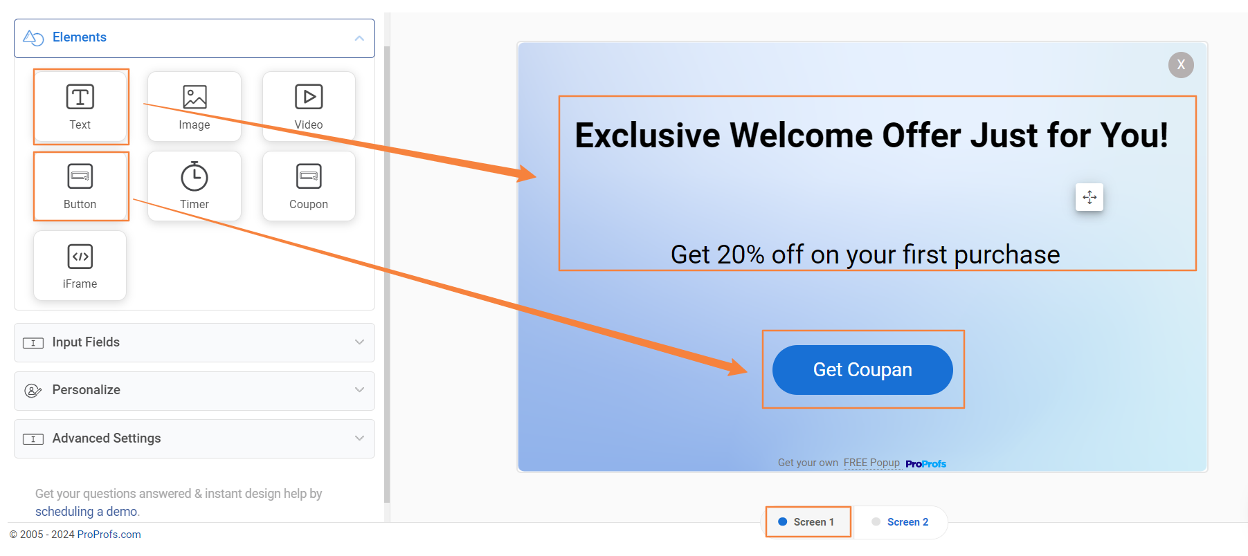
Use the campaign builder to:
- Add an eye-catching title and a concise, compelling description.
- Include a clear call-to-action (CTA) button, such as “Get My Coupon.”
- Add an email input field and mark it as required to capture leads.
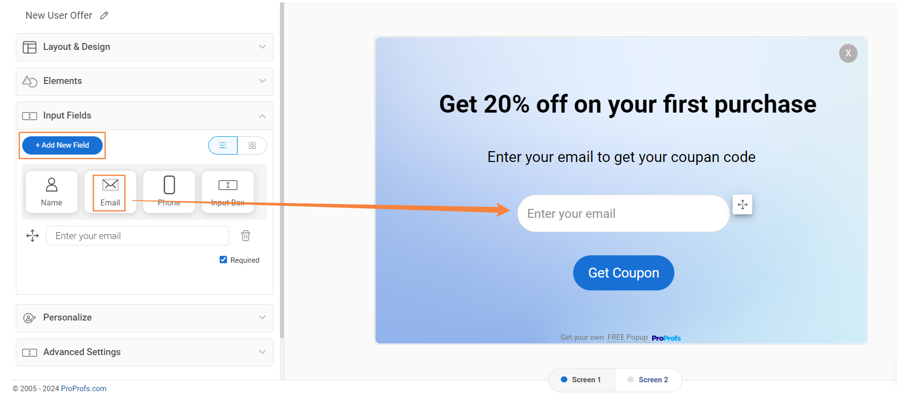
Step 4: Craft the Second Screen
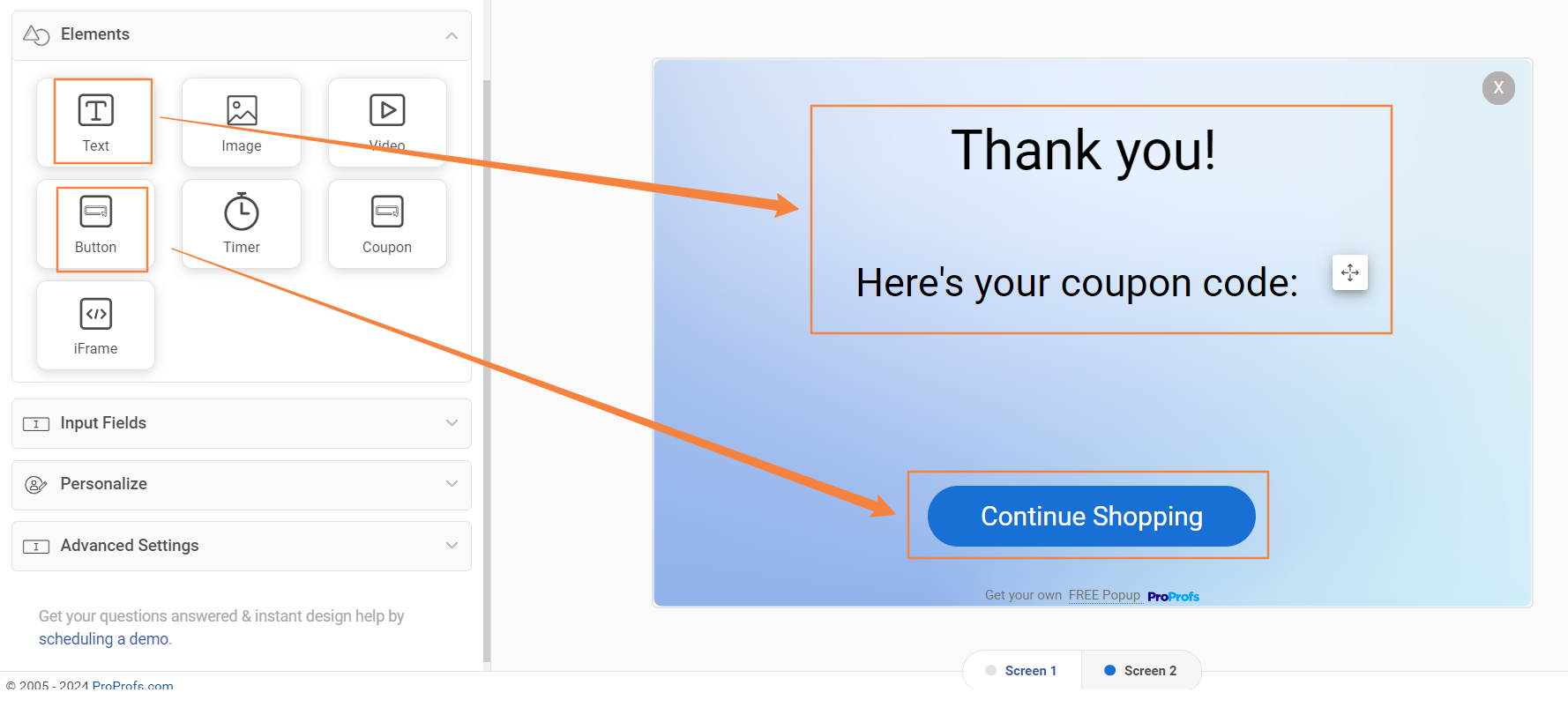
Use the campaign builder to:
- Express gratitude for signing up with a “Thank you” message.
- Add a button to close the overlay or direct users to a specific offer page.
- Include the “Picreel dynamic coupon” element and enter your coupon code.
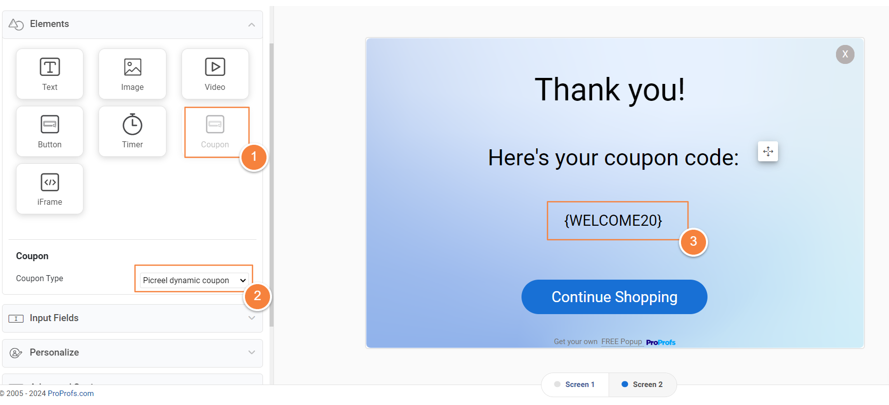
Step 5: Preview & Test
- Click “Preview” to see your popup from the visitor’s perspective.
- Test all functionality to ensure a seamless experience.
Step 6: Save and Publish
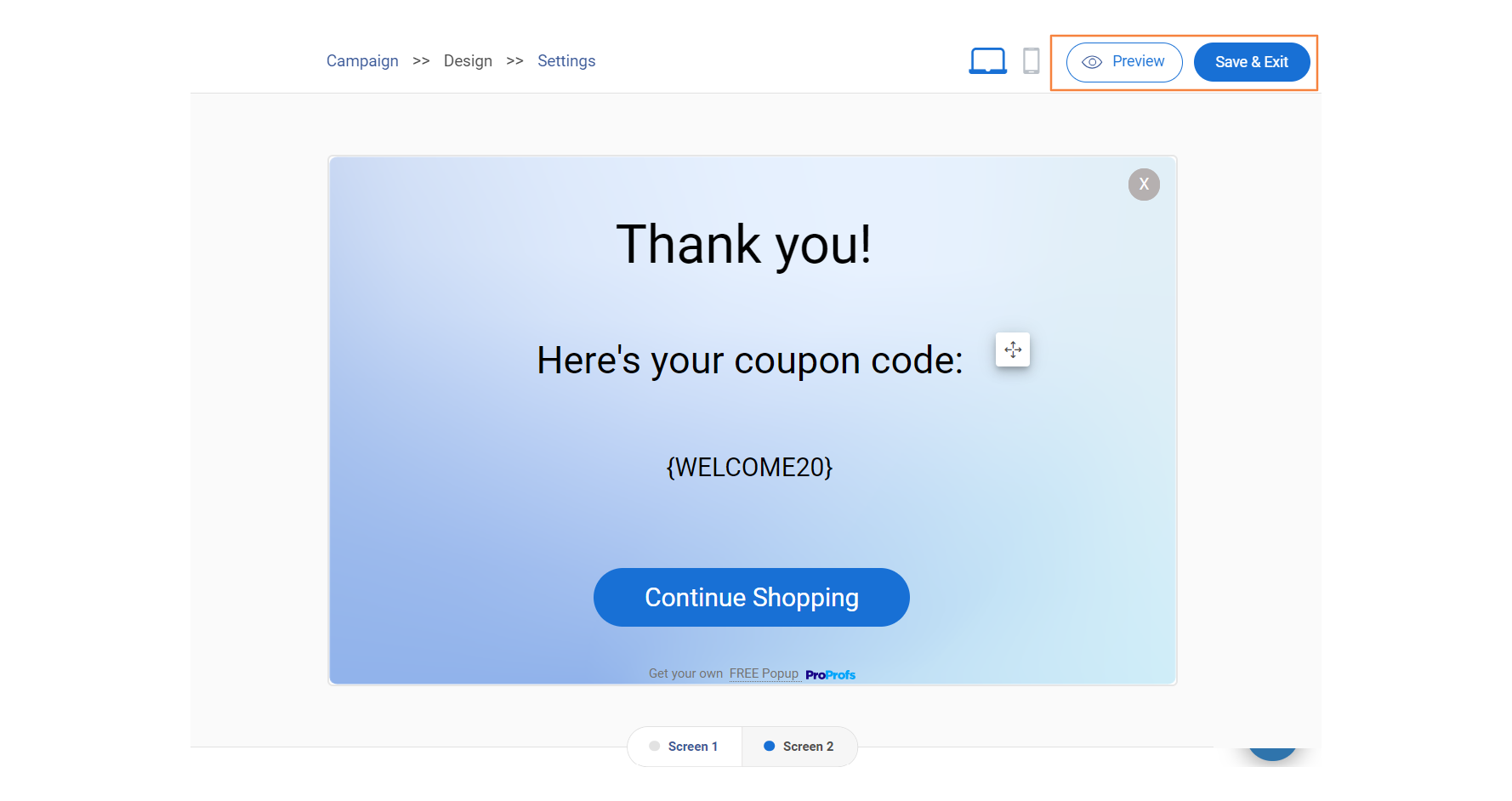
Click “Save & Exit.” Your multi-screen overlay is now live!
Your multi-screen overlay is ready to impress your audience and drive results!
Feel free to experiment with different designs, offers, and targeting options to optimize your outcomes.
Elevate Your Website Engagement With Picreel
By breaking down information and guiding users through a simple process, multi-step popups effectively capture valuable leads and boost engagement. Tools like Picreel make creating and setting up these popups easy, helping businesses improve their lead-generation strategies without hassle.
The key is presenting clear benefits, reducing barriers, and ensuring a smooth user experience. So, consider using multi-step popups—especially with a platform like Picreel — to elevate your lead generation efforts and see your sales funnel grow!
Frequently Asked Questions
1. How is a multi-step popup different from a regular popup?
In contrast to conventional popups that bombard users with all the information at once, multistep popups provide a more accessible and interactive experience by presenting content in a series of sequential steps. This approach alleviates the feeling of being overwhelmed, allowing users to concentrate on one piece of information at a time. By gradually revealing content, these popups reduce the cognitive burden, making it more straightforward for users to process and engage with the presented information.
2. Is it difficult to make a multistep popup?
No, creating multistep popups is surprisingly easy, even for those without extensive technical knowledge. Platforms like Picreel and dedicated popup creation tools offer intuitive interfaces that allow you to drag and drop elements, customize designs, and set up triggers without writing a single line of code. This user-friendly approach makes it accessible to many users, regardless of their coding skills.
3. What are the best practices to create multi-step popups?
Some best practices include offering a clear value proposition, using visual cues for progress, keeping steps concise, and ensuring mobile responsiveness. Another technique to consider for optimization is A/B testing.
4. What’s the easiest way to build multi-step forms?
You can use dedicated popup builders like Picreel, leverage the popup features in your website builder, or explore WordPress plugins for advanced functionalities. Select the way that best suits your needs and technical skills.
FREE. All Features. FOREVER!
Try our Forever FREE account with all premium features!

 We'd love your feedback!
 Thanks for your feedback!


