Mobile popups, when designed strategically, can be a powerful tool for capturing attention and driving conversions. Unlike their intrusive desktop counterparts, modern mobile popups offer a more engaging and user-friendly experience.
In this guide, we’ll explore the proven strategies for optimizing mobile popup performance, including:
- Effective design elements to grab attention and minimize disruption
- High-converting popup types tailored to different goals
- Step-by-step instructions for creating impactful mobile popups
Let’s dive in!
What Is a Mobile Popup?
A mobile popup is a type of on-screen message or window that appears on mobile devices like smartphones and tablets. Unlike website popups, these are designed specifically for smaller screens, ensuring the content is optimized for mobile users.
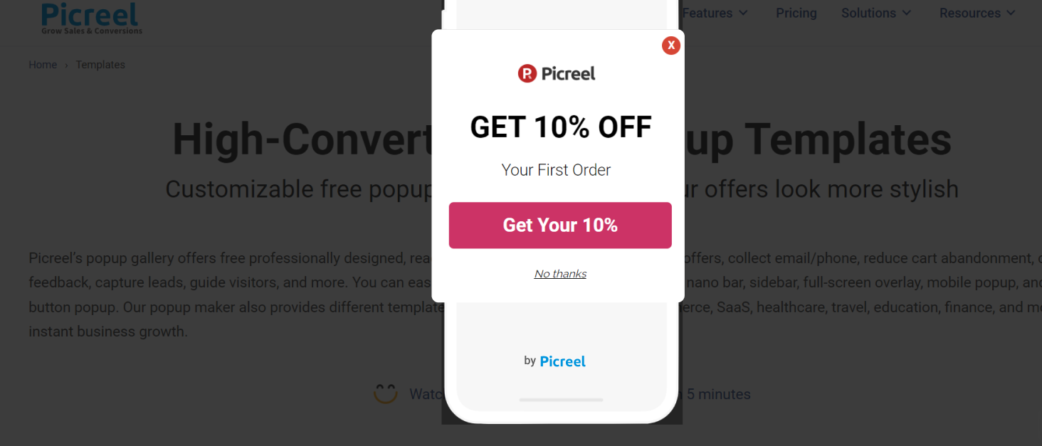
Mobile popups are typically used to grab the user’s attention without disrupting their browsing experience, and they are commonly utilized for:
- Lead generation: Collecting emails or phone numbers via sign-up forms.
- Promotional offers: Displaying sales, discounts, or special deals.
- User engagement: Encouraging users to take action, such as subscribing to a newsletter or downloading an app.
Mobile popups can be triggered by various user actions, such as scrolling, exit intent, or after a specific amount of time spent on the page.
They are often responsive and can be customized to blend with the mobile interface’s design to ensure an effective yet non-intrusive experience.
How to Create a Mobile Popup – A Step-by-Step Guide
Let’s see a step-by-step process of creating mobile popups in Picreel to help you get a better idea:
1. Log in and click “Campaigns” from the left-side menu.
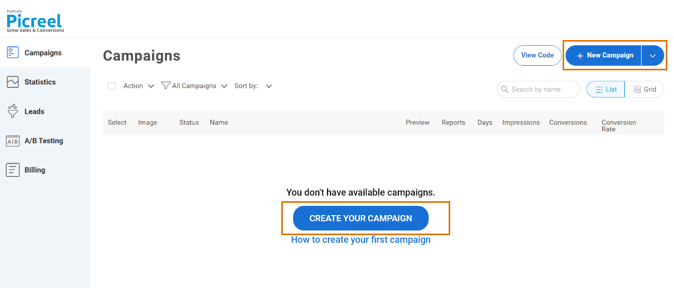
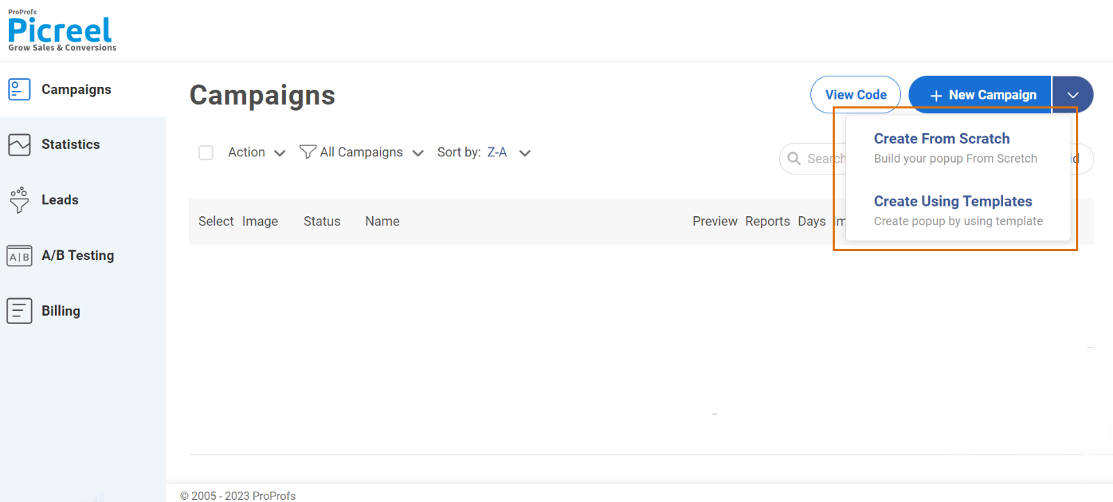
2. Click the dropdown arrow next to “New Campaign” from the top right corner. You can pick from a pre-built template or create your own campaign from scratch.
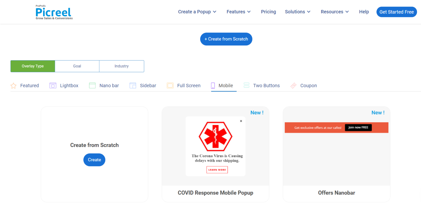
3. Next, choose the type of popup you want to create from the template menu. For best results on mobile, use the mobile-specific popup templates that Picreel offers.
4. Customize a design according to your preferences. You can change the layout, design, fields and text, options, banner settings, and fonts, and even customize it with the available data.
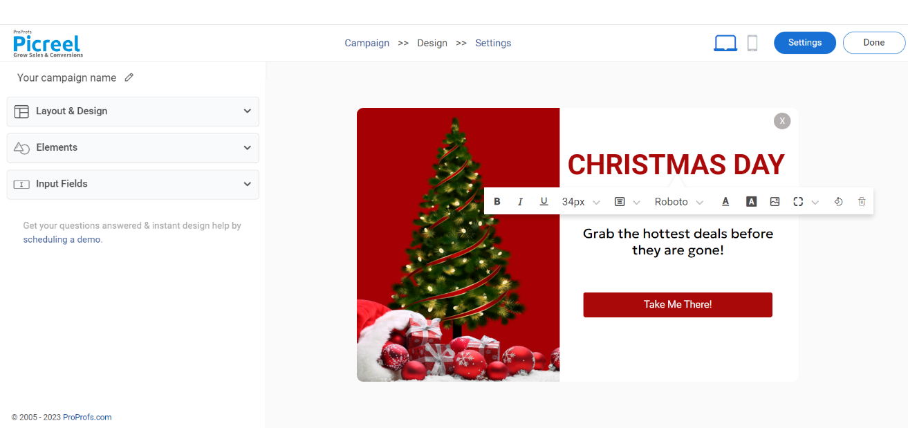
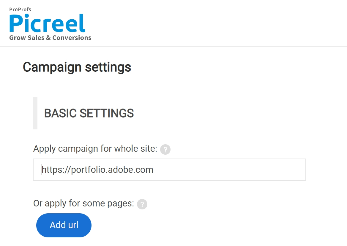
5. Enter the URL of the website you want to target and choose to display your popups on the entire site or specific pages.
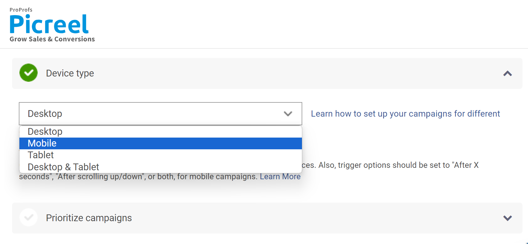
6. Click “Settings” at the top of the popup preview and go to “Device Type.” A dropdown menu will appear with a selection of device-specific popups. Select “Mobile” from the menu to create a popup optimized for mobile devices.
7. Click “Save” to activate your popup.
Watch this video tutorial on how you can create a popup using Picreel:
That’s it, you are done!
How to Get the Most Out of Your Mobile Popups: 11 Best Practices
The following tips will help you create high-converting mobile popups to grow your business.
#1 – Choose a Compliant Design
The Google policies might have got you all worried. First, these rules and penalties on search ranking apply only to mobile devices. So, you are free to target your desktop visitors with different popup designs. Next, for mobile devices, you need to choose a compliant design that is non-intrusive and doesn’t affect the user experience.
Go with a popup design that covers only a certain part of the mobile screen. These include short popups, nanobars, alert bars, etc. If your popup covers around 40-50% of the page and your background content is still easily accessible, then it’s a good mobile popup design. Just remember to scale the dimensions of your overlays to fit a phone.
#2 – Create an Eye-Catching Teaser
If you don’t want to risk any penalties and have decided to go with bars or slide-ins, then you need to work on your teaser copy. A teaser is basically a bar that will trigger the popup only when the visitor clicks on it. So, you must design a compelling copy with limited content to grab visitors’ attention instantly.
Make sure to include the value of your offer, like “Here’s 50$ off on your next purchase” or “Grab your free e-book now,” etc. You can also use questions such as “Ready to grab an exclusive deal?” or “Want to win tickets to Paris?” etc. These are good headlines, and you can place them at the top or bottom of your landing page.
#3 – Write Short & Crisp Copies
A rule that goes for both mobile and desktop popups. You need to present your offer using a short, simple, and crisp content copy. Visitors don’t have all day to read big stories. Moreover, you get less space on mobile devices to deliver your offer. If the visitors are compelled to scroll the popup to get your message, it’s not good for conversions. So, you should be creative with your copy and content placement.
Pen down the most relevant information that you feel should be included in the copy. The three main elements to consider are – a catchy headline, an easy-to-understand offer, and a compelling CTA copy. Play with the font, size, color, alignment, and so on to match the content copy and popup with your brand’s style.
#4 – Use Minimum Visuals (Or Don’t Use Any)
If you have read our other articles like popup best practices to drive conversions, you know that we usually advise using images and videos in popups. Well, that’s not the case with mobile phones. As images consume a lot of space, that leaves very little room to insert your message, form fields, and CTA.
For desktop popups, images help in visualizing the offer to grab visitors’ attention. So, you will have to work with a creative background design using eye-catching font styles and colors to make your mobile popup equally appealing to the visitors. Keep in mind that your CTA plus headline should capture the attention rather than the background and design, or else the background might overshadow your offer.
#5 – Create a Crystal Clear Call to Action (CTA)
According to your offer and goal, make sure that your CTA aligns with that. It should be an obvious prompt and should guide the visitor to take action. If it is not clear and visitors feel confused about your offer, they’ll just close the popup.
We are not only talking about the CTA content but also the design. It should be outstanding. Use a button that is large enough to click, and make sure to use contrasting colors and fonts. While writing the CTA content, use action words such as Get, Submit, Sign-up, Grab, Complete, Use, Claim, View, Shop, Subscribe, Apply, and so on.
#6 – Include Minimum Input Fields
As businesses often try to convert their desktop popup designs into mobile popups, they keep the same number of fields. Well, it is not a best practice. Firstly, there is not much space to accommodate three or more fields. Secondly, most visitors like to keep things fast and won’t be filling long forms.
So, you should restrict the input fields in your mobile popups. Ask for the most relevant information that can get the job done. Mostly, you would want to capture email addresses or phone numbers along with the names of the visitors. So, limit the number of fields to one or two. If you want to include more than two fields, try using a multi-step popup. In the first step, you will be just giving the teaser of your offer. You will use the space for multiple input fields in the next popup windows.
#7 – Pick the Right Incentive
In the case of a desktop, there are so many elements to track visitors’ movement to present them with the right popup. For mobile visitors, you can mainly play with the webpage they are on. The incentive should be relevant to the landing page. For example, you definitely won’t be showing a newsletter subscription popup on your product page.
Give your visitors a good reason to go through your popup. Here are some relevant and proven incentives for different web pages:
- For product pages: Discount coupons, countdown timer deals, or flash sales.
- For blog pages: Newsletter signup form, free guide, giveaway contest, or any other lead magnet.
- For other landing pages: Welcome mat with first-time discount, free shipping, or gifts.
- For checkout page: Exit offers, discount codes, personalized offers, or up-sell/cross-sell popups.
#8 – Accurately Segment Your Visitors
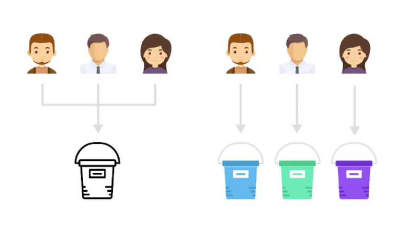
Image Source: Convince and Convert
Every mobile visitor has a unique preference. So, you should not display the same message to every visitor. Shoppers expect a personalized experience, and you don’t want to be running around displaying a new user welcome popup to your existing visitors. That is why smart segmentation is necessary.
There can be different categories of visitors, such as first-time visitors, existing customers, shoppers who abandoned their cart, frequent buyers, visitors coming from your social media, location-specific visitors, and so on. Depending on the category the visitors fall in, you can create and display the most relevant mobile popups to them.
#9 – Smartly Set Trigger Rules
Timing is everything when it comes to displaying popups. Welcome popups are good for first-time visitors, but even these should wait for a few seconds. Using the trigger options, you can choose when to display popups.
Trigger rules are all about visitors’ behavior on your website. There are different triggers like how far they have scrolled, which pages they visited, which links they clicked, or if they are trying to switch tabs or exit your website. Use exit-intent overlays if you don’t want to annoy visitors with normal, frequent popups.
#10 – Gamify Your Popups
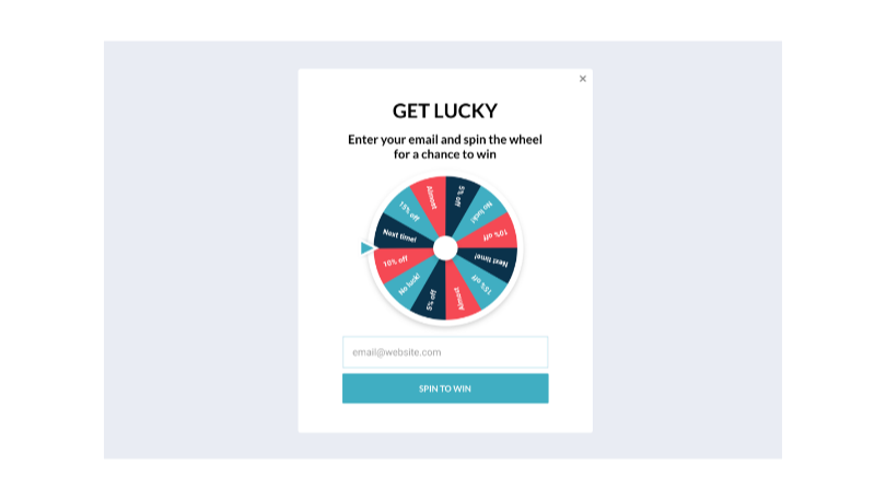
The classic popups with the same old design template might be boring, especially if you run an e-commerce store. So, do something unique with your popups from time to time. There are certain popup templates, like a spin-to-win popup, countdown timer popup, quiz popup, etc., to add fun to your forms.
Sprucing things up also increases the chances of engagement. Ensure you do not shoot such popups right when visitors enter your store. Once they explore your products, add fun and discount popups to their experience. Use an appealing color combination to make an impression at first glance.
#11 – Constantly Test Your Popups
Popup marketing is all about improving by assessing previous results. Using A/B testing, you can create different versions of mobile popups to check your conversions. Make changes to different elements, but one at a time, to see what works best for your audience.
Also, you need to test different popups on mobile devices of different sizes. This helps ensure a great user experience on all devices. You can use Google Analytics to check which mobile devices visitors use most. Figure out the devices, design popup campaigns, test variations, and improve conversion rates.
What Are the Types of Mobile Popups?
Let’s check out some mobile popup examples that have a better chance of conversion:
1. Exit-intent Popups
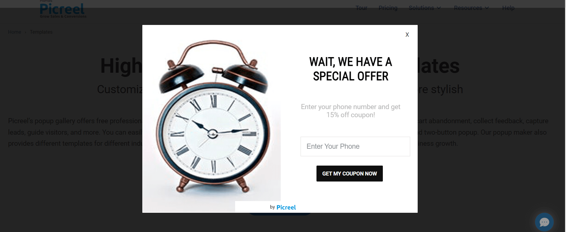
These popups appear just as a user is about to leave your site, displaying a compelling offer or message to entice them to stay. Whether it’s a discount code, a limited-time promotion, or an invitation to join a loyalty program, mobile exit-intent popups give you one final chance to capture the user’s attention and convert them.
Purpose: The major benefit of these popups is that they retain potential customers and boost conversions by providing tempting incentives at the right moment of exit.
2. Timed popups
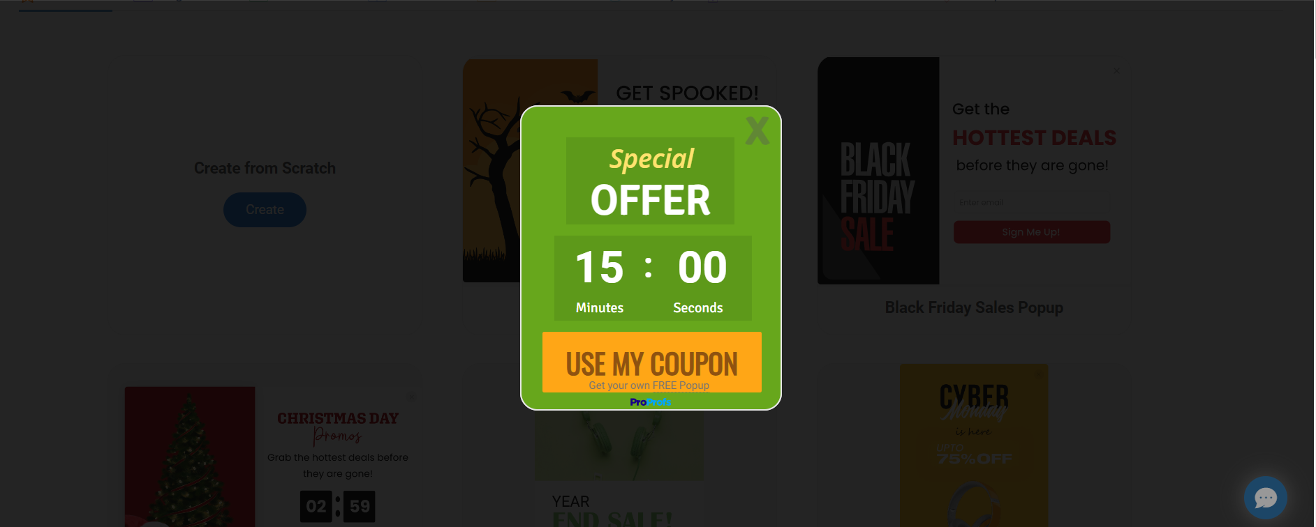
Timed popups are triggered after a certain period of time, typically when a user has been on a page for a set amount of seconds or minutes. This type of popup ensures that visitors have had enough time to engage with your content before presenting them with a strategic message or offer that encourages them to take action.
Purpose: These popups are beneficial since they engage visitors effectively by delivering targeted messages or offers after they’ve spent a meaningful amount of time on your site.
3. Scroll-triggered popups
These popups appear when a user has scrolled down to a specific point on a page. By leveraging user engagement and behavior, scroll-triggered popups can be used to highlight relevant products, promote special offers, or prompt users to sign up for a newsletter or subscribe to your content.
Purpose: Scroll-triggered popups capture user attention at the right moment of interest, increasing the likelihood of them responding positively to the displayed content.
4. Welcome popups
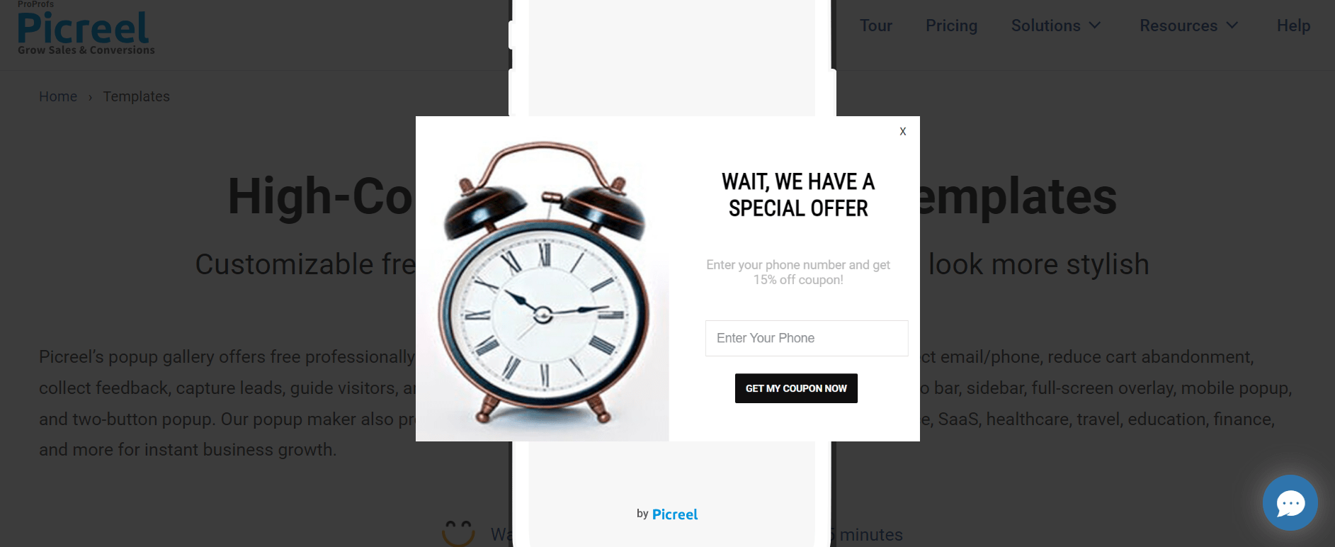
Welcome popups are displayed to visitors as soon as they arrive on your site. They can be used to provide a warm introduction to your brand, share important information, collect email addresses for newsletters, or offer a special discount or promotion to new users to encourage them to explore your site further.
Purpose: With welcome popups, you can create a positive first impression and initiate user engagement from the moment they land on your site.
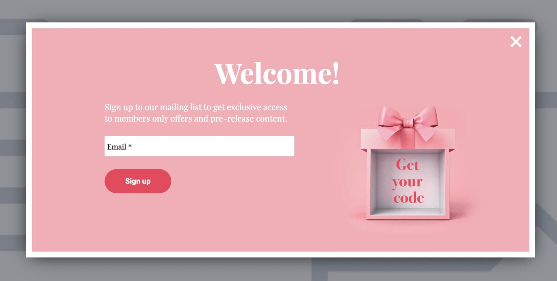
Image Source: Getresponse
5. Gamified popups
Gamified popups add an element of playfulness and engagement to the user experience. By incorporating interactive games, quizzes, or lucky wheels, they offer a fun and enjoyable way for users to interact with your brand while encouraging them to take a desired action, such as making a purchase or signing up for a service.
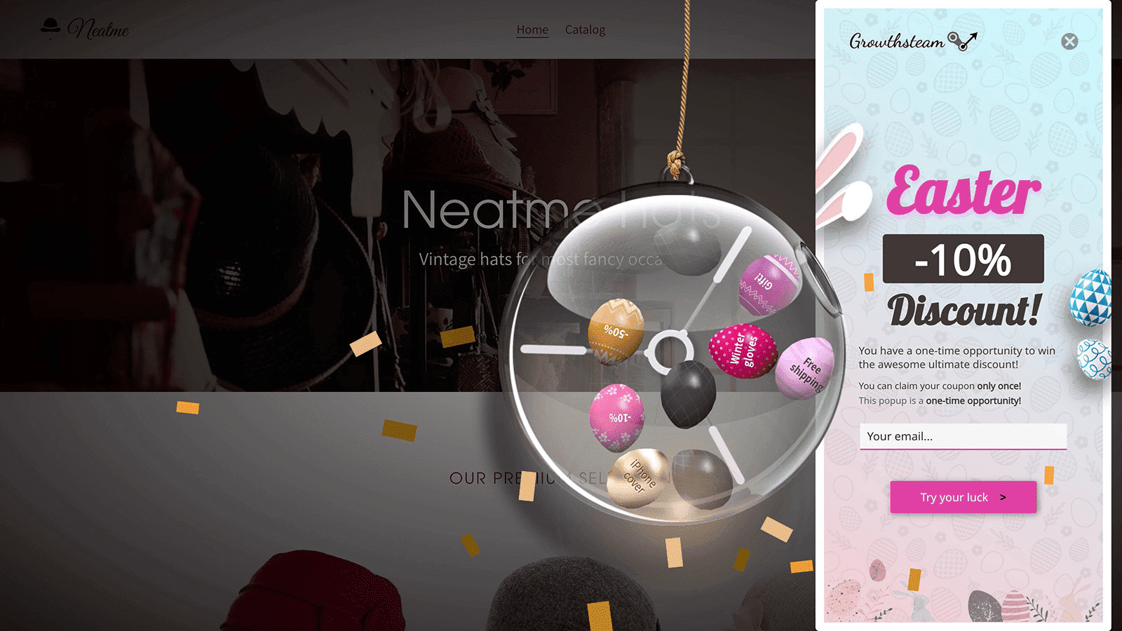
Image Source: TrueThemes
Purpose: Gamified popups enhance user engagement and interaction by making the experience entertaining, resulting in increased brand affinity and conversions.
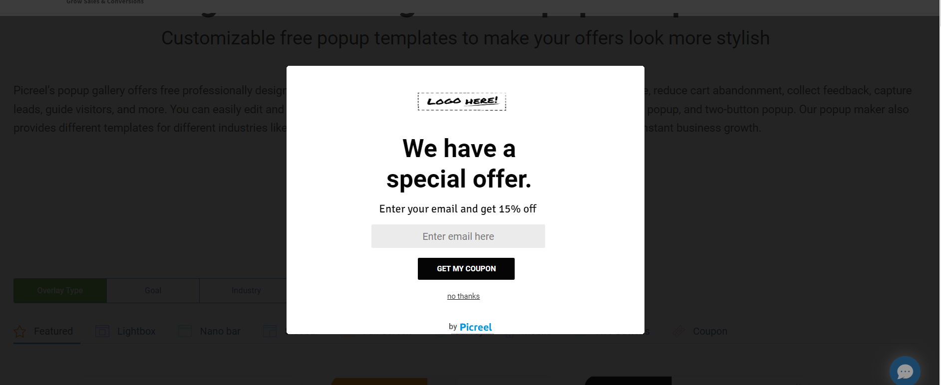
6. Coupon popups
Coupon popups display exclusive discounts, special offers, or coupon codes to users. The allure of saving money can significantly increase conversions and incentivize visitors to make a purchase or take advantage of a limited-time deal.
Purpose: These popups boost conversion rates by appealing to the consumer’s desire for savings and providing a tangible incentive to make a purchase.
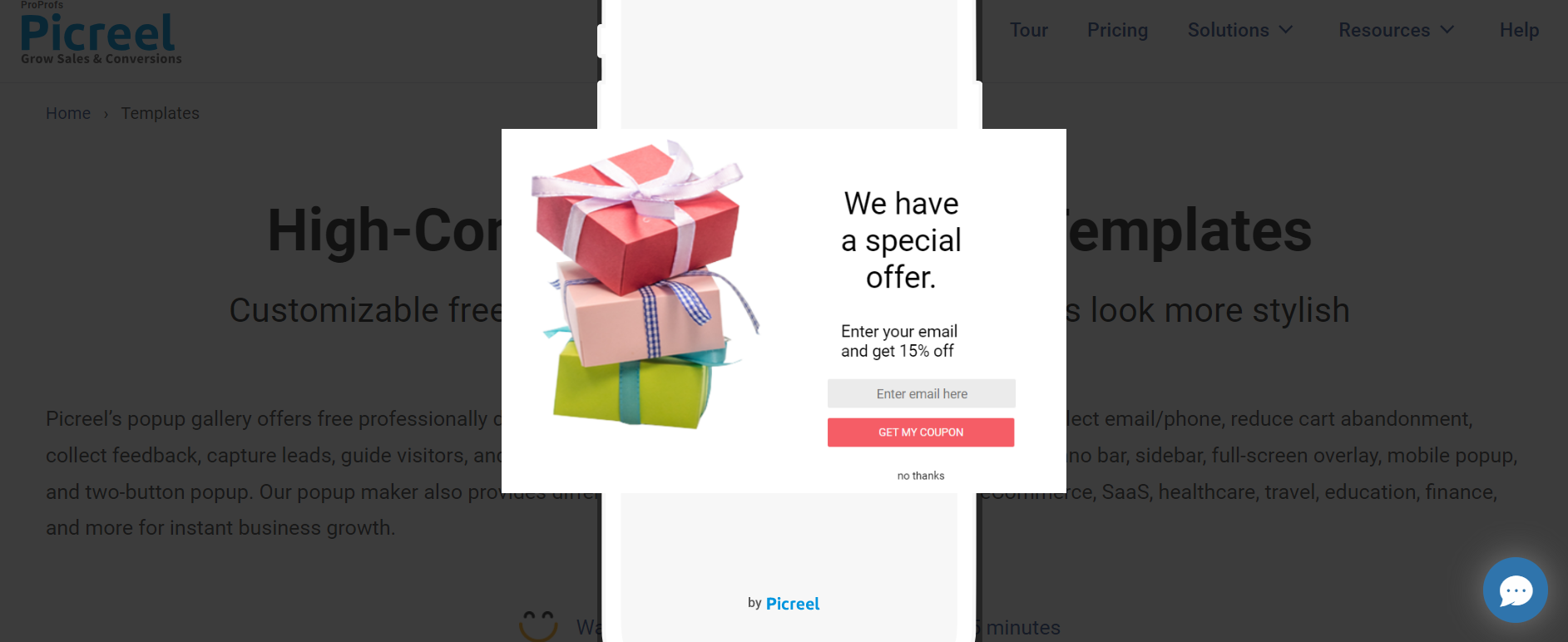
7. Video popups
Video popups utilize the power of visual storytelling. By displaying a video showcasing your products, services, or brand story, you can capture the attention of users and effectively deliver your message while increasing engagement and conversions.
Purpose: Video popups convey your brand message more effectively through visual content, increasing user engagement and understanding.
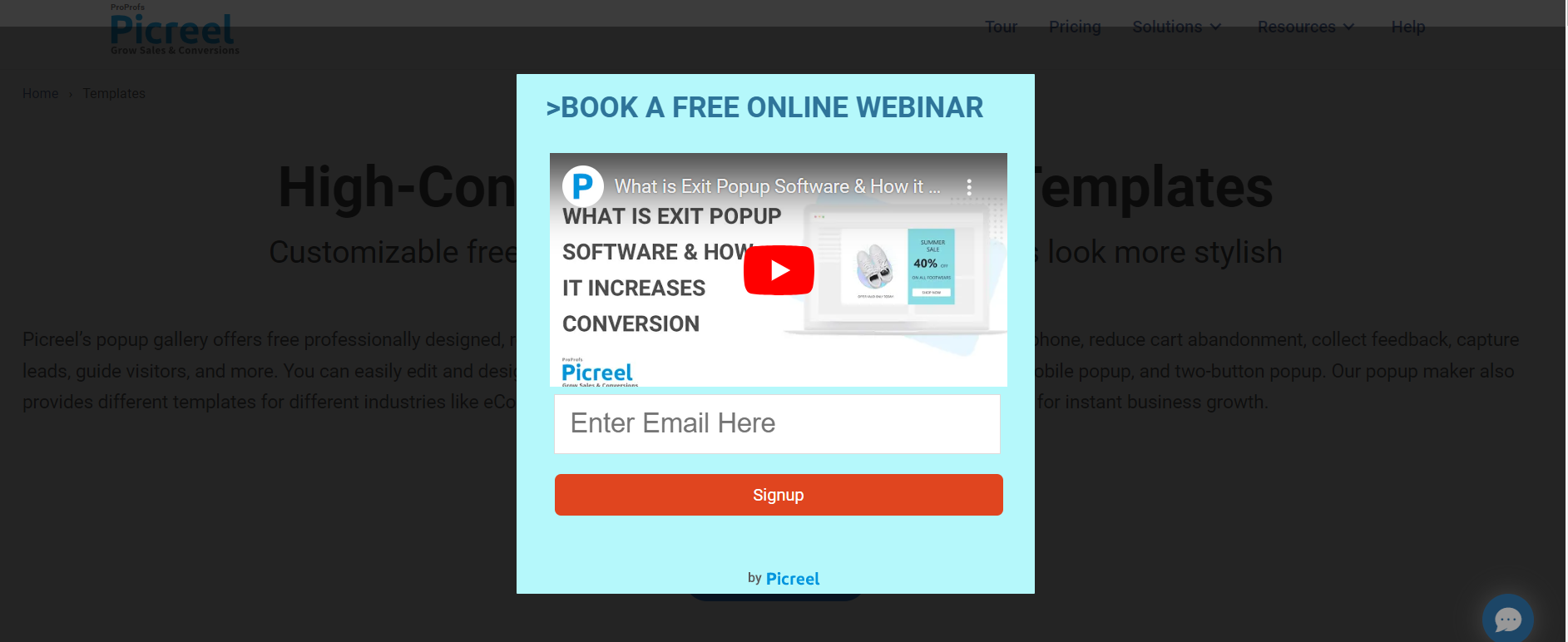
8. Social proof popups
Social proof popups leverage testimonials, reviews, ratings, or social media interactions to build trust and credibility with visitors. By showcasing positive feedback from satisfied customers, you can alleviate any doubts or concerns and encourage users to take action.
Purpose: These popups help you establish trust and credibility by showcasing positive user experiences, ultimately influencing purchasing decisions and fostering a positive perception of your brand.

Image Source: Drip
9. Feedback popups
Feedback popups are designed to gather valuable insights from users. By asking for feedback, opinions, or suggestions, you can gain a better understanding of your audience’s needs and preferences, ultimately improving your products, services, or website to meet their expectations.
Purpose: These popups help you gain actionable insights to enhance user experience and tailor your offerings based on direct input from your audience.
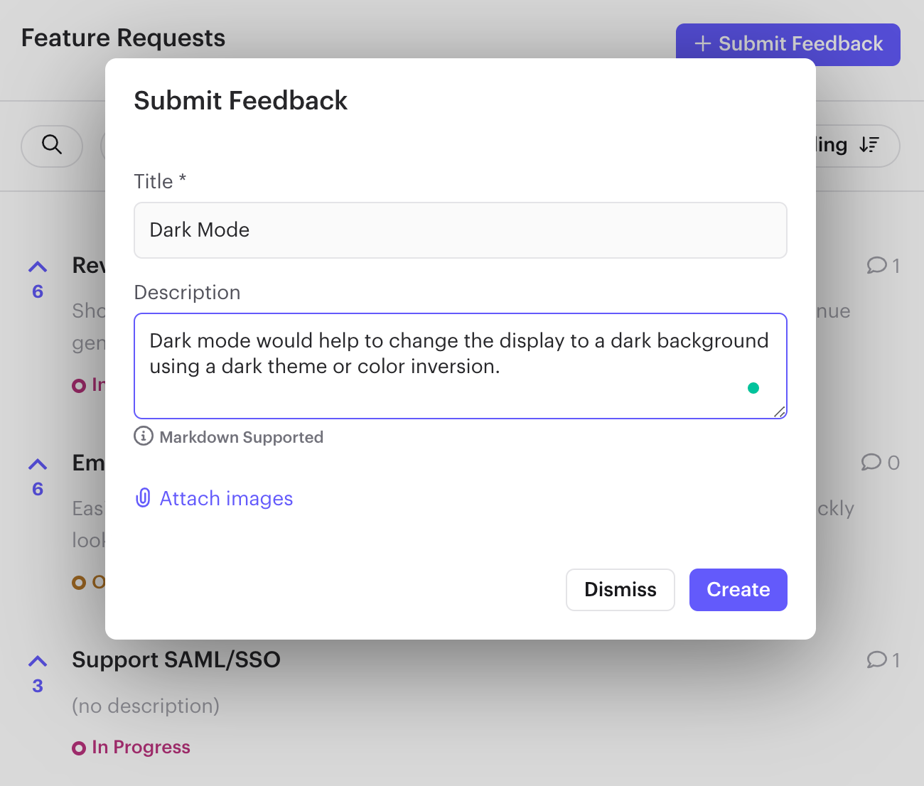
Image Source: Rapidr
10. Lead magnet popups
Lead magnet popups offer valuable content, such as ebooks, whitepapers, or exclusive guides, to visitors in exchange for their email addresses. This allows you to build your email list, nurture leads, and establish a direct line of communication for future marketing efforts.
Purpose: These popups can assist in building a targeted email list and establish a connection with potential customers by providing valuable content in exchange for their contact information.
FREE. All Features. FOREVER!
Try our Forever FREE account with all premium features!
Skyrocket Conversions With Engaging Mobile Popups
Mobile popups are a powerful strategy to engage website visitors and boost conversions.
However, it’s essential to follow best practices to ensure a positive user experience. When designing your popups, consider the timing, relevance, and value to get the best results.
Now that you know the best practices for mobile popup conversions and the right tool to do the job, rapid business growth is not far away. Remember these points and start targeting your mobile visitors with inch-perfect mobile popups.
One important tip: Never ignore Google’s guidelines, or you might get in trouble. Always prioritize your customers’ experience. Once you find your winning mantra for maximizing mobile traffic conversions, keep improving it by testing changes.
 Tips
Tips
We’d love to hear your tips & suggestions on this article!
FREE. All Features. FOREVER!
Try our Forever FREE account with all premium features!

 We'd love your feedback!
 Thanks for your feedback!


