Are customers bouncing off from your website without taking any action? How do you catch their attention or engage your audience? A hello bar is your answer!
Well-designed hello bars can help your business greet visitors, capture leads, and engage customers. You can market your products, share ongoing offers, or drive visitors to the content they might find helpful.
When potential customers visit your website, they should not have to search for the best deals, discounts, news, or updates. The less “effort” a visitor has to make to get the best deals or information, the more likely they will stick around. The absence of a popup or hello bar can be catastrophic for your brand, leading to high bounce rates, lower engagement, and poor sales.
So, what exactly is a “hello bar” and where do you place it on your website?
Don’t worry. In this post, we will help you understand what exactly hello bars are and how you can use them to grab visitors’ attention. We will also explore 15 hello bar examples from top brands that will get your creative juices flowing.
Ready to get inspired? Let’s go!
What Is a Hello Bar?
A hello bar is a small banner that is strategically placed at the top or bottom of a website. You can place hello bars on your home page or specific web pages such as the pricing, features, or contact us page. But why does your business need hello bars?
Apart from sharing a “warm hello,” well-designed hello bars can be used for the following reasons:
- Greet your website visitors
- Share proactive announcements related to safety protocols or downtime
- Grow your email list for marketing opportunities
- Provide updates related to ongoing offers or discount coupons
- Capture lead details and increase sales
- Redirect visitors to a specific landing page
If you have never seen a hello bar before, don’t worry, you are not alone. Look at the below hello bar example to get an idea of what it really looks like.
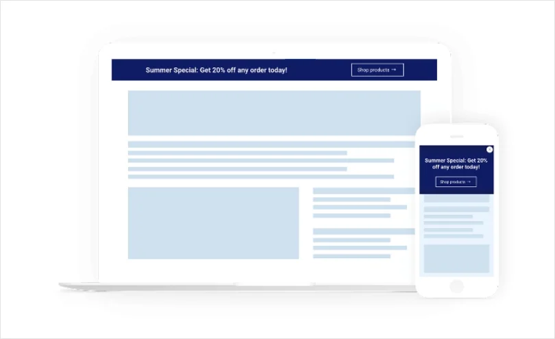
Now that we have understood what a hello bar is, it’s time to move ahead and view some creative examples.
15 Hello Bar Examples
In this section, we will see hello bar examples from real brands in just a moment. In addition to the design or visual aspect, it’s important to understand the “why” or purpose behind hello bars.
1. Positive Hello Bar Example
When customers end up browsing your website, do they return feeling sad or happy? This is an important question that your marketing and design teams need to address.
According to a study, it takes website visitors less than two-tenths of a second to form a first impression. With a hello bar that shares a positive message, you can put your website visitors into a good mood instantly. Even a small “smiley” or use of bright colors such as yellow can have a positive psychological effect on visitors.
Example: ProProfs.com
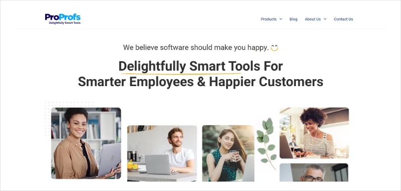
ProProfs is a leading software company that is committed to delivering delightful experiences to all users. The company offers a variety of customer service and learning tools such as help desk software, live chat, training maker, and more.
As soon as a visitor opens their website, they are greeted with a big, bright, and yellow announcement bar. The message clearly shares the company’s core values of delight and awesome support. The lesson here is that when people think about software, they usually think about work, complexities, etc. However, by linking software with “happiness,” ProProfs has successfully changed the narrative.
2. Educate Customers About Your Product
Do you want visitors to know more about your product or service? What better way than using a hello bar for the same purpose.
Many prospective customers might have heard about your brand or what you sell. However, they might not have a complete picture of how your product works or what problems it can solve. To educate customers and answer their potential questions, you can share links to product guides, videos, or tours.
Example: ProofHub
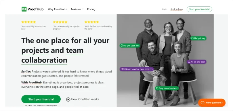
ProofHub is an online team collaboration tool that helps you manage all your projects under one roof. Managers can easily assign work and tasks to team members, and teammates can collaborate using comments or share important files.
ProofHub has done a great job of adding relevant links on its hello bar. For example, one link offers visitors a quick introduction to ProofHub and its features. There is another link to a guide about remote working that shares several tips to navigate through the remote work life.
3. Share Special Discounts
Customers are always searching the web for brands offering discounts and offers. According to a Statista report, around 88% of consumers in the United States stated that they had used coupons for online shopping. This finding is supported by a recent survey conducted by DontPayFull.com in 2024, highlighting the significance of coupons in consumers’ shopping behaviors.
If your business does not advertise this using a hello bar, you might be missing out on great opportunities. When you organize a sale during any holiday or festive season, you must convey the same to your target audience. Make sure your hello bar displays the relevant coupon code and any terms and conditions.
Example: Pepperfry.com
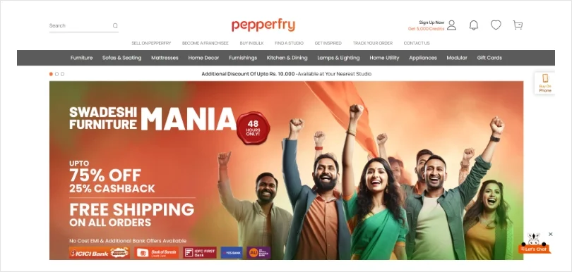
Pepperfry is an online furniture and home decor brand that allows customers to shop for furniture items from the comfort of their homes. In addition to a robust e-commerce platform, they have more than 70+ stores across India.
When you visit Pepperfry, you will see their ongoing offers displayed right at the top of the website. For example, during the Mother’s Day week, the company organized Super Mom Sale, offering a 50% discount on selected items. The company even added a link to its terms and conditions page to avoid any future conflicts.
4. Give Reward Points to Customers
Customers love brands that reward them for their loyalty. According to a study, 81 percent of customers are more likely to continue doing business with brands that offer loyalty programs.
By advertising loyalty programs in your hello bar, your business can encourage loyalty, retain existing customers, and attract prospects. Moreover, to make sure your message stands out, you must use the right typography – font, font size, and font colors.
Example: Sephora
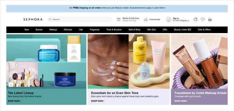
Sephora is a French brand popular for selling beauty and personal care products. The company features more than 350 brands known for makeup, skincare, hair, fragrance, and other beauty products.
Sephora’s loyalty program, called Beauty Insider, allows customers to earn reward points on every purchase. As you can see from their hello bar design, they have mentioned that customers can get 4X points on shopping from the Fragrance category. It is important to note how they have highlighted relevant points in bold to catch visitors’ attention.
5. Share Important Business Announcements
Another remarkable use of a hello bar is to share important business announcements with your audience. But what could be those announcements?
Glad you asked! You can share any announcements related to business mergers, new partnerships, website domain changes, new store timings, COVID-19 guidelines, and much more. Sharing such information using a hello bar helps you build trust with customers and ensure everyone is on the same page.
Example: TrustRadius
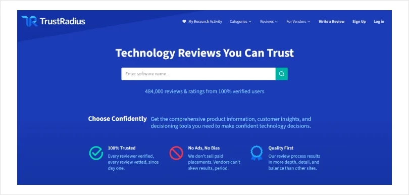
TrustRadius is a leading software review and comparison platform that helps individuals and businesses buy better software products. Some popular categories include collaboration tools, help desk software, CRM web analytics tools, payroll software, etc.
The company used its hello bar to announce its latest integration with Demandbase. The hello bar also includes a “Learn More” call to action button so that interested visitors can read more about this and educate themselves.
6. Allow Customers to Choose Their Language
Is your website visited by people from across the globe? Do you have a global consumer base that loves to buy your products? If yes, then you must allow customers to choose the language they are most comfortable with.
You can use a hello bar to give customers the liberty to choose their preferred language from a small drop-down menu. Once they have selected the language, the page will get automatically refreshed and the website will appear in the new language. By creating a multilingual website, you can offer a personalized browsing and shopping experience to your customers.
Example: Shopify.com
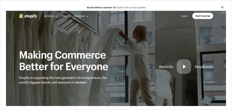
Shopify is an e-commerce platform that helps you start, manage, and grow your online business. Moreover, Shopify users can easily manage their marketing, shipping, as well as payments in one place.
When you visit Shopify’s pricing page, you will see a hello bar right at the top. It gives visitors the option to view the pricing page in their regional language. You can choose the region from a drop-down menu and click continue. This small yet impactful hello bar empowers Shopify customers to view pricing details in their regional language and helps the business generate more sales.
7. Talk About Top Deals of the Day
If you have ever visited an e-commerce store, you must be familiar with the terms – flash sale, limited time offer, happy hours, or 50% off until midnight!
These are called “daily deals,” and they help you create a sense of urgency among e-commerce customers. But the question is, how do you inform customers about the top deals of the day?
While there are multiple ways to do it, such as email marketing, website popups, live chat notifications, etc., hello bars remain the most effective. When done right, daily deal hello bars can help you attract attention and drive more visitors to buy your products.
Example: Target
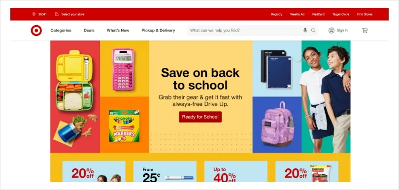
Target is an American department store chain that is present in all 50 US States. Now, when you think of Target, you must think of their big department stores selling everything from clothes to household or electronics items. However, Target’s digital sales accounted for $20.03 billion in 2021.
A huge credit for this goes to Target’s daily deal offers displayed on its website. The moment you visit its website, you can check out all the top deals in one place. This allows customers to check for the latest offers, save money, and have a delightful shopping experience.
8. Give Product Tours
Product tours are incredibly beneficial for your business and the people interested in your products. They are in-app tutorials designed to guide new users to make the most of your app or SaaS product.
An absence of a basic set of instructions can frustrate users and increase churn. Therefore, if you have a well-designed and informative product guide, you must promote it on your website using an announcement bar. Good product tours and guides can increase engagement, product adoption, and user retention.
Example: Workable
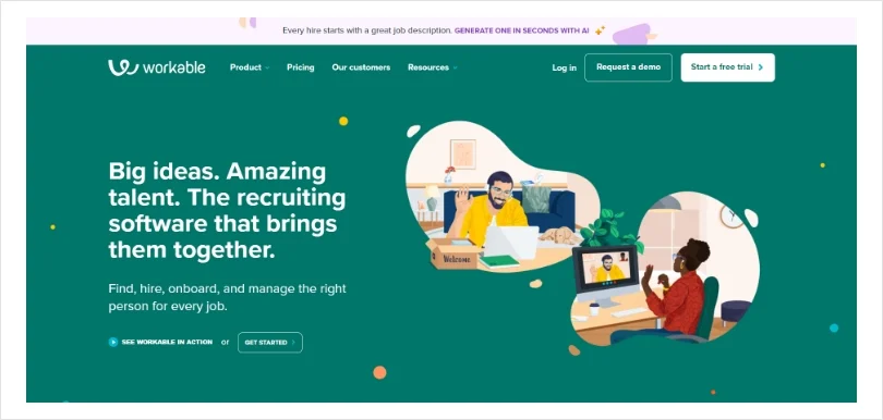
Workable is a popular recruitment software that allows you to hire the right talent for your organization. For example, recruitment software can help you schedule job postings on over 200+ websites., collaborate with hiring managers, and create branded career pages in just a few clicks.
Workable makes the best use of a hello bar by encouraging visitors to take a tour of its software product. We all know how hiring the right people can be a big challenge for any growing company. Workable addresses this problem on its hello bar and claims it can help user’s get their hiring back on track. Promising indeed!
9. Create an Urgency
If a person is not interested in your product, no deals or offers can make them change their minds. However, if they are even a tiny bit curious, creating a sense of urgency will amplify their already-present feelings of buying something.
A great way to create urgency is to tell your website visitors that if they don’t act quickly, they might miss out on an amazing deal. After all, if customers see they can get a deal anytime they want, they will be in no rush and put off the purchase until later. Let’s look at a hello bar example by Udemy to see how you can rush visitors to take the desired action.
Example: Udemy
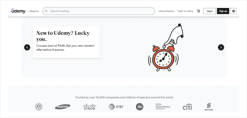
Udemy is a an online course platform that targets students as well as professional adults. The learning platform offers thousands of free and paid courses across multiple categories: design, marketing, health & fitness, IT, finance, web development, and more.
Udemy does an excellent job of creating a sense of urgency among students and working professionals. For example, it uses a receding timer on its hello bar to indicate the amount of time left to grab a limited-time deal. This is a great way to stir your audience to take action and grow sales.
10. “Book a Call” Hello Bar
Sometimes, instead of sharing their email, you would want customers to take more direct action on your website. You can request them to book a call with your team and talk business.
Using the bottom of the funnel CTAs such as “Book a Call Now” or “Schedule a Free Consultation” can help you grow your business faster. You can add relevant CTAs on your hello or sticky bar and encourage potential customers to buy from your company.
Example: Studio Grow
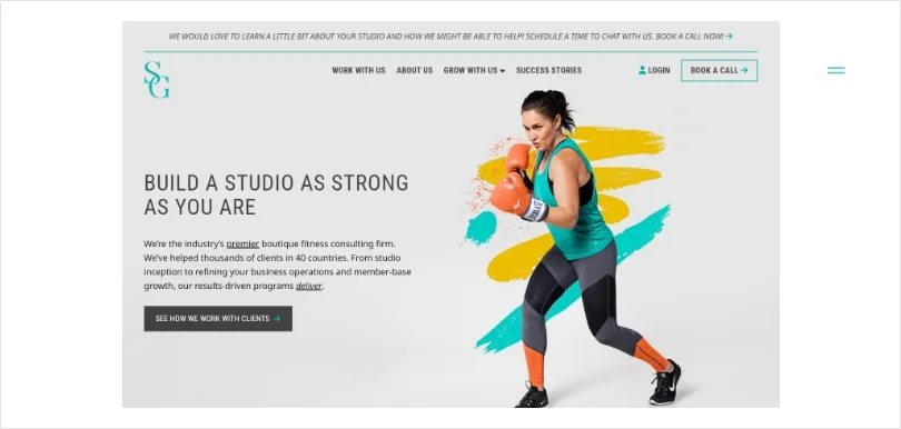
Studio Grow is a fitness consulting firm that helps fitness studios manage their operations better and make higher profits. Over the years, the company has helped thousands of fitness entrepreneurs across 34 countries.
Since Studio Fitness is a B2B service company, it includes “Book a Call Now!” CTA on its hello bar. If there are studio business owners looking to skyrocket their business, they can simply book a call and get straight to business.
11. Share Real-Time Updates
Hello bars can be used to share real-time updates with your customers. If you run a business that operates 24×7, you need to keep your customers posted about what’s happening.
For example, suppose you run a logistics business. In that case, you need to share real-time updates about the delivery schedules in regions that might be affected due to weather conditions or political reasons. The same applies if you own an airline company, food delivery app, car-hailing service, etc.
Example: United Airlines
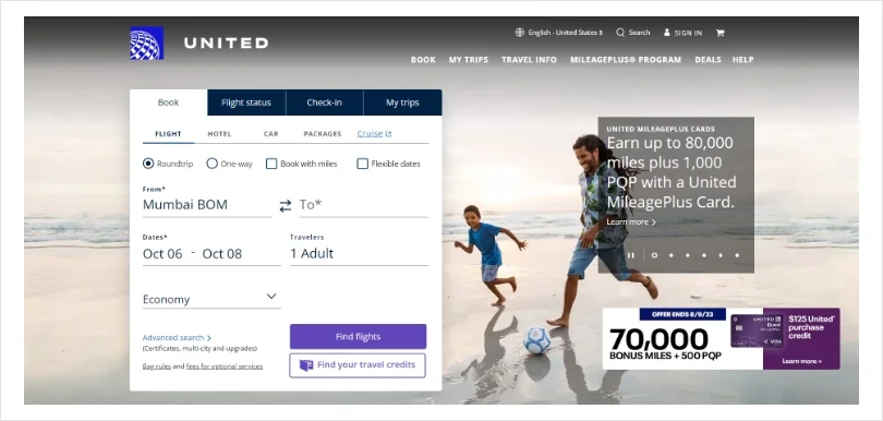
United Airlines is one of the leading airline companies in America, owning a market share of 12.9%. Right from their website, customers can book one-way or round trips, check flight status, and enjoy the best deals on flights.
But that’s not all. Even this billion-dollar company uses a hello bar to share important travel updates with customers. For example, you can view the latest information about US entry requirements and international travel restrictions. All this data is updated in real-time so that customers do not have to suffer during their trips.
Moreover, if customers need to cancel or change their travel plans due to COVID-19, no additional fees are charged (the same information can be seen in their hello bar).
12. Capture High-Quality Leads
Your website might be visited by thousands or millions of people every day, but what’s the point if visitors are not converting into buyers. This is where a hello bar can help you capture high-quality leads and grow sales.
Sometimes visitors are not interested in buying a product immediately. However, they are interested to learn more or get a product demo. You can place the relevant call to action buttons on your hello or top bar to target such visitors. For example, you can use CTAs such as – “Sign Up Today and Get 50% Off” or “Want to Skyrocket Your Sales? Register Now.”
Example: Neilpatel.com
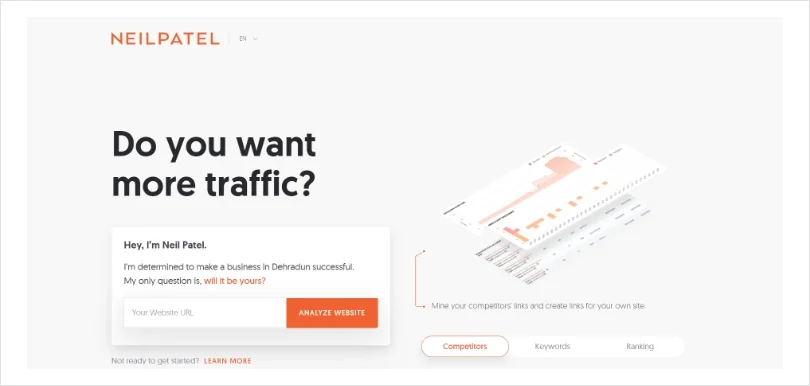
Neil Patel is a New York Times bestselling author and is considered a leading marketing influencer on the web. Neil Patel runs his own digital marketing blog that offers multiple resources on digital marketing tips, trends, and tools.
As a marketing guru, Neil realizes the value of his face. No wonder he has used his own portrait on his blog’s hello bar. It asks a simple question: “Do you want me to do your marketing for you?” For anyone who is looking for marketing tips or solutions would show interest. Once they click on the link, they are greeted by a small form, allowing Neil’s team to generate more leads.
13. Stand By Your Corporate Social Responsibility
Corporate social responsibility or CSR reflects your company’s commitment to the well-being of society and the environment. But how does CSR benefit your business?
CSR can help your business create a positive brand reputation and attract prospects that share the same vision as yours. Around 70% of Americans believe it’s either “somewhat” or “very important” for businesses to make the world a better place. So if your business is supporting a social or environmental cause, you can use a hello bar to promote it.
Example: Wix
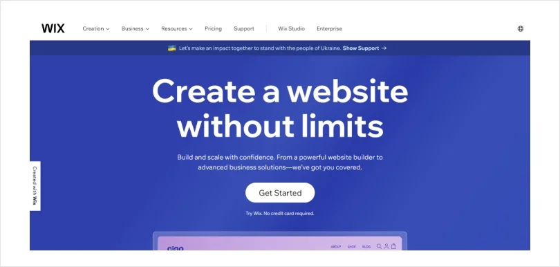
Wix is a leading website development platform that is used by millions of freelancers, web developers, and entrepreneurs. With an easy drag-and-drop feature and ready-to-use templates, anyone can create beautiful and professional-looking websites.
Wix is quite open about its corporate social responsibilities. In fact, it used its hello bar to seek support for the Ukraine crisis (Russian invasion of Ukraine, 2022). With millions of Ukrainians displaced and thousands killed, Wix encouraged customers to offer support. For example, Wix users can add Ukrain flags or badges on their website to raise awareness and show support.
14. Promote Events
Is your business organizing a sales event or broadcasting an online webinar? Why not share the same with your customers using a hello bar?
Events and webinars are a great way to market your products or services, meet like-minded entrepreneurs, interact with potential customers, and develop channels for additional revenue. While there are multiple ways to promote your event among event participants, a hello bar on your website can work like a charm. You can even ask interested people to share their email addresses to receive the invite.
Example: BIGContacts
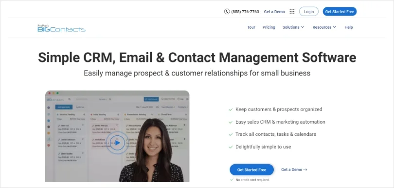
BIGContacts is a popular CRM tool designed for small to mid-sized businesses. The tool helps you organize contacts in one place and manage leads with a custom sales pipeline. Moreover, you can even automate your sales and marketing email campaigns.
BIGContacts used its hello bar to announce an upcoming webinar that the company had organized for sales enthusiasts. Website visitors could click on the “Know More” link to get details about the webinar and register their email addresses to receive the official invite.
15. Multipurpose Hello Bar
Hello bars do not always have to serve a specific function. Sometimes, you can design them for multiple purposes to meet your company’s different marketing and communication needs.
For example, you can use a single hello bar for capturing leads, announcing upcoming events, sharing the latest company updates, etc. This will ensure that all the relevant information is conveyed to the concerned people. Moreover, instead of scrolling your website endlessly or contacting your team, website visitors will have all the information on their fingertips.
Example: Levi.com
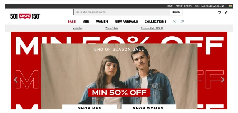
Levi Strauss & Co. is a world-recognized apparel brand and a global leader in denim wear. Founded in May 1853, the fashion brand has more than 500 stores worldwide.
In addition to their brick-and-mortar stores, customers can also shop from their online store. As soon as you visit its website, you will realize that Levi Strauss has done an excellent job of using a hello bar that serves multiple purposes. For example, website visitors can learn about the Levi Strauss app, ongoing discounts, trending apparel, and the Levi Warehouse Event – all from the same hello bar.
Best Way to Make a Hello Bar
There are multiple tools available in the market that can help you design, create, and publish hello bars on your website’s homepage or other landing pages. In this section, we have chosen Picreel – an easy tool to create popups, hello bars, and sidebars.
In Picreel, hello bars are also known as nano bars. Let’s see how you can create them in easy steps.
- Navigate to Campaigns >> New Campaign
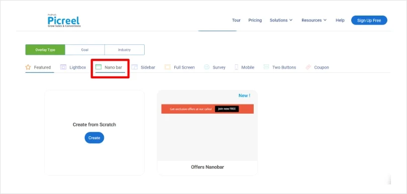
- Select Nano bar
- Hover your cursor on an overlay and click ‘Customize’ to start editing
- Now, you can choose to redirect users to a new link or collect data from users, such as name, phone, and email.
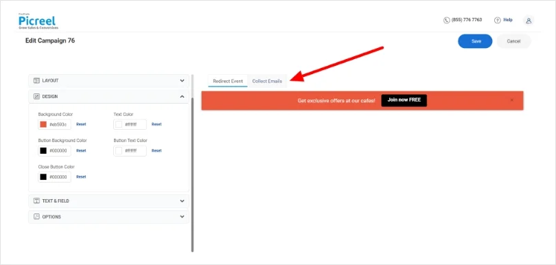
- You can choose to customize the nano bar size (small or large), text, nano bar position (top or bottom of the page), show shadow, hide close button, and several other settings.
- Now, add the URL on which you want to display your nano or hello bar (you can choose to display it on the whole site or specific pages).
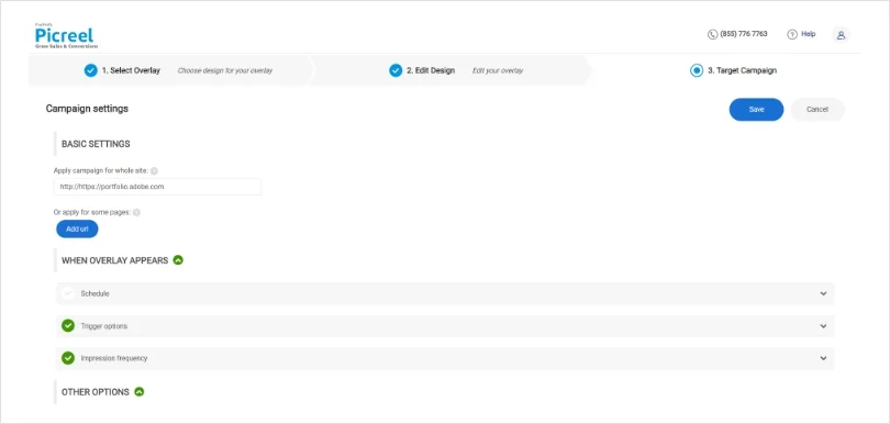
- Once, you are happy with the settings and changes, click Save. Congratulations! Your first hello bar is now active on your website.
Engage Your Audience With a Beautiful Hello Bar
As we can see, a well-designed hello bar can be a small yet impactful addition to your website. In addition to optimizing your website for marketing and lead generation, hello bars can help you share business updates, promote corporate social responsibilities, and encourage visitors to take a product demo/free trial.
In short, the possibilities are endless! We are sure our collection of hello bar examples will offer a healthy dose of inspiration to your team. So what’s the wait?
We recommend you go for an easy-to-use tool such as Picreel to design beautiful yet functional hello bars, popups, sidebars, and more. Keep engaging your audience!
 Tips
Tips
We’d love to hear your tips & suggestions on this article!
FREE. All Features. FOREVER!
Try our Forever FREE account with all premium features!

 We'd love your feedback!
 Thanks for your feedback!


