Since the onset of the digital marketing wave, entry popups have emerged as an indispensable tool for enhancing user engagement, collecting leads, and boosting conversions.
These well-timed, often creatively designed overlays can grab the attention of visitors the moment they land on a website, providing a critical touchpoint to convey important messages or offers.
However, crafting an effective entry popup requires more than just flashy graphics or compelling copy. It demands a deep understanding of audience needs, behaviors, and the delicate balance between engagement and intrusion.
This blog aims to showcase the best entry popup examples that have struck this balance with finesse, driving remarkable results for their websites.
Also, if you want to watch a quick video on how to create effective popups, here’s one:
Entry Popup Examples to Engage Customers
Let’s explore eight standout entry popup examples that have successfully captivated customers and driven engagement:
Canva
Canva’s app-focused popup, displayed on its web platform, immediately grabs attention with a visual that previews the app’s collaborative editor environment and complements this with concise feature highlights.
The call-to-action, “Let’s get out of here,” coupled with a light, engaging tone, effectively communicates the app’s benefits, like seamless collaboration without the clutter of browser tabs.
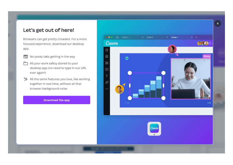
Its strategic placement for web users ensures it reaches an audience already familiar with Canva, making the detailed yet accessible message particularly resonant.
Billion Dollar Beauty
Billion Dollar Beauty is best-known for its high-quality beauty products. The company is dedicated to helping customers feel confident and beautiful with their innovative, easy-to-use products.
The entry popup design features a clean and inviting layout with a focus on a friendly and approachable image.
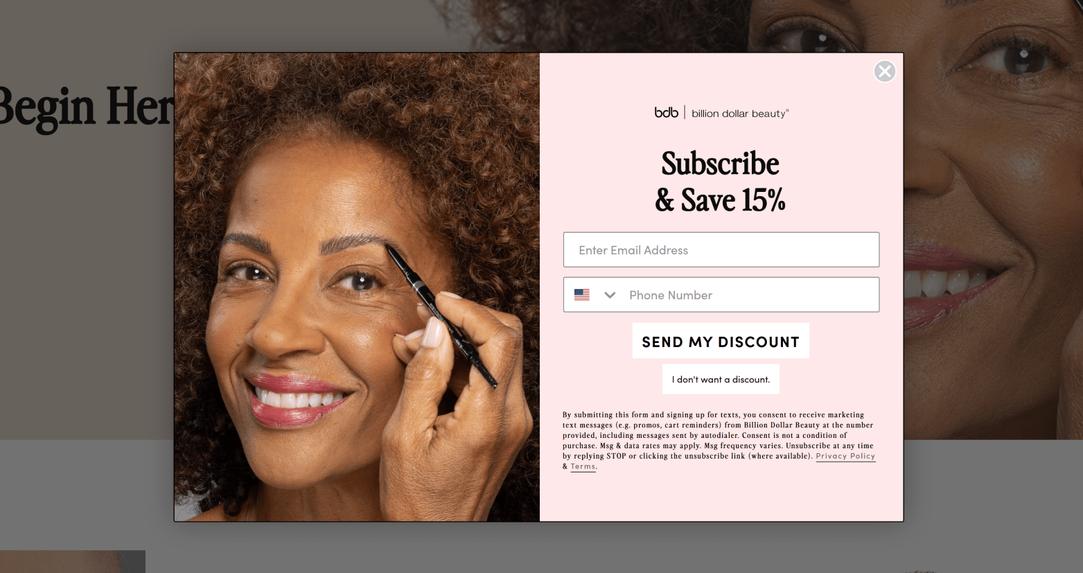
The prominent “Subscribe & Save 15%” headline immediately grabs attention, encouraging visitors to take action. The form is simple, asking for an email address and phone number, making it easy for users to sign up.
While the offer of a 15% discount incentivizes sign-ups, the option to skip the discount respects user choice. The benefits for the company include growing its email list for future marketing campaigns and increasing the likelihood of conversions.
PCMag
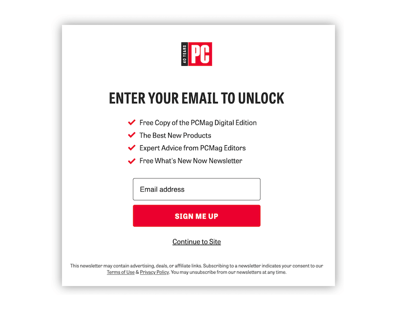
The popup from PCMag cleverly entices users with various offers in exchange for their email addresses. Featuring the PCMag logo prominently at the top, the popup is structured with a compelling headline, “Enter your email to unlock,” followed by a checklist detailing the benefits, and concludes with a simple field for the email address.
The call-to-action, “enter your email to unlock,” is straightforward.
This design’s effectiveness lies in its simplicity and clarity; the red CTA button not only draws attention but also harmonizes with the logo and checkmarks, creating a visually cohesive and attractive design.
The transparency of what the user stands to gain—a free digital edition, the latest product recommendations, and expert advice—ensures the user understands the value of their email, enhancing the likelihood of engagement.
Klarna For Business
Klarna for Business showcases an exemplary approach with its multi-step pop-up form, which simplifies the data entry process for users while efficiently capturing leads.
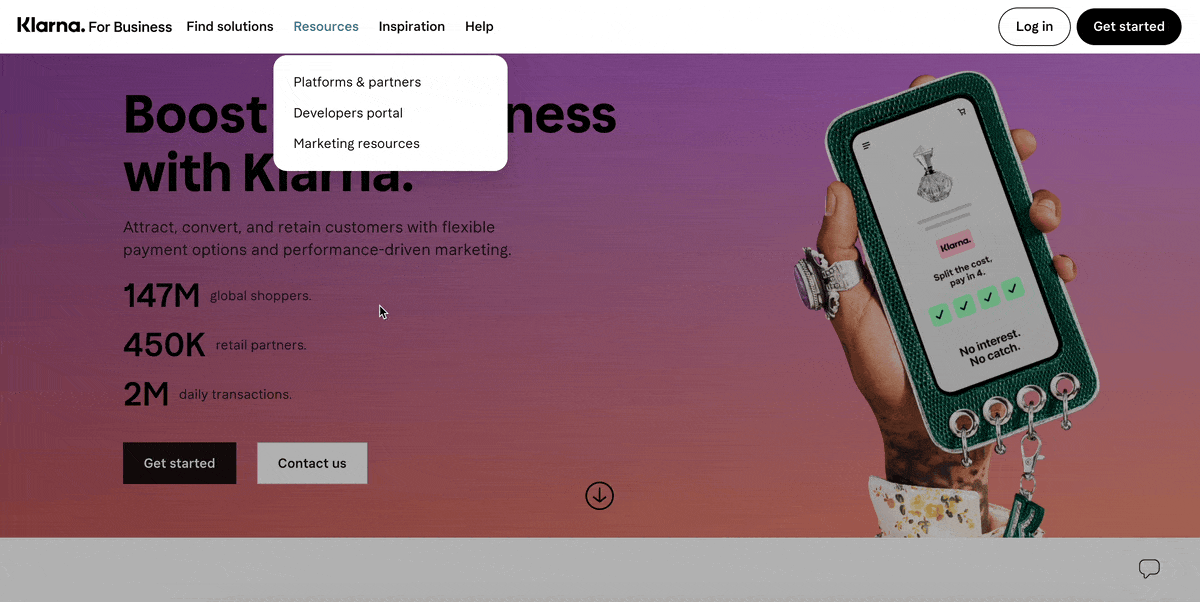
The form’s design is notably clean, incorporating ample whitespace, making it easy on the eyes and welcoming for users.
The key lesson here is the value of simplicity and the strategic use of whitespace in form design to enhance user experience and facilitate a smoother information collection process.
Kith
Kith presents a concise and compelling popup that encourages users to “Join our list.” This invitation is followed by the promise of updates on new products and exclusive access through the Kith Loyalty Program, with options to select preferences among men’s, women’s, or kids’ collections before entering an email.
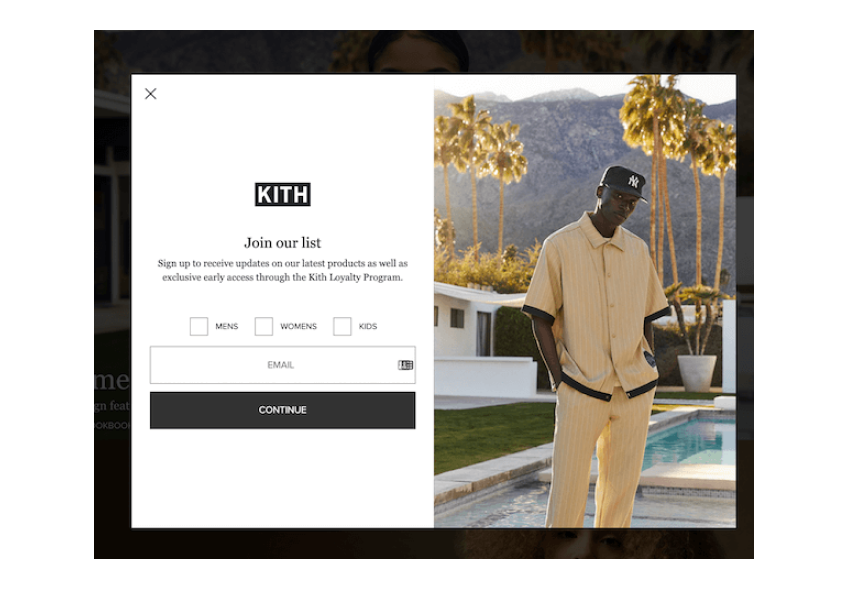
This approach stands out for its emphasis on personalization, using the popup tool to gather first-party data to tailor the user experience. Its simplicity is its strength, avoiding unnecessary complexity to keep the message clear and aligned with Kith’s minimalist black-and-white branding.
This strategy demonstrates how straightforward messaging and design can effectively engage customers and personalize their journey.
Tully’s Training
Tully’s Training introduces a standout popup example that captures attention with a personal touch from Mary Tully herself, asking if the user’s dog faces specific challenges like “Puppy mayhem,” “destructive behavior,” “aggressive dogs,” or “potty training,” offering four distinct options to choose from.
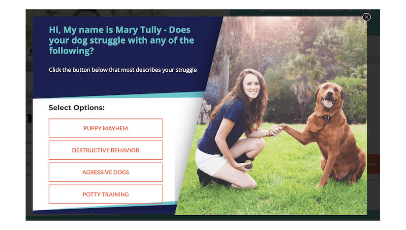
What makes this popup particularly effective is its visual appeal; it features a high-quality image of Mary Tully with a dog, instantly building a connection and trust with the viewer. The design’s consistency in font and color scheme with the photo’s hues enhances its attractiveness.
Moreover, the popup’s interactive nature, offering four clickable options rather than the standard yes/no or email input, significantly increases user engagement. It’s hard to resist clicking when you’re directly addressed with relatable options, showcasing an innovative approach to encouraging interaction.
Fiverr
Fiverr employs a smart popup strategy to promote its app, presenting it as an immediate step following user signup, thus streamlining the user journey toward utilizing its mobile platform.
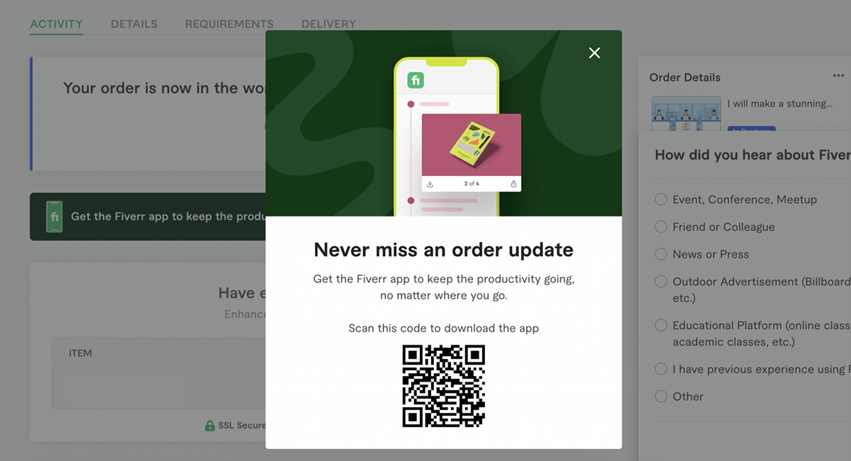
The core advantage of this method lies in its convenience; by featuring a QR code, Fiverr simplifies the app download process, making it a quick and easy transition for users.
This approach not only enhances the overall user experience by eliminating unnecessary steps but also effectively encourages the adoption of their app, offering a direct and hassle-free path to accessing their services.
Pattern Beauty
Pattern Beauty effectively uses a discount website pop-up as a splash page on their website. This eye-catching feature immediately greets visitors with not just one but three discount offers.
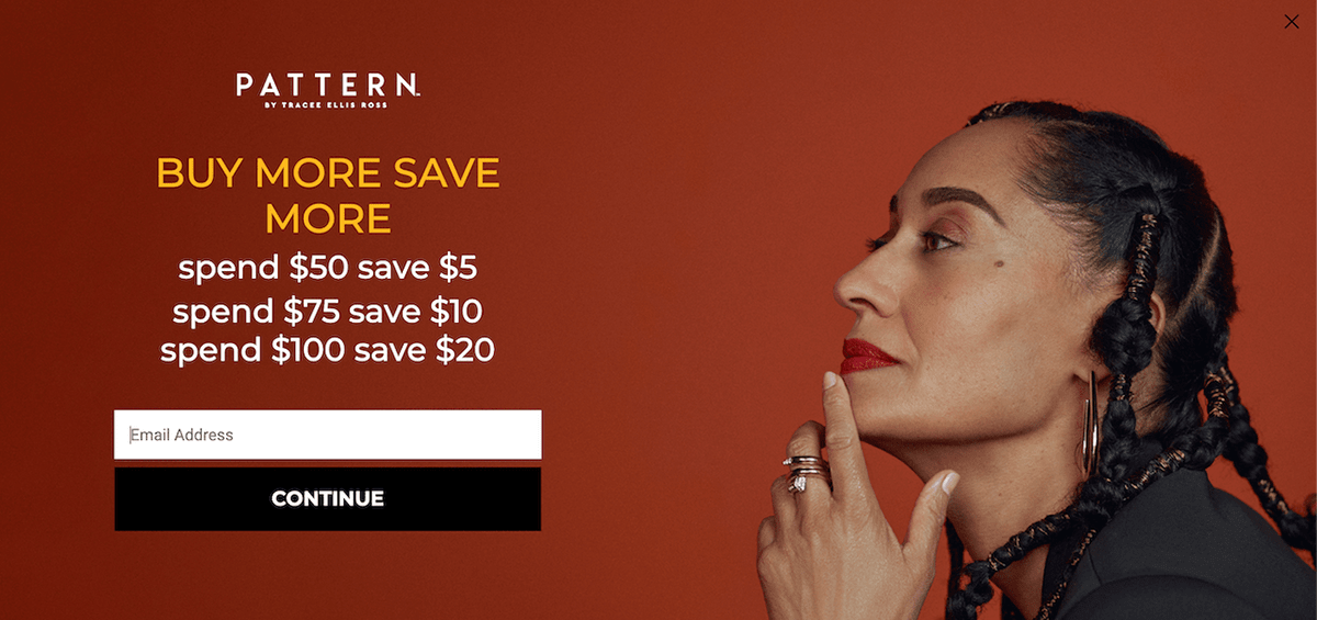
The clever “spend more to save more” structure of the deals encourages customers to explore more products and increase their purchase value.
The pop-up on Pattern Beauty’s website is all about a clever marketing strategy. Implementing a tiered discount structure encourages customers to browse more products and amplify their cart value.
Also Read - How to Use Website Popups to Boost Your Conversions: 15+ Examples
Create an Entry Popup with Picreel: Step-by-Step Tutorial
Now that we have looked at the best entry popup ideas, let’s move on to the practical business – How to turn these ideas into interactive popups with Picreel.
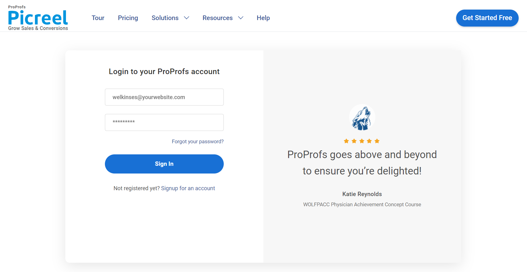
1. Sign up for a Picreel account and log in.
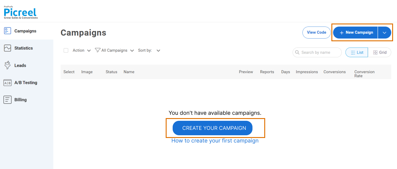
2. Go to the “Campaigns” menu and click “New Campaign” at the top right. You can also select the templates option from the drop-down or start from scratch.
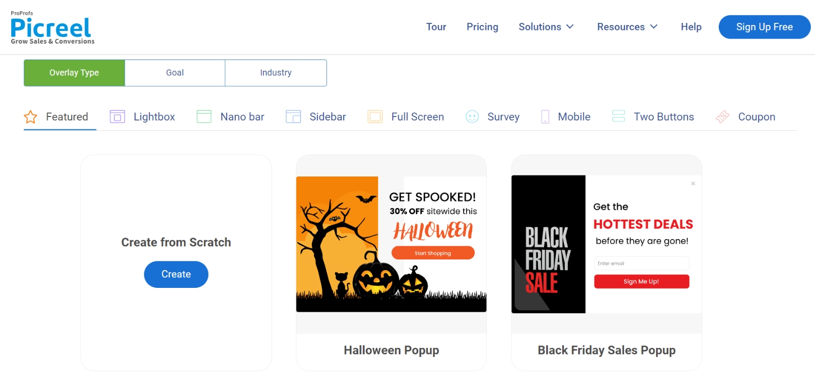
3. From the templates menu, choose the type of popup you want to create.
4. Once you select the design, customize it according to your preferences.
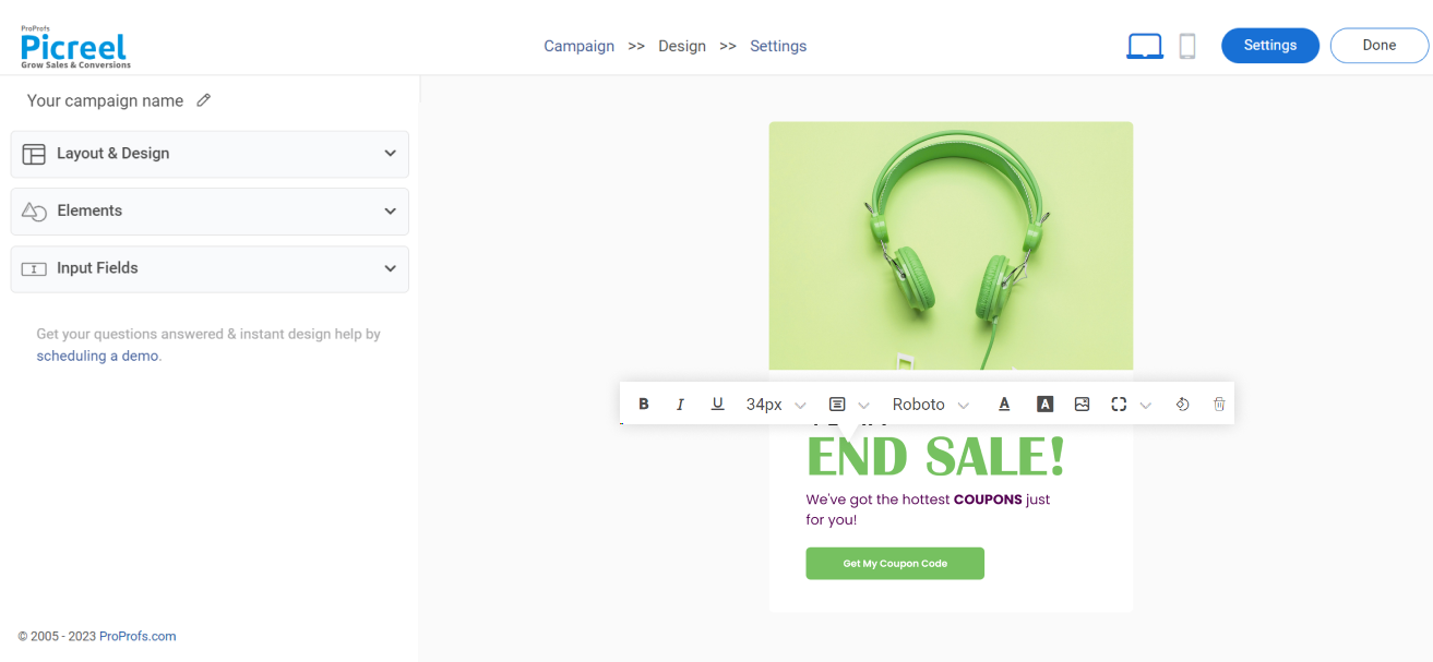
5. Configure your targeting and trigger options to specify when and where you want your popup to appear.
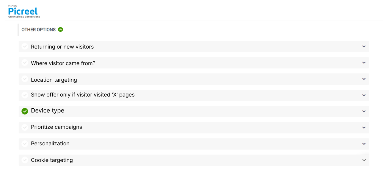
6. Click “Save” to activate your popup.
Save the Day With Entry Popups
Entry popups, when executed with thoughtfulness and creativity, can significantly enhance user engagement, lead capture, and conversions.
By incorporating lessons on personalization, visual appeal, and convenience, as demonstrated by companies like Canva, PCMag, and Fiverr, businesses can create popups that resonate with their audience and seamlessly integrate into the user experience.
Embracing these practices will ensure your popups are not just seen but also appreciated and acted upon, paving the way for deeper customer connections and improved business outcomes.
 Tips
Tips
We’d love to hear your tips & suggestions on this article!
FREE. All Features. FOREVER!
Try our Forever FREE account with all premium features!

 We'd love your feedback!
 Thanks for your feedback!


