Picture this: You’re about to leave a website when—bam!—a popup offers you a deal too good to resist. You click, you buy, you win. That’s the magic of e-commerce popups.
These little windows pack a big punch, turning casual visitors into customers with the right message at the right time. They’re not just about grabbing attention; they’re about driving action. Businesses worldwide have seen their conversions skyrocket, all thanks to a well-placed popup.
In this blog, we’ll explore some of the best e-commerce popup examples to demonstrate how powerful they can be. From capturing emails to reducing cart abandonment, these examples will show how popups can significantly boost engagement and drive sales.
Ready to transform your online store with smart popups? Let’s do this together.
What Are E-commerce Popups and What Are Their Types?
Popups are those little windows that pop up on a website, usually triggered by something a visitor does—like scrolling down a page or moving their mouse to leave. They’re designed to grab your visitors’ attention and encourage them to take action, whether that’s signing up for your newsletter, downloading a free eBook, or making a purchase.
Popups can be super effective for e-commerce websites. Here’s why they’re so powerful:
- Grow your email list and build relationships with subscribers.
- Reduce cart abandonment and give your sales a nice boost.
- Highlight special offers and discounts to entice visitors.
- Gather customer feedback and reviews to improve your business.
- Increase social media engagement and followers.
- Direct visitors to deals or promotions you don’t want them to miss.
- Enhance average order value (AOV) by suggesting related products.
- Offer personalized product recommendations that feel tailor-made.
Watch: How to Use E-commerce Popups to Boost Sales
But here’s the thing—different popups work in different situations. Let’s dive into some common types you can use on your site:
- Welcome Popups: These capture email addresses from first-time visitors by offering a discount or another sweet deal. It’s a great way to make a strong first impression.
- Exit-Intent Popups: Just when a visitor is about to leave your site, this popup swoops in to give them one last nudge—maybe with a special offer or a reminder about items left in their cart.
- Timed Popups: These show up after a visitor has spent a certain amount of time on your site. They’re perfect for promoting things like a free guide, a coupon, or a trial offer.
- Scroll-Triggered Popups: When a visitor scrolls down to a certain point on a page, these popups appear. They’re great for showcasing best-sellers, customer testimonials, or loyalty programs.
- Click-Triggered Popups: These popups appear when a visitor clicks a specific link, button, or image. They’re often used to provide extra details, like product info or size options.
- Cart Abandonment Popups: When visitors try to leave your site with items still in their cart, this popup reminds them to complete their purchase, helping you recover potential lost sales.
- Popups With Quizzes: Engage your visitors with quizzes that offer personalized product recommendations based on their answers. It’s a fun way to guide them to products they’ll love.
- Upsell and Cross-Sell Popups: These encourage additional purchases by suggesting related or complementary products when someone adds an item to their cart or reaches the cart page.
- Product Recommendation Popups: Tailor product suggestions to returning visitors or subscribers. This helps them discover new or related products, making their shopping experience more personalized.
Best Examples of E-commerce Popups
Effective e-commerce popups can significantly boost engagement and conversions. Here are some classic examples, along with practical insights to make them work even better:
1. 10% Off on Your First Order!
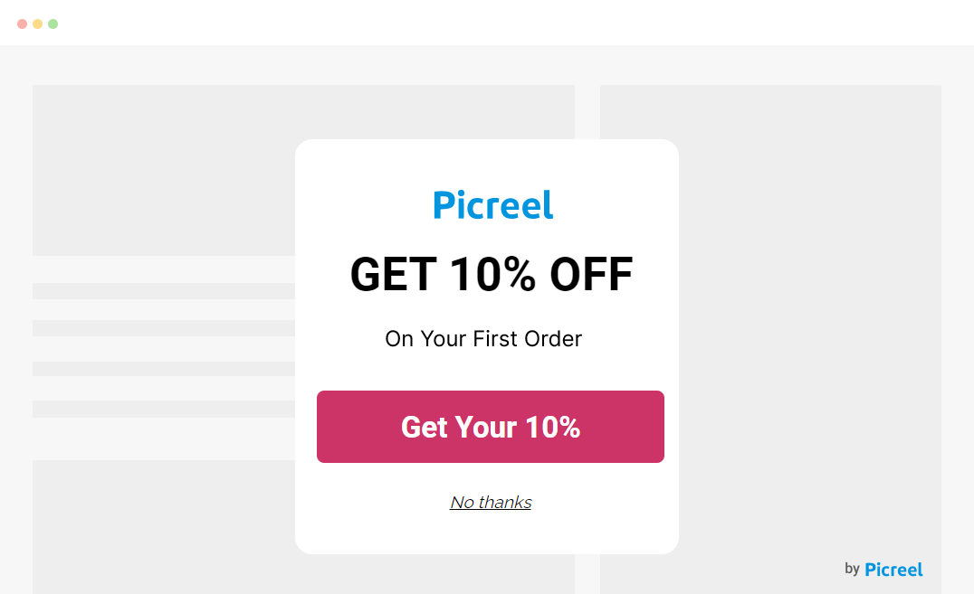
Offering 10% off to first-time visitors is a classic way to welcome newcomers and turn them into loyal customers. The popup should be simple and inviting, with a clear message like “Unlock 10% Off Now.” This not only encourages that first purchase but also helps you gather email addresses to keep the conversation going.
Pro Tip: After visitors sign up, send a warm welcome email series to introduce them to your brand and other special offers.
2. Flash Sale Popup
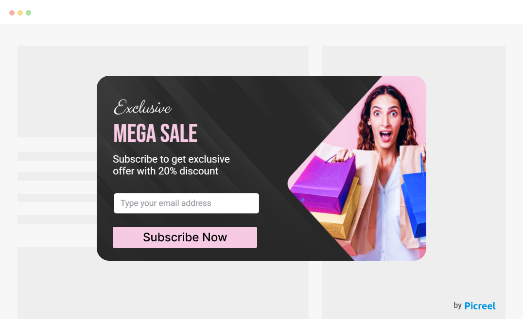
Flash sales are all about excitement and creating a sense of urgency. A popup announcing “50% Off Today Only!” with a vibrant design and countdown timer can spark immediate interest. A CTA like “Shop Now Before Time Runs Out!” motivates visitors to jump on the deal while it’s hot.
Pro Tip: Time your flash sales for when your site has the most traffic to maximize results.
3. Coupon Code Popup
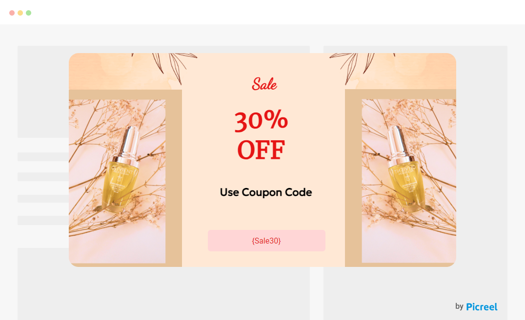
Who doesn’t love a good deal? A coupon code popup offering “Use Code SAVE20 for 20% Off” can catch your visitors’ attention. Make sure the code is easy to copy, and guide them with a straightforward CTA like “Apply Code and Save!” to make the process smooth and hassle-free.
Pro Tip: Include a “Copy Code” button to simplify the user experience and ensure they use their discount at checkout.
4. Product Discount Popup
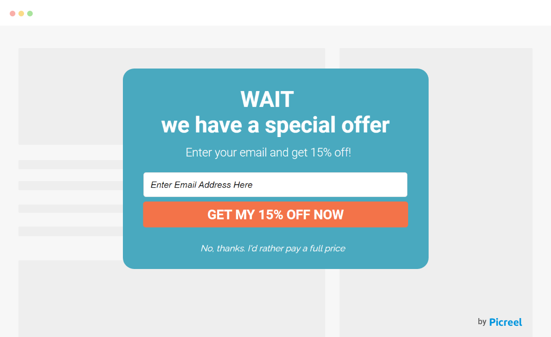
Sometimes, visitors just need a little nudge. Suppose someone is browsing a specific category, like sneakers; a discount popup offering “15% Off All Sneakers” can be that extra push they need. Pair it with an eye-catching image and a CTA like “Grab the Deal” to make it irresistible.
5. Gift Card Giveaway Popup
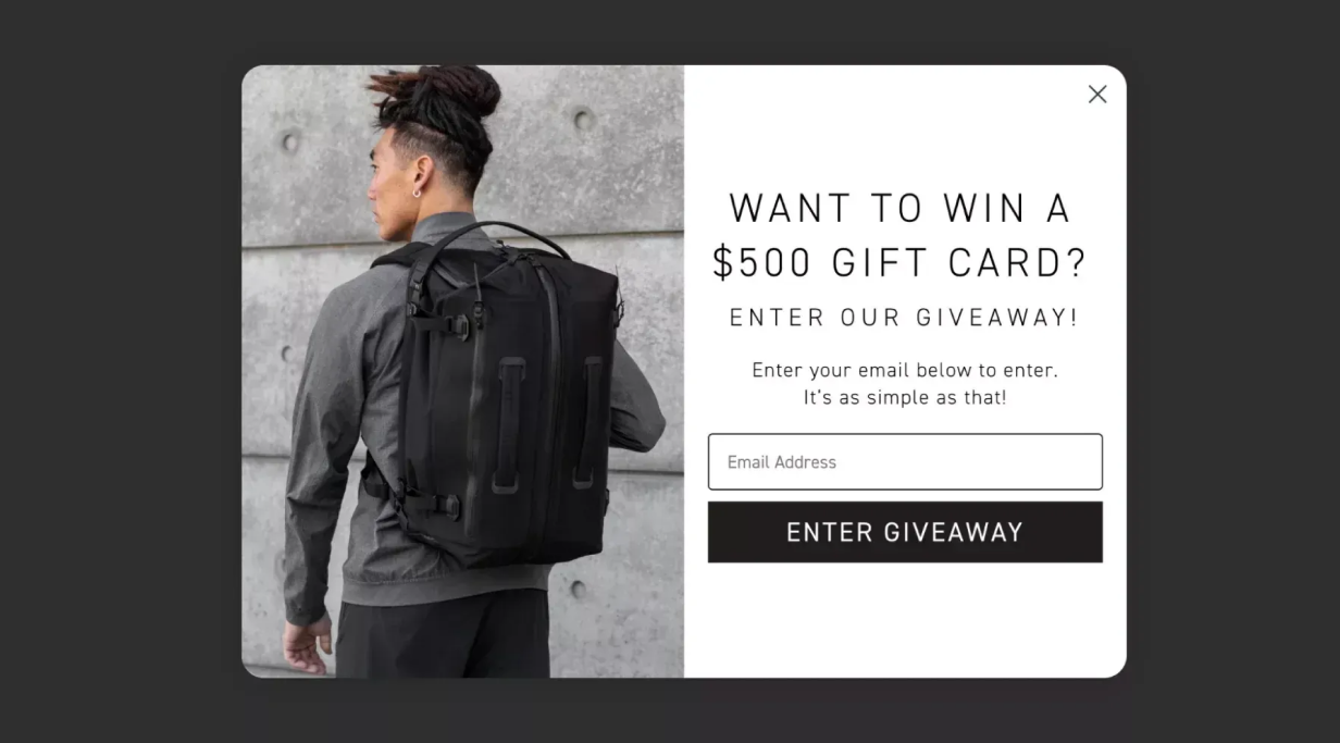
Image source: blackember.com
Who wouldn’t want a chance to win something awesome? A popup offering, “Enter to Win a $100 Gift Card!” is a fun way to engage visitors and grow your email list. Keep the entry process simple with a CTA like “Enter to Win” that invites them to join the fun.
Pro Tip: Align these giveaways with special occasions or holidays to capture more interest and increase participation.
6. Referral Program Popup
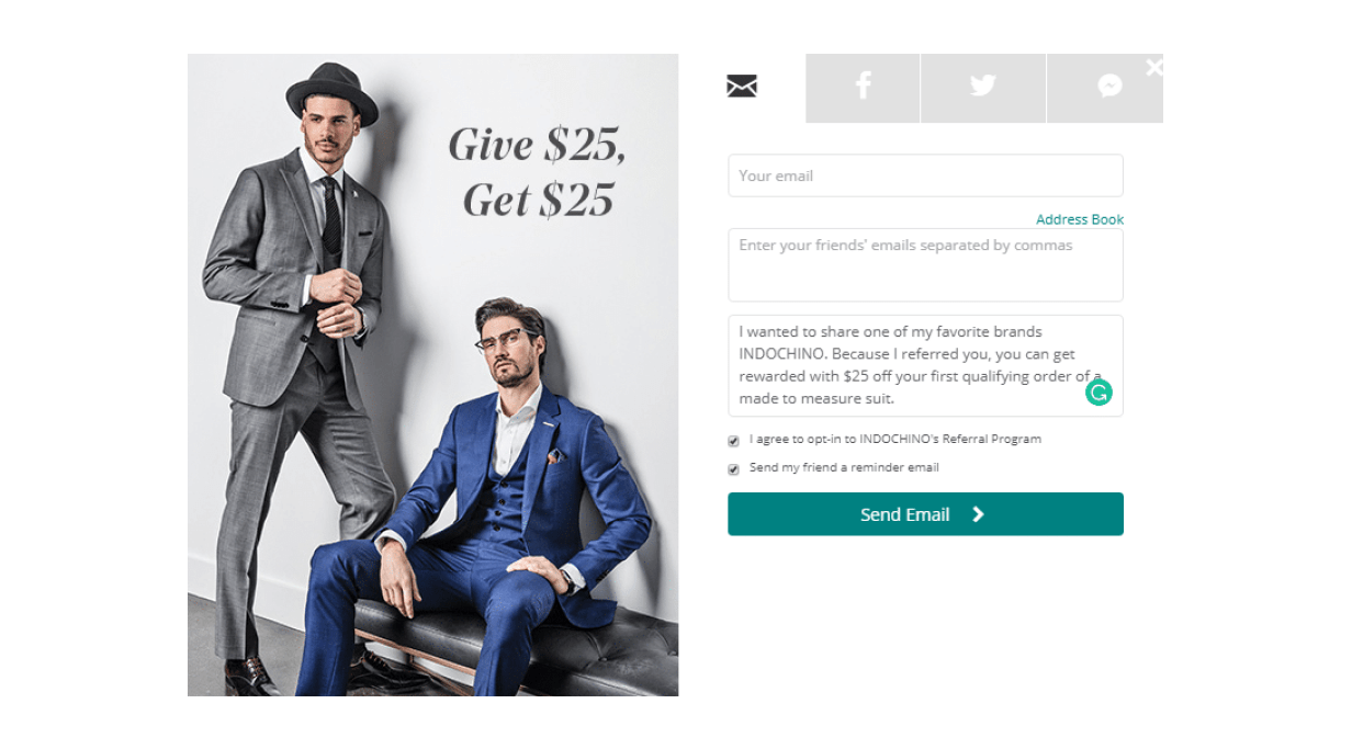
Image source: indochino.com
Referral programs are a fantastic way to expand your customer base while rewarding your existing customers. A popup that says, “Refer a Friend, Get $10 Off!” encourages your loyal customers to spread the word about your brand. This kind of popup is most effective when it’s easy to use—consider adding direct sharing options via email or social media. A clear CTA like “Get Your $10 Now” makes it straightforward for customers to take action.
7. Spin-to-Win Popup
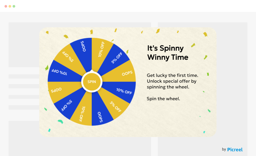
Adding a fun, interactive element like a spin-to-win popup can make the shopping experience more engaging. Visitors get the thrill of spinning a virtual wheel to win discounts, freebies, or other perks. This type of popup is particularly effective for driving user engagement. A CTA like “Spin the Wheel” invites them to try their luck, making the experience feel more like a game than a sales pitch.
Pro Tip: Use bright colors and playful sound effects to enhance the interactive experience and keep visitors coming back for more.
8. Customer Feedback Popup
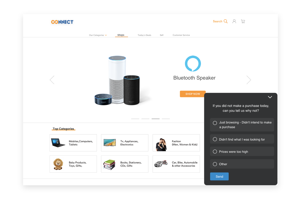
Gathering customer feedback is invaluable for improving your eCommerce site, and a well-designed popup can help you do just that. A popup offering, “Answer a Quick Survey for 10% Off,” can encourage customers to share their thoughts. Adding a progress bar shows them how close they are to completing the survey, while a CTA like “Complete Survey and Save!” motivates them to finish.
Pro Tip: Keep the survey short and focused—just a few questions—to ensure higher participation rates.
9. Only 2 Left in Stock!

Image source: pucci.com
Creating urgency with scarcity can be a powerful motivator. An “Only 2 Left in Stock!” popup taps into the fear of missing out (FOMO) and encourages quick purchases. This type of popup works particularly well for limited edition items or products that are selling fast. Pair it with a CTA like “Buy Now Before It’s Gone” to push visitors to make a decision.
10. Cross-Sell & Upsell Popup
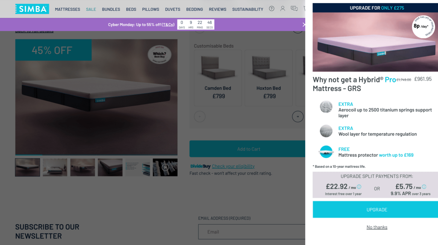
Image source: simba.shop
Maximize your average order value with cross-sell and upsell popups. For example, if a customer adds a phone to their cart, suggest a matching case or a screen protector at a discount. This strategy works best when the recommended products complement the original purchase. A CTA like “Add to Cart” makes it easy for customers to include these additional items in their order.
11. Free Shipping Popup
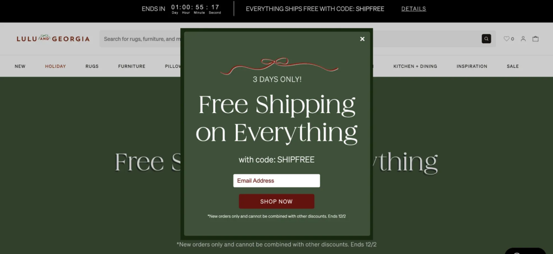
Image source: luluandgeorgia.com
Free shipping is a major incentive for online shoppers. A popup offering, “Free Shipping on Orders Over $50!” can encourage visitors to add more items to their cart to qualiis stratfy. Thegy is particularly effective in increasing the average order value. A CTA like “Shop Now and Save on Shipping” drives the message home.
Pro Tip: Clearly display the minimum purchase amount required to qualify for free shipping to avoid any confusion and set clear expectations.
12. Limited-Time Offer Popup
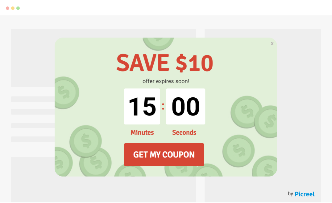
A limited-time offer creates urgency and excitement, which can significantly boost conversions. For example, a popup with a message like “Exclusive Access for the Next 24 Hours” paired with a countdown timer can push visitors to take immediate action.
A strong CTA like “Claim Your Access” encourages them to act before the offer expires. A/B testing different CTA variations can help you identify the most compelling option that drives the highest conversions.
13. Exclusive Access Popup
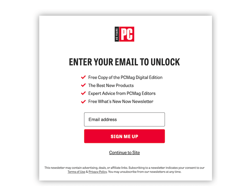
Image source: PCMag
Offering exclusive access to sales or new products can make your visitors feel special and valued. A popup that says, “Join Now for Early Access to Our New Cn” collectioan entice visitors to subscribe or register. The CTA could be something like “Get Early Access,” which adds a sense of privilege and urgency.
14. Holiday Sale Popup
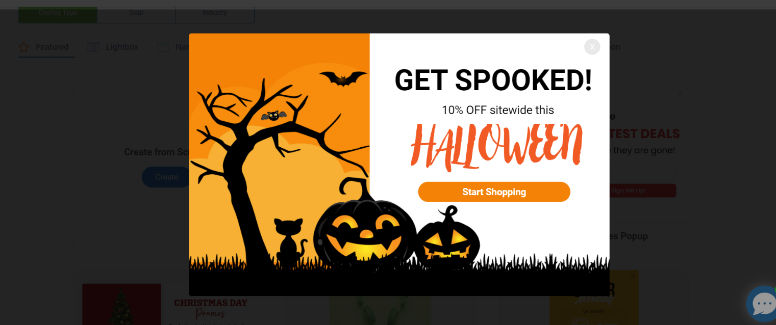
During the holiday season, a well-timed popup promoting a holiday sale can capture the festive spirit and boost sales. A message like “Holiday Sale! 30% Off Everything” combined with a festive design can attract attention and create excitement. The CTA “Shop the Holiday Sale” makes it easy for visitors to dive into the deals.
Pro Tip: Use holiday-themed visuals and messaging to enhance the seasonal appeal and create a sense of occasion.
15. Newsletter Signup Popup
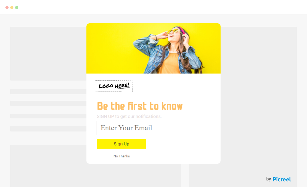
Building your email list is crucial for ongoing engagement with your customers. A simple and effective newsletter popup offering, “Sign Up for Our Newsletter and Get 15% Off Your Next Purchase,” can help grow your subscriber base. A straightforward CTA like “Sign Me Up” makes it easy for visitors to join.
Pro Tip: Highlight the benefits of subscribing, such as exclusive deals or insider news, to make the offer even more appealing.
Top 10 Ecommerce Popup Best Practices for Success
Getting more users to convert with popups isn’t just about slapping the latter on your site—it’s about doing it smartly. Here’s how to make your popups work like a charm:
1. Be Less Intrusive
Nobody likes being bombarded with popups right off the bat. Keep things simple—limit how many you show at once, and always make sure they’re easy to close.
For example, instead of hitting visitors with multiple popups as soon as they arrive, try showing a single, well-timed popup after they’ve browsed a bit. This way, you’re more likely to catch their attention without annoying them.
2. Target Your Popups
Your visitors aren’t all the same, so why should your popups be? Customize them based on who’s visiting, their device, browsing habits, or location.
Imagine this: a visitor from New York is checking out your site on their phone. You could serve up a popup offering free shipping just for New Yorkers. That’s a surefire way to make them feel special and boost your chances of engagement.
3. Time It Right
Timing can make all the difference with popups. Instead of popping up as soon as someone lands on your site, try waiting until they’ve had a chance to explore a bit.
For example, you could trigger a popup after they’ve scrolled halfway down the page or spent a minute browsing. This way, you’re not interrupting too soon, and they’re more likely to pay attention to your offer.
Pro Tip: Play around with the timing to find out what works best for your visitors. Some might appreciate a little delay, while others could be ready to engage right away.
4. Be Transparent With What You Offer
When it comes to popups, honesty is the best policy. If you’re making an offer, be clear and upfront about it. Visitors appreciate knowing exactly what they’re getting into. When your offer is straightforward and trustworthy, people are more likely to take you up on it, whether it’s signing up for a newsletter or making a purchase.
5. Create a Design Centered on Simplicity
Keep your design clean and simple. Stick to your brand’s colors and fonts so the popup feels like a natural part of your site. A sleek, minimalist design not only looks good but also makes it easier for visitors to engage. They’ll appreciate the streamlined experience and are more likely to take action.
Here’s an example:
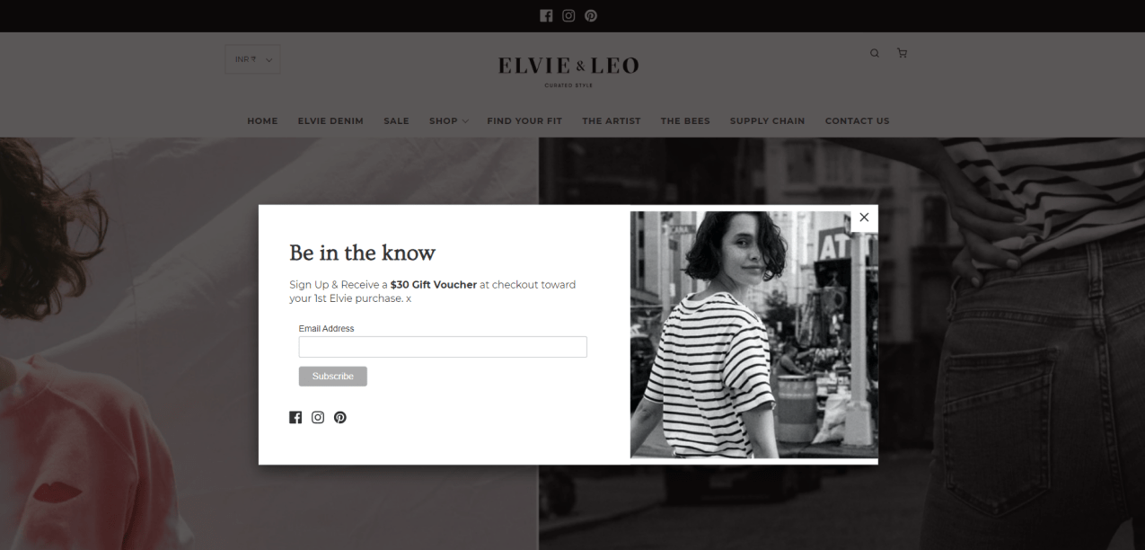
Image Source: Elvie & Leo
6. Give More Than You Ask For
If you’re asking visitors for something—like their email—make sure you’re giving them something valuable in return. For example, offer a juicy 20% discount on their first purchase. That way, they feel like they’re getting a great deal, which makes them much more willing to share their contact details.
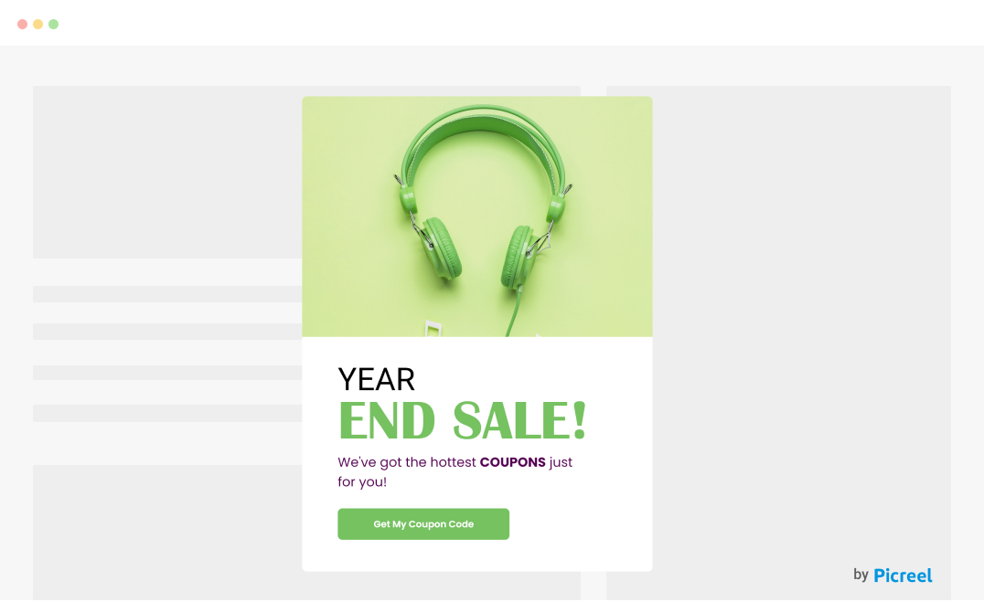
7. Add Visual Appeal With Product Images
A picture is worth a thousand words, right? Adding a product image to your popup can really make it pop. Imagine you’re promoting a new line of headphones; showing a sharp, eye-catching image of your best-seller can instantly grab attention and make visitors eager to check it out.
Here’s an example:
8. Keep Text to a Minimum
When it comes to popups, less is definitely more. Use a snappy headline to draw people in, and keep the rest of the text short and sweet. The idea is to get your message across quickly and clearly so visitors know exactly what to do next without feeling overwhelmed.
9. Use Social Proof
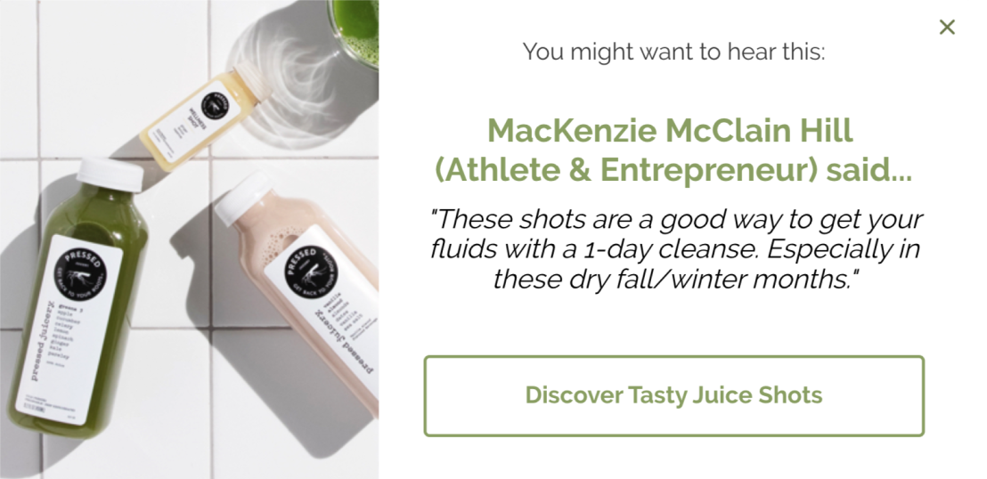
Image source: Drip
Adding a bit of social proof to your popups can help visitors feel more confident about taking action. Think about including customer reviews, testimonials, or even a small note like “5 people recently bought this product.” It’s a way to subtly show that others are enjoying what you offer.
Pro Tip: Choose reviews or real-time notifications that naturally fit into your popup design, enhancing its effectiveness without being too intrusive.
10. Always Offer an Exit Option
Everyone likes to be in control of their browsing experience. Make sure your popups have a clear and easy-to-find exit option. When visitors can close the popup without any fuss, they’ll have a more positive experience on your site, making them more likely to stick around and explore.
Convert Like Crazy With Smart E-commerce Popups
Your visitors are at different stages in their buyer’s journey, and it’s your job to guide them forward by removing any friction along the way. As we’ve seen, e-commerce popups are an excellent tool to help you do just that.
By applying the examples and best practices we’ve discussed, you can create popups that engage your visitors and encourage them to act. Whether it’s welcoming new customers, offering exclusive discounts, or reducing cart abandonment, the right popups can make all the difference.
To maximize your popup strategy, consider using Picreel. This powerful tool helps you design, test, and optimize popups tailored to your specific needs. With an intuitive drag-and-drop popup builder, customizable templates, and advanced targeting, Picreel makes it easy to create popups that drive results.
Don’t let your visitors slip away—try Picreel today and see how it can enhance your e-commerce strategy and boost your conversion rates.
FREE. All Features. FOREVER!
Try our Forever FREE account with all premium features!


