As we explore diverse eCommerce websites, we’re bound to stumble upon popups. While some of these popups dazzle us with their visual appeal, others feel like invading our space and proving irrelevant, tempting us to bid farewell to the site.
As an eCommerce store owner and marketer, your visitors exiting without making a purchase is the last thing you want. Which is why, it becomes crucial to capture visitors’ attention without causing interruptions or annoyance. But how can this be achieved?
The solution lies ahead.
Popup marketing plays a vital role in the success of eCommerce stores and has the potential to increase conversions by 15-300%.
However, the key lies in creating engaging popup designs and delivering the right content to the right audience at the right time.
To assist you in creating delightful popups, we have prepared this comprehensive eCommerce popup guide. It covers everything from the examples specifically tailored for eCommerce to the basics and importance of popups and best practices, enabling you to guide site visitors seamlessly toward the conversion funnel.
13 Best Ecommerce Popup Design Examples to Grow Revenue
Here are some of the best eCommerce popup design examples to get inspiration from:
1. Kitchen Cabinet Kings
Kitchen Cabinet Kings witnessed a remarkable 26.57% increase in conversion rate by strategically implementing targeted discount popups on their website.
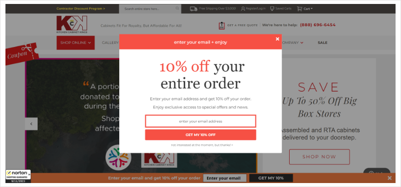
The bold headlines clearly convey the intent, accompanied by prominently displayed coupon codes. The call-to-action seamlessly takes visitors to their cart, automatically applying the coupon.
What’s more, the mention of a 48-hour window creates a compelling sense of urgency. These popups redefine transparency, simplicity, and convenience, ensuring a hassle-free shopping experience.
Kitchen Cabinet Kings’ ingenious approach captivates customers, guiding them towards irresistible deals. With a harmonious blend of clarity, ease, and limited-time incentives, they know precisely how to grab attention and make wallets happy. Enjoy your shopping spree!
Pro tip: It’s essential to have clear and concise content throughout your popup to capture the attention of your website visitors. Starting with an attention-grabbing headline, ensure your message is easily understood and gets straight to the point. Visitors often skim through content, so making your offer prominent in the headline is crucial, enticing them to consider taking action by clicking on your call-to-action (CTA).
2. Chubbies
Chubbies, the masters of captivating first-time visitors, showcase an attention-grabbing popup with a crystal-clear offer in the headline. Instead of a discount, they entice with a $10 cash incentive, adding a unique twist.
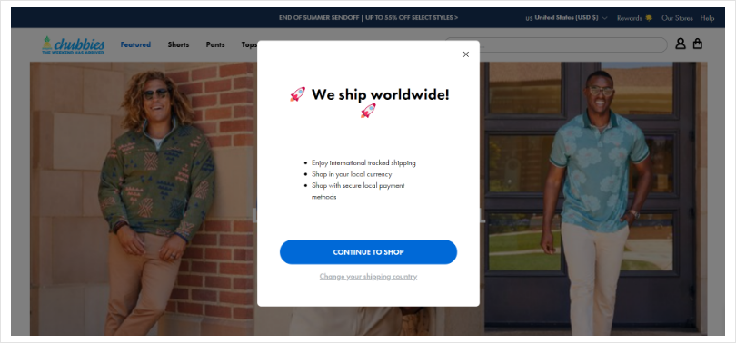
This popup not only captures email addresses but does so with a creative design featuring actionable CTAs and decline buttons. Chubbies’ innovative approach maximizes engagement while ensuring a seamless user experience.
Their clever use of a cash incentive sets them apart from the competition, appealing to visitors with the allure of instant savings. With a visually appealing email input field design and strategically placed CTAs, Chubbies seamlessly captures leads and keeps the momentum going.
3. The Dallas Morning News
The Dallas Morning News experienced a remarkable surge in newspaper subscribers by employing a sleek exit-intent popup design.
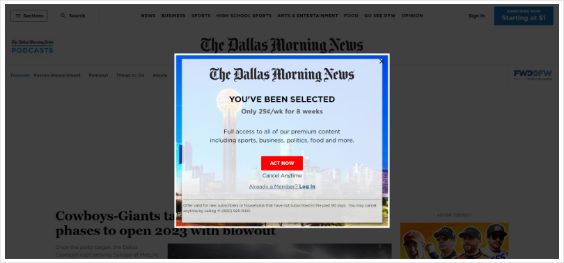
This captivating popup targets visitors on the verge of leaving, delivering an impactful headline highlighting a limited-time offer. Skillfully placed images showcase the newspaper’s product/service, effectively conveying its compatibility.
The call-to-action (CTA) takes the visitor directly to the signup page, streamlining the conversion process. This brilliant combination of attention-grabbing headlines, compelling visuals, and a seamless CTA ensures maximum engagement and drives subscriptions.
The Dallas Morning News has truly mastered the art of converting departing visitors into loyal readers.
4. 100% Pure
When engaging a broad audience, gamifying your popups can work wonders. 100% Pure understands this concept and employs a captivating mystery offers popup to captivate visitors.
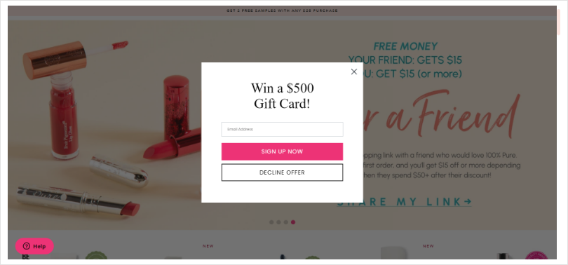
The design and color scheme seamlessly blend with the website’s theme, creating a visually cohesive experience. As visitors progress to the second step, the popup reveals enticing offers and presents an email capture form. Multiple options allow visitors to receive personalized emails and exclusive offers, further enhancing engagement.
By gamifying their popups, 100% Pure entices and excites visitors, resulting in increased conversions and a loyal customer base.
5. GAIAM
GAIAM, the epitome of eCommerce creativity, showcases its brilliance in a lead magnet popup that attracts new subscribers and customers.
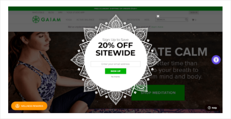
The aesthetically pleasing design seamlessly aligns with the website’s overall look and feel, while the straightforward copy delivers the message effectively. GAIAM sweetens the deal by offering a sitewide 20% discount, making the incentive even more enticing, as it applies to all products.
This thoughtfully designed popup effortlessly accomplishes its purpose, drawing in new leads and customers with style and simplicity.
Pro tip: While drawing inspiration from eCommerce popup examples is helpful, design popups on ecommerce sites that align with your brand and website, customizing your popups’ colors and overall theme to match your website’s aesthetics can make them appear seamless and integrated with your web pages. This cohesive design approach will make your popups feel like a natural extension of the user experience.
6. Dream Giveaway
Dream Giveaway employs a powerful exit popup to skyrocket ticket sales and generate valuable leads. The impactful headline grabs attention, while concise and straightforward copy avoids any distractions.
Engaging graphics effectively showcase what visitors are missing out on, prominently displaying the added incentive of a 25% bonus. The strategically placed call-to-action (CTA), decline buttons, and a visually contrasting color combination ensure this popup emerges as a clear winner.
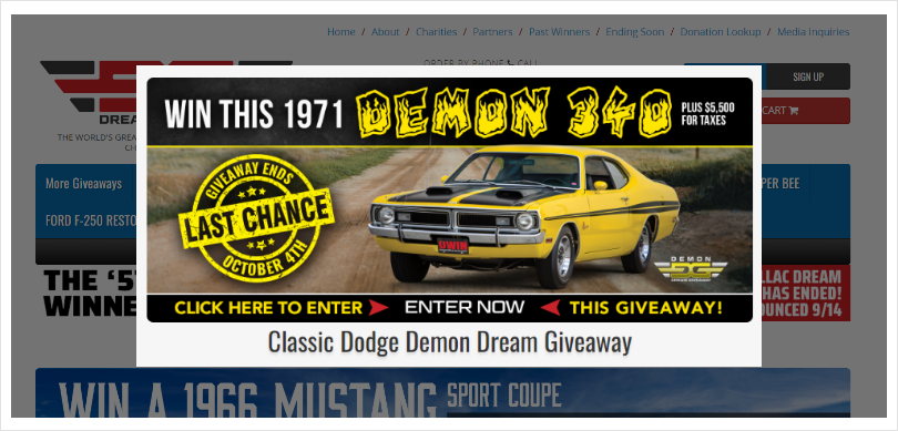
Dream Giveaway’s expertly crafted exit popup maximizes conversions and propels visitors further along the sales funnel.
7. PaintYourLife
With its visually captivating design, this popup effortlessly lures in new customers. The heartwarming image of a person holding a gift exudes warmth and generosity, while the adjacent discount creates an irresistible urge to obtain the code and make a purchase.
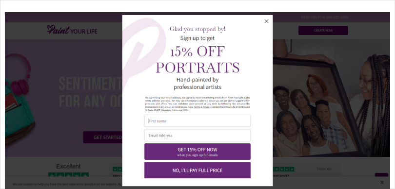
PaintYourLife, leveraging this single popup campaign, achieved remarkable results, experiencing a conversion rate of approximately 28% and a substantial increase in artwork sales. Additionally, such popup designs serve as a valuable tool for capturing high-quality leads, paving the way for future successful marketing campaigns.
Here, you discover the power of visually appealing popups and unlock growth and customer acquisition potential.
Pro Tip: Monitoring and improving popup performance is crucial for increasing conversions and sales. A/B testing is a valuable technique that allows you to experiment with different elements of your popups.
Test multiple designs, make small changes, and play with incentives to identify the most effective variations in triggering conversions. This iterative testing process helps you refine your popups based on data-driven insights and optimize their performance over time.
Read More - 11 Pop-Up Best Practices to Drive Conversions
8. Organic Chics
Organic Chics harnesses the power of personalized popup campaigns to ignite sales. These sleek designed popups offer tailored product recommendations, complete with compelling images and discounted prices, all leading visitors seamlessly to the checkout page.
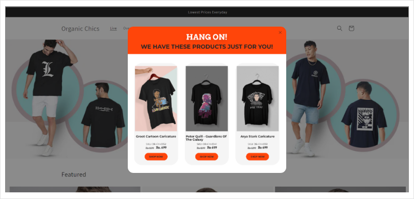
By analyzing visitors’ site activity, Organic Chics dynamically displays relevant recommendations or redirects them to their best-selling products and services. This strategic approach leverages personalized engagement, maximizes conversions, and ensures a delightful shopping experience.
Pro Tip: Even with an excellent design and enticing offer, displaying your popups to the right audience at the right time is vital. Segment and target your visitors effectively by using precise targeting options. Utilize trigger metrics like exit-intent (displaying the popup when visitors are about to leave), time on page, or scroll percentage to determine the optimal timing for your popups.
9. Hello Fresh
Hello Fresh excels at offering a creative and enticing deal to first-time visitors through an impactful exit popup. The headline clarifies that visitors will receive discounts on their first three orders, with the twist of displaying the discount in currency instead of a percentage.
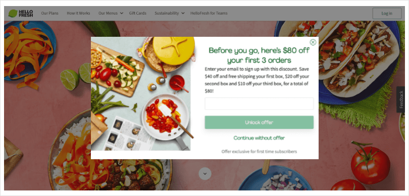
The visuals seamlessly blend with the website’s aesthetics, capturing visitors’ attention effortlessly. As a lead magnet, this popup also serves as a powerful tool for expanding the subscriber base, ensuring long-term engagement.
Hello Fresh’s thoughtful and engaging exit popup strategy showcases its commitment to attracting and delighting new customers.
Pro Tip: To maximize the effectiveness of your popups, tailor your offers to be relevant to your website visitors. Consider offering first-time discounts to new visitors and exit offers to those displaying exit intent or new offers to returning visitors.
You can personalize the offers you present by analyzing visitors’ site activity, time spent on pages, and products/pages browsed. This personalization creates a sense of relevance and increases the likelihood of conversions.
10. Awara Sleep
Awara Sleep’s minimalistic popup design stands out as a truly unique approach, specifically targeting engaged visitors with a gentle nudge. The offer itself holds two crucial elements.
Firstly, it is a limited-time offer, cleverly accompanied by a countdown timer that fuels a sense of urgency. Secondly, the offer remains mysterious, only accessible to shoppers after entering their email addresses. This ingenious combination transforms the popup into a powerful sales and lead capture tool.
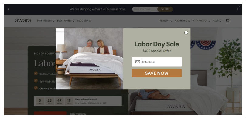
Awara Sleep’s exceptional design and strategic use of enticing offers ensure maximum engagement and conversions while building a valuable email subscriber base.
11. Gwen Beloti
Gwen Beloti’s exclusive ecommerce popup design effortlessly captures the essence of its luxurious and premium brand by utilizing two contrasting colors.
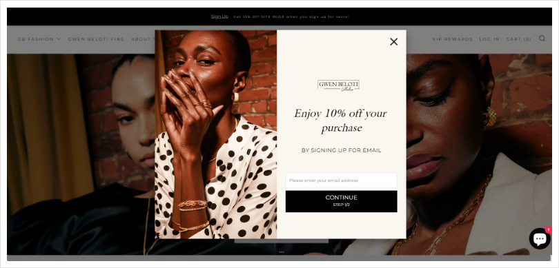
The headline delivers a crystal-clear and impactful offer that resonates with visitors. To further enhance the value of the offer, an additional field for Birthday Month is included. Recognizing that shoppers appreciate discounts on special occasions like birthdays and anniversaries, this strategic addition amplifies the success of the popup campaign.
Gwen Beloti’s attention to detail and understanding of customer preferences result in a captivating popup experience that drives engagement, conversions, and customer satisfaction.
12. Stackcommerce
Stackcommerce employs a powerful strategy by offering a massive incentive in the headline, capturing high-quality leads, and driving sales.
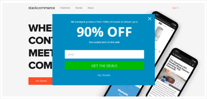
The irresistible 90% OFF discount is impossible for shoppers to overlook. Playing with numbers and making them appear substantial instantly grabs visitors’ attention. The bold CTA text in the green box further assures visitors of a simple, single-step signup process, making it an ideal choice for busy shoppers.
Stackcommerce’s clever combination of a compelling headline, impressive discount, and user-friendly CTA creates a winning formula for capturing attention, boosting conversions, and satisfying customers.
Pro Tip: After capturing visitors’ attention with a compelling headline, the call-to-action (CTA) needs to be powerful. It’s crucial to make your CTA clear, understandable, and visually appealing at first glance. Use engaging and actionable language that encourages visitors to take the desired action.
Additionally, provide an exit button, such as “No, thanks!” or “I am not interested in your offer,” allowing visitors to dismiss the popup if they choose to do so easily.
13. BIG4
To regain customers, BIG4 implemented a loyalty club signup popup that proved to be a game-changer, recovering a remarkable 54% of abandoning customers.
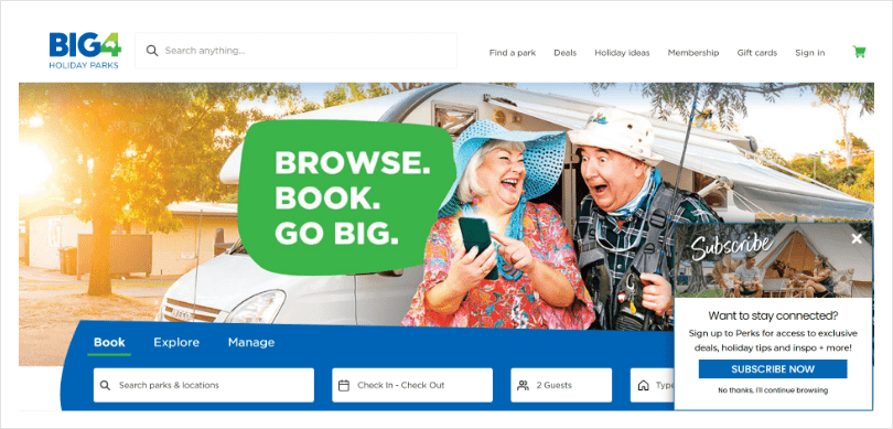
This ecommerce popup design, with its limited-time offer, hones in on a tempting 20% discount for the premium membership. The strategically placed call-to-action (CTA) guides customers directly to the checkout signup page, where they can effortlessly complete their order at a discounted price.
BIG4’s effective use of this popup re-engages customers and incentivizes them to become loyal members, driving both customer retention and sales.
Read More - 10 Website Popup Examples + How To Create One
Importance of Using Popups on E-Commerce Sites
Popups can be game-changing if used effectively with proper strategies. Here’s how popups can help you grow your online store.
Capture Visitors’ Attention
Popups on eCommerce stores are the best attention grabbers. Visitors will likely pay attention if you display the right offers to the right audience. You can calmly nudge the visitors down the conversion funnel without being over-promotional.
Grab Quality Leads
You can use lead magnets to reveal discount coupons or free shipping codes to visitors in exchange for their email addresses. This helps you grow your subscriber base. You can also bring in a short signup form using a two-step popup to make the process easier.
Boost Sales
As targeted eCommerce popups are about displaying flat discounts, limited-time deals, first-time offers, and so on, they guide visitors to take the next step, i.e., completing the purchase. With an engaging CTA, you can further push visitors to relevant pages.
Reduce Cart Abandonment
One leading reason eCommerce stores use popups is to reduce cart abandonment. The average abandonment rate is 70%, so popups are crucial in redirecting shoppers to their carts. You can increase sales from visitors about to leave using suitable exit offers and an interactive copy.

Capture Feedback
With the help of lead capture forms and surveys, you can find out why visitors depart from your store to make the necessary improvements. As popups allow you to display short forms, the response rates are often higher than in classic surveys.
Now that you know why popups are super important for eCommerce businesses, it’s time to check out some pro tips and best practices to boost sales using popups.
How Picreel Helps You Design High-Converting Ecommerce Popups
Choosing the right tool to design popups on ecommerce sites is one of the most important things. We’ll take Picreel as our tool of choice is it is one of the best popup builder tools out there and comes with a huge template library of 100+ customizable popup designs to get started in minutes.
Here are the steps to create engaging popups:
Step 1- Create a Popup Campaign
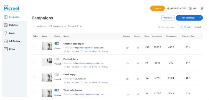
Begin by creating a Popup Campaign on Picreel. After logging in, click on “Campaigns” in the left tab and choose either “Create your campaign” in the middle of the screen or “New campaign” in the top right corner.
Step 2- Pick a Suitable Template for Your Campaign
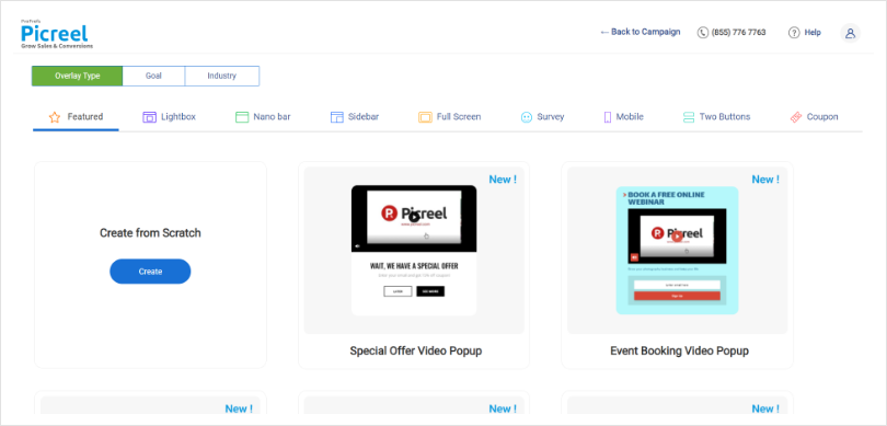
Select a suitable template for your campaign. After creating the campaign, you’ll be taken to the template screen with over 100 pre-built templates to choose from. You can also create a campaign from scratch if you prefer. Once you’ve decided on a template, click “Customize” to proceed.
Step 3- Customize Your Popup Campaign
Customize your Popup Campaign. In this step, you have full control to customize various aspects of your popup campaign:
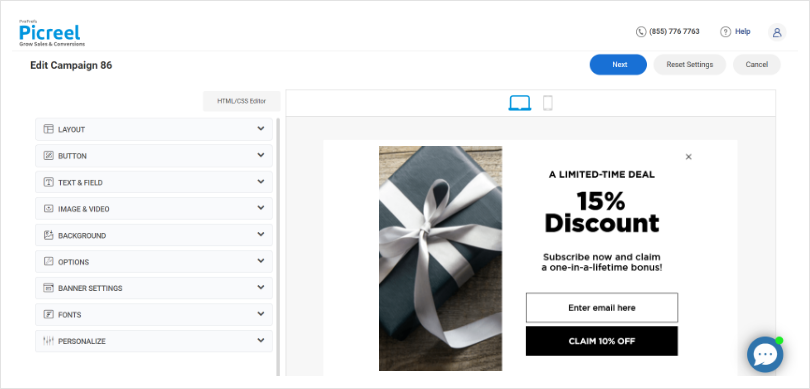
- Layout: Choose the type of popup button you want to use.
- Text & Field: Add or remove fields and edit the displayed text.
- Options: Define the popup’s functions, such as overlay and GDPR policies, and customize the close button.
- Banner settings: Choose the type of banner for the popup.
- Fonts: Customize the font of the text in your popup.
- Personalize: Opt to personalize your popup with on-site data.
Once you’ve finished customizing, click “Next” to proceed.
Step 4- Personalize Targeting and Triggers
Personalize targeting and triggers by deciding where and how you want your popup to appear. Enter the website URL you want to target and choose whether to display the popup on the entire site or specific pages.

Determine when the overlay should appear by scheduling or customizing triggers based on scroll percentage or time spent on the page. You can also set the popup to appear on click by inputting custom CSS as a trigger.

Additionally, you can customize targeting based on factors like returning or new visitors, referral sources, geography, device type, and custom cookies. When finished, click “Save,” and you will be redirected to the get started page.
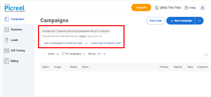
Step 5- Copy the Code Snippet
Copy the code snippet provided. Simply copy the code snippet and install it into your website. After that, your popups will start functioning as intended.
Transform Your Sales With the 13 Best Examples
Popup designs, best practices, and software offer effective strategies for attracting new customers without disrupting their experience. Well-crafted popups grab attention and encourage action, boosting conversions.
Following best practices ensures clear and compelling content presentation, and you can seamlessly engage new customers and drive sales growth by strategically integrating popups into your marketing strategy.
Continuous optimization and monitoring are key to success in today’s competitive market. Implementing these strategies enables you to achieve remarkable results and propel your business forward.
Experience the benefits of Picreel with a complimentary 15-day trial and witness enhanced lead generation and sales. The tool also offers a forever-free plan with unlimited campaigns and popups, enabling you to test it out before making a decision. Ensure optimal performance by consistently conducting A/B testing on your popups to identify the highest converting variations. Dive straight into the realm of popups and attract a fresh wave of customers to your business!
 Tips
Tips
We’d love to hear your tips & suggestions on this article!
FREE. All Features. FOREVER!
Try our Forever FREE account with all premium features!

 We'd love your feedback!
 Thanks for your feedback!


