Are your website visitors leaving without taking any action? Trust me, I’ve been there. I know it’s frustrating to see potential customers browse and bounce without signing up, making a purchase, or even clicking a button.
The good news? A strategically crafted popup message can change that by grabbing attention at the perfect moment. This can help you achieve a conversion rate of 11.09%, reduce bounce rates, and keep visitors engaged.
To help you create a high-converting popup message, I have included popup types, tips to make them effective, and real-world examples in this blog post. I’ve also covered how to measure your popups’ impact to refine your strategy for better results.
Let’s do this together.
What Is a Popup Message?
A popup message is a website overlay notification that incorporates an informational or marketing text message. This text generally has a powerful heading, additional details, and a strong CTA to engage and convert visitors.
Top 6 Types of Popup Messages
Popups aren’t one-size-fits-all. Here are the six popup types that most online businesses use to enhance engagement, build email lists, and boost conversions. You can use some or all of them, depending on your goals.
1. Welcome Popup Message
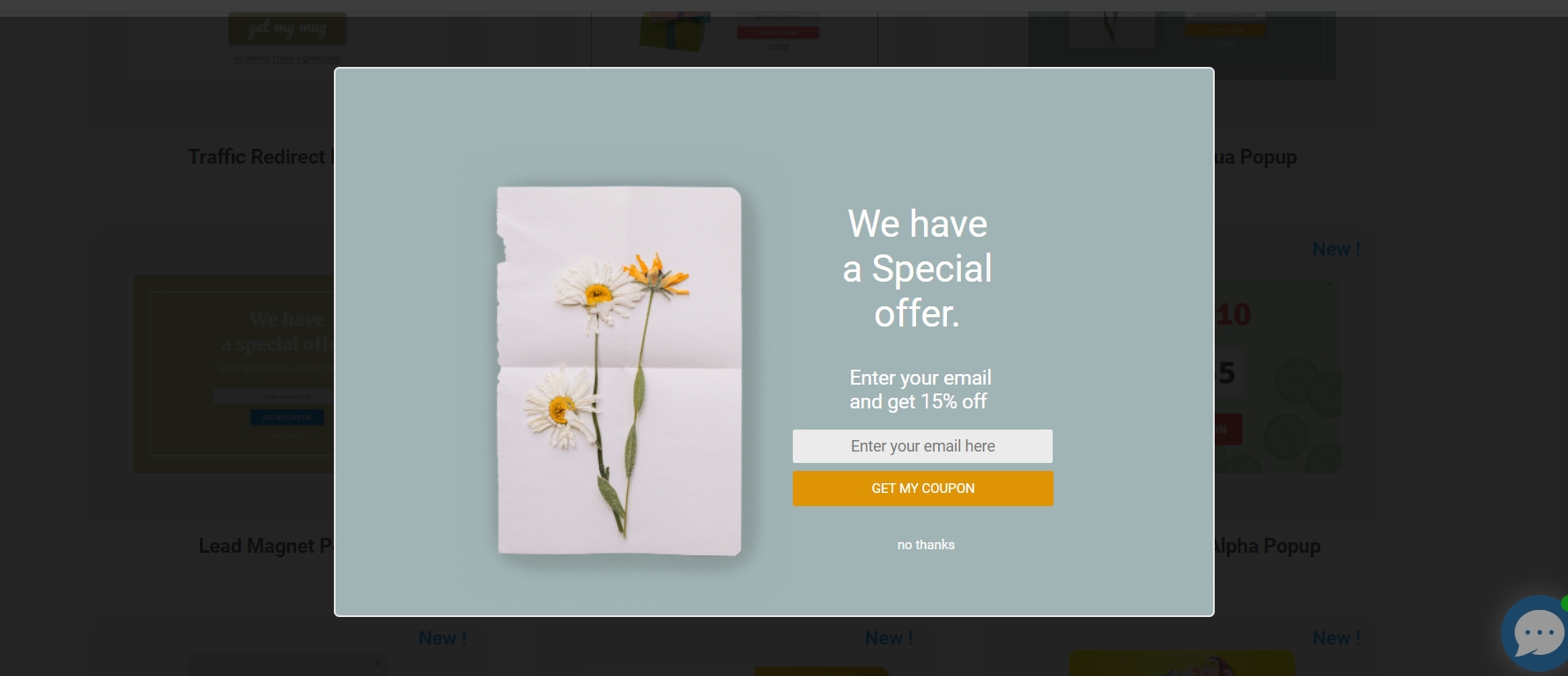
Image Source: Picreel
Welcome popup message greets your website visitors with a warm “Hey, we’re glad you’re here. Here’s something special for you.” It grabs attention right away and nudges users toward an action.
2. Exit Intent Popup Message
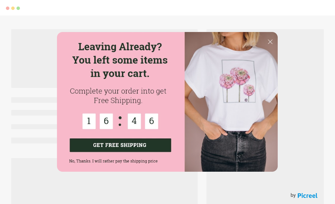
Image Source: Picreel
The exit intent popup message gives your visitors a compelling reason to stay, such as a discount or freebie, after tracking that your visitors are about to leave. This converts almost lost sales into conversions.
3. Newsletter Subscription Popup Message
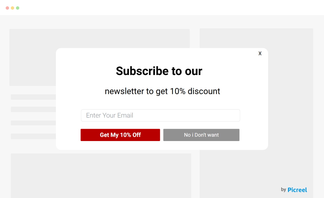
Image Source: Picreel
A newsletter popup message asks if your visitors would like to subscribe to your newsletter in exchange for an attractive discount, such as exclusive updates, deals, and early access to sales. This helps you grow your email list.
4. Discount Popup Message
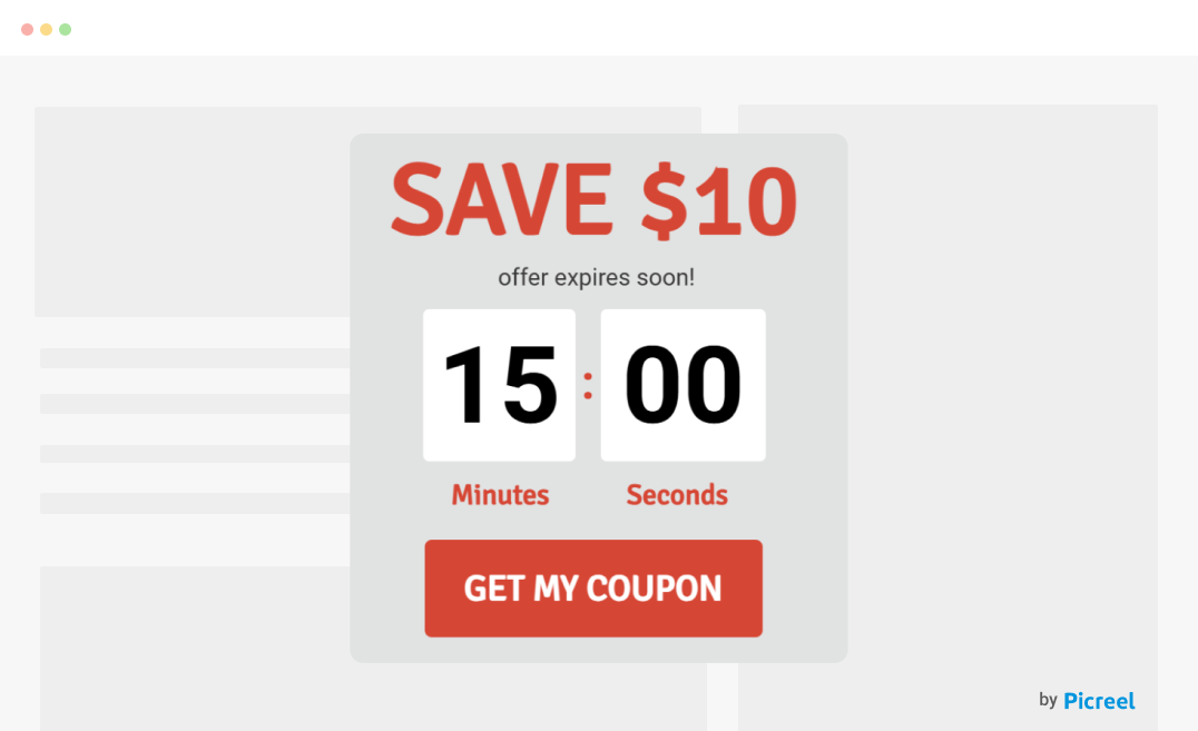
Image Source: Picreel
A discount countdown popup message provides your website visitors with a limited-time discount, such as a percentage off or free shipping, to make it sound urgent and hard to ignore. By offering a limited-time deal it, pushes your visitors toward making a purchase.
5. Social Proof Popup Message
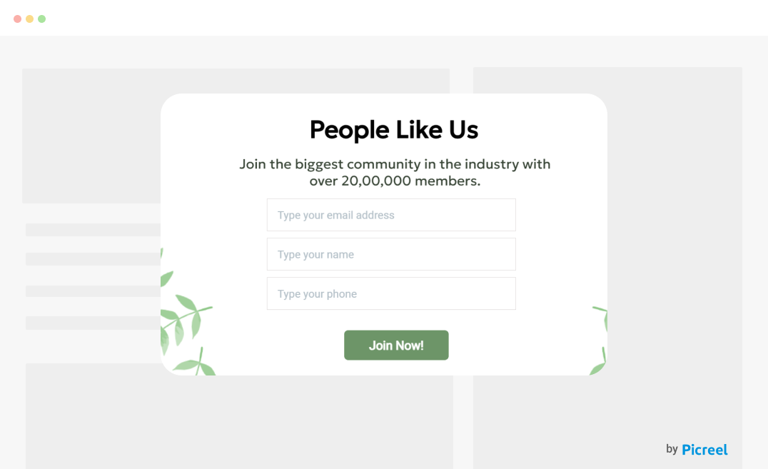
Image Source: Picreel
A social proof popup message reassures your visitors that your product or service is worth it by highlighting the number of users, positive testimonials, or recent sign-ups. It leverages the idea that people trust what others are already doing, boosting confidence and encouraging action.
6. Referral Popup Message
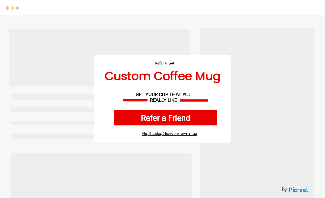
A referral popup message is a great way to turn happy customers into brand advocates. I’ve seen businesses use discounts, freebies, exclusive perks, or store credits to encourage referrals. Some offer two-way rewards, where the referrer and the new customer benefit. These popups help drive organic growth and customer loyalty effortlessly.
5 Tips for Crafting an Effective Popup Message
You’ve seen popups everywhere, but what makes some effective while others get ignored? These five tips will make you aware of how to create a popup message on HTML sites or Android devices that grabs attention and drives results effectively.
1. Provide Value to Visitors
People ignore popups when they don’t see what’s in it for them. If you’re asking your visitors for something like an email, signup, or a purchase, you need to give them a compelling reason to say yes. For instance, a popup message offering “15% off your first order” in exchange for emails works because it provides immediate savings.
2. Choose the Right Timing
A well-timed popup message feels helpful and not intrusive, making your visitors more likely to engage. Let them settle in first and display it after 10–15 seconds or when they’ve scrolled halfway. Ideally, exit-intent popups work great when someone’s about to leave, while discount popups right before checkout can seal the deal.
3. Include a Clear Call to Action (CTA)
If your popup message doesn’t tell your visitors exactly what to do next, they’ll ignore it. Instead of a vague “Submit”, try a CTA like “Get My 10% Off” or “Join the Community” — something that clearly states the benefit your visitors will be getting in exchange. This will compel them to take the desired action.
4. Incorporate Attractive Visuals
Your popup message needs to catch the eye without being overwhelming so that more visitors can take action. A clean design, high-quality images, and contrasting colors make it stand out while keeping things readable and professional. For example, a discount popup with a bold red button screams urgency, while a soft pastel newsletter popup feels inviting.
5. Target the Right Audience
When your popup message feels relevant and personalized, they are likelier to grab attention and drive action. For instance, if someone is leaving with items in their cart, an exit-intent popup promoting special offers like free shipping might convince them to stay. First-time visitors? A welcome popup with a discount works better.
But how to create a popup message while targeting so precisely? Smart popup builders like Picreel can help you create and target a popup message on Android devices or HTML websites with their ready-made templates and advanced targeting rules.
8 Real-World Examples of Popup Messages
A great popup grabs attention without being annoying. Here are some real-life examples that show how big brands strike the perfect balance. You will also find suggestions on how to best use each popup for maximum engagement and conversions.
1. Beau Domaine
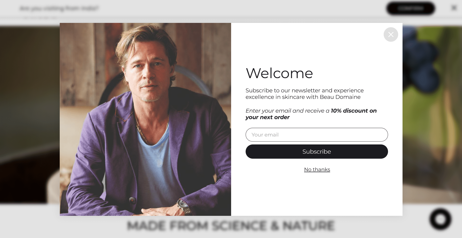
Image Source: Beau Domaine
Beau Domaine’s welcome popup is not just saying hello; rather, it’s giving them a reason to stick around with a 10% discount for subscribing. Smart, right? The clean design and professional image make the website look trustworthy and well-established, giving your visitors the confidence to share their email.
If you’re adding a welcome popup to your site, keep it simple:
✅ Greet visitors + offer something valuable (discount, freebie, or exclusive content)
✅ Use minimal, engaging text
✅ Make subscribing effortless
2. Ruroc
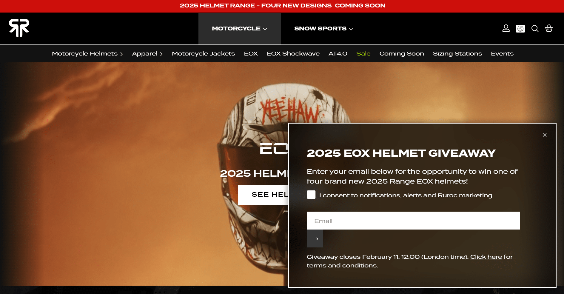
Image Source: Ruroc
This Ruroc popup message strategically builds an email list and boosts engagement by offering visitors something exciting — a chance to win a brand-new helmet. Why does this work? Because people love free stuff, and a giveaway creates instant interest.
If you’re adding a giveaway popup to your site, focus on:
✅ A clear, enticing offer (free product, discount, or exclusive access)
✅ Minimal input fields to keep it quick
✅ A deadline to create urgency
3. Ramp
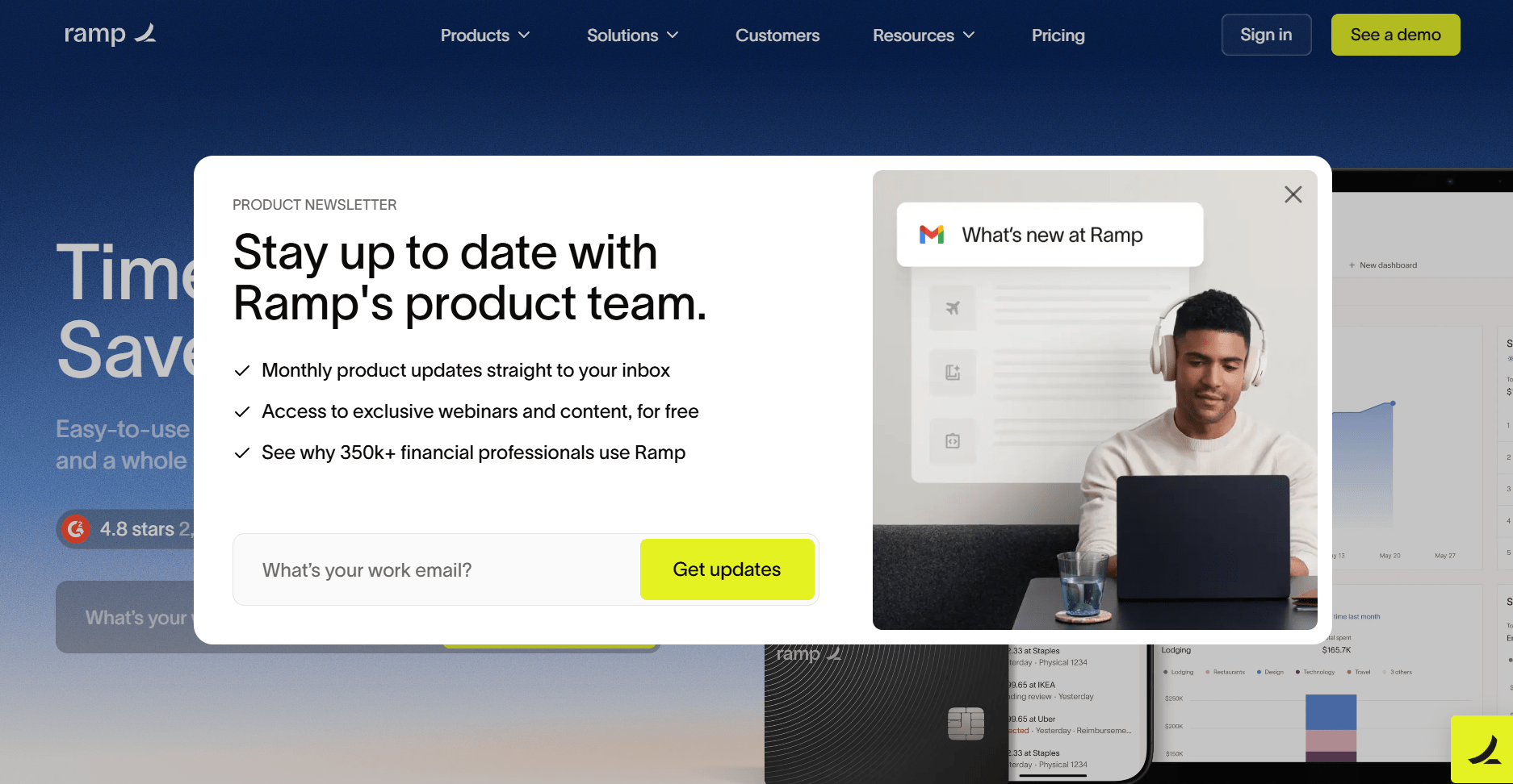
Image Source: Ramp
This Ramp newsletter popup is a great way to keep visitors engaged and boost newsletter subscribers without feeling intrusive. Instead of just asking for an email, it highlights clear benefits — monthly product updates, free webinars, and insights from 350K+ professionals.
If you’re adding a newsletter popup, focus on:
✅ Highlighting the benefits (updates, exclusive content, or industry insights)
✅ Keeping the form short for easy signup
✅ Using a strong CTA that encourages action
4. Press
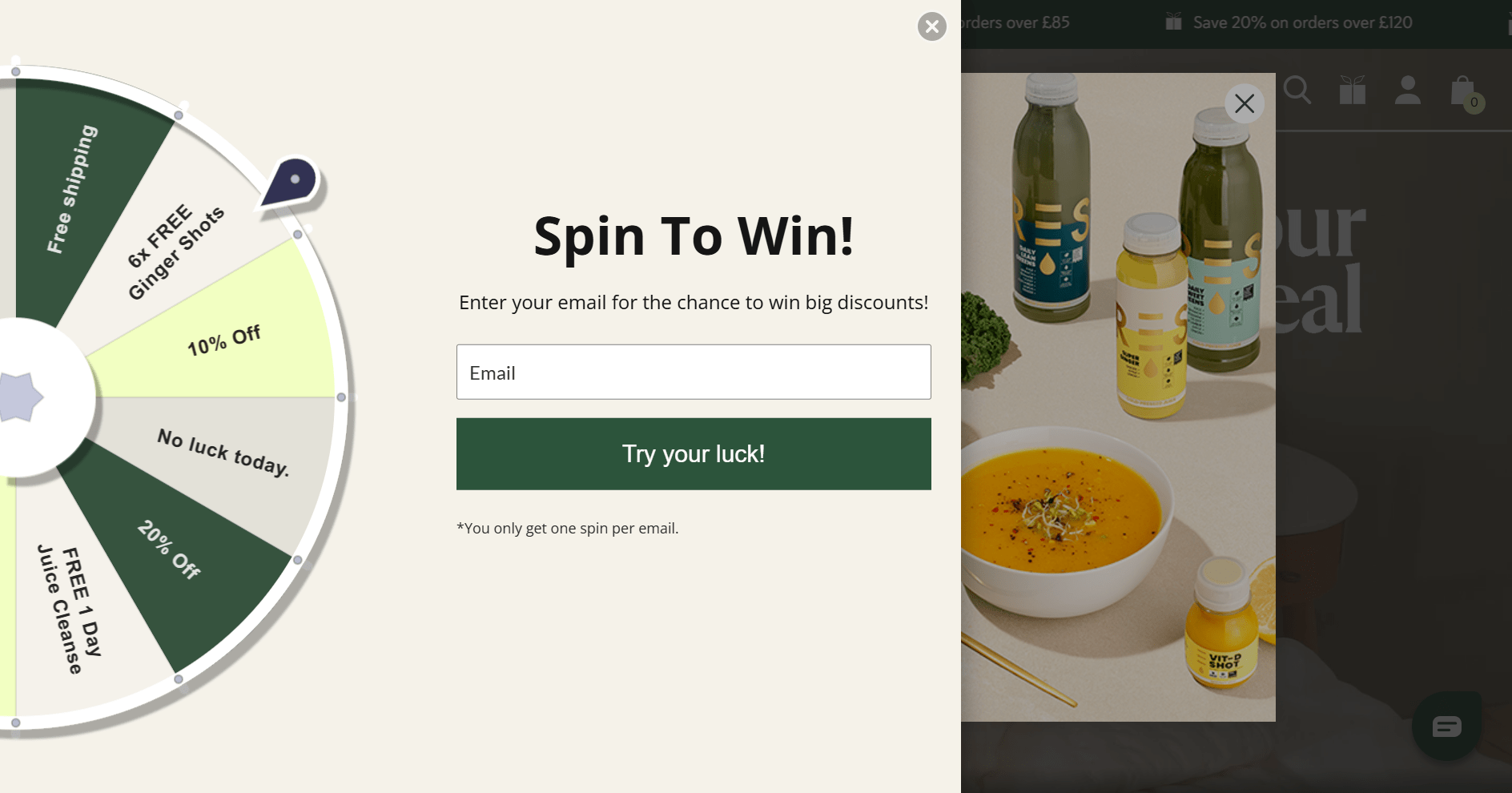
Image Source: Press
This Press gamified discount popup is a fun and interactive way to grab attention and boost email signups. Visitors get to “spin the wheel” for a prize only after they enter their email address. You see how they’ve turned collecting discounts into an interesting game in which visitors are likely to engage.
If you’re adding a gamified popup message, focus on:
✅ An engaging experience (spin-to-win, scratch cards, or challenges)
✅ Exciting, valuable rewards
✅ A simple, clear CTA
5. Blume
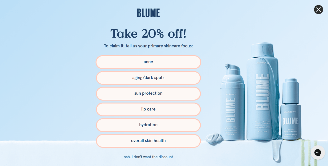
Image Source: Blume
This Blume quiz discount popup is a clever way to collect valuable data for future marketing while offering an incentive. Instead of just handing out a 20% discount, it asks visitors about their skincare focus. This makes them feel engaged rather than interrupted. Such strategic approach boosts conversions and builds stronger customer connections!
If you’re adding a quiz-style popup, focus on:
✅ Personalization — ask relevant, easy-to-answer questions
✅ A reward at the end to encourage participation
✅ Visually appealing, simple design
6. Sienna Sauce
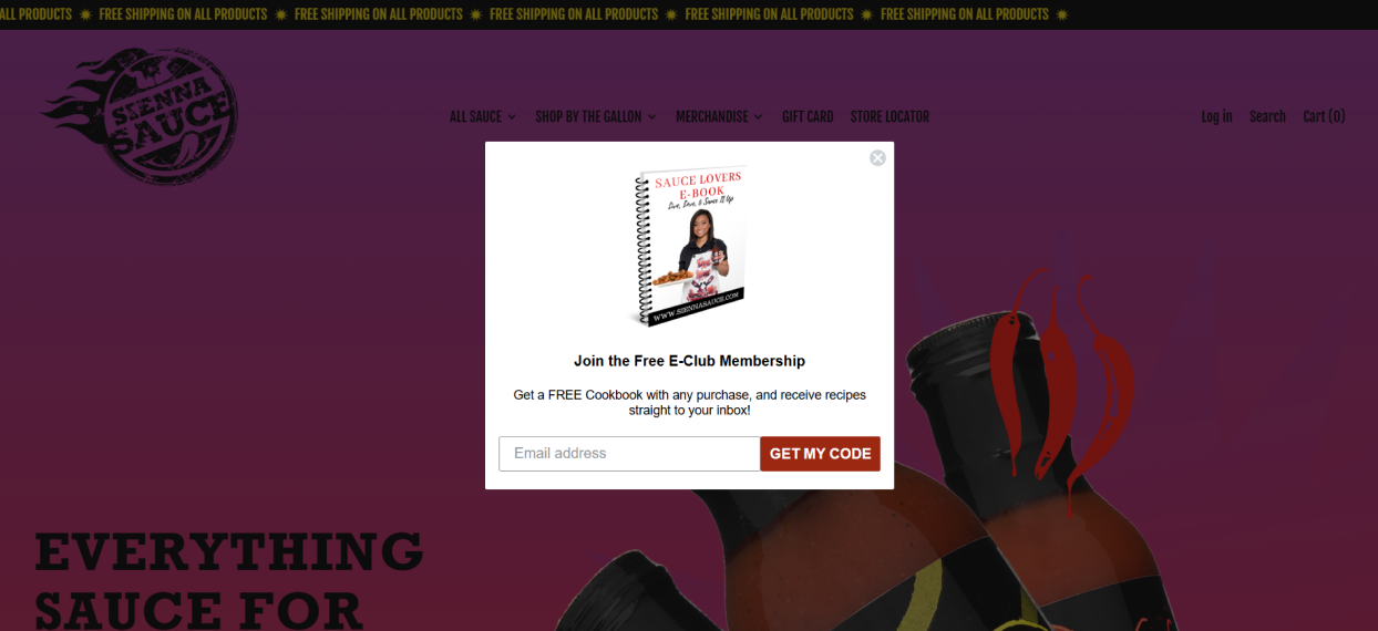
Image Source: Sienna Sauce
This Sienna Sauce popup hasn’t followed the mainstream discount popup strategy. Rather it sweetens the deal with lead magnet, a free e-cookbook. Someone buying sauce might not know what to cook with it so this popup solves that problem. Plus, the bold visuals and clear messaging make the offer instantly appealing.
If you’re using a value-added popup, focus on:
✅ A bonus that complements your product
✅ A strong headline that highlights the benefit of grabbing the product or taking action
✅ A clear, action-driven CTA
7. KissMyKeto
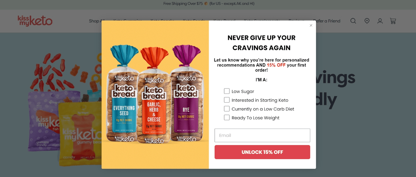
Image Source: KissMyKeto
This KissMyKeto exit popup is a smart strategy because it turns an exit into an opportunity. Instead of letting potential buyers walk away, this popup offers an attractive 15% discount while collecting their dietary preferences for better product recommendations.
This strategy reduces cart abandonment and improves future marketing. If you’re adding an exit popup, focus on:
✅ Asking relevant questions to understand your audience
✅ Making the offer feel personalized
✅ A bold, attention-grabbing design
8. Magic Spoon
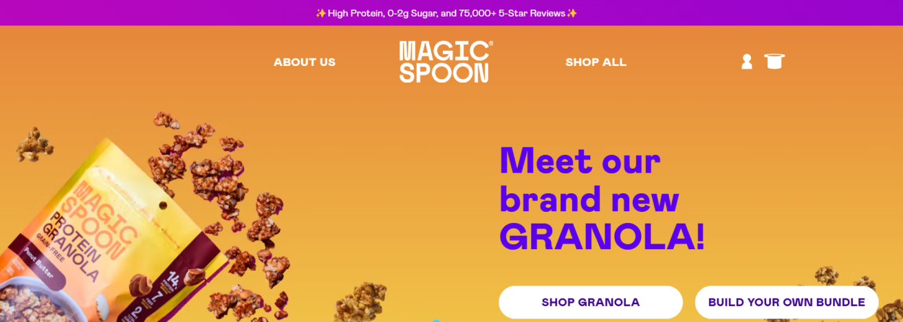
Image Source: Magic Spoon
This Magic Spoon social proof popup is brilliant because it immediately builds trust by highlighting 75,000+ five-star reviews. Why does this work? Because people trust real experiences. Seeing a high number of positive reviews validates product quality and reduces hesitation.
Plus, the subtle placement keeps it noticeable without feeling intrusive. If you’re adding social proof to your site, focus on:
✅ Highlighting impressive stats (reviews, bestsellers, or awards)
✅ Keeping it concise
✅ Placing it where visitors naturally look
FREE. All Features. FOREVER!
Try our Forever FREE account with all premium features!
How to Evaluate Your Popup Messages’ Performance
So, you’ve added a popup message on the HTML site, but how do you know if it’s actually working? Measuring its impact isn’t just about counting clicks; you must dig deeper to see if it’s driving real results. Here are the key metrics to track success:
1. Conversion Rate: How many people take action? Whether it’s signing up, making a purchase, or redeeming an offer, this tells you if your popup is effective.
2. Engagement Rate: Are your visitors interacting with your popup or closing it immediately? If most users dismiss it, the design, timing, or offer might need tweaking.
3. Bounce Rate: Is your popup able to re-engage website visitors who have left? A well-timed exit-intent popup should reduce bounce rates and keep users engaged.
4. Visibility & Reach: Is your popup being seen by the right people? If visitors aren’t noticing it, you might need to adjust placement, timing, or triggers to improve visibility.
Also, comparing two popup versions helps you find what works best. Different headlines, CTAs, or designs can make a huge difference in performance.
But tracking all of this manually can be overwhelming. That’s when Picreel’s popup analytics simplifies the process. It provides real-time insights into views, clicks, conversions, engagement, and performance trends, helping you optimize popups for maximum impact.
Optimize Your Popup Messages for More Conversions
A well-crafted popup message can capture attention, increase sign-ups, and even reduce cart abandonment. Use the types, tips, and examples covered in this blog to design popups that actually convert. Keep testing and refining based on real data for maximum impact.
If you’re looking for an easy way to create high-converting popups, ready-to-use templates offered by top popup builders like Picreel can help. Its advanced targeting and smart trigger features ensure your popup message reaches the right audience at the perfect moment, driving more conversions effortlessly.
The best part? With this powerful tool, you can start leveraging popups and get the most out of every visitor for free using the Forever Free Plan. So, this is your sign to create your first popup message today.
FREE. All Features. FOREVER!
Try our Forever FREE account with all premium features!

 We'd love your feedback!
 Thanks for your feedback!


