Ever had shoppers browse your store, add items to their cart… and then vanish? Frustrating, right? Shoppers abandon carts for many reasons – 48% due to extra costs, 22% because of long shipping times, and 12% over return policies.
So, how do you stop them from leaving?
That’s where cart abandonment popups come in. A well-created popup can address these concerns and compel them to purchase. But what are the elements and process of creating such popups?
Read along to find the elements, real-world examples, and ready-to-use templates to create an abandoned cart popup. Let’s go.
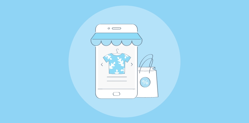
What Is a Cart Abandonment Popup?
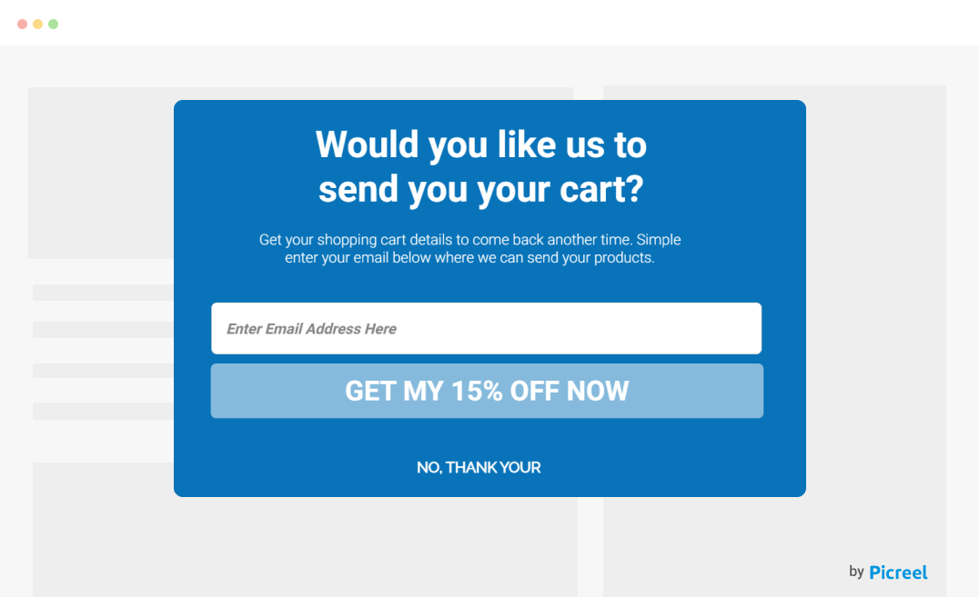
A cart abandonment popup is a message that appears on checkout, product, or home page when a shopper is about to leave a website without completing their purchase. It’s like a last-minute nudge, reminding shoppers about the items in their cart. Sometimes, it also offers a discount or free shipping to encourage them to stay and check out.
Image Source: Picreel
When placed strategically, you can easily bring visitors back without investing much effort in implementing retargeting ads or follow-up emails.
How to Reduce Cart Abandonment Using Popups
You need more than just a generic reminder to prevent shoppers from abandoning their carts. Here are the abandoned cart best practices you must follow to turn hesitant shoppers into paying customers using popups:
1. Include Necessary Information
Shoppers may hesitate due to unclear return policies, shipping costs, or product details. Use your popup to answer common concerns.
2. Incorporate Exit-Intent Technology
Trigger popups when visitors are about to exit or inactive for some time to give them a reason to stay and make a purchase.
3. Offer a Discount or Free Shipping
A small incentive, like 10% off or free shipping, can convince shoppers to complete their purchase. Highlight the offer clearly in your popup to maximize sales.
4. Personalize Discounts
Set rules to offer different discounts based on cart value, like “Spend $100 and get 15% off!” This encourages larger purchases.
5. Create Urgency
Limited-time offers, countdown timers, or low-stock alerts make shoppers act fast. For instance, a simple “Hurry! Your discount expires in 10 minutes” can work wonders.
6. Capture Email Addresses for Follow-Ups
If they show signs of leaving, collect their email with a popup offering a discount in exchange. This lets you send reminder emails and recover lost sales later.
7. Address Other Concerns
Highlight easy returns, secure payments, or customer support options. Assuring shoppers that they’re making a risk-free purchase can help close the deal.
8. Use Social Proof
Adding reviews, star ratings, or a message like “Join 10,000+ happy customers!” reassures hesitant buyers, boosts confidence, and drives sales.
9. Include a Clear Call-to-Action (CTA)
Make the next step obvious with a bold button like “Claim Your Discount” or “Complete My Purchase”. A strong CTA drives conversions.
10. Use Persuasive Copy
Your words are significant in driving sales. So, use engaging, benefit-driven copy like “Don’t miss out on this deal!” instead of a plain “Are you sure you want to leave?”.
10 Best Cart Abandonment Popups Examples
Before you create your cart abandonment popup, check out and take inspiration from these live examples that brands use to turn hesitant shoppers into buyers.
I have also suggested the most strategic placement and areas of improvement for each example. So, you’re in for insights on creating the best cart abandonment popups.
1. TOMS
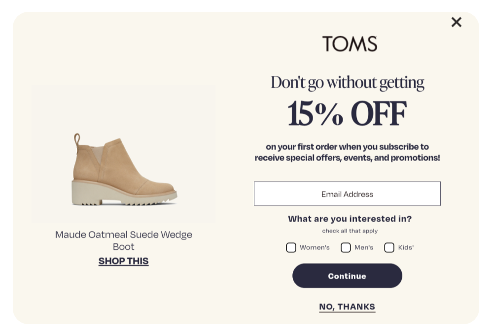
Image Source: TOMS
Thinking of offering a discount to your new visitors? It’s a proven strategy to increase sales, as 80% of American shoppers purchase from a brand for the first time if they offer a discount. So, include a discount in your popup like TOMS. The bold 15% off headline instantly re-engages visitors, while the email capture ensures you can follow up with potential buyers and recover lost sales.
Offering interest selection (Women’s, Men’s, Kids’) helps you create a personalized experience and show relevant offers, which increases the chances of sales.
Placement: This personalized popup best captures hesitant buyers at checkout, on the products page, and homepage. Trigger it when shoppers are leaving.
How You Can Improve It
- Add a short reassurance like “Hassle-free returns” to ease doubts.
- A stronger CTA like “Claim My 15% Off” could boost engagement.
2. SwissWatchExpo
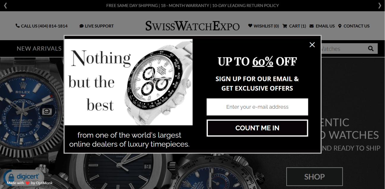
Image Source: SwissWatchExpo
If you’re using a discount-based popup, make sure it grabs attention, like SwissWatchExpo’s “Up to 60% Off” offer. A bold headline clarifies the deal and encourages shoppers to grab luxury watches at a heavy discount, which is rare. The email sign-up helps you reconnect with unengaged shoppers. Using a strong CTA like “Count Me In,” can help you compel visitors to take action.
Placement: If you sell high-value items, this kind of popup works best when shoppers hover over the exit button or spend time on the checkout page.
How You Can Improve It
- Add a time limit (“Offer expires in 24 hours!”) to create urgency.
- You can remove the text below the image, as it makes the popup cluttered. A 3-4 word text works better.
3. Gourmet Baskets
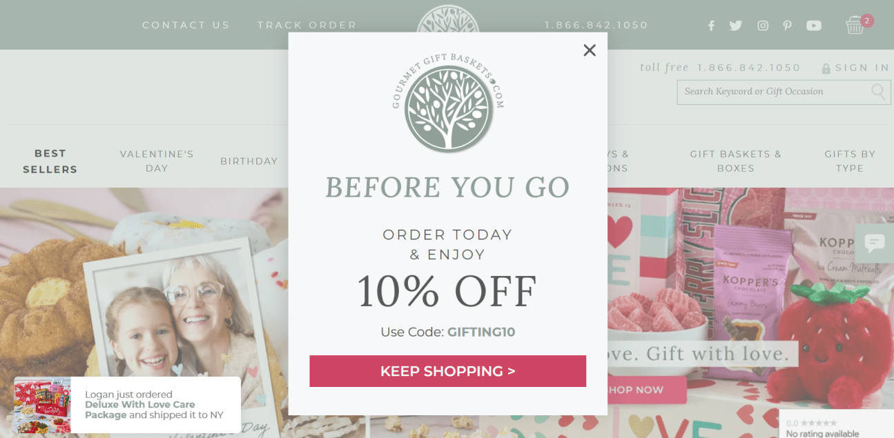
Image Source: Gourmet Basket
If you want to catch shoppers right before they leave, a simple exit-intent popup like Gourmet Basket’s works well. A clear “Before You Go” message helps you grab attention. And did you notice how the “order today and enjoy a 10% discount” message? It gives them a reason to stay and get their baskets at a discounted rate immediately.
The discount code is visible upfront, reducing friction from your shoppers’ buying journey. Moreover, including a bold “Keep Shopping” button makes it easy for your shoppers to continue browsing.
Placement: Use this on your cart and product pages after shoppers add their products and start scrolling again without purchasing.
How You Can Improve It
- Use a darker shade of colors so it can pop out and grab attention better.
- Save the coupon code for the next popup page when visitors click on the CTA to track the number of conversions.
4. Eye Love
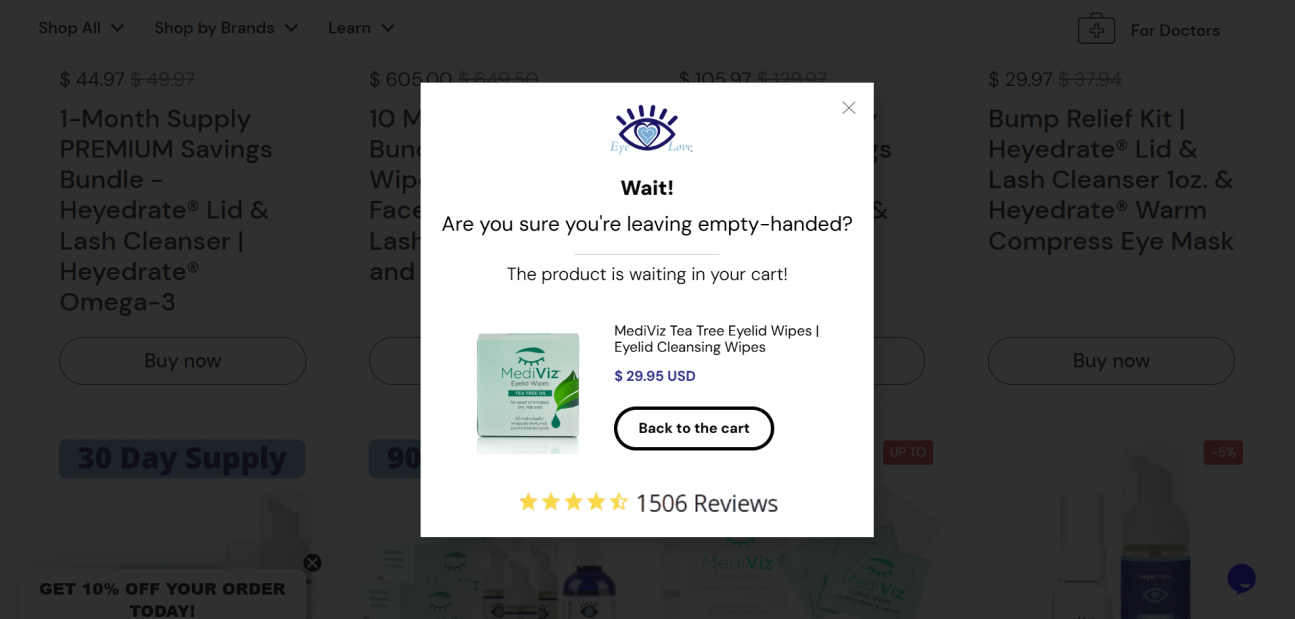
Image Source: Eye Love
Nobody likes leaving a good deal behind, and this Eye Love popup does a great job reminding shoppers of that. Adding a “Wait! Are you sure?” message makes the popup feel personal, encouraging them to stop and think. By including the product image, price, and glowing 1,500+ reviews, you can reassure them they’re making the right choice.
With a similar CTA, you can make returning to the cart and purchasing easy.
Placement: You must place it when visitors land on the site next time or hit the back button on the cart page.
How You Can Improve It
- Adding a short reminder about fast shipping or easy returns could reduce hesitation.
- Including a brighter CTA button will make it stand out more, driving higher clicks.
5. Porcobrado
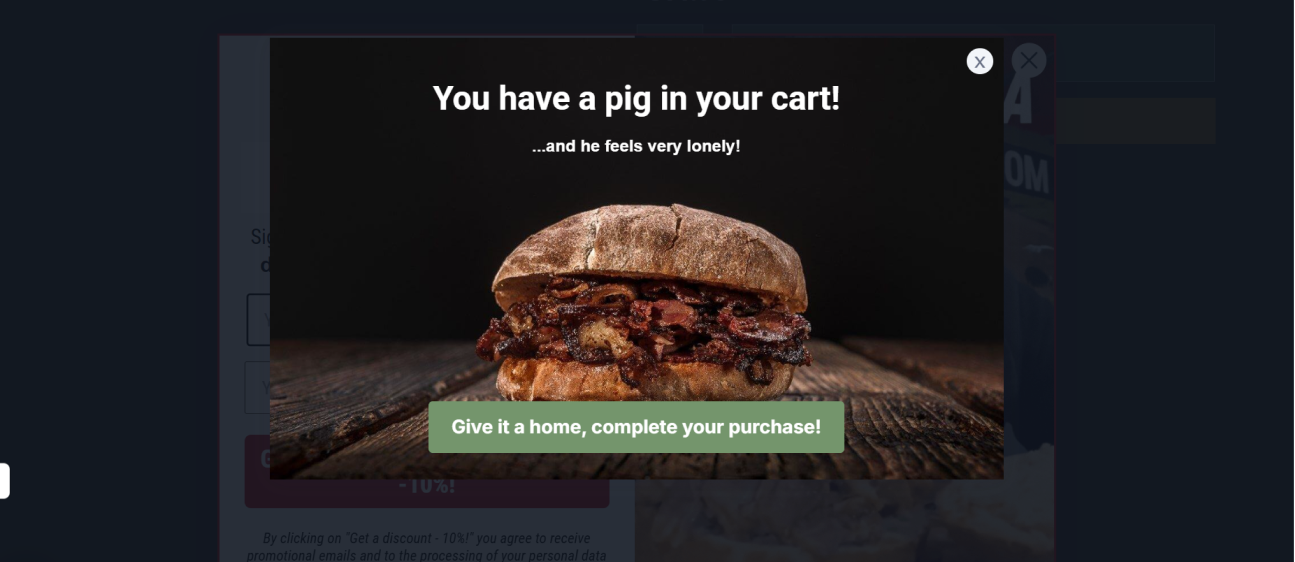
Image Source: Porcobrado
Let’s talk about this popup — it’s witty, memorable, and hard to ignore. That playful “You have a pig in your cart!” line? Brilliant. By using a similar popup, you can make people pause, maybe even chuckle, and reconsider leaving. Plus, adding the mouthwatering burger image is definitely going to re-surface your visitors’ cravings and push them toward making a purchase.
Placement: It works well on the checkout page before the payment step when shoppers fill in all the details but become inactive at the payment step.
How You Can Improve It
- Consider adding a secondary button like “Not ready? Explore more options” to keep shoppers engaged instead of exiting.
- Make the CTA more action-driven, like “Order Now & Satisfy Your Craving”.
6. Press
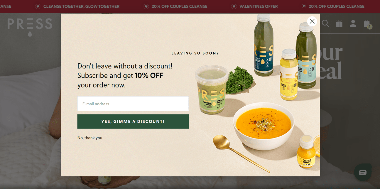
Image Source: Press
By using a similar discount-loaded exit-intent popup, you can give shoppers a gentle reason to stay. A “Leaving so soon?” message can naturally hook your visitors into conversations. Giving a 10% discount helps your shoppers save money and makes them feel like they’re getting a better deal.
Adding an email capture is smart because it helps you stay connected with and nurture potential buyers for future sales.
Placement: You can use it as a delayed trigger on high-ticket product pages to encourage shoppers to purchase before leaving.
How You Can Improve It
- Offer a bonus like “Get 10% off + a free recipe guide with your order!” to provide irresistible value without cutting margins much.
- Everyone loves feeling special. So, instead of just “10% off,” try “You’ve unlocked a VIP 10% off—grab it now!” to make it feel exclusive.
7. Colorescience
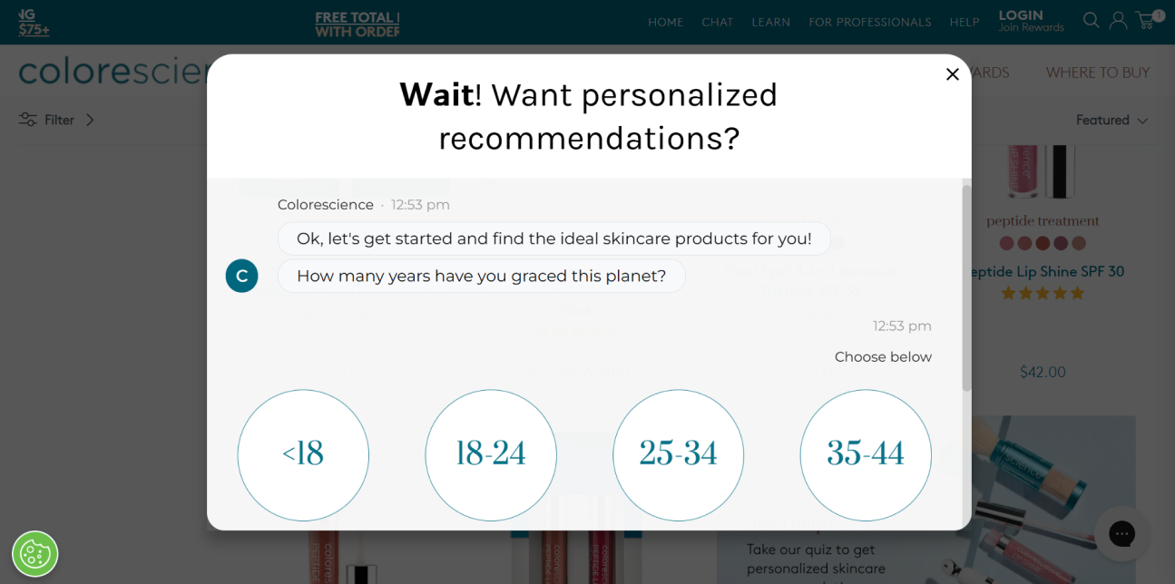
Image Source: Colorescience
Let’s be real—skincare isn’t one-size-fits-all. When someone is about to leave without buying, they are often confused about which product is best for them. A popup survey like Colorescience’s solves that problem by starting a conversation instead of just throwing a discount at them.
This chat-style design can make your popup feel like an interactive and personal skincare consultation rather than a sales pitch, helping you re-engage shoppers.
Placement: You can use such consultation popups on the homepage for new visitors, as exit-intent popups, or on product pages for high-consideration items. This will help them clarify which products are best for them and make informed sales decisions.
How You Can Improve It
- Show a progress bar because users are more likely to complete the process if they see they’re just “2 steps away” from personalized results.
- To build trust, include real customer testimonials with a line like “Over 20,000 happy customers found their skincare routine this way!”
8. Brooklinen
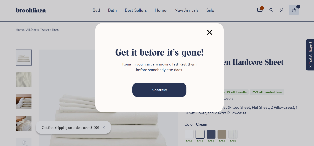
Image Source: Brooklinen
Who doesn’t want to grab something before it’s gone? If you use a scarcity-driven popup like Brooklinen’s, you’re tapping into that fear of missing out (FOMO), a powerful way to nudge hesitant shoppers. Using a message like “Get it before it’s gone!” makes your product feel high in demand. That instantly makes shoppers rethink leaving.
Instead of offering a discount, adopting this approach can help build urgency without hurting your profit margins.
Placement: To drive purchases from new visitors, it is best to use it on low-stock product pages on weekends or holiday seasons when demand naturally spikes.
How You Can Improve It
- Show actual stock levels by adding “Only 3 left in stock!” to make the urgency feel even more real.
- To build credibility, include social proof with a note like “5 people are viewing this item right now.”
9. Only Natural Pet
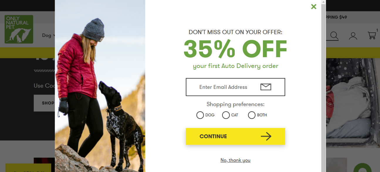
Image Source: Only Natural Pet
Pet owners love convenience, especially when it saves them money. Using a popup like this gives your customers an easy way to lock in savings while ensuring their pets never run out of essentials. So, it’s an unmissable deal for them. Adding a bold 35% off headline helps you immediately grab attention.
Letting your visitors pick between dog, cat, or both adds a personal touch, helping them make informed purchase choices easily from the personalized recommendations. The bright yellow CTA (“Continue”) is hard to miss, guiding them smoothly toward their next step.
Placement: To drive more subscriptions, incorporate it on daily-use product pages like pet food while highlighting convenience and savings.
How You Can Improve It
- Run an A/B test between the current and an alternate exit message, “I’ll pay full price later,” to see which one gets the fewest clicks.
- Highlight the long-term savings with a simple line like “Save 35% now + enjoy ongoing discounts with auto-delivery!” to make it feel like a smart financial decision.
10. Kate Spade
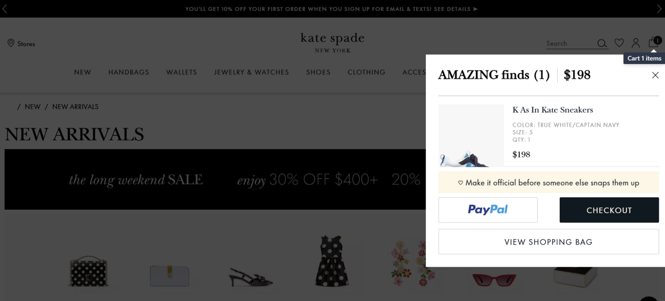
Image Source: Kate Spade
You know that feeling when you finally find the perfect pair of shoes, but you hesitate for a moment — then poof, they’re gone? That’s exactly what this popup taps into. Writing a compelling message like “Make it official before someone else snaps them up” drives urgency and makes your shoppers experience FOMO. This pushes them to purchase.
Adding a clear checkout option like PayPal removes any friction in the checkout process.
Placement: You can use this popup on any website page for limited-edition items or bestsellers that deserve an extra push.
How You Can Improve It
- Using a countdown timer for limited-time offers like “Your favorites are running out, but we’ve reserved your cart for 10 minutes!” can drive action.
- Offering a small incentive through a message like “Checkout now for free express shipping!” could boost conversions.
Abandoned Cart Popup Templates
After going through those interesting cart abandonment popup examples, you must be excited to create one. But how do you create such popups? How much time does it take? Well, it’s an easy and quick process if you use customizable, ready-to-use cart abandonment popup templates like those Picreel provides.
To use them, you don’t need a developer or coding skills. You just need to edit the message and tweak the design according to your branding to create an abandoned cart popup. When you’re done, just copy the campaign code on your website to make the popup appear immediately.
Here are some cart abandonment popup templates you can use to grow sales:
![]()
FREE. All Features. FOREVER!
Try our Forever FREE account with all premium features!
Maximize Conversions With Effective Cart Abandonment Popup
Abandoned cart popups help you win back hesitant shoppers and boost sales. To help you implement this for your store, I’ve outlined abandoned cart best practices. Following them will make your popups more effective and drive more conversions.
For creative inspiration, I have also elaborated on 10 real-world examples of popups businesses use to recover lost sales. And if you want to skip the hassle of building popups from scratch, consider using a popup builder like Picreel.
It offers ready-to-use templates, advanced targeting, and smart triggers to create and show the right popup at the perfect moment. Don’t let potential customers slip away; create your first abandoned cart popup today.
 Tips
Tips
We’d love to hear your tips & suggestions on this article!
FREE. All Features. FOREVER!
Try our Forever FREE account with all premium features!
 We'd love your feedback!
What did you like & how can we make it even better?
 Thanks for your feedback!
 Ask Your Question
Have a question? Get expert help to make your decision easier.