Isn’t it a harsh reality to accept as a business owner? Cart abandonment! If you are running an online store, a lot of your website visitors are going to leave your store without shopping. The statistics don’t lie, as the average cart abandonment rate is around 70%. The most proven and effective way that businesses generally follow to counter this rate is sending abandoned cart emails to visitors. But, what exactly is an abandoned cart email, and what are some of the best-abandoned cart email examples that you can follow? This blog post is all about it!
Let’s first talk about an alarming statistic. In general, the average e-commerce email open rate is just around 15%, but when it comes to abandoned cart emails, the number goes up to 45%. So, you can actually get your visitors back to convert them into paying customers.
What is an Abandoned Cart Email?
First, let’s talk about an abandoned cart. A visitor explores your online portal and is interested in some of your products. After adding those products to their shopping cart, they leave your website without making the purchase due to any XYZ reason. This is cart abandonment, and we all can admit how sad it is to see our customers leave.
An abandoned cart email is a follow-up message sent in response to the cart abandonment. This email is sent to all your visitors who abandoned their cart. The aim is crystal clear to bring back the customers so they can complete their orders.
The abandoned cart email templates are designed in such a way that they remind the recipient of what they were browsing at your online portal. The benefit of this email is quite visible in the stats as it wins back the revenue that left your station.
If you’re a WooCommerce store owner, you can try one of the best cart recovery plugins for WooCommerce (i.e.) “WooCommerce Abandoned Cart Recovery” which will recover your cart through generating automated abandoned cart recovery mails.
Why Visitors Abandon Online Shopping Carts?
When we talk about online portals, there are different industries running their businesses, and every industry is different. However, there are a lot of common reasons behind people abandoning their shopping carts.
For this, we can first consider our own shopping experience. What are the reasons behind us leaving an online shopping portal without making the purchase? Some website technical issues or found the same product at a lower price on some other websites or high shipping cost or a complex checkout process, etc. In some cases, we are just browsing the website, and that’s the same scenario with different visitors.
For some abandoned carts, you just can’t do anything to bring back the visitors as people who are just browsing your website or comparing the prices were never going to buy in the first place. There is no need to worry about these visitors. But, if someone genuinely interested in your products/services left your website due to a legitimate reason, your focus should be on bringing them back. Let’s check out this visual representation to understand the reasons for abandonment during checkout.
Whatever the reason is behind the customers departing from your website, there’s always a way to fix this with email marketing. Many online businesses use exit-intent software to capture email addresses of abandoning customers. With the right shopping cart abandonment email, you can bring back a lot of customers to your website to complete their purchase.
When Should You Send an Abandoned Cart Email?
Optimizing your abandoned cart emails to recapture sales comes down to the perfect timing. Without the right timing, the impact won’t be the same. In general, businesses either send a single abandoned cart email or a series of three emails.
#1st email: A friendly reminder after an hour, the customer abandoned the cart. It is designed for customers who might have left the website due to some technical issues or other distractions. The aim here is to politely remind them of making the purchase.
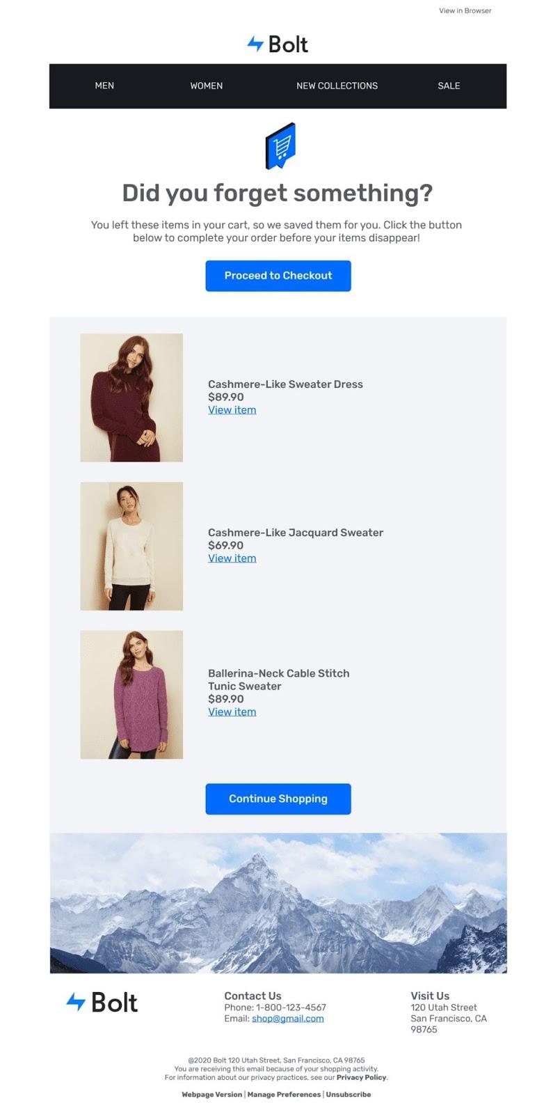
Image Source: Bolt
#2nd email: An email to create a sense of urgency after 24 hours. This email should motivate the customer to complete their order. You can play the limited availability card here, or you can mention that discounts on products will be expiring soon.
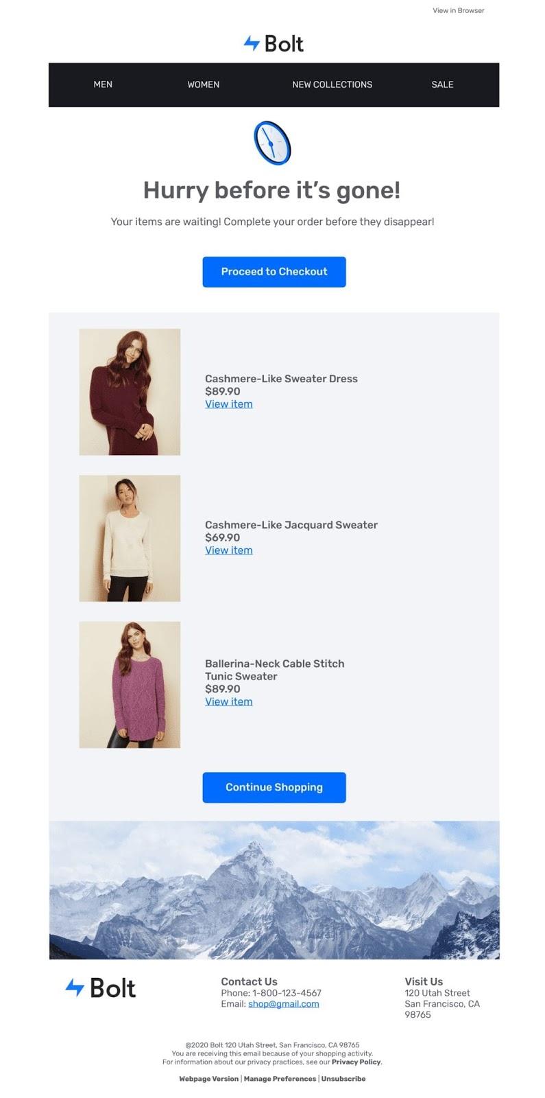
Image Source: Bolt
#3rd email: Generally, the third email after 24 hours has a low success rate. Firstly, avoid sending it in quick succession so that it doesn’t lead to spam. You can send this 24 hours after the second email to incentivize the customer with free shipping or a discount coupon.
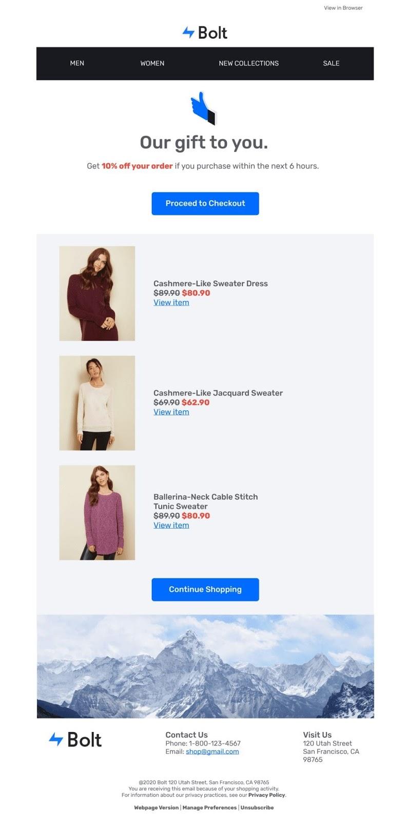
Image Source: Bolt
Any email after the third is likely to cause more harm than good to your brand reputation. It can also flag you as spam, leading your efforts to dump. So, try to decide your sequence of emails with A/B testing and time the emails perfectly to draw the customer’s attention.
Now that we know some interesting stuff about abandoned cart emails, it’s time to check some striking abandoned cart email examples!
14 Abandoned Cart Email Examples to Win Customers
1. Nomad
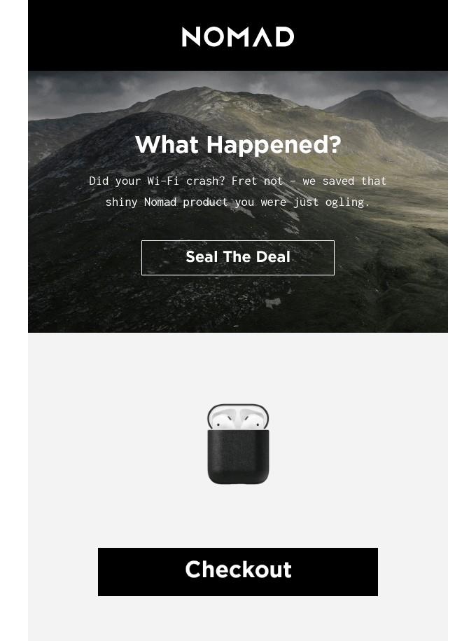
NOMAD’s abandoned cart email is all about keeping it simple and witty. If you pay close attention to their CTA, it will take the customers directly to the payment options page, where they can quickly finish their order. The time-consuming checkout process is one of the key reasons for customers abandoning their carts, and this email seamlessly resolves the issue with a direct checkout option.
2. Google
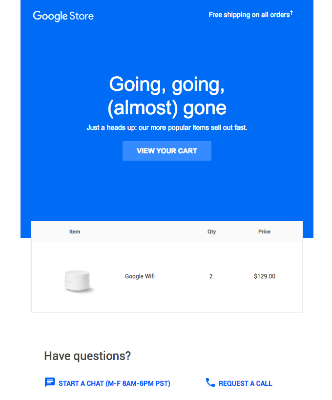
Isn’t it the perfect abandoned cart email? Google never fails to impress, and this email proves that. It includes every element from a clear CTA and personalization (customer’s cart) to a sense of urgency. “Going, going, (almost) gone” and “Our more popular items sell out fast” are good enough phrases to keep the customers engaged. The art of copywriting here keeps the recipient compelled to make the purchase, so they don’t miss out.
3. Virgin Atlantic
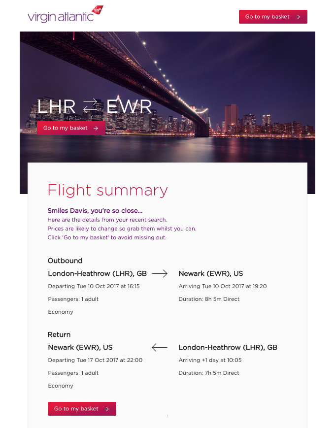
Virgin Atlantic addresses the customers with personalized intro text along with a photo in the background of the destination. The email also includes the complete flight information, making it easier for the customer to proceed with their booking. At last, the email has created urgency by mentioning the price change situation. The three CTAs are perfectly placed, and you can follow a similar pattern according to the industry you’re in.
4. Timberland
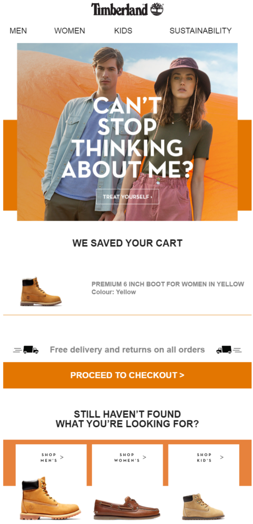
Online shoppers often don’t know what they actually want until they see it. Timberland cleverly designed this abandoned cart email by keeping the spotlight on the product the visitor added to the cart while adding some similar alternative products that the recipient might like. This way, you can easily nudge the cart abandoners in the right direction. Also, the checkout CTA and mentioning free delivery/returns at the center of the email are quite impactful.
5. Whisky Loot
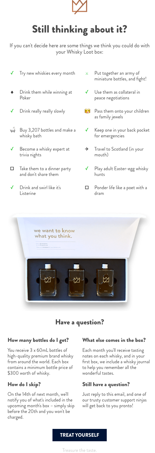
Whisky Loot’s abandoned cart email is definitely a unique and creative representation to bring back lost visitors. Even though the email design looks long at first glance, it keeps the recipient engaged till the very end. Mentioning reasons for buying a product in a witty way makes the recipient feel delighted. After addressing all the questions, the CTA “Treat Yourself” is placed perfectly for customers to complete their purchase.
6. Brooklinen
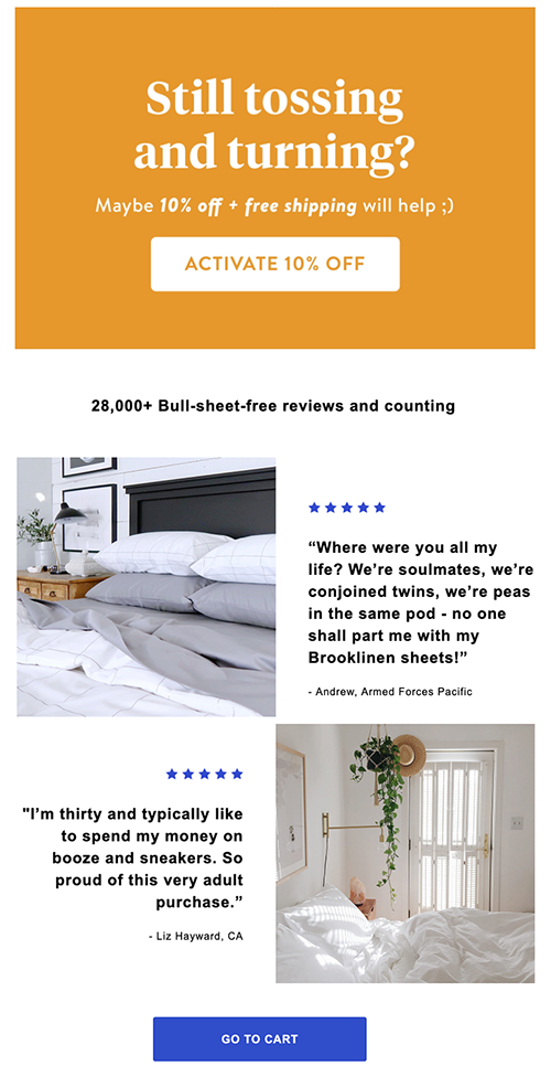
Creativity at its peak! The customer’s movement and activities across the website must have indicated that the customer wasn’t sure about the product quality. Brooklinen used online reviews posted by other shoppers to let the recipient know that products in the abandoned cart are worth purchasing. Also, free shipping and a discount coupon are offered to attract the customer even more.
7. Allbirds
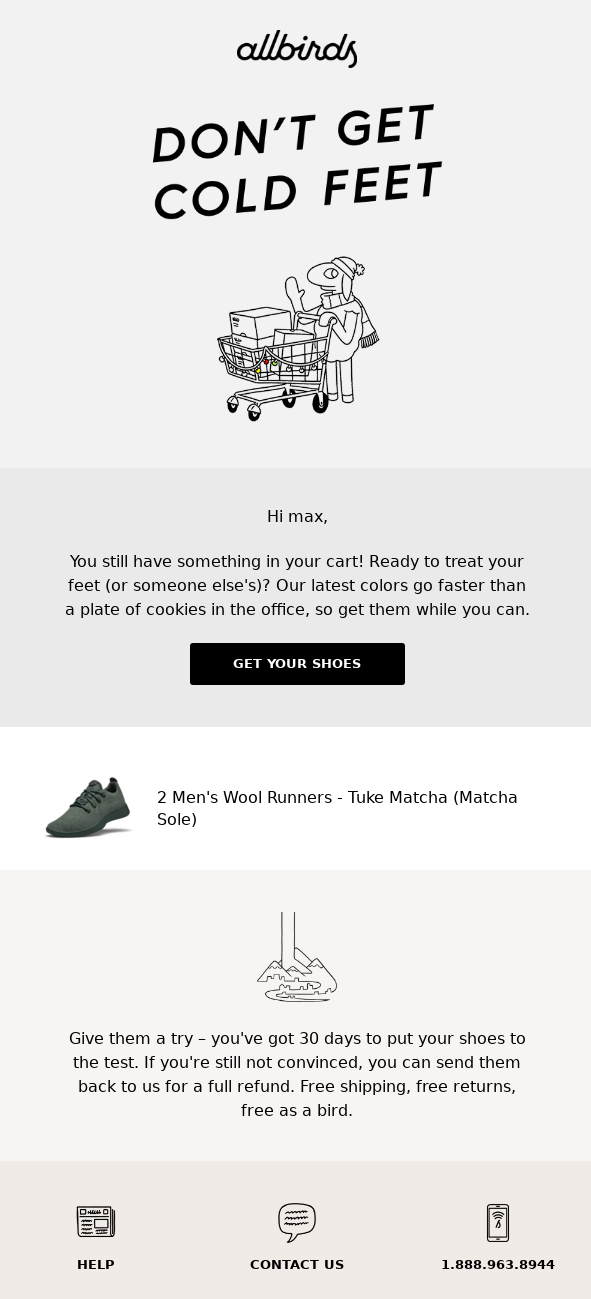
More than 49% of online shoppers actively check the return policy of products before making the purchase. If your customers are hesitant about buying items, you can remind them of your hassle-free, no-questions-asked return policy. That’s what Allbirds’ abandoned cart email is all about. Personalizing the email, using a funny reference to create urgency, and providing the return information clearly along with support icons make it another perfect email.
8. Dyson
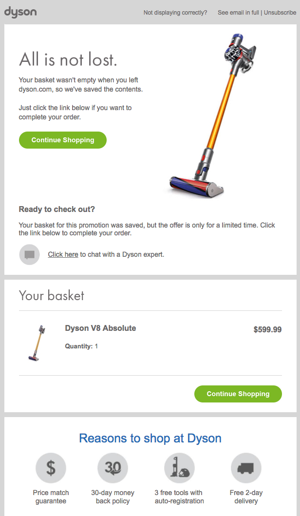
Here, Dyson tried to incorporate multiple things in a single email and delivered it neatly. The email starts off by letting the recipient know that their cart is reserved, and they can reach out for help regarding any issue. Next, they included the image of the product along with cart details to remind the recipient of what they added to the cart. To create a sense of urgency, Dyson included that promotional price is limited and have provided 2 CTA buttons, making it easy for mobile users to complete their purchase.
9.Target
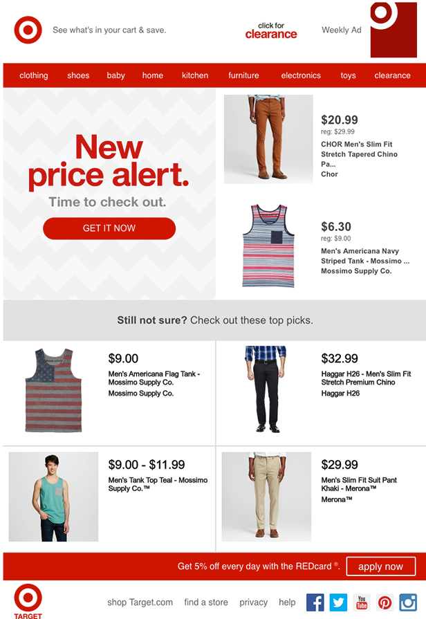
Target takes a unique approach by offering a discount on the products in the customer’s cart. The abandoned cart email clearly says “New price alert” to draw the recipient’s attention. In case the approach doesn’t work, Target included some of their similar top picks to bring the customer back on their website for browsing and shopping again. The mention of a 5% extra discount on a certain payment method is also compelling.
10.Bluemercury
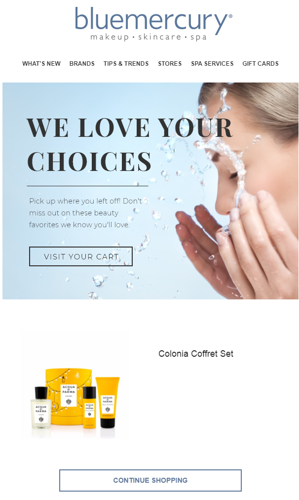
People love being appreciated for their choices. Telling your visitors that they made a great choice is a proven strategy to make them feel special. The way Bluemercury designed this abandoned checkout email makes the recipient think that the beauty set should be in their bathroom instead of the cart. With 2 CTAs, the design is minimalistic and is one of the most simple and beautiful abandoned cart emails.
11. Dote
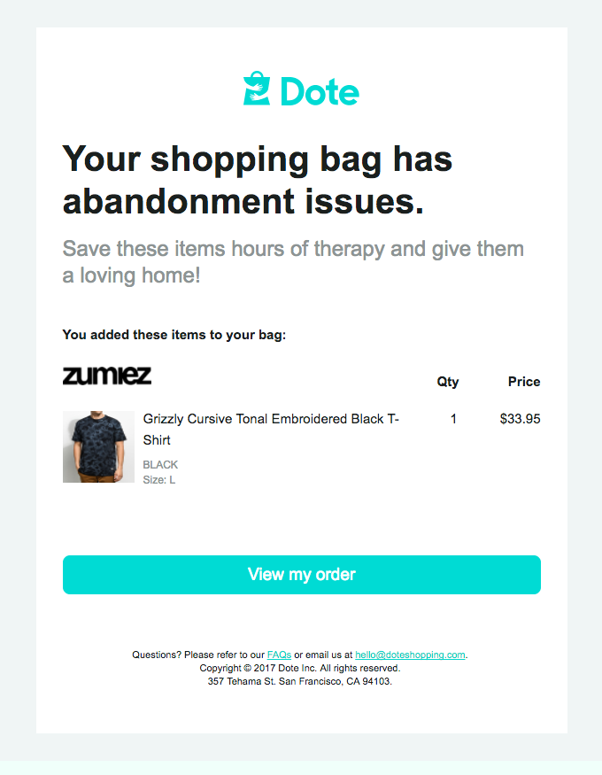
Some interesting and funny taglines are the way to your customer’s heart. With humorous copywriting, Dote keeps the recipient engaged and makes the brand compelling to the customers. Also, the interesting thing about this email copy is, it is short, simple, and to the point without any unnecessary stuff to irritate the recipient. The CTA makes it easy to visit the bag and continue shopping.
12. Moschino
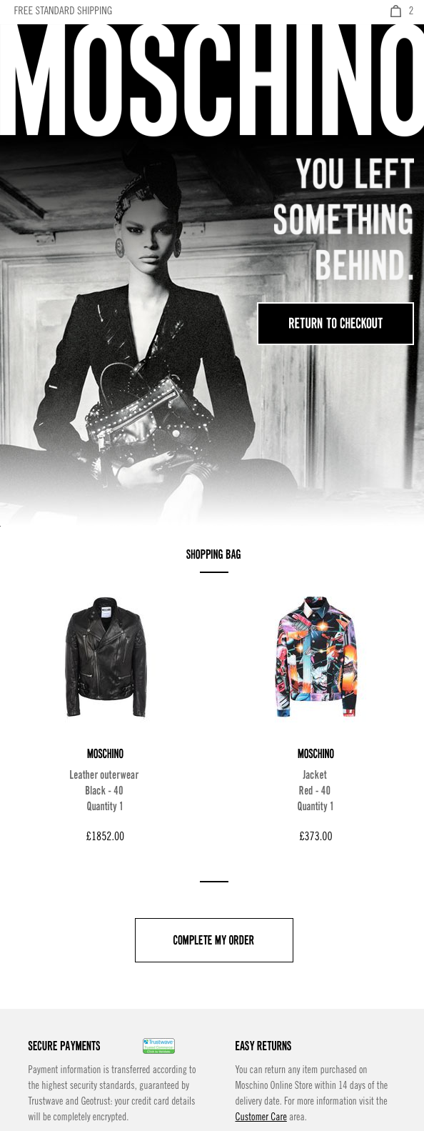
Moschino’s abandoned cart email uses a vintage visual representation optimized for mobile users. The shopping bag, along with the order details, is placed beautifully along with a one-click CTA. The best thing about this copy is Moschino included two crucial pieces of information, Secure Payments, and Easy Returns. This assures the recipient that they are dealing securely, and in case of any issues with the product, returns can be processed easily.
13. NATIVE
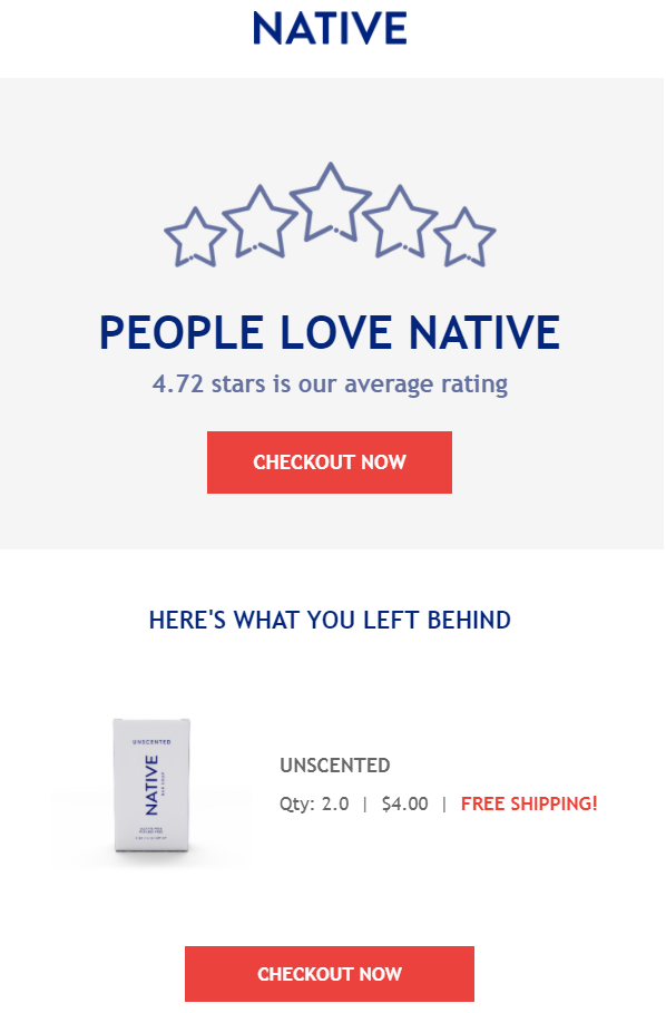
For people who may not trust your brand yet, implementing reviews and testimonials in abandoned cart emails is the perfect strategy for providing value. Instead of showing them a particular product review, NATIVE focuses on overall brand review. The email copy is simple and delivers the message powerfully. Mentioning free shipping along with the cart details further compels the recipient to make the purchase.
14. Sugarbearhair
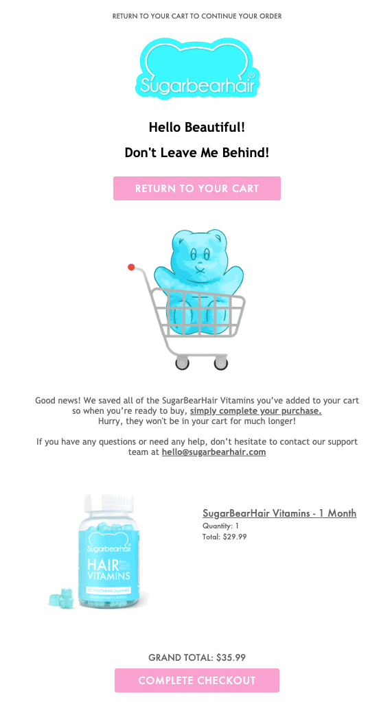
Graphic elements, especially GIFs and videos, will be your audience’s critical first impression. This Sugarbearhair’s abandoned cart email stands out with an illustrated GIF. The color scheme used is great as the CTAs pop in the email. Also, the cart details are given along with the customer support details in case there is an issue with the product. While incorporating such an example, make sure to create a sense of urgency as well.
FREE. All Features. FOREVER!
Try our Forever FREE account with all premium features!
Which Abandoned Cart Email Design Is Best for You?
Undoubtedly, there are a lot of approaches to the abandoned cart emails, and we earlier got a grip of how important these emails are for a brand to bring back abandoning customers. The first step before planning your email marketing strategy is to effectively get the email addresses of your abandoning visitors. The best way to do this is with the help of an exit-intent popup.
To choose the best email design for you, we suggest A/B testing different variations to see what works best for your audience. Do they prefer humor? Do they like personalized emails? Are discounts and offers compelling for them? It is really important to find this out before laying out your final design. Also, keep multiple dynamic designs ready as a different cart recovery email template may be more effective to a particular recipient.
You can easily create different cart abandonment email templates with engaging and compelling content to increase the chances of conversion. Using the right tool for email marketing, store these email templates to automate the campaigns whenever you get the details of abandoned visitors. This way, your team won’t have to create/edit emails every time and can invest their valuable time on better tasks.
Time to delight your potential customers with stellar copywriting and branding!
 Tips
Tips
We’d love to hear your tips & suggestions on this article!
FREE. All Features. FOREVER!
Try our Forever FREE account with all premium features!

 We'd love your feedback!
 Thanks for your feedback!


